(index.php)
The Triumph of Martha Jungwirth: How This Abstract Pioneer is Finally Getting Her Due and Continuing to Break Boundaries
Austrian artist Martha Jungwirth, now 84, has recently gained wide recognition after years of being underappreciated in the art world.
Born in 1940 and based in Vienna, her work—primarily oil and watercolour on paper and canvas—explores the expressive potential of these mediums, focusing on energy and movement rather than realistic representation. As Jungwirth has explained, “When external movement, bodily movement, and inner movement align, and this convergence succeeds, that’s when painting begins.”Jungwirth’s international breakthrough came in 2010 when her work was included in a group exhibition curated by German painter Albert Oehlen at the Essl Museum in Austria. In 2018, Jungwirth was honored with the prestigious Oskar Kokoschka Prize by the Austrian state, and that same year, she had a solo exhibition at the Albertina Museum in Vienna. Her recent exhibitions include solo shows at the Guggenheim Bilbao and the Palazzo Cini Gallery in Venice in 2024.
She studied at the Academy of Applied Arts in Vienna from 1956 to 1963, and from the start always explored working in various media. In 1968, she became the only woman among the founding members of the “Wirklichkeiten” (Realities) artist group. Despite this, Jungwirth has always followed her own unique artistic path, navigating between gesturally abstract and formal compositions. Unlike the rational, methodical approaches of Minimalism and Conceptualism that defined the 1960s and 1970s, Jungwirth’s paintings emanate a raw, intimate and organic connection to the self.

While Jungwirth approaches the canvas with an idea in mind, she does not begin with any pre-sketches or plans. Instead, Jungwirth notes that the image unfolds gradually during the act of painting itself. She works on compositions from all sides, with her sheets of paper or canvas typically positioned on the floor. Her works often serve as personal records, capturing her thoughts at a given moment—whether influenced by recent travels, pressing concerns, or historical paintings she has researched. Reacting to sudden impulses, she makes bold, colorful marks on canvas or paper. These marks—layered, overlapping, and at times blurred—infuse the picture plane with a dynamic sense of movement and energy.
Her creative practice is one of constant experimentation of unusual materials and unorthodox methods. Her preference for worn and weathered materials is especially evident in the paper and cardboard she often chooses as “canvas”. These surfaces bear the marks of time—frayed edges or sheets torn unevenly from rolls of kraft paper. Then oftentimes, Jungwirth will attach these sheets of paper onto canvas, deliberately leaving portions of the canvas exposed, drawing attention to the raw quality of her materials. She frequently works with oil paint, but what makes her practice unique is her preference of using oil paint on paper—an unconventional approach. The oil often seeps into the paper, so that once she completes her brushstrokes, the paint begins to form its own marks organically as the oils absorb into the surface, highlighting the chemical properties of the medium. Another recurring aspect of her work is the tendency to leave large portions of the canvas blank. As she explains, “I can’t do it. A dense, completely filled canvas is not for me.”

Jungwirth’s extensive travels, from Istria and the Cyclades to Bali, often serve as direct inspiration for her works, with the places she visits frequently reflected in the titles of her pieces. One notable example is her Indesit series, which draws on a transformative trip to New York City in 1975, when she was 35. The city’s vast, imposing architecture, coupled with her experience at MoMA where she encountered Mies van der Rohe’s large-scale charcoal drawings, deeply influenced her artistic direction. Her works from that year reflect her new fascination with the structural qualities of commonplace appliances like dishwashers and washing machines. She began to view these objects as urban symbols—contemporary, functional equivalents to the towering forms of city buildings, which she found overwhelming in New York City. While her style has evolved considerably since those early works, some elements have remained constant, such as the prevalence of empty space, the focus on markmaking, and the direct influence of her travels on her works.

During the 1980s, Jungwirth increasingly embraced the creation of large-scale watercolors and oil paintings, using bold techniques to apply the paint. One of her most notable series captures Vienna’s Spittelauer Lände, situated along the right bank of the Danube Canal in the Spittelau district. In these expansive works, she conveys the essence of the city’s atmosphere, from its fluctuating weather and urban noise to the constantly shifting light.

In her series Vladimir Nabokov: Speak, Memory, Martha Jungwirth draws on photographs she took in the backyard of a house during a visit to Saint Petersburg in the summer of 2017. The series also reflects her engagement with historical figures and references. Here the title directly alludes to the Russian-American novelist and poet Vladimir Nabokov.

Bukephalos is a representation of the legendary war horse of Alexander the Great. With its delicate silhouette—both timeless and primordial—it stands as a symbolic witness to the wars, tragedies, and natural disasters that have shaped countless civilizations. This work not only reflects her engagement with historical references but also introduces another key theme in her art: the depiction of animals.
Martha Jungwirth’s Australidelphia series delves into the world of Australian marsupials, some of which are referred to as “living fossils” for retaining characteristics from ancient times. The series goes beyond a mere homage to these enduring species, but also serves as a poignant response to the catastrophic bushfires that ravaged Australia in 2019–20, claiming countless animal lives. “There’s something apocalyptic about that,” Jungwirth remarked. “First the animals burn, then the people.”

Her monumental work La Grande Armée is inspired by the animal-shaped funeral beds discovered in the antechamber of pharaoh Tutankhamun’s tomb. Thought to represent a lion, a spotted cow and a third composite creature, here, all three animals are lined up, facing the same direction, as guards and onlookers onto the passage to the afterlife. The strikingly rounded curl of the lion’s tail also recalls the elegant lines of typical ancient Egyptian depictions of animals.
Jungwirth draws inspiration from a wide array of art historical painters, infusing her work with references to both classical and modern traditions. Her recent oil paintings, for example, are influenced by the works of Francisco de Goya and Édouard Manet. However, she reinterprets these sources through her distinct artistic language, resulting in bold and transformative reimaginings of the original works. This enables her to both pay homage to and challenge the legacy of iconic figures, producing works that are deeply rooted in art history yet distinctly contemporary. Jungwirth’s series, inspired by Manet’s A Bunch of Asparagus (1880), delves into the physicality of paint, creating a delicate balance between the painted surface and the untouched areas of the paper. Jungwirth reimagines Manet’s asparagus motif, maintaining the rich texture of the brushwork through her own strokes and preserving the outline, while nearly concealing its true form. Jungwirth’s work constantly hovers between abstraction and figuration.


Martha Jungwirth’s art merges history, personal or broader, with intuitive expression, crafting works that go beyond realistic representation. Her distinctive use of materials and spontaneous brushwork reveal a profound connection to both the world around her and her inner self. Vibrant hues of pinks, reds, and purples pulse across the canvas, infusing the work with energy and life. As she explains, “Through my way of painting, I transform reality, but the starting point is always what I see in front of me. It’s not abstract. You can see figures, if you want to. But what’s important to me are the emotions.” Her work is a luminous, fearless celebration—each piece a bold, beautiful declaration, rich with depth and intuition. At 84, she continues to paint prolifically, pushing boundaries and, at last, receiving the acclaim she has long deserved.

The New School of London Painters
The late 1980s in London was a time where the momentum of the contemporary art scene was at a new high. A group of young, restless artists, known as the YBAs, emerged out of art colleges from around London and began exhibiting together, showcasing their provocative, head-turning painting and sculpture to the masses.
Tracey Emin, Damien Hirst, Jenny Saville, among other YBAs, breathed new life into the London art scene and in turn went on to lead prolific careers that are still thriving 40 years on. While many view this period as the heyday of British contemporary art, a similar sense of excitement is brewing across the streets of London with a new generation of graduates coming to the forefront.
London has long been an incubator of young talent, in part due to the sheer strength of its art colleges. Five major colleges, the RCA, Royal Academy School, Royal Drawing School, Goldsmiths and City & Guilds, have together built a flourishing ecosystem of young and ambitious artists across the city. Among the latest set of graduates from the Royal College of Art, Francesca Mollett and Pam Evelyn have already sparked particular interest with gallerists and collectors.

Mollett and Evelyn are both abstract painters: Mollett explores ideas surrounding nature, the body, and the mind, while Evelyn opts for unpredictable, shifting patterns spreading across her canvases. Just this past December, both artists debuted works at auction, each selling for over 10 times their estimate. Mollett’s and Evelyn’s sudden rise is not by coincidence. Abstract art by women is having a moment — galleries and museums around the world are tapping into the blossoming interest surrounding female abstract painters and their continued reinvigoration of the medium. It’s no surprise that both Mollett and Evelyn have already secured representation at internationally-renowned galleries.
Another recent graduate, Emma Prempeh, has made headlines this month after securing a solo booth at Frieze New York. Prempeh’s paintings are both cinematic and personal – scenes depicting family members and friends emphasise an appreciation of ancestral time and relationships, selfhood and transformation. However, it’s Prempeh’s unique choice of material – in particular schlag metal, a material similar to gold leaf, which oxidises over time, allowing colours to change as time passes. London-based gallery, Tiwani Contemporary, announced representation of Prempeh as soon as she left the RCA, highlighting increased risk-taking by galleries in hopes of securing young talent as early as possible.

While the majority of this new wave of graduates seem to have a particular affinity to painting, they are continuing to push the boundaries of the medium. One particular graduate, Emily Kraus, works inside a metal cubic structure around which she stretches a raw canvas loop with no end, allowing for space to move around her body. She first invented the apparatus to reconfigure the spatial constraints of her assigned eight-by-eight foot studio at the RCA, but has since recognised how its restrictions have served as the starting point for an entirely new approach to her practice. Her method is characterised by a continuous oscillation between periods of impromptu, active mark-making and moments of meditative rumination. Kraus currently has a solo show at The Sunday Painter, featuring a selection of her monumental Stochastic paintings.

The sheer speed at which London graduates are evolving into international-recognised artists is staggering. Issy Wood and Rachel Jones, two notable London graduates from 2018 and 2019, have gone on to become two of the most desired artists on collector’s wish lists, both exhibiting internationally within just a few years of leaving school. As a result, the summer graduate shows across the city continue to brim with collectors and gallerists, all vying to discover young, fresh talent. Upcoming London graduate shows include: Royal Academy Schools (8th June – 25th June), Goldsmiths (23rd – 26th June) and the Royal College of Art (TBA, September 2023).
At LVH Art, we constantly monitor graduate shows to discover and educate our clients on the best young artists on the rise.
The opacity of territory and identity: Mohamed Bourouissa, Robert Longo and Joshua Oheneba
“America really is a territory; it’s such a segregated country. In Philadelphia you can see this. The African Americans have to be here, the Mexicans there. In France, and in Algeria too, you have segregation but it’s more diffused. In the US it’s very, very clear, it’s very violent.” – Mohamed Bourissa in conversation with Okwui Enwezor (Kamel Mennour and The Barnes Foundation, Philadelphia), P. 9-10.

Mohamed Bourouissa (b. 1978) is an Algerian-French photographer whose work focuses on what existence in the margins looks like for those left behind at the crossroads of exclusion. Born in Algeria, Bourouissa has lived in France since 1983. Alike Frantz Fanon, the French West Indian psychiatrist and philosopher from Martinique, Bourouissa challenges how historically rooted cultural beliefs around race, identity and language written within the codes of everyday life and the challenges this casts for the existence of those from ethnic minority backgrounds. Fanon wrote in Black Skin, White Masks, ‘In the World through which I travel, I am endlessly creating myself.’ Bourouissa’s work has been largely influenced by Fanon’s critique of colonial mentality. Exploring this notion of alterity, Bourouissa integrates himself within culturally rich marginalised communities. His depiction of these people who are usually on the periphery of society both challenges the historical reservations for artistic subject matter and defies social conventions. For example, Horse Day a documentary and series of imagery shot in the Strawberry Mansion neighbourhood in Philadelphia focuses on an African American community’s urban stables, in a way that removes class convictions surrounding horsemanship and the perspective that would exoticize these Black cowboys.

If Bourouissa critiques the constructs of mass media through photography, American artist Robert Longo (b. 1953) uses his charcoal, large-scale drawings to call into question police brutality. Longo’s hyperrealistic works have included subject matter reflecting themes of racial injustice and problematizing authority. In August 2014, the Ferguson protests and riots took place following the shooting of Michael Brown, a young Black man, by a police officer in Missouri. Longo depicted this event in his work ‘Untitled (Ferguson Police, August 13, 2014)’ which features a row of silhouettes of ambiguous armed cops marching towards the picture plane, illuminated by searchlights in a haze of smoke behind them. The drawing was based upon photographs of the turbulent, charged streets of Ferguson following the shooting. The chosen moment presents the police in a demonic light and as writer Jonathan Jones says, it suggests a shadow on America’s conscience. The ongoing incidents of conflict between the American police force and Black citizens, adds urgency to the need for mutual recognition as the security of millions of citizens is defied when stigma against skin colour is active in a country’s main body of defence.

Finally, the rising Ghanaian contemporary painter Joshua Oheneba Takyi, also featured in ‘What’s Up 2021’, conceives this substructure of territories and identities with regards to shared human experiences. Unlike Bourouissa and Longo’s work, Oheneba Takyi’s vivid, acrylic paintings are less of a critique of the opacity of recognition. Instead, the repeated theme of chairs in his work suggests something that unifies human experience and marks human territory. Speaking about his own move from Kumasi to Accra the artist described how he arrived in his apartment with no belongings and the first object he placed in it was a chair. In conversation with Efia Serwah, Oheneba Takyi said, “That was a very defining moment for me because all my life I didn’t realise how a chair could signify human presence. Suddenly the room was not empty anymore. With a chair there, it made me feel like I actually occupied that space.” He has continued to employ this ordinary and domestic object as the focal point of his painting to explore themes of placement and displacement.
Mohamed Bourouissa, Robert Longo and Joshua Oheneba Takyi are three artists featured in ‘What’s Up 2021’ whose conflicting mediums explore a variety of themes. However, each artist has incorporated an element regarding the opacity of human flow and recognition into their work. Bourouissa does this through community and identity, Longo through oppression and authority and Oheneba Takyi through the metaphorical use of the chair as a symbol of stability and belonging. This breadth of themes are increasingly important in the twenty first century as we strive to break down the behaviours that were embedded in our culture from the past and art is proven to be an incredibly powerful force in doing this.
The Last of the Adventurers: The Legacy of Peter Beard
Photographing wildlife, wild personalities and living an extravagant, untamed, life, Peter Beard was the personification of the word “Wild.” Baptized “the last of the adventurers,” Beard is as famous for his very public private life as he is for his idiosyncratic collage diaries and assemblages. Bringing together found objects, contact sheets, literary text and photographs from Tsavo, Kenya, his work subverts craft, control, and intentionality, typically associated with conventional artistic practice.

Beard himself referred to his devotion to photography as something to be taken not too seriously, introducing himself as “a dilettante,” or amateur. However, the artist played an undisputed role in portraying an impeccable artistic vision of Africa to the West, although many accused him of offering a slanted and idealized perception of the continent – the only lover he remained loyal to until the end.

This infatuation with Africa is directly transferred onto his complex collages, often splattered with animal blood, and at times, with his own. Montage, Beard ́s most frequented medium is now more relevant and “valid” as an art form than it was at the dawn of his practice, and many contemporary artists and creatives draw heavily from his work. A versatile art form that allows one artwork to accommodate multiple texts and visuals, the medium is increasingly significant in our information-crowded society due to its potential for synthesizing elements and transforming them into a general mood, creating resonances and connections that form the basis of discussion and learning.

It is this ability to create an image that values multiple distinctive understandings that allowed Beard to insert environmental messaging into his work, quietly advocating for ecological and animal conservation causes, becoming a humble pioneer of the movement. “He led the way,” said Paul Theroux. “He was really the first person to chronicle the decline of wildlife.” The environmentalist in Beard led him from studying at pre-medical school at Yale to changing his course to Art History, studying with artist Josef Albers and art historian Vincent Scully. “It soon became painfully clear,” Mr. Beard said, “that human beings were the disease.”

After once finding a big game poacher on his property, “Hog Ranch,” famously next to Karen Blixen ́s (author of “Out of Africa”) coffee plantation, Beard tied the man up in wires, stuffed a glove in his mouth and left him there. Although this cost the artist a week in African jail and a few more of press and rumors in NewYork, these solitary but outrageous acts of protest slowly but surely granted Beard an environmentalist status within Western and African preservationist circles. Ultimately, the artist was years ahead of his time in his efforts to sound the alarm about environmental damage, and became a walking symbol for a future generation of artists who would use their art to send urgent social messages to the public. “The deeper the white man went into Africa, the faster the life flowed out of it,” Beard wrote in his most critically acclaimed book, “The End of the Game.”

In fact, since the birth of Beard ́s practice, collage art has been famously utilized as a tool for social and political commentary – the use of visual methods of information gathering, editing, analysis and synthesis have become a process and space of reflection for artists, allowing for a deeper meaning to be inserted into their compositions. From Barbara Kruger ́s black and white photographic collages filled with direct cultural critique of capitalism and patriarchy, to the more recent Carmen Winant ́s subversive feminist creations (the artist taped thousands of photographs of women giving birth to the walls of the Museum of Modern Art), collaging has become a real technique of presentation and communication, of any idea or belief.

It is thanks to the ability of the collage to coexist as an aesthetic piece of art as well as a direct message, (unlike other mediums where you are encouraged to interpret and speculate), that allowed Beard ́s work and personality to become so prolific in Western social circles. Just like his work, Beard ́s persona was built on juxtaposition, on the interplay of fragments from multiple sources, whose piecing together formed something wonderful. An artist, ecologist, father, husband, heir to tobacco and railroad fortunes, adventurer, fervent socialite and Casanova, amongst many more, Beard succeeded in simultaneously harmonizing all of these aspects of his life. In the same way that his work was built on interdisciplinarity, connecting multiple layers of meaning, Beard makes a case for versatility and elasticity in identity, in a society where we are often encouraged to pigeon-hole ourselves.

Which Peter Beard will be remembered remains an open question for now. According to his family, the artist “died where he lived: in nature.” So Bon voyage Monsieur Beard. May you rest on the wild side.
The Legacy of Gerhard Richter
In 2017, artist Gerhard Richter made the announcement that his latest series of paintings would be his last. At 85 years old, the physical demand of his practice was starting to take a toll. While Richter noted that he will continue to work on smaller drawings, the announcement symbolized the end of a period of painting by Richter that shaped much of the art world of the past century.
The Early Sixties: Beginnings
It wasn’t until he was in his early thirties that Gerhard Richter set his sights on becoming a professional artist. Arriving in Düsseldorf in 1961, Richter enrolled in the Düsseldorf Academy, where he found himself surrounded by other prolific German artists of the time, such as Sigmar Polke and Joseph Beuys. Richter found himself torn between the stylistic innovation of the US, such as Jackson Pollock’s approach to abstraction and Andy Warhol’s approach to pop art, and an indebtedness to the socio-political focus of European art at the time.
Throughout the early 60s, Richter experimented with different source materials, but ultimately settled with photographs from newspaper clippings. Richter described photographs as “The most perfect picture. It does not change; it is absolute, and therefore autonomous, unconditional, devoid of style.”
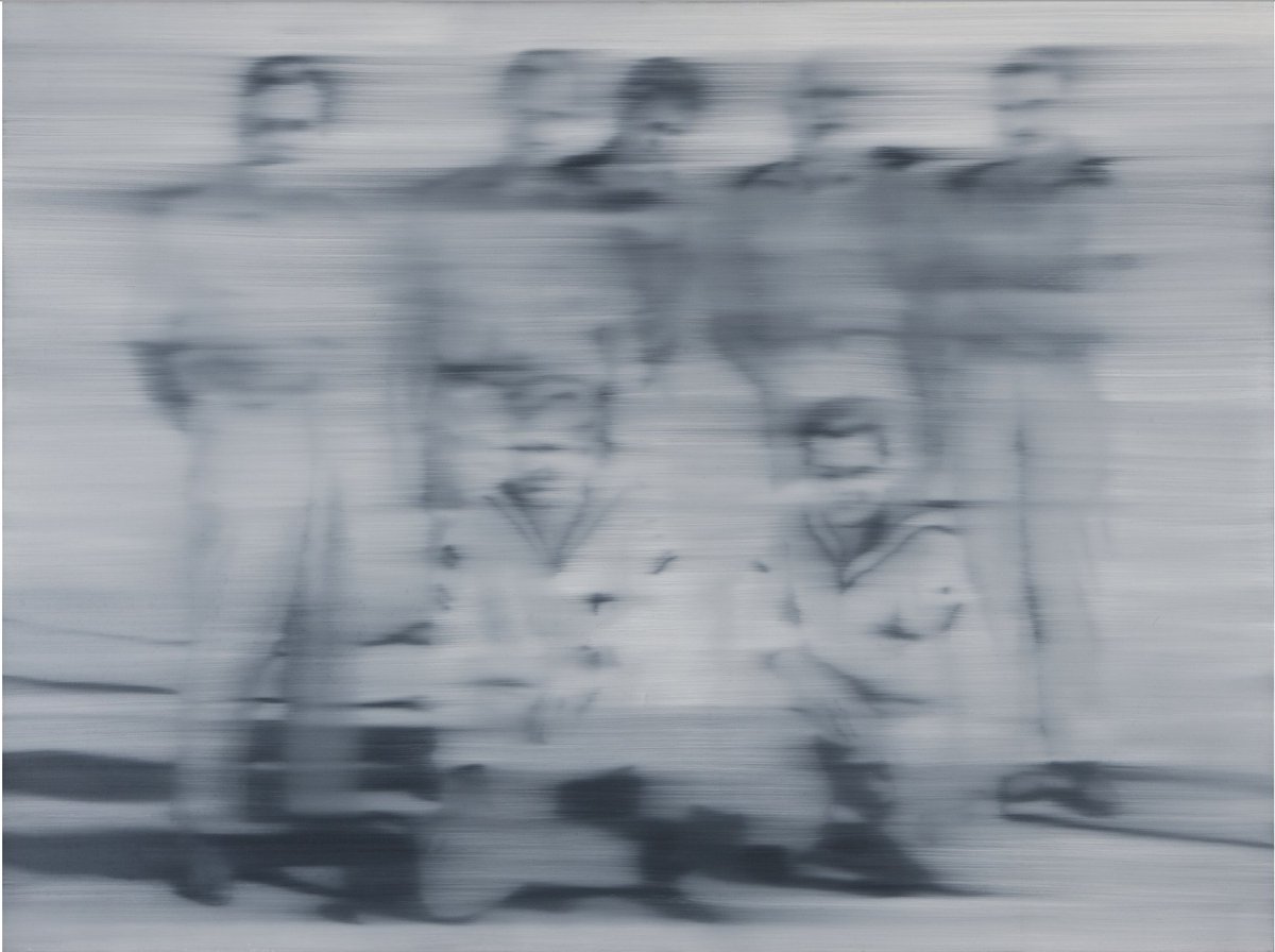
As seen in his 1966 work ‘Sailors’, Richter would take a photograph, translate it onto the canvas in paint with cool, monochromatic tones, and blurring the image to give the appearance of it being out-of-focus and in motion. Richter would state that his obsession with blurring images comes from a desire to “make everything equally important and equally unimportant.”
The Late Sixties: Entering Abstraction
In the later half of the 1960s, and as his fame began to rise, Gerhard Richter began to further explore abstraction and its endless potential. Already embracing it in part with his signature style of blurring found photographs, Richter was in search of something more profound.
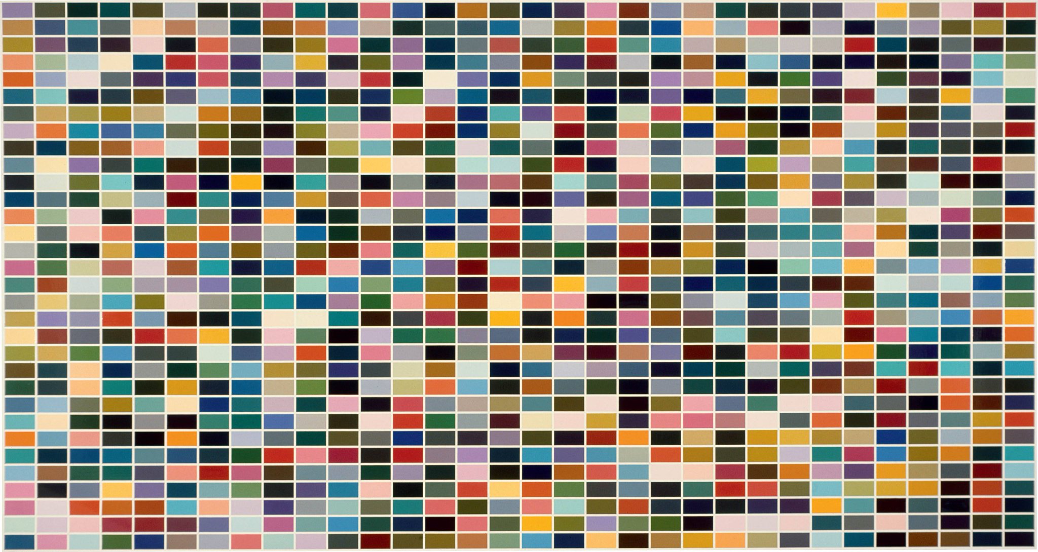
Richter conceived a series of works called the Color Chart paintings after a visit to a Düsseldorf hardware store, where the artist noticed an array of paint sample cards. He became inspired by the industrially formulated and chromatically comprehensive selection that was utterly devoid of aesthetic motive. In order to make the paintings, he copied the cards exactly, injecting as little compositional input as he could. Each Color Chart painting presents multiple uniquely colored and uniformly sized rectangles or squares of glossy paint arranged on a white background. The Color Charts were among the first of Richter’s paintings not done in black and white, and stands as a memorable example of Richter’s ability to constantly reinvent his artistic practice.
The Eighties: Abstraktes Bild
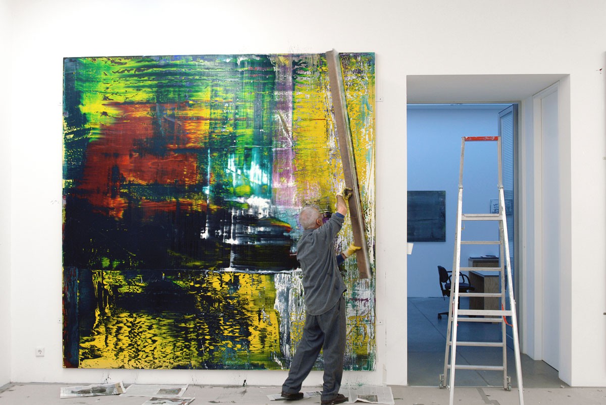
In a return to the gestural style of his photographic paintings and a move away from the minimalism of his Color Chart paintings, Richter embarked on his Abstraktes Bild series, which introduced the iconic use of the squeegee technique. This process was not one of addition, but rather of subtraction — exploring the instantaneous moment of creation, purposely uncontrollable and purely facilitating the application of paint rather than the final composition. Richter would apply pressure using homemade wood and plexiglass squeegees to drag and wipe the paint repeatedly across his canvas, methodically building up and deconstructing the layers. The resulting bands and smears of vibrant color rupture as they sprawl across the canvas. The Abstraktes Bild series is widely considered one of his greatest contributions to art history, beginning the series in 1976 and continuing it through until 2017.
The 1980s marked another shift in Gerhard Richter’s practice, one that returned to his very first obsession: the photograph. He began a series of overpainted photographs. Unlike his photo-inspired paintings from the 1960s, these works used a true photograph as the background, with Richter applying layers of paint above to disrupt and conceal the image. The result is a fascinating interplay between the photographic image and the painted surface, that challenges the viewer’s perception of both mediums.
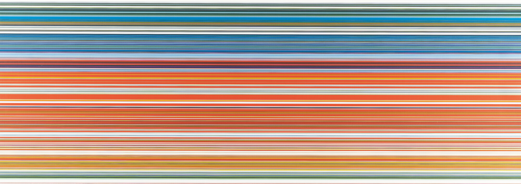
The 2000s: Strip Paintings
In 2011, Richter once again reinvented his artistic process with his Strip series. Stepping away from the use of source material taken by others, he instead utilized his own earlier painting as the source material. Digitally dissecting his Abstraktes Bild (724-4) (1990) into 4,096 sections, Richter mirrors, multiplies and recombines the details, finally printing them as pictures composed of horizontal stripes, in various formats up to 10 meters in length. Using computer-controlled image-making processes to reinterpret his own abstract painting, we are once again reminded of Richter’s incredible, chameleon-like ability to transform as an artist.
2017: The Final Painting
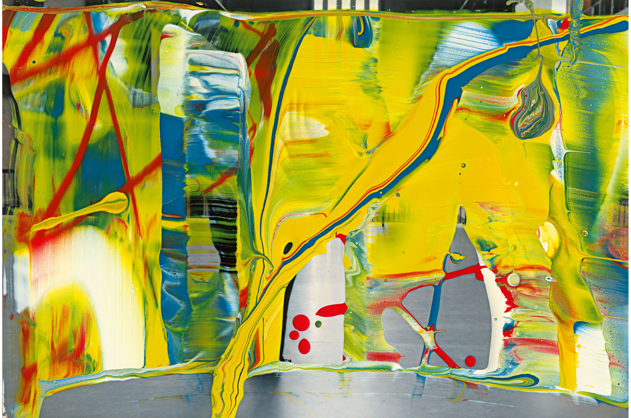
Gerhard Richter’s final large-scale painting, Abstraktes Bild 952-4 (2017), represents a culmination of all of the past decades of artistic exploration. His final paintings are his most complex, most layered works, revealing and concealing more than before. Hues of red and black (a color rarely used by Richter) creep through acidic strokes of green and purple. Above all, his final set of large-scale paintings radiate with a sense of freedom not seen in previous works.
The Legacy of Minimalism: The Trailblazing Artists who Shaped the Movement
Minimalism was the art movement that embraced precision, repetition, and material purity, moving away from expressive, gestural abstraction as part of a broader shift in artistic priorities. Emerging in the 1960s, it was the birth of an era that focused on material and medium to form art.
By the late 1950s, attitudes toward painting and sculpture shifted dramatically, moving away from the emotive intensity and physicality of Abstract Expressionism. In contrast to the gestural dynamism of Pollock and de Kooning, a new generation of artists embraced sleek, reductive aesthetics, rejecting loose spontaneity in favor of precision and restraint. Minimalism emerged as a radical change, stripping art of self-expression and individuality, an unprecedented shift in artistic philosophy. Gaining prominence in the early 1960s, Minimalism arose as a response to the perceived excesses of Abstract Expressionism, which many artists viewed as overly personal, self-indulgent, and lacking substantive meaning. In opposition, they sought to create art that was objective, inexpressive, and devoid of reference, works that stood on their own, unburdened by narrative or emotion.
Defined by artists such as Donald Judd (1928 – 1994), Dan Flavin (1933 – 1996), Agnes Martin (1912 – 2004), and Frank Stella (1936 – 2024), the movement prioritised form over narrative, creating works that existed as self-contained objects rather than representations. Minimalism art often incorporates industrial materials. For example, Judd’s fabricated metal boxes, Flavin’s fluorescent light installations, and Carl Andre’s metal floor plates remove signs of the artist’s hand to focus on spatial relationships and perception. This aesthetic purity extended beyond the visual arts, influencing architecture, design, and even cinema. Stanley Kubrick’s 2001: A Space Odyssey (1968) is an iconic example of stark geometric set designs, the use of negative space, and an emphasis on spatial awareness that reflect key Minimalist principles. The movement’s ideals also left an indelible mark on architecture, with figures such as Ludwig Mies van der Rohe, Tadao Ando, and John Pawson embracing simplicity, open space, and material authenticity in their designs. Mies van der Rohe’s famous mantra, “less is more,” became a defining principle of Minimalist architecture.

One of the earliest figures associated with Minimalism, Frank Stella, famously declared, “What you see is what you see.” His Black Paintings (1958–1960) featured thick black bands separated by thin white lines, rejecting the illusionism of traditional painting, emphasizing the flatness of the canvas itself. By eliminating brushstrokes and personal expression, Stella pioneered an objective, non-referential approach to painting. His later series, such as the Protractor Paintings (1967–1971), introduced vibrant color and geometric complexity, yet still adhered to his belief in non-representational, structured compositions.

Donald Judd, perhaps Minimalism’s most defining voice, sought to create what he termed “specific objects,” works that were neither painting nor sculpture but existed autonomously in space. His stacked metal boxes and plywood structures, often arranged with mathematical precision, rejected traditional composition in favor of serial repetition. By outsourcing production to industrial fabricators, Judd removed any evidence of the artist’s hand, reinforcing Minimalism’s rejection of subjectivity. His writings further cemented the movement’s theoretical foundations, advocating for a new kind of art that existed purely on its own terms rather than as a metaphor or representation.


In contrast to Judd’s industrial rigidity, Agnes Martin approached Minimalism with a deeply meditative sensibility. Inspired by Taoism and Zen Buddhism, her delicate, hand-drawn grids and muted color fields conveyed a quiet spirituality. Works such as Untitled #5 (1998) demonstrate her meticulous, repetitive mark-making, which she viewed as a form of transcendence rather than a mechanical process. Unlike her male Minimalist counterparts, Martin’s work retained a sense of the personal—her subtle imperfections and soft pencil lines invited contemplation and emotional engagement.

Dan Flavin transformed industrial materials into ethereal, immersive experiences through his use of fluorescent light tubes. His early works, such as Diagonal of Personal Ecstasy (1963), introduced the concept of light as both object and medium. Flavin’s installations interacted dynamically with the surrounding architecture, casting coloured shadows and redefining spatial perception. His dedication to the repetition of simple forms and commercial materials aligned with Minimalist principles, yet his work introduced an ephemeral, almost spiritual quality that distinguished him from his peers.

Minimalism’s Contemporary Legacy
While Minimalism’s dominance waned in the late 20th century, its principles have seen a resurgence in contemporary art. Artists such as Robert Irwin (1928 – 2023), James Turrell (b. 1943), Roni Horn (b. 1955), and Mary Corse (b. 1945) continue to explore Minimalist themes, integrating them with new materials and conceptual depth.
Robert Irwin was known for exploring perception and spatial awareness, expanded upon Minimalism’s focus on light, space, and the viewer’s experience. His installations frequently incorporate translucent materials, scrim fabric, and subtle variations in light to blur the line between art and the surrounding environment. Works like Untitled (Dawn to Dusk), 2016 manipulate natural light to create an immersive, evolving experience, recalling the experiential nature of James Turrell’s light-based works.

James Turrell is another key figure whose work aligns with Minimalist ideals while introducing a uniquely peaceful and immersive experience. Rather than using traditional materials, Turrell works with light itself, transforming architectural spaces into ethereal environments. His Skyspaces, enclosed chambers with an open ceiling framing the sky, encourage deep contemplation, altering viewers’ perception of time and space. His ongoing Roden Crater project, an extinct volcanic cone in Arizona transformed into a vast celestial observatory, exemplifies his commitment to using light and emptiness to evoke a meditative stillness. Unlike the stark industrialism of Judd or Flavin, Turrell’s Minimalism is deeply experiential, inviting viewers into a heightened awareness of their surroundings.

Roni Horn investigates materiality and perception in ways that resonate with Minimalist ideals. Her sculptures have an extraordinary physical presence, appearing at once solid and fluid, weighty yet ethereal. The subtle variations in surface texture and opacity echo Agnes Martin’s devotion to nuance and repetition, engaging the viewer in a prolonged act of seeing.

Mary Corse, a pioneering figure in contemporary Minimalism, explores the intersection of light, perception, and materiality. Unlike many of her predecessors, who relied on industrial materials, Corse incorporates handmade elements in her works, such as her signature microsphere paintings that shift in luminosity depending on the viewer’s position. This interplay between surface and light aligns her with the traditions of Minimalism while introducing an experiential, almost metaphysical quality that resonates with contemporary concerns. Her White Light series exemplifies this approach, using glass microspheres embedded in paint to create works that seemingly glow from within, reinforcing Minimalism’s ongoing dialogue with light and perception.
This renewed interest in Minimalism is not merely a revival but a transformation. In an era oversaturated with visual and digital noise, the resurgence of Minimalist principles suggests a cultural desire for clarity, stillness, and material truth.

The legacy of Park Seo-bo
Park Seo-Bo was a leading figure in contemporary Korean art. Born in Yecheon, North Gyeongsang province, in 1931, he was among the first generation of artists to build their careers in the wake of the Japanese occupation of Korea (1910-45) and the Korean War (1950-53). Park began his artistic training at the Hongik University, where he studied under Kim Whanki, the pioneer of Korean abstract painting. Graduating in 1955, Park was one of the emerging artists who reacted against the academic conservatism of the Kukjon, the National Art Exhibition system. This marked the start of Park’s pioneering role in Korea’s ‘Art Informel’ movement, spearheaded by the young artists of the Contemporary Artists Association (Hyeondae Misul Hyeohoe). Despite the limited information then available in Korea about Art Informel in Europe and Abstract Expressionism, Park challenged the assumptions of the dominant representational Korean art style, and explored conceptually and materially abstract forms and experimentation.

Known for his “Écriture” series, Park developed an unconventional new technique. This began in the early 1970s as ‘pencil-écriture’, inspired by his three-year-old son’s rudimentary penmanship. Witnessing his son’s frustration during a handwriting exercise, Park began to emulate his mark-making by drawing numerous delicate repetitive graphite lines on a canvas coated with gesso and wet, white paint. The gentle movement of Park’s ‘graphisme’ creates a vibrating effect in which the artist emphasised the meditative aspects of an art technique derived from endless repetition – to the point of “emptying oneself out”. “Écriture” is French for writing, though Park preferred the Korean “Myobop”, which translates as “method of describing”. In this process, Taoist and Buddhist philosophies underpin the spiritual journey intrinsic to this approach. Through repetitive action, Park was able to harness a flow of energy which focussed his restless creativity and mind on a path of self-discipline and self-improvement, akin to the scholar-monks of ancient Korean tradition.

Parallels can be drawn between Park Seo-Bo’s ‘Ecriture’ and the work of his contemporaries, including Lee Ufan, Chung Chang-Sup, and Kwon Young-Woo, who also employed monochrome colour palettes and repetitive gestures. Park was the founding figure of Dansaekhwa or Korean Monochrome Painting. He once said that “Without reaching that spiritual realm, painting becomes something that’s merely pretending to be Dansaekhwa,”. Throughout his life, Park saw art as a tool for spiritual contemplation, and during the 1980s, he applied the gentle technique of his Écriture to traditional Korean hanji paper. Made from mulberry bark, hanji preserves the ancient scriptures of Korean Buddhism. To Park, the material offered endless opportunities of experimentation but most significantly, represented a connection between his works and the natural world. The artist would add layers of hanji underneath the paint and use his hands and wooden sticks to create lines. The artist believed his work was not an expression of himself but instead implied that his role as an artist was to allow the material to speak for itself. As he once said, ‘My pieces are products of a dynamic harmony between the material properties of hanji and my Myobop technique’.

In the 1990s and early 2000s, Park Seo-Bo worked primarily with black and white, as they represent profound East Asian philosophy. Black as a metaphor for time and pure emptiness; white as a symbol of spirituality and the void. Park’s ambition was to use ‘colours that heal’ in an attempt to create paintings that restore peace to a world of rapid change. In the 2000s, the artist became inspired by the radiant autumn colours around Mount Bandai near Fukushima, his colour Écriture works on hanji paper became imbued with sculptural bursts of colour, marking a clear transition from his early natural tone paintings. The result is a striking meditation of materials and textural contrast, which calms the viewer and brings one closer to the pure beauty of nature.

Park Seo-Bo was recognised throughout his career. Between 1962 and 1994, he taught at Seoul’s Hongik University, his alma mater and one of the most prestigious art institutions in Korea. In 1991 Park had two major retrospectives at the National Museum of Modern and Contemporary Art, Korea, titled “Park Seo-Bo’s Painting: Its Forty Years,” and the second in 2019, titled “Park Seo-Bo: The Untiring Endeavourer”. At the 2015 Venice Biennale, his work received international recognition at the Dansaekhwa exhibition. In March 2021, White Cube presented a large solo exhibition of Park’s work. Later that year, the painter was awarded the Geumgwan Order of Cultural Merit, bestowed by the South Korean government for services in the fields of culture and art that promote national culture and development. His works are in the collection of prestigious museums around the world, including New York’s Museum of Modern Art, the Guggenheim Museum, Chicago Art Institute, Pompidou Center in Paris and Hong Kong’s M+. Today, the Seo-bo Art and Cultural Foundation, which Park Seo-Bo founded in 1994, continues to support young Korean artists and contemporary Korean art. In 2024, two museums will be dedicated to Park’s work: one in Jongno-gu, Seoul and the other a private museum in Jeju Island, to be opened in March.
Park is survived by his wife Yoon Myeong-sook, two sons and a daughter.
The Cool School: California Light & Space Artists
In 1960s Los Angeles, concurrent to the Minimalist movement in New York City, emerged a group of artists associated by their preoccupation with light and space.
The Light and Space movement, sometimes referred to as California Minimalism, shares with Minimalism a stripped down aesthetic, but prefers to interact with its environment much differently. The vast geography and temperate climate of California is echoed in the work of these artists including Dan Flavin, Larry Bell, Robert Irwin, James Turrell, and Mary Corse.

The name ‘Light and Space’ was first used in 1971 at a UCLA University Art Gallery Exhibition that included Larry Bell, Robert Irwin, Peter Alexander, and Craig Kauffman. The exhibition, titled Transparency, Reflection, Light, Space: Four Artists, describes the work as a “liaison between the artists and the spaces they chose to animate.” These artists attempted to create something unique that was both ethereal and geometric.

Some of the pillars of the Light and Space Movement are scale, finish, and multi-sensory displays. The work tends to be less about the object itself and more about the perception of it. Much of these creations used a large scale or site specific installation. Stretching into the environment around it, a work such as Mary Corse’s Untitled (White Black Blue) stretches an incredible length to confront the viewer with alternating white, black, and blue acrylic paint that has been infused with glass microspheres. The vastness of such a work allows for the viewer to more readily feel their own presence against it as well as amplifies details such as the nuanced finish of shiny glass in the paint.
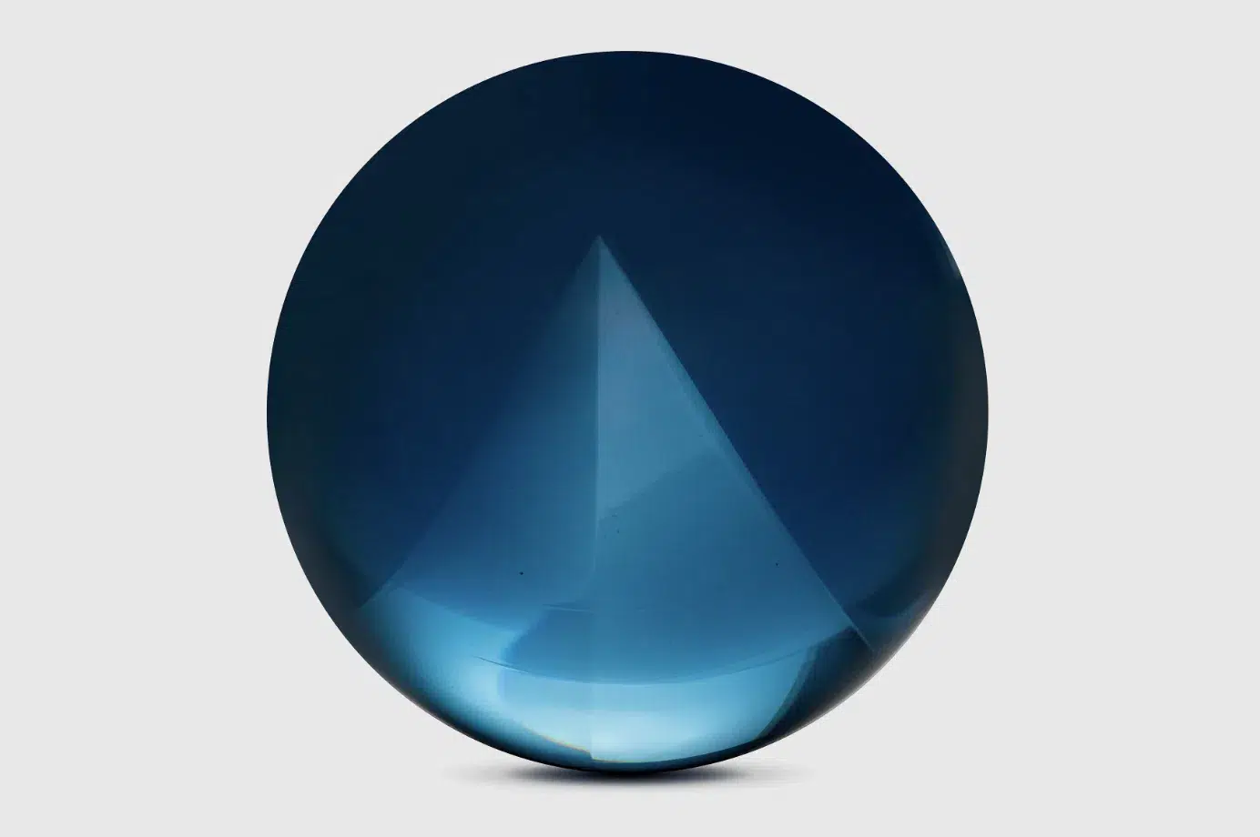
Finish, particularly a glossy finish, was favoured by this movement. Art Historian John Coplans termed this phenomenon the ‘finish fetish’ in the late 1960s. Some favoured materials included glass, plastic, neon, and resin. Helen Pashgian, a prime female member working within the group, favoured a highly glossed, smooth surface. Seen in works such as Untitled, the cast resin creates a glassy sheen almost tactile to the viewer and only further emphasised by its spherical shape.

A full scale installation intends to ignite many senses at once and continuously shifts when moving through a space. Working with light particularly allows artists to do this as light is never the same from a different vantage point. A James Turrell installation is often a flow of ambient colours and smooth shapes taking on different effects from its surroundings. The colour mixed with light creates a feeling of both the natural environment as well as the sublime. In James Turell’s Untitled There is a combination of hard edges and organic shapes, warm light and cool light, and light coming from both above and below. These culminate in an overwhelming and changing sensory effect for the viewer.

The Light and Space Movement have left a legacy despite coming out of a relatively small art scene in mid century California. Sometimes referred to as ‘The Cool School’, these works are something to be experienced as much as to be viewed.

The Formative Friendship between Miró and Calder
The American artist Alexander Calder and the Spanish painter Joan Miró met in Paris in 1928, where they both had their studios, and since then they grew a relationship that was both personal and intellectual. Their encounter happened during a crucial period for the development of modern art and they met frequently in both Paris and Spain.
During the 1930s, the socio-political scene in Europe and America was characterised by an aura of terror and dismay due to international conflicts, which eventually resulted in WWII. The political tensions that aroused at the time, ended up impacting every aspect of the life of the citizens of the countries involved. Moreover, the countries that remained out of the global conflict, experienced problems on their own. Spain had just gone through a civil war that left the country in total sorrow, moreover, areas of the country such as the Basque Country had been used as ground for exterior powers to experiment with warfare material, as illustrated in Pablo Picasso’s painting Guernica (1937). In this unstable and miserable political and social environment, artists played a crucial role in transmitting cultural and political ideas, standing against violence and seeing the rise of different cultural movements, such as Surrealism, which developed out of the Dadaism of WWI. Surrealism invaded both spectrums of arts and literature, exploring the potential of the subconscious mind. During such times, both Alexander Calder and Joan Miró became interested in investigating and expressing their inner self through their art.
When in Paris, Miró grew a very precise painting style: organic forms and flattened picture planes drawn together with sharp lines. Although Miró’s work was often categorised as Surrealist due to his interest in Automatism and his usage of sexual symbols, he refused to become member of any interwar artistic movement. Miró’s surrealist reputation was attributed to him by suppression, in particular due to his Catalan origins and affinity, which was subject of persecution during Franco’s regime in Spain. Thus, during the 1940s, his inspiration became more oneiric (related to dreams) and his subject matter more connected to the cosmic world.

On his part, emerging from his engineering roots, Alexander Calder changed the course of modern art by developing his revolutionary mobiles: sculptures which hung from the ceiling, suspended in space. Drawing inspiration from the Futurists and Constructivists, Calder created these sculptural objects incorporating wires and abstract shapes that fluctuated in the air in perfect balance. His mobiles soon became a trademark to his practice, and were described by art critics as “drawings in space.”

In addition to a mutual admiration and a close friendship Calder and Miró shared many artistic principles, such as the usage of pure colours and abstract forms. During the 1930s, they exhibited together in many group shows, the first one being in 1932, followed by a larger group exhibition in 1933. Most importantly, in 1937, the Spanish Republican government commanded both artists to create a set of new works for the Spanish Pavilion at the World Fair in Paris, where their works were exhibited next to Pablo Picasso’s legendary Guernica. Their synergy was so evident that Calder’s mobiles were described in 1936 by The New York Times as “living Miró abstractions” and in 1937, they had their first joint exhibition at the Honolulu Academy of Arts.

But the most astonishing fact about their artistic relationship, which so perfectly illustrates the calibre of their mutual influence is best represented by the body of works Constellations, which each artist simultaneously realised during WWII when the two had no way to communicate. Constellations not only confirms that the two artists shared the same artistic notions, but it also demonstrates how they thought and acted in alignment. While for Calder the decision to name his series Constellations was voluntary, as suggested by his dear friend and fellow artist Marcel Duchamp, initially, Miró only used the term to refer to one of his paintings. However, by the end of the 1950s, both Miró and Calder’s works converted to the same name for their similarity and since then it has been natural for art critics and curators to link the two bodies of work together.


For Calder and Miró, the Constellations series represented a way to explore their inner thoughts. Yet, while the two artists were influenced by the Surrealist idea of the unconscious mind being the most authentic birthplace of inspiration, they individually developed their imagery through their own personal experiences during the war. Miró created Constellations between 1939 and 1941, when he was in Spain trying to escape from the fascist regime. The 23 works from the series witness the inner evolution of the artist as he continued his journey to find refuge from the fascists. The earliest works represent a sense of anguish; the earth and celestial figures, typical of the artist’s iconography, look in pain and are often depicted towards the bottom of the paper. Contrarily, the latest ones, which were produced when Miró finally reached the island of Palma de Mallorca, where he felt safer, show a new sense of openness; the human figures fluctuate as the force of gravity disappears, transmitting a sense of lightness.
Joan Punyet Miró, the artist’s grandson, said in an interview that, “The Constellations are a sublime break. They are the way to the power. Towards the universe. They area door to escape from a circumstantial war, from a genocide, from the brutality of nonsense”. While for Miró the Constellations series represented his career zenith, for Calder, Constellationes represented a significant body of work, but not the central one. Astronomy was indeed an interest of Calder from an early age and he often explored the idea of the cosmos in his work. In this regard, his series Constellations can be seen as a continuation of the work Universes which he realised in the early 1930s.

Constellations shows that in addition to similar creative sensibilities, the two men shared much more in common. On one hand, they both recurred to the usage of interlacing, uninterrupted lines to create shapes and creatures and of a naughty, childlike playfulness. On the other, they reflect their own very distinguished personalities: Calder being more light-hearted, naïve and cheerful; while Miró wanted to frighten the viewer through his innocent looking shapes, illustrating the dark side of humanity through distortion and fragmentation.
Not long after Miró finished his series, Calder started employing wood in his work. This technical decision was not only driven by the fact that metal supplies shortened during the war but was also a thoughtful decision which enabled him to show his support for the army. Hence, the sculptures from this period include some hand carved wooden abstract shapes and are characterised by an unusual stillness. In fact, when in 1943 Calder opened a solo show at Matisse Pierre Gallery to showcase them, to the surprise of the audience, nothing was moving.

In 1943, after two years of the completion of Miró’s Constellations, the Museum of Modern Art in NewYork helped the Miró smuggle 22 of the paintings out of Europe, which were later exhibited at Pierre Matisse Gallery in New York in 1945 – the same gallery were two years earlier Alexander Calder exhibited Constellationes. About his show Miró wrote that it “should not be considered as a simple artistic event, but an act of human import” because his paintings were “realised during this terrible time when (the fascists) wanted to deny all spiritual values and to destroy all that man holds precious and worthy in life”.
After WWII, Calder and Miró’s friendship kept growing until Miró passed away 1983. In 1971,Calder donated to the Fundació Joan Miró the work Mercury Fountain, which was exhibited at the World Fair in 1937 alongside works by Miró. The year later, Miró wrote a beautiful catalogue text for a Calder’s exhibition in Palma de Mallorca, which took the form of an illustrated poem.
Miró and Calder’s Constellations series were most recently exhibited in conjunction in New York in 2017, when Acquavella Galleries and PACE started a collaboration. Acquavella secured Miró’s paintings, while PACE Calder’s sculptures. The joint exhibition Calder/ Miró: Constellations displayed over 60 works that varied in medium from sculptures, to paintings and works on paper, none of which were for sale. The exhibition was an incredible chance for the audience to see with their eyes how the two painters fed of each other.
Their synergy, friendship and artistic alignment have become a myth in the art world. Still today, Calder and Miró’s grandsons, both leading each artist’s foundation, have a close relationship, which has allowed many collaborations between the two organisations to take place. As Miró’s grandson said, “The communion that existed between Calder and Miró was mystical.”

The Fantastic Designs of Pierre Paulin
“I do not create. I invent, I arrange, I design.” – Pierre Paulin
“I do not create. I invent, I arrange, I design.” Pierre Paulin stated in a 2008 interview for Maison & Object. The late French furniture and interior designer known for his expressive inventions first discovered his passion for design from his uncle, George Paulin, who was an automobile designer. After completing his studies at École Camondo he launched his own collection of furniture in 1954.
Paulin’s starting point for much of his early furniture was the merit of elastic fabric. He disliked the upholstery he saw in French design around him and yearned for designs with more fluidity and softness. His early work consisted of jersey fabric or even elastic manufactured for swimsuits. Paulin went on to work with furniture houses such as Thonet and Artifort, eventually establishing the ADSA design agency with his wife, Maia Wodzislawska. Here we take a look at some of Paulin’s most celebrated creations, some of which can be found in notable institutions around the world such as MoMA in New York and the Victoria and Albert Museum in London.
Alpha Collection
Perhaps some of Paulin’s most recognisable creations today, the Alpha Collection consists of chairs, ottomans and sofas. Originally designed around 1960 for the president’s apartment at Élysée Palace as a commission by George Pompidou. The Alpha furniture is constructed of wood, wrapped in foam, then upholstered and pieced together to create an undulating arrangement. Avant garde at its time, the Alpha furniture still appeals in contemporary design for its versatility and sense of comfort.

The Dune Sofa
Originally created in 1970, the couch is actually made up of four modules that joined together create an impressive living room masterpiece, as seen in Frank Ocean’s home. Each of the modules in Paulin’s Dune collection range from $5,400 to $8,200 in price, with a variety of ways in which the pieces can be arranged. Some iterations are ideal for entertaining, like one with a table surface nestled between two raised mounds. Others seem great for family gatherings, like one where the couch has a wide raised back and extended leg room. Another, with a setup that seemingly encourages back-to-back seating, looks perfect for solo lounging with a good book.

The Tapis Siege
The origami-like form of the ‘Tapis-Siège’ daybed, with its corners that can be propped up to recline against is the perfect sofa to relax or to read, as this piece functions both as sofa and as storage for books and magazines. ‘Our absolute favourite thing to do in the living room is to all climb onto that piece and read,’ says Paulin’s son Benjamin.

The Cathédrale Table
The striking Cathédrale table is an iconic piece made of lacquered aluminium and a glass top. The Cathédrale tables come in a variety of designs and heights all of which have architectural patterns that contrast much of Paulin’s cosier designs. This 1981 masterpiece echoes the windows and spires of a cathedral to create a truly unique yet pragmatic piece.

The Ribbon Chair
The Ribbon Chair was named by American clientele that suggested the form of the chair takes on that of a folding ribbon. The piece consists of a fully upholstered chair on a metal frame. The Ribbon Chair is an example of Paulin’s innovative and organic use of form in his furniture. He blends the bold with the practical, despite the striking design he always wanted his work to be functional. The Ribbon Chair is produced in a variety of upholstery and colours and can be found in The National Gallery in Melbourne, Australia.
