(index.php)
Sculpting the Invisible: Fujiko Nakaya’s Fog Environments
For more than five decades, Fujiko Nakaya has worked with one of the most elusive materials in contemporary art: fog. Neither solid nor stable, it resists the conventions that have long defined sculpture. Using advanced misting systems that atomise water into microscopic droplets, Nakaya creates clouds that move through landscapes and around architecture. It cannot be fixed, held, or preserved, but instead is continuously shaped by wind, humidity, temperature, and the movement of visitors.
Born in Sapporo, Japan in 1933, Nakaya grew up in a family deeply engaged with scientific research. Her father, Ukichirō Nakaya, was a physicist known for his pioneering studies of snow crystals and for creating the first artificial snowflakes in laboratory conditions. His work on atmospheric phenomena strongly influenced Nakaya’s later artistic interest in weather and environmental processes.
Nakaya studied painting at Northwestern University in the United States before returning to Japan in the 1960s. During this period, she became involved with Experiments in Art and Technology (E.A.T.), an initiative that brought artists together with engineers and scientists. This interdisciplinary environment proved crucial in practice, and rather than focusing solely on traditional materials, Nakaya began to explore technological systems capable of producing environmental effects. This experimentation eventually led to the development of fog as her primary artistic medium.
The Pepsi Pavilion: The First Fog Sculpture (1970)
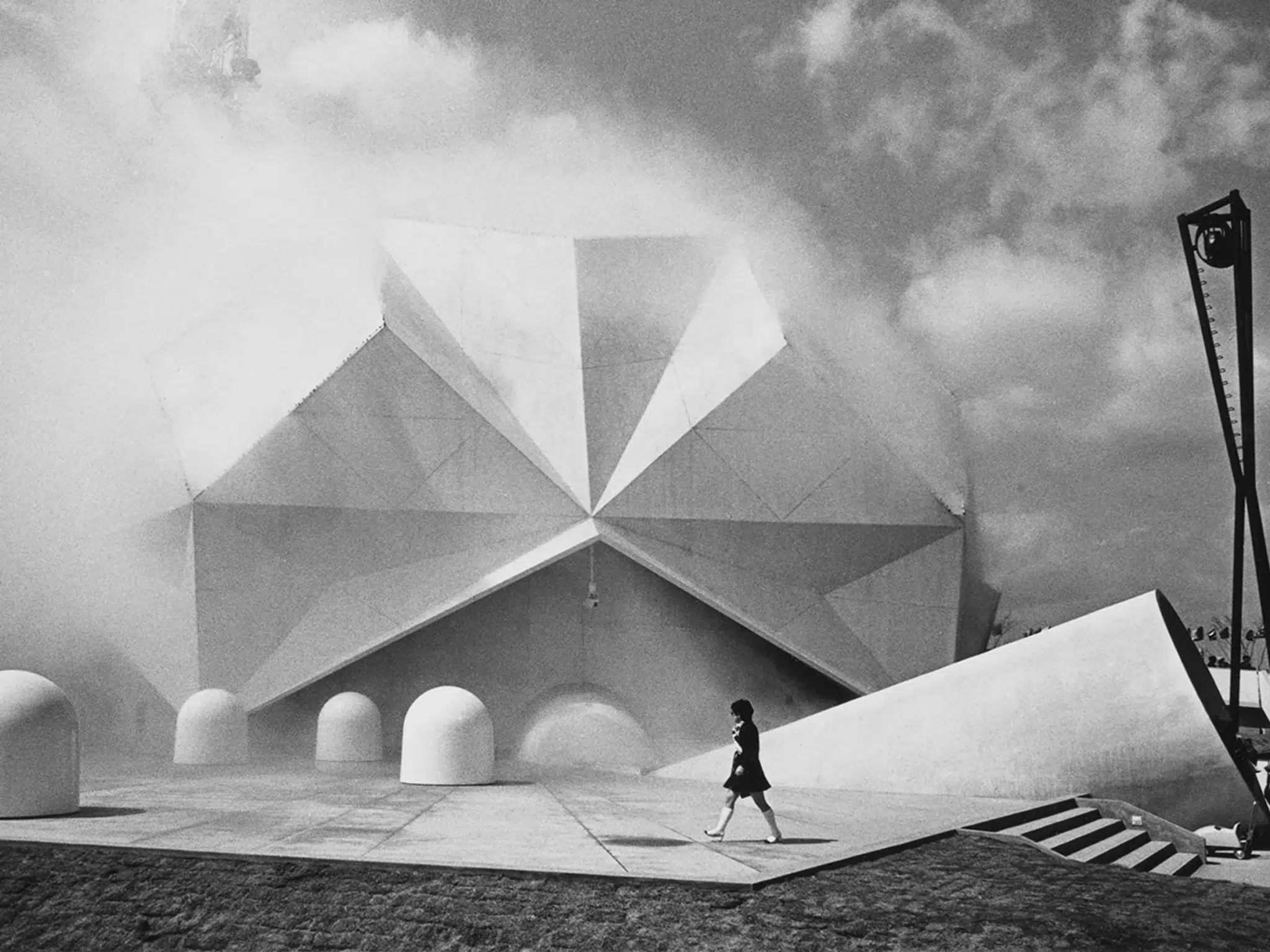
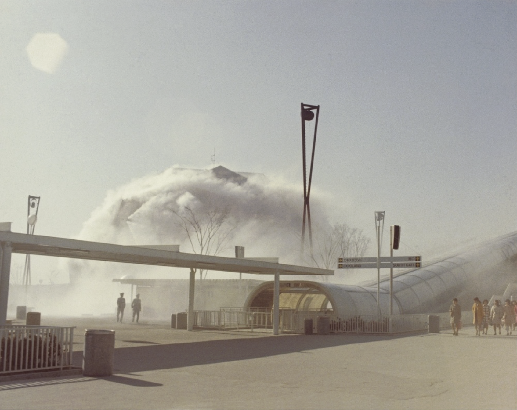
Nakaya’s first fog sculpture was created for the Expo ’70 Osaka at the Pepsi Pavilion. Commissioned as part of a large collaborative project organised by Experiments in Art and Technology, the pavilion aimed to integrate art, architecture, and emerging technologies. Nakaya effectively created an artificial cloud that continuously surrounded the exterior of the building. Hundreds of fog nozzles were installed along the roofline, releasing fine mist that enveloped the pavilion in a shifting atmospheric layer. Rather than declaring a solid form, the pavilion breathed in and out of a drifting veil of fog—appearing, vanishing, and reappearing like a mirage, something which had never been done before. This project marked the beginning of Nakaya’s lifelong exploration with “fog sculptures”. It demonstrated how atmospheric phenomena could function as a sculptural medium and opened new possibilities for environmental art.
Nakaya’s fog works rely on a precise technological process that transforms water into airborne droplets. High-pressure pumps force purified water through specialised stainless-steel nozzles, producing droplets typically between 10 and 20 microns in diameter. At this scale, the droplets remain suspended in the air rather than falling immediately to the ground. Because the droplets are extremely fine, the fog behaves similarly to natural mist or clouds, so that in the end, wind direction, humidity, and temperature all determine how the fog expands. Unlike theatrical fog machines, which often use chemical vapour or smoke, Nakaya’s installations use only water. The fog eventually evaporates, rejoining the natural water cycle—an approach as ephemeral as it is environmentally restrained.
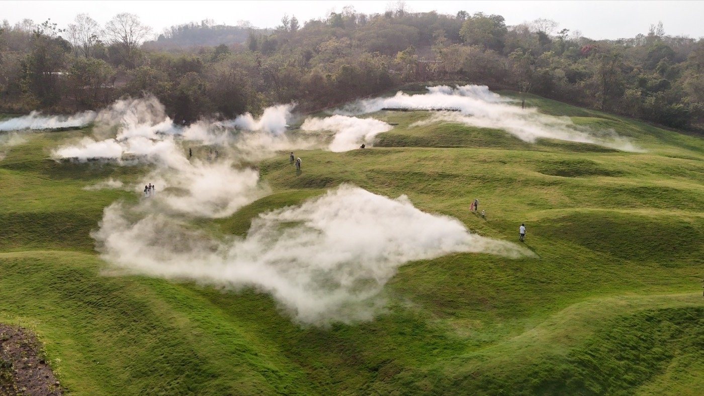
Khao Yai Fog Forest: Fog Landscape #48435 (2024 – current)
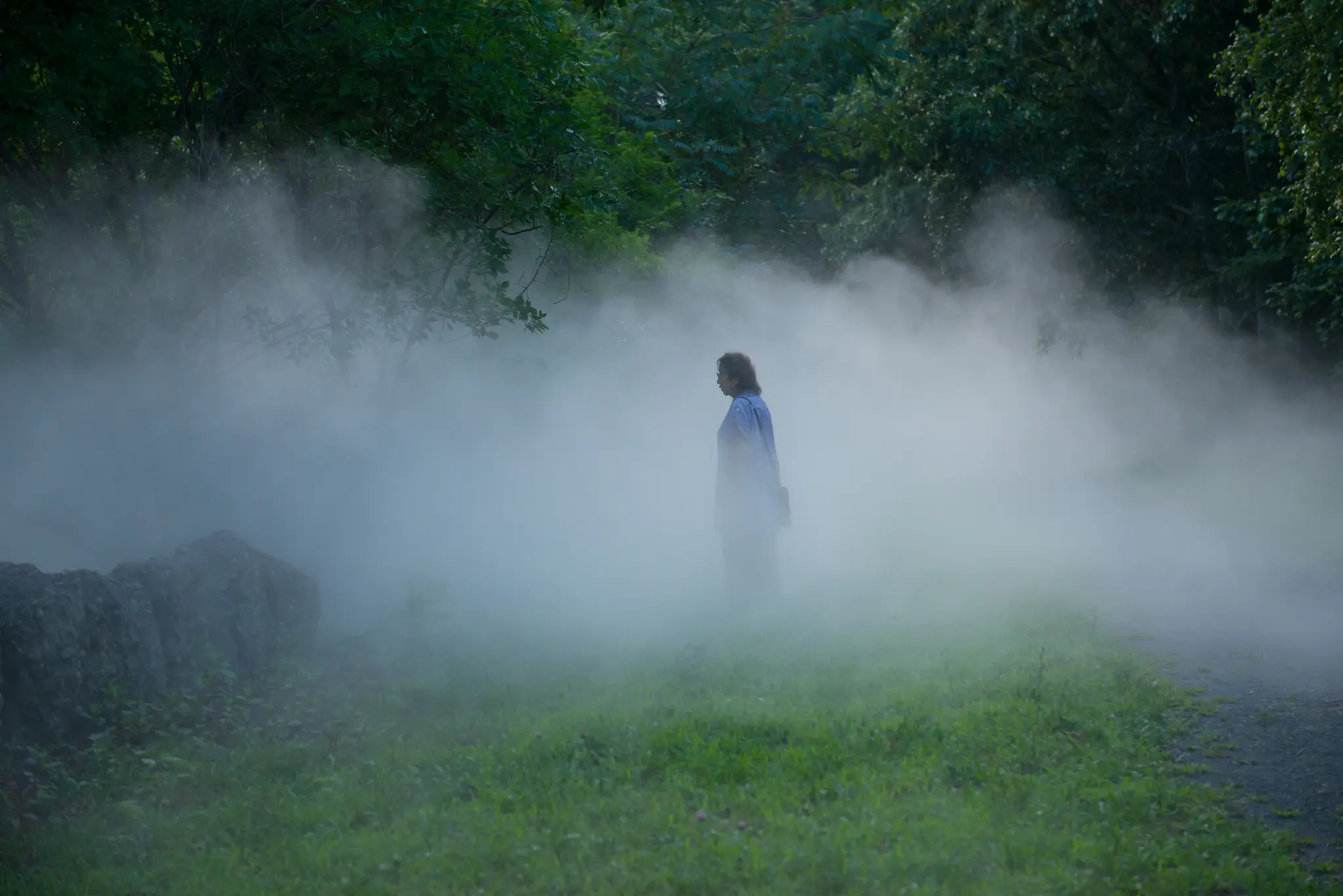
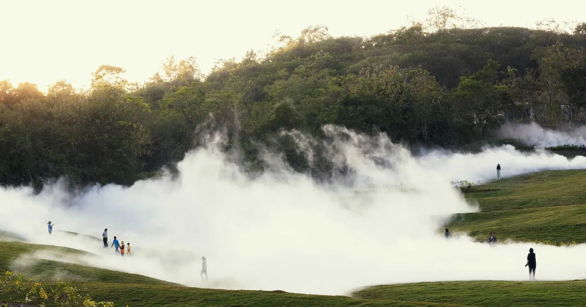
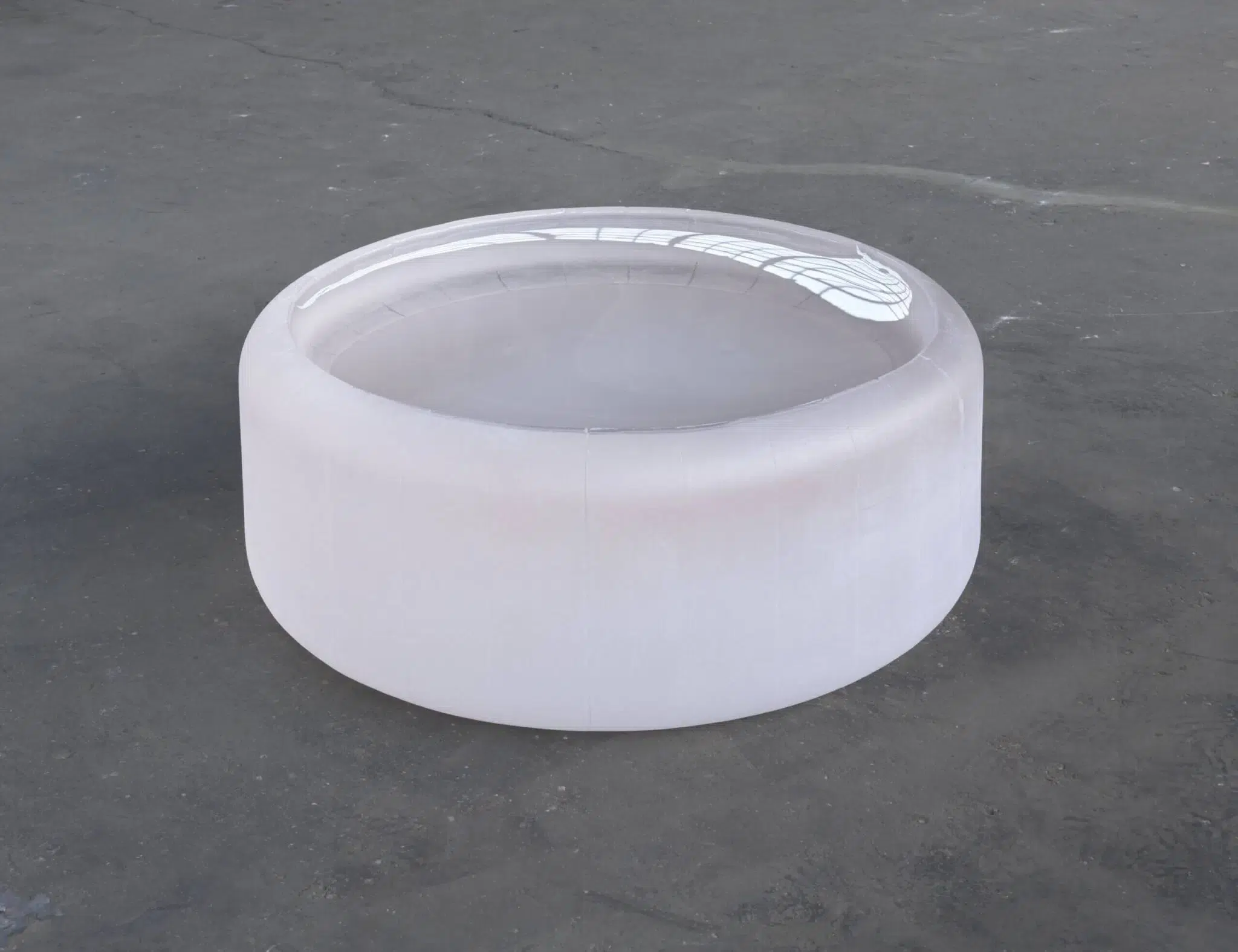
Khao Yai Art Forest is a large-scale outdoor contemporary art site located in Thailand, near Khao Yai National Park, founded by Marisa Chearavanont. Developed as a long-term cultural and environmental project, it brings together local and international artists to create site-specific works directly within the landscape. Fujiko Nakaya’s Fog Landscape #48435 (2024 – current) at Khao Yai Fog Forest represents a defining addition to the Art Forest. The work is situated within a 10,000-square-foot site in the forest, yet its perceptual and spatial reach extends far beyond this measured footprint. It does not impose a discrete sculptural form onto the landscape, but instead, activates the site by making its atmospheric conditions visible. For this work, Nakaya altered the terrain to guide the movement and accumulation of fog, allowing the landscape itself to function as a compositional element. Fog gathers in lower areas, drifts across slopes, and disperses through vegetation, responding continuously to shifts in wind, humidity, and temperature. At times, the landscape is fully obscured, collapsing depth and confusing orientation. At others, the fog thins, revealing fragments of trees and terrain. The experience is immersive and destabilising. Vision becomes unreliable, and attention shifts toward bodily perception, such as moisture, temperature, and movement.
The fog is produced in collaboration with Aquaria, a San Francisco-based company whose technology is designed to harvest atmospheric moisture and convert it into clean drinking water. Drawn from the atmosphere and released as fine droplets, the water forms fog that naturally disperses without oversaturating the environment. Once the fog forest activation has been completed, it leaves no lasting trace, and no environmental damage—as if it had never occurred at all. The fog operates as a medium of connection, linking atmospheric processes with embodied experience. It reveals the circulation of water and air while situating the viewer within that cycle. We had the opportunity to interview Marisa Chearavanont this month, where she reflects in depth on this work and its central role within the sculpture park. You can read the full interview here.
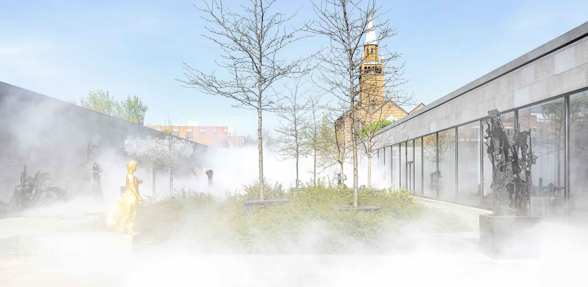
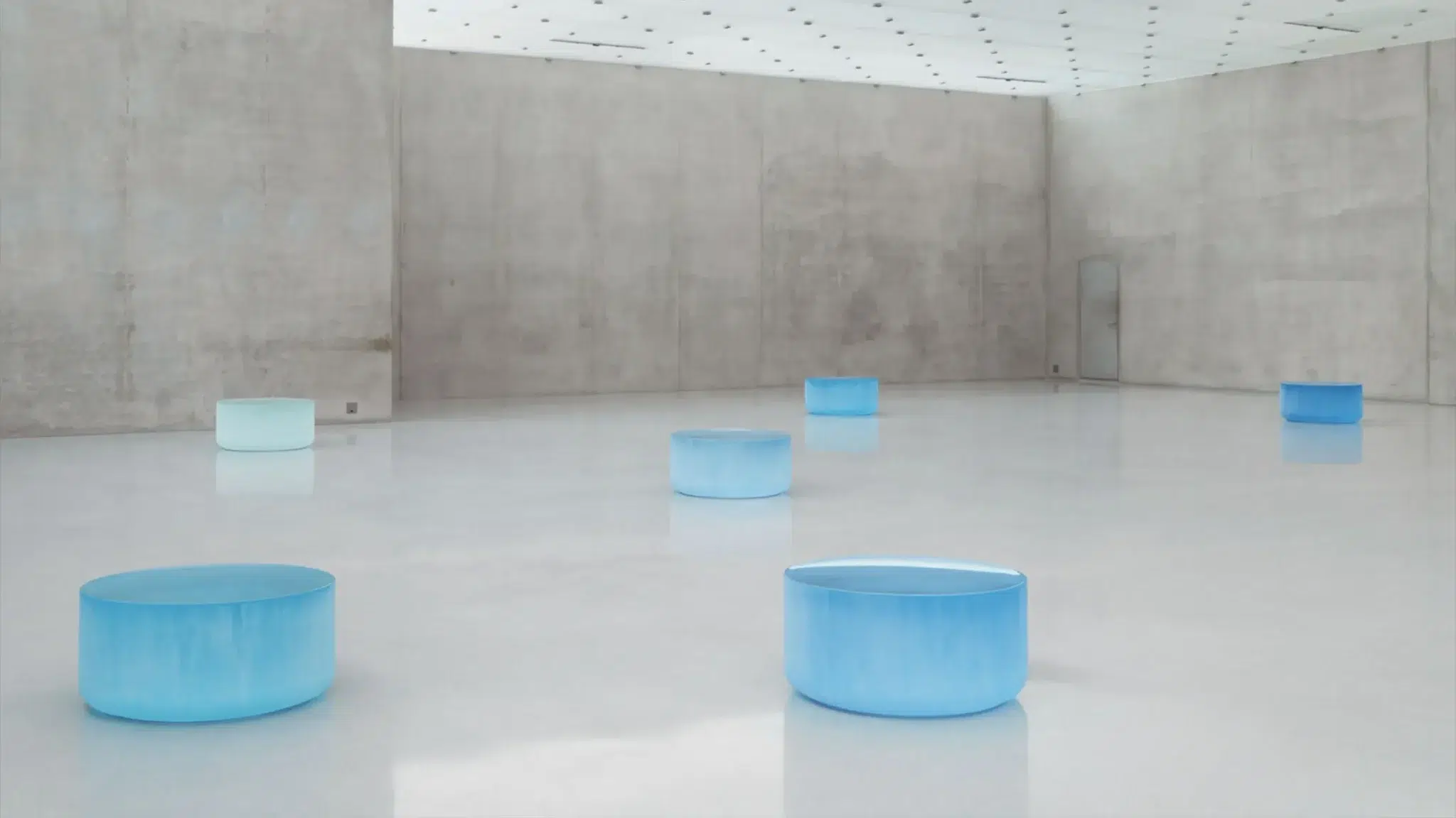
Cult of Mist (2025) in the Sculpture Garden of the Neue Nationalgalerie
Nakaya’s Cult of Mist (2025) in the Sculpture Garden of the Neue Nationalgalerie in Berlin engages a markedly different spatial and historical context. The installation occupies the entire sculpture garden of Mies van der Rohe’s building, a site defined by precision, clarity, and modernist order. The fog is released from multiple points along the perimeter of the garden, gradually filling the space before dissipating upward. The scale of the work corresponds to the full dimensions of the garden, transforming it from a stable display environment into a dynamic atmospheric field.
A defining feature of this installation is its interaction with the existing sculptures. Works by Henri Laurens, Wolfgang Mattheuer, and Alicja Kwade are intermittently obscured and revealed as fog moves through the space. Their forms, typically stable and legible, become contingent. This transformation extends to the architecture itself. While Mies van der Rohe’s design emphasises structural clarity and visual continuity, Nakaya’s fog introduces instability into this system.
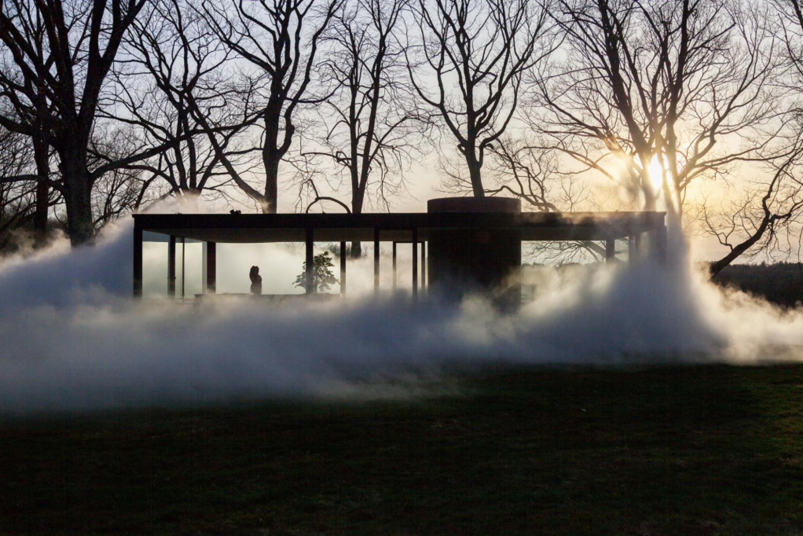
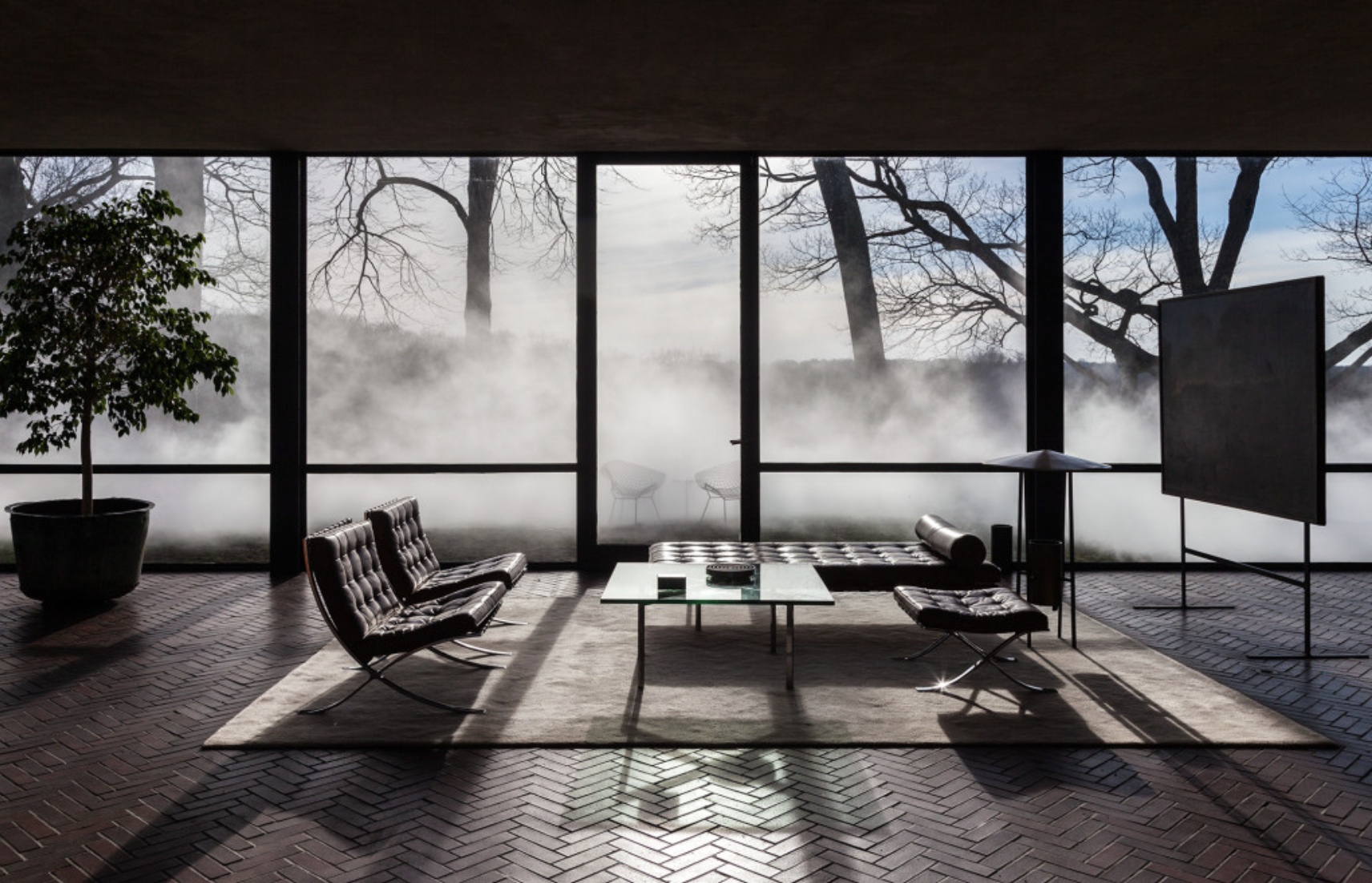
Veil (2014) at the Glass House
The Glass House is a canonical work of modernist architecture in Connecticut, defined by its transparent glass façade. The building is conceived as an object of visual continuity, where landscape flows into architecture and architecture extends into landscape. Nakaya’s intervention introduces a fundamental inversion of this condition. The installation introduces opacity into a structure defined by transparency. At regular intervals, a dense field of fog gathers around the building, gradually obscuring it until it disappears from view. The house, typically defined by its clarity and presence, becomes uncertain and contingent. The fog interacts directly with the material surface of the building. Moisture gathers on the glass, softening reflections and introducing layers of visual distortion. The glass becomes perceptible as a surface, no longer functioning as an invisible boundary.
From the Pepsi Pavilion to forests and modernist sites, Nakaya works with what cannot be held. Her fog gives form to air in motion—only to dissolve again, reminding us that atmosphere is always in flux, and that change is constant. In making these shifting conditions perceptible, her work heightens our awareness of the environment, emphasising it not as a static backdrop, but as a living, responsive system we are already part of.
The Top Contemporary Artists Reimagining Textile Traditions
For much of modern art history, material determined status. Painting and sculpture were positioned at the summit of cultural value, while textiles and craft-based practices were relegated to the margins, associated with decoration, domesticity, or utility rather than intellectual ambition. Yet this hierarchy has never been as stable as it appeared. Across generations and geographies, artists have steadily unravelled these assumptions, revealing that textile art is just as powerful as any other medium.
From the woven metal tapestries of El Anatsui to the intricate textile environments of Klára Hosnedlová, to the immersive installations of Chiharu Shiota, artists are redefining what these materials can do. We look at how established artists such as Tracey Emin and Sonia Gomez use reclaimed fabrics that hold personal and collective histories, and how younger artists like Wang Ye extend the medium into new conceptual territory. This group of nine artists, whether emerging or established, demonstrates that textile art is not peripheral to contemporary art but firmly at its centre.
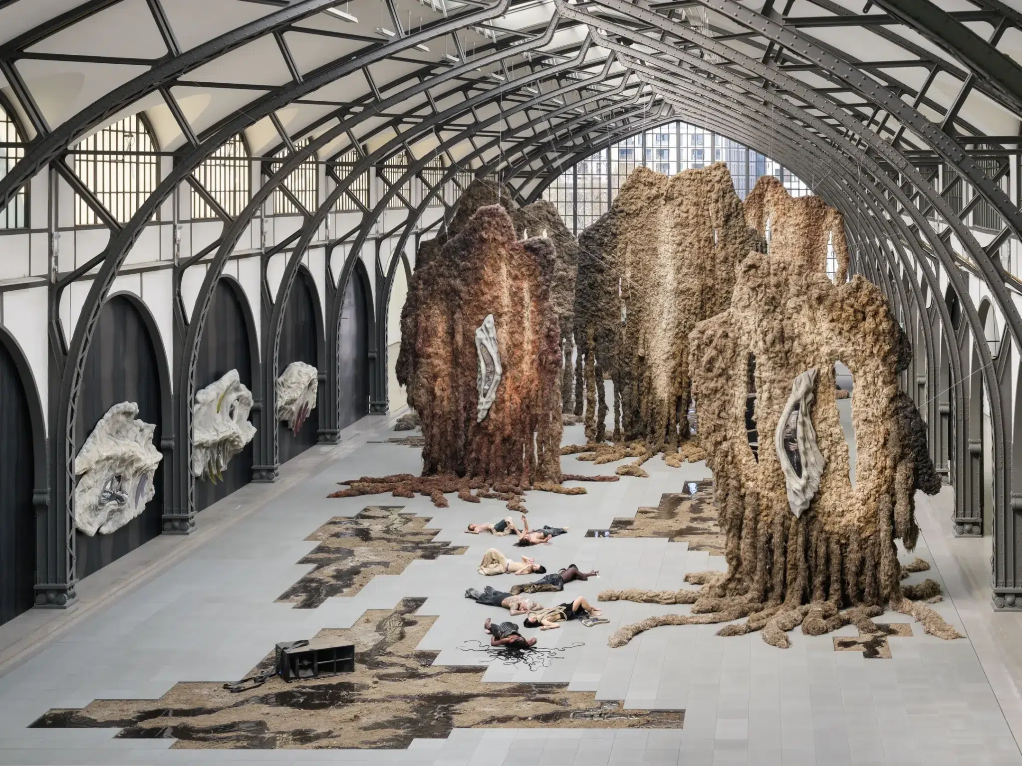
Klára Hosnedlová
Klára Hosnedlová (b.1990) is a Czech contemporary artist whose work spans installation, sculpture, painting, and performance. Rooted in the histories of craft, folklore, and the architecture of post-socialist Central and Eastern Europe, her practice transforms textile and embroidery into expansive spatial experiences. Through large-scale environments and live actions, she creates immersive worlds that blur disciplinary boundaries and draw viewers into atmospheres that are intimate and uncanny at the same time.
Last summer at Berlin’s Hamburger Bahnhof, Hosnedlová created an exhibition commissioned by Chanel that received widespread critical acclaim. She constructed monumental forms from meticulously arranged fabric, metal, and other materials, shaping spaces that felt at once architectural and ethereal. Alongside these imposing structures, her smaller works offer a more intimate yet equally compelling experience. At first glance, they resemble traditional canvases; only upon closer inspection does their true nature emerge. Composed of fabric, they introduce an unexpected fragility that contrasts with the grandeur of the larger installations, while reinforcing her sustained exploration of material presence.
She currently has an exhibition on view at White Cube in Bermondsey, London, through 29 March 2026. The presentation brings together an immersive installation, live performance, and a series of smaller works. Together, these elements form a cohesive environment that feels almost spiritual in atmosphere, while also demonstrating her ability to work powerfully across vastly different scales. In her hands, fabric moves beyond its physical properties and takes on a metaphysical presence at every scale and for every purpose, whether in an intimate canvas, garments for a performer, or a monumental installation.
Tracey Emin
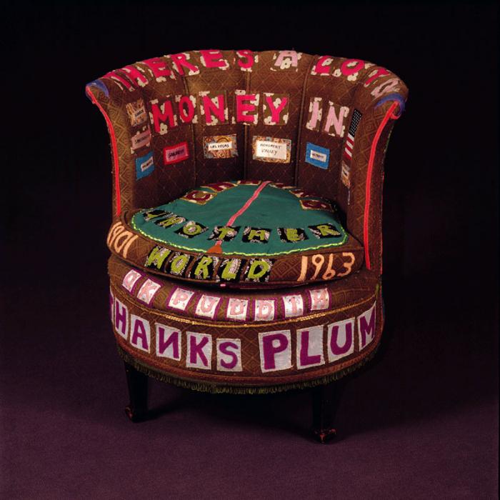
Tracey Emin (b. 1963) has consistently returned to textile as one of the most intimate and direct mediums within her practice. Long before her large-scale paintings and bronzes came to define her practice, fabric functioned as a primary vehicle for confession, memory, and autobiography. Whereas quilts were traditionally valued primarily for their aesthetic qualities, often featuring geometric designs, throughout the 1990s Emin transformed quilts, blankets, and upholstered furniture into carriers of language. Hand-cut letters in felt and cotton are stitched directly onto fabric grounds, forming fragmented statements, names, dates, and private reflections. The stitching remains visible. The seams are uneven. The surface retains the trace of labour. In these works, sewing becomes analogous to drawing. Thread operates as a line, marking experience directly onto cloth.
In There’s a Lot of Money in Old Chairs (1994), Emin covers a traditional upholstered armchair with appliquéd phrases. The padded back and rounded seat remain intact, but the object is overlaid with brightly coloured text that wraps around its curved form. Words follow the structure of the chair, encircling its base and rising across the backrest. Language becomes inseparable from the object’s physical presence. By stitching personal phrases into its surface, Emin transforms furniture into a surrogate figure.
As highlighted in our article on Tracey Emin’s career, in honour of her current Tate retrospective, textiles occupy a central place in her artistic practice. She often selects fabrics loaded with personal meaning to express her experiences. Some pieces come from a sofa her family had since her childhood, while others are made from her own clothing, weaving memory and autobiography directly into the material of the work.
Nour Jaouda
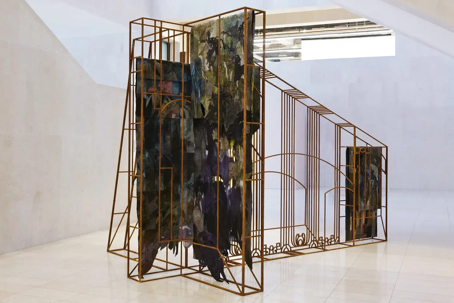
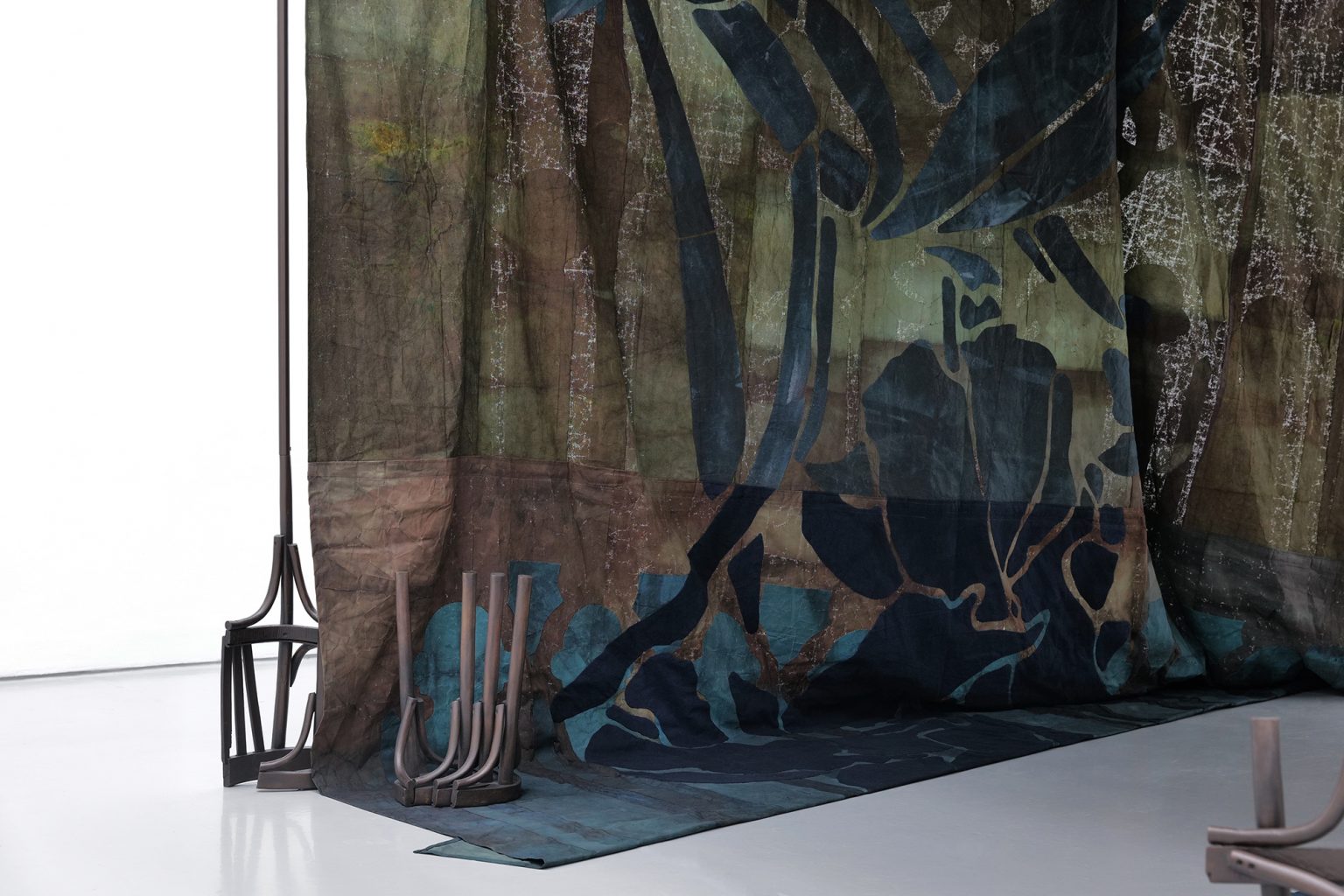
Nour Jaouda (b. 1997) is an artist working between London and Cairo, whose practice blends painting, textiles, and installation to probe memory, migration, and the landscapes of cultural identity. Her work navigates the tension between attachment and dislocation, often drawing on the emotional dimensions of movement and impermanence. Central to her works are hand-dyed textiles, enriched with vegetal pigments and layered textures, which act as repositories of memory and instruments of transformation.
The fabrics that make up her work are repeatedly soaked, folded, stained, and layered with pigment over time. She then employs a process of décollage, cutting and removing parts of the fabric, which she describes as “a radical and poetic strategy that is as much destructive as it is constructive; where the act of undoing and unbuilding becomes an addition rather than a negation to the work.” These fragments are then reassembled into sculptural tapestries that often hang freely in space, their raw edges and visible seams emphasizing their materiality. Gravity shapes the final form, and light passing through thinner sections reveals subtle variations in tone, lending the works both weight and permeability.
From 27 September 2025 to 11 January 2026, Jaouda presented her first institutional solo exhibition, Matters of Time, at Spike Island. The installation draws inspiration from the Khayamiya, intricately patterned appliqué textiles traditionally used to line tents in Cairo, functioning as both ornament and shelter for communal gatherings such as funerals, Ramadan rituals, and Eid celebrations. Within Spike Island, Jaouda creates an intimate, tent-like environment that doubles as a memorial space, inviting visitors to sit, reflect, and mourn. Botanical landscapes are referenced through deconstructed shapes of indigenous plants and trees, recalling those uprooted or lost. In this sheltered space, memory, landscape, and material converge, offering a contemplative encounter with absence and transformation.
Wang Ye
Wang Ye (b. 1990) is a Chinese artist who transforms textile into a medium that is both structural and painterly. Working with woven and hand-constructed fabrics, he creates wall-based compositions that emerge through stitching, layering, and cutting. Colour is subtle and carefully modulated, achieved through layered textiles and woven patterns rather than illusionistic effects, allowing the material’s physical presence to remain central.His work draws on traditional weaving while engaging contemporary abstraction, treating cloth as both surface and structure. Wang also collaborates with local Hunan embroiderers in Changsha, translating motifs from Western Modernist works into intricate silk embroidery. The gestures and daily lives of the artisans, down to small details like hair ornaments, also often inform his works, blending personal memory, craft, and cultural heritage. As the artist noted, “‘I absorb stories as feelings and weave them into my work.” Through this approach, Wang bridges folk traditions and contemporary art, highlighting the ongoing dialogue between labor, material, and formal expression.
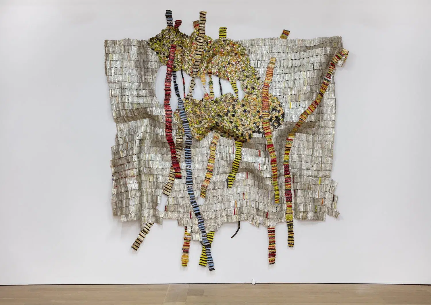
El Anatsui
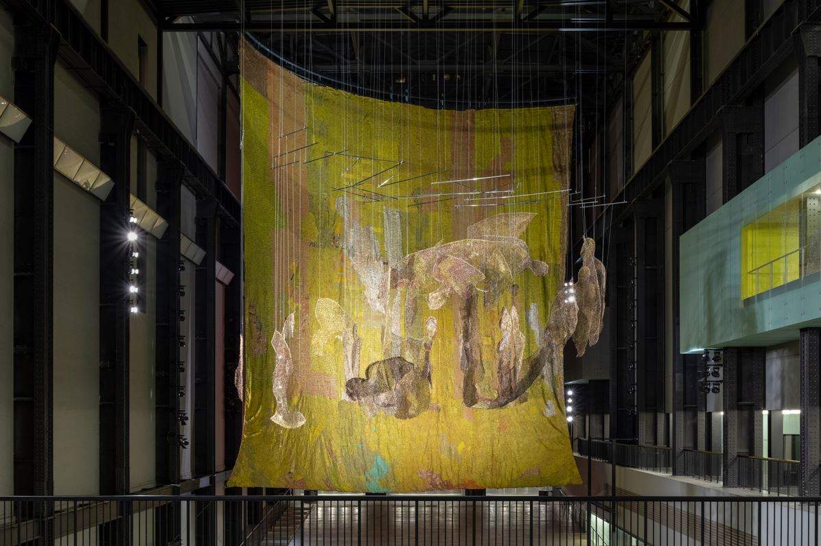
El Anatsui (b. 1944), born in Ghana and based in Nigeria for much of his career, is best known for monumental wall-based works composed of thousands of discarded aluminum bottle caps and metal fragments. These elements are flattened, cut, and stitched together with copper wire to create vast, flexible surfaces that hang like tapestries while retaining the weight and presence of sculpture. “The process of stitching, especially the repetitive aspect, slows down action and I believe makes thinking deeper,” says Anatsui. “It’s like the effect of a good mantra on the mind.”
While it might appear that he is simply recycling materials, Anatsui frames his practice differently, describing it as a “transformation” of the objects he uses. The bottle caps, for example, carry both personal and historical resonance: “To me, the bottle tops encapsulate the essence of the alcoholic drinks which were brought to Africa by Europeans as trade items at the time of the earliest contact between the two peoples.” By using materials associated with consumption and trade, he reflects on histories of colonial exchange, global commerce, and the movement of goods and people. In his hands, these discarded items become luminous, abstract fields of color and texture. His work shows that textile-inspired techniques do not have to be soft or delicate; he takes the tradition of stitching and modernizes it with unconventional materials, effectively revolutionizing what might be called “textile art.”
Anatsui embraces collaboration, acknowledging the contributions of his assistants: “The variety which is needed at this scale comes from the style and the feel of each individual hand.” Working with a team allows him to realize works of immense scale while preserving subtle variations in texture and rhythm. His installation Behind the Red Moon in the Turbine Hall at Tate Modern, from 10 October 2023 until 14 April 2024, exemplifies this approach. Suspended within the vast industrial space, the work cascaded downward in folds and ripples, responding to gravity and architecture alike. The metallic surface captured and reflected light, shifting as viewers moved beneath it. What might initially appear as rigid metal revealed a surprising softness and fluidity from a distance, reinforcing Anatsui’s belief that artistic forms are not fixed, but dynamic and change over time. “Each material has its properties, physical and even spiritual,” he explained. Through scale, repetition, and collaborative labor, Anatsui elevates humble, discarded materials rich in history into works of extraordinary presence that shift and transform in front of ones eyes.
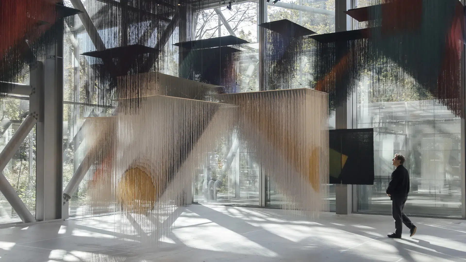

Olga de Amaral
Olga de Amaral (b. 1932) is a pioneering figure in transforming textile into a sculptural and conceptual medium. Based in Colombia, she trained in weaving during the 1950s and studied textile design in both Colombia and the United States, but soon developed a singular visual language that merges fiber with painting, relief, and architectural installation. Early in her career, she experimented with linen, cotton, and horsehair, pushing the limits of traditional weaving, and gradually introduced gesso and gold leaf to create layered surfaces that oscillate between softness and solidity. Her works often begin with conventional weaving techniques but transcend tapestry, producing modular panels and suspended forms that inhabit space as autonomous, sculptural objects rather than decorative textiles.
Gold is central to de Amaral’s practice, not as ornament but as a structural and luminous element. Its reflective qualities introduce depth, subtle tonal shifts, and a dynamic interplay with light, transforming fiber into radiant, monumental surfaces. While the reference to pre-Columbian gold traditions informs her aesthetic, her compositions remain firmly abstract, emphasizing repetition, seriality, and the tension between tactile softness and architectural rigidity. Throughout her long career, de Amaral has exhibited internationally, with landmark shows in Bogotá, New York, and Paris, earning recognition for pushing the boundaries of textile beyond craft into contemporary art. Her recent exhibition at Fondation Cartier in Paris from 12 October 2025 to 16 March 2025, featured large-scale suspended installations that filled the galleries with luminous, modular forms, inviting viewers to experience works that hover between curtain, wall, and sculpture, emphasizing her lifelong commitment to exploring the spatial, material, and conceptual possibilities of fiber.
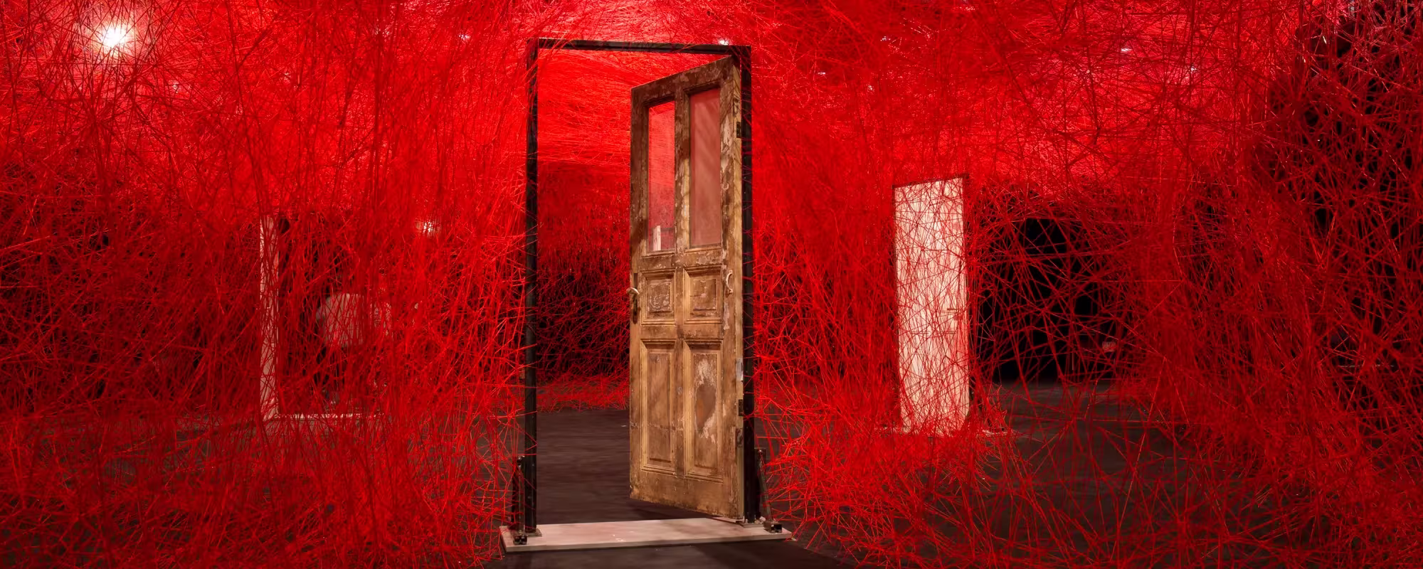
Chiharu Shiota
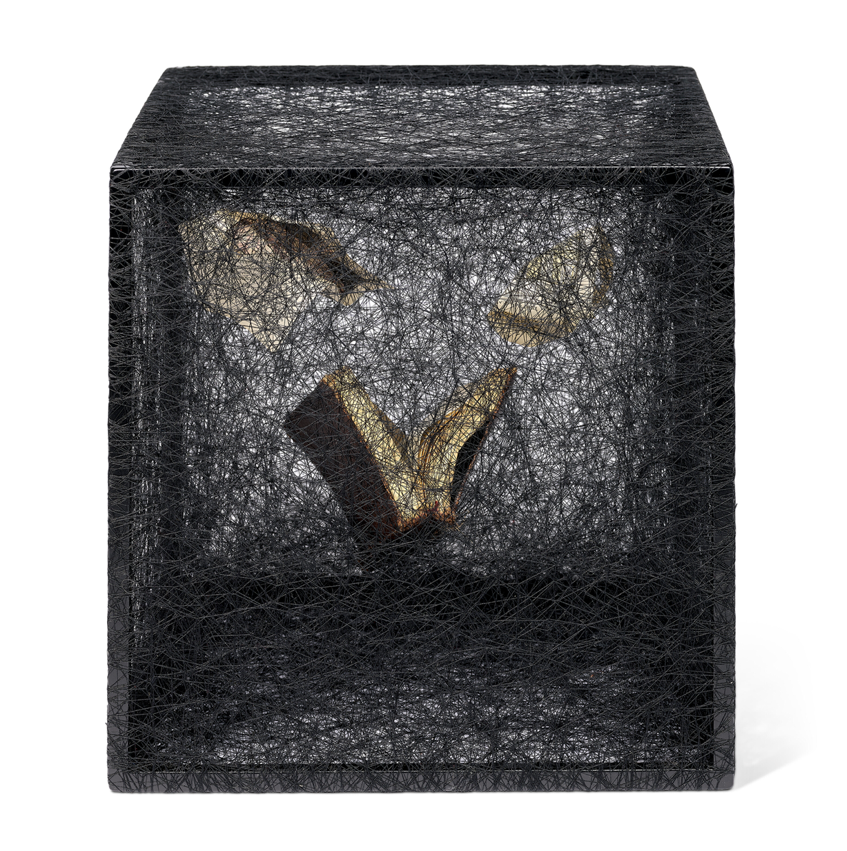
Chiharu Shiota (b. 1972) has developed a practice centred on immersive installations constructed from vast accumulations of thread. Born in Osaka and based in Berlin, she stretches thousands of metres of red or black yarn across architectural interiors, creating dense, interwoven structures that envelop objects and fundamentally alter spatial perception. Her installations frequently incorporate everyday items such as keys, boats, chairs, dresses, or suitcases. These objects act as vessels of memory, absence, migration, and personal history. The production of these works requires meticulous planning and close collaboration with a team of assistants. Each thread is hand-stretched and layered to build a complex spatial matrix. The resulting environments guide the viewer’s movement, creating corridors, thresholds, compressed zones, and voids that heighten physical and psychological awareness.
Alongside these monumental installations, Shiota maintains a sustained practice in smaller-scale works, including intimate thread sculptures, framed compositions, works on paper, and delicate drawings. In these pieces, thread is often contained within wooden frames or glass vitrines, where it forms compact, tangled constellations around single objects such as letters, shoes, or fragments of fabric. She also produces watercolours and sketch-like drawings that map the conceptual foundations of her installations, revealing her sensitivity to line, gesture, and spatial rhythm. These quieter works condense the emotional intensity of her environments into concentrated forms, demonstrating that her exploration of memory and connection does not depend on scale alone.
A major current presentation in the United Kingdom is Threads of Life at the Hayward Gallery in London, on view from 17 February to 3 May 2026. The exhibition brings together large-scale installations alongside drawings, photographs, and early performance documentation, tracing the evolution of Shiota’s practice and her enduring investigation into the unseen ties that bind individuals across time and place.
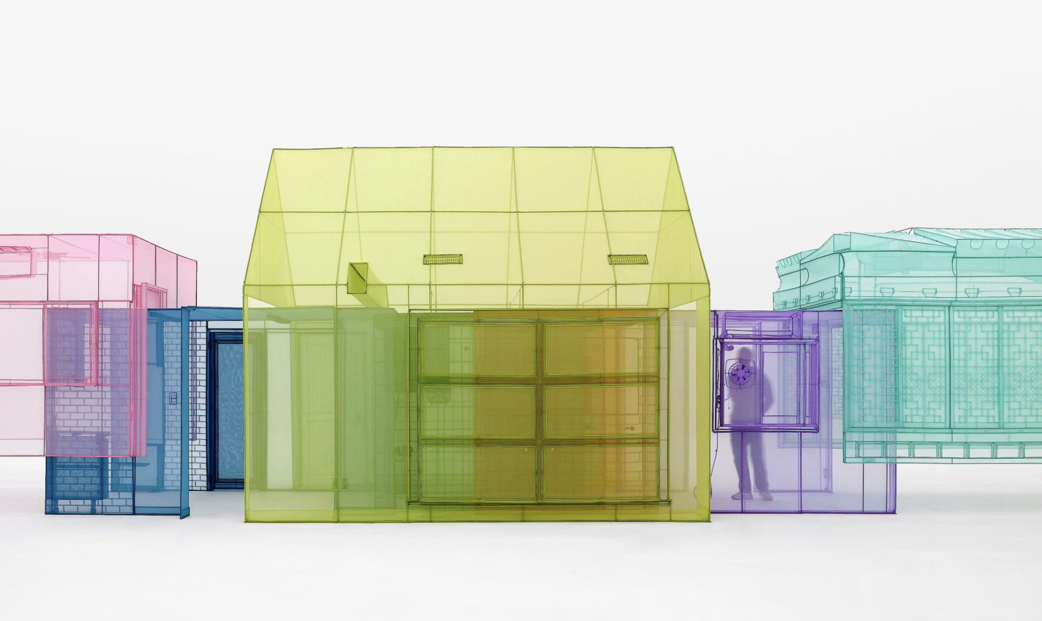
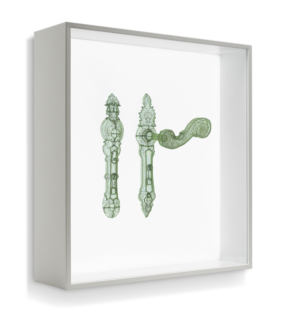
Do Ho Suh
Do Ho Suh (b. 1962) was born in Seoul, South Korea, and is based between London and Seoul. His practice centres on architecture, memory, and the experience of displacement. Working primarily with translucent polyester fabric, he creates full-scale replicas of domestic interiors, corridors, staircases, and architectural thresholds drawn from places he has lived. Meticulously measured and reconstructed in sewn fabric, often in vivid monochromatic hues, these structures include electrical fixtures, door handles, light switches, and even the smallest architectural details rendered in textile. Lightweight and portable, they reproduce spaces that once signified permanence and belonging, creating a tension between fragility and structure that lies at the core of his work.
Suh’s use of fabric is both conceptual and material. Textile enables him to translate solid architecture into something permeable and translucent, transforming walls into semi-transparent membranes through which overlapping rooms and corridors remain visible. In many installations, architectural spaces from different countries are connected into a continuous sequence, forming composite structures that mirror the layered nature of memory and migration. Through fabric, Suh reimagines architecture as intimate and transportable, expanding textile beyond surface and decoration into a medium capable of carrying psychological, cultural, and spatial meaning.
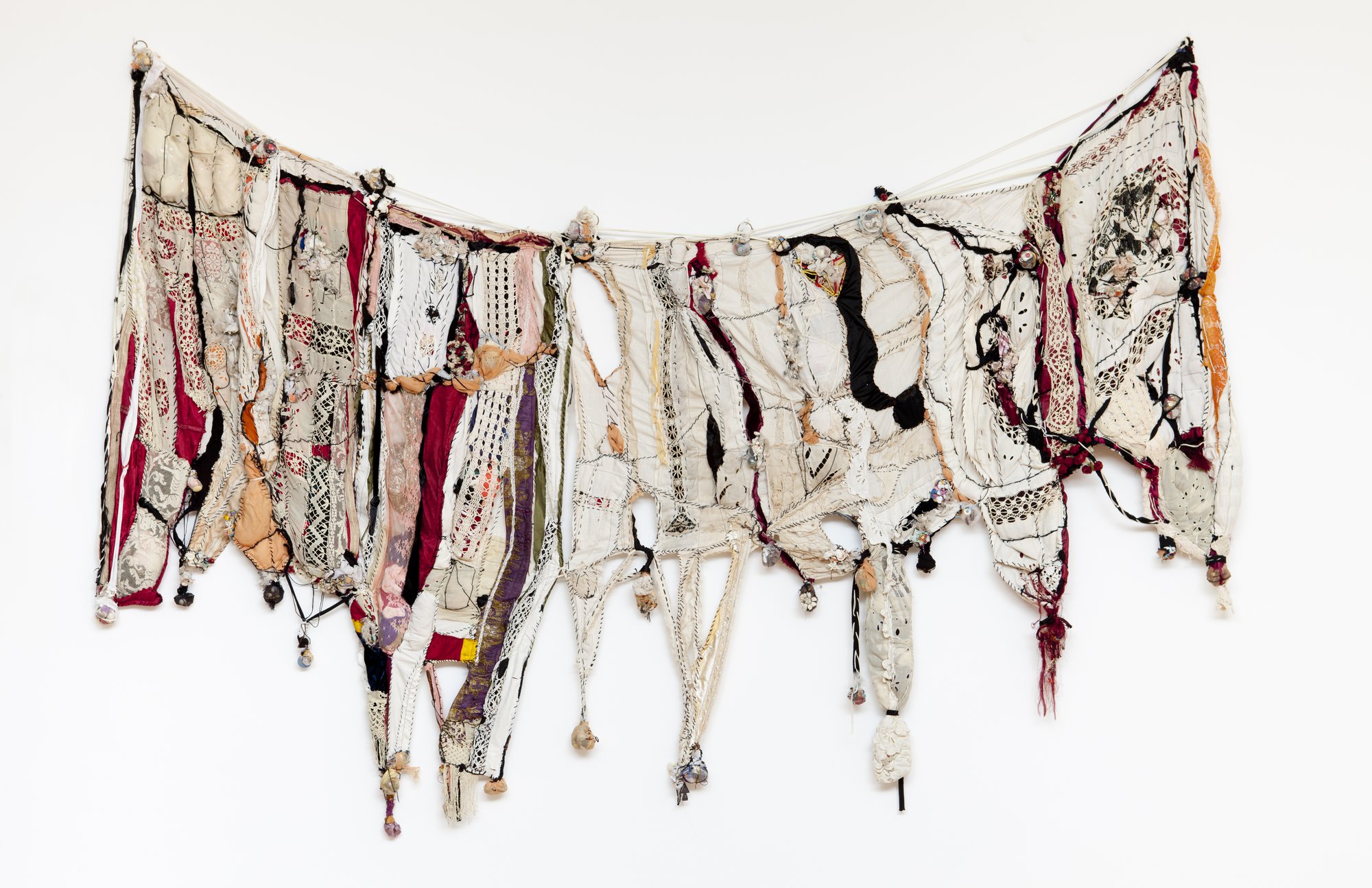
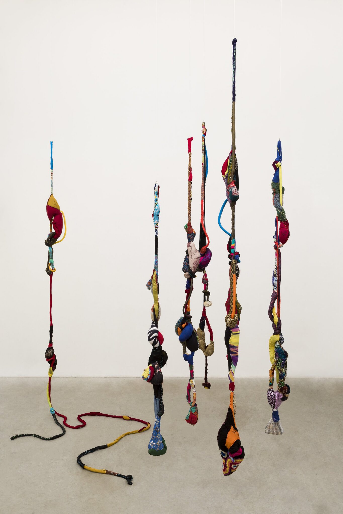
Sonia Gomes
Sonia Gomes (b. 1948) is a Brazilian contemporary artist known for her sculptural works made from reclaimed fabrics, ropes, and textiles. She collects used materials such as clothing, lace, embroidery, and other domestic fabrics, transforming them into complex three-dimensional forms. By knotting, twisting, and wrapping the materials together, she creates organic sculptures that appear to grow, hang, or stretch through space. Her process is intuitive and guided by the textures, colours, and histories of the fabrics themselves.
Her work often explores ideas of memory, identity, and cultural heritage. The reused fabrics carry traces of personal and collective histories, which Gomes brings into the context of contemporary art. Her sculptures can suggest bodies, landscapes, or symbolic objects, connecting traditional craft practices with modern artistic expression. As the artist has said, “My work is black, it is feminine, and it is marginal. I am a rebel. I never worried about masking or stifling anything that might or might not fit standards of what is called art.”
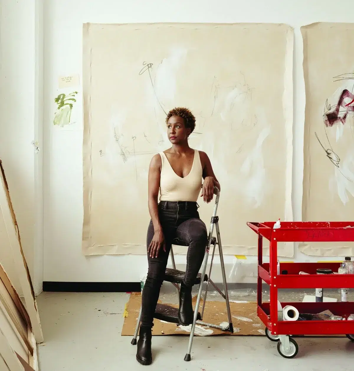
From her Iconic Paintings Back to the Origin: Retracing Tracey Emin’s Journey
With her major retrospective now open at Tate Modern, we are spotlighting Tracey Emin, the fearless British artist renowned for her raw, provocative and deeply personal work. Emin rose to prominence in the 1990s as a key member of the Young British Artists movement. She established herself through a fearless willingness to place her own life at the centre of her art, developing a practice defined by a direct and unfiltered examination of love, loss, and self-discovery. Widely recognised today as one of the most significant living female artists, her major retrospective, Tracey Emin: A Second Life, further cements her enduring impact and relevance.
Tracey Emin, born in 1963 in Croydon, London, grew up in the seaside town of Margate. From the outset, her work has defied confinement to any single artistic medium. Her work moves fluidly across painting, sculpture, installation, neon, textile, and performance. Yet regardless of form, her work is unified by an unwavering commitment to emotional truth. For more than four decades, Emin has approached art-making as both a means of confronting trauma and a process of transformation, using creative expression to examine, endure, and transcend lived experience. As she herself described, “Making art lets me breathe, helps me to stop my mind from crashing in.”
In this article, we start with the paintings she embraced making later in her career. They convey a striking emotional depth shaped by lived experience and resilience. From there, we trace backward through her earlier career, examining the conceptual works and installations that established her practice and the themes she has remained true to from the very beginning.
Painting
Painting has occupied a complex place in Emin’s life. Although she trained as a painter, she abandoned the medium for a period following an abortion in her early twenties. To Emin, the smell of oil paint became intolerable, inseparable from trauma. For years, she turned instead to other forms, such as installation, textiles, and performance.
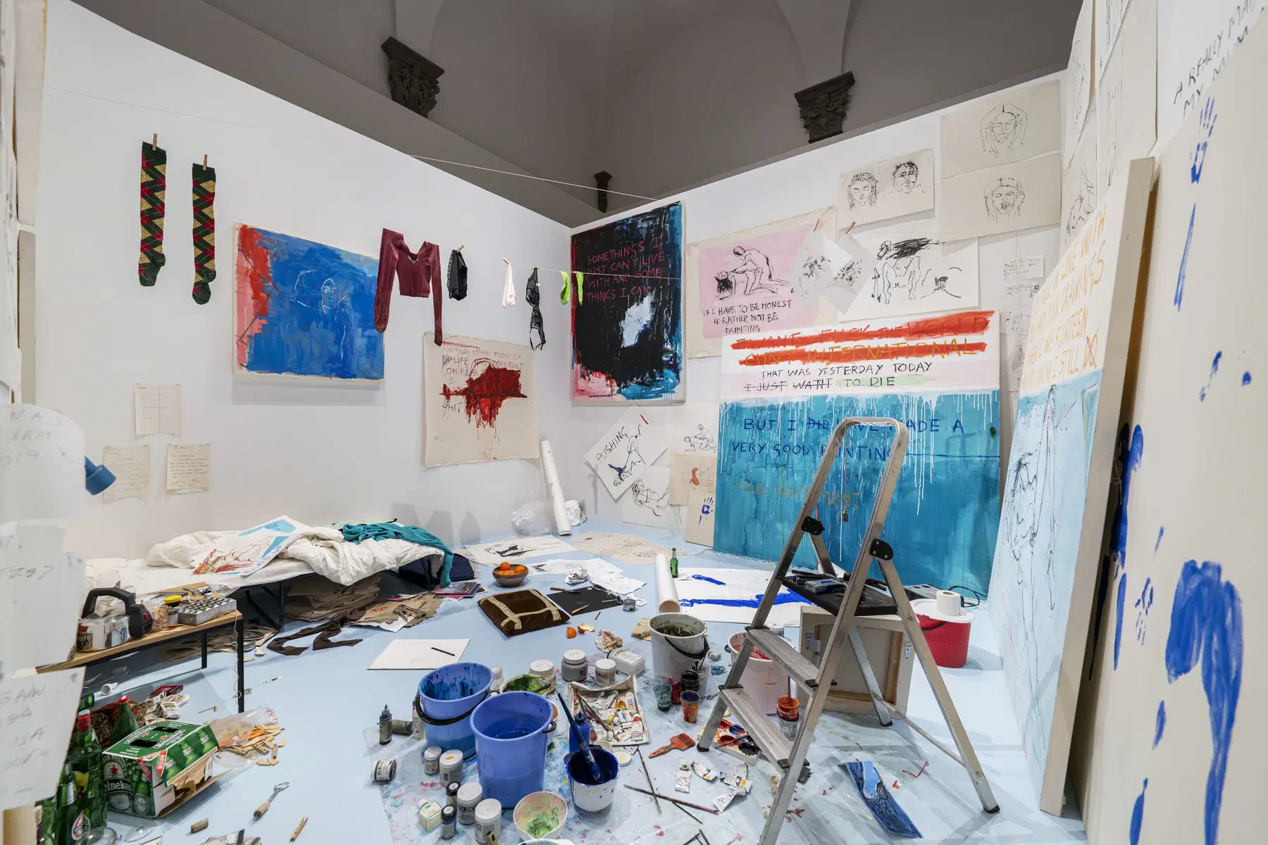
Her return to painting was itself a performative act. During Exorcism of the Last Painting I Ever Made, staged at Galleri Andreas Brändström in Sweden in 1996, she lived and worked inside the gallery for three weeks, transforming the space into both studio and installation. She painted openly and even slept on-site, allowing the entire process to unfold before the gallery visitors, blurring the boundaries between artwork and lived experience and between the private space of the artist’s studio and the public gallery.
Reflecting on her earlier decision to stop painting, she later remarked, “It’s like I needed to punish myself by stopping the thing I loved doing the most.” The statement reveals how intimately bound painting was to her identity. When it returned, it was no longer simply a medium. It had become a necessity.
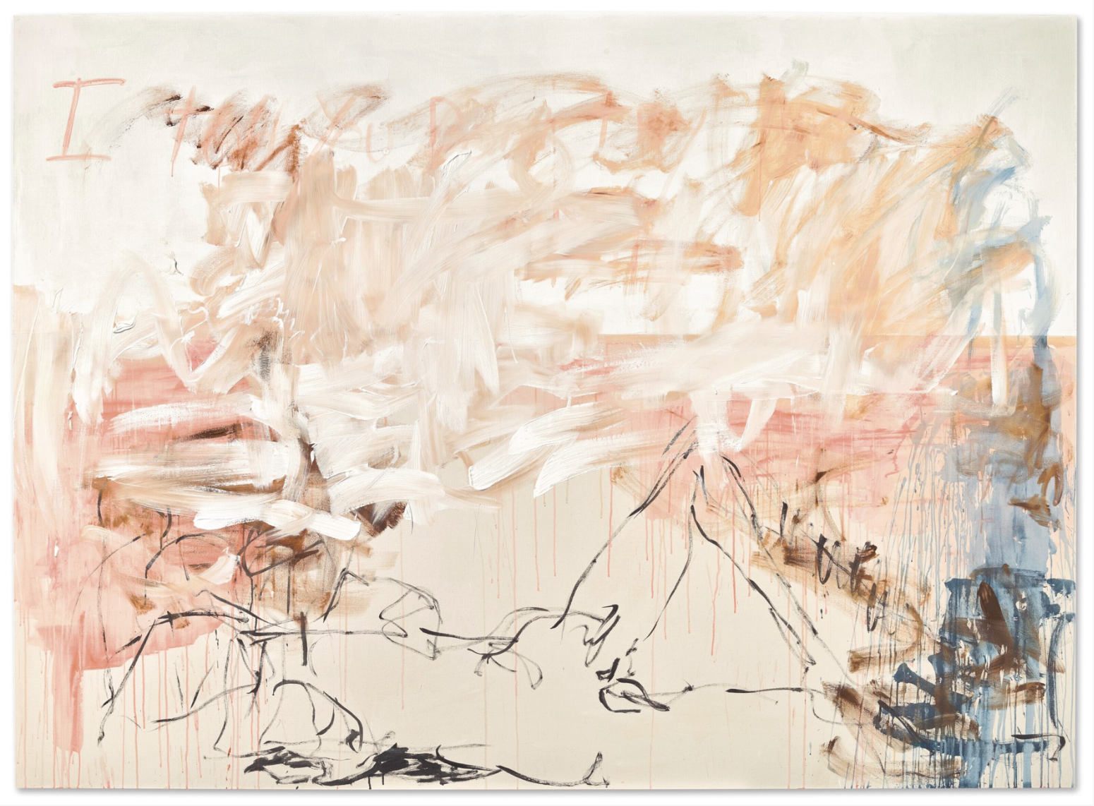
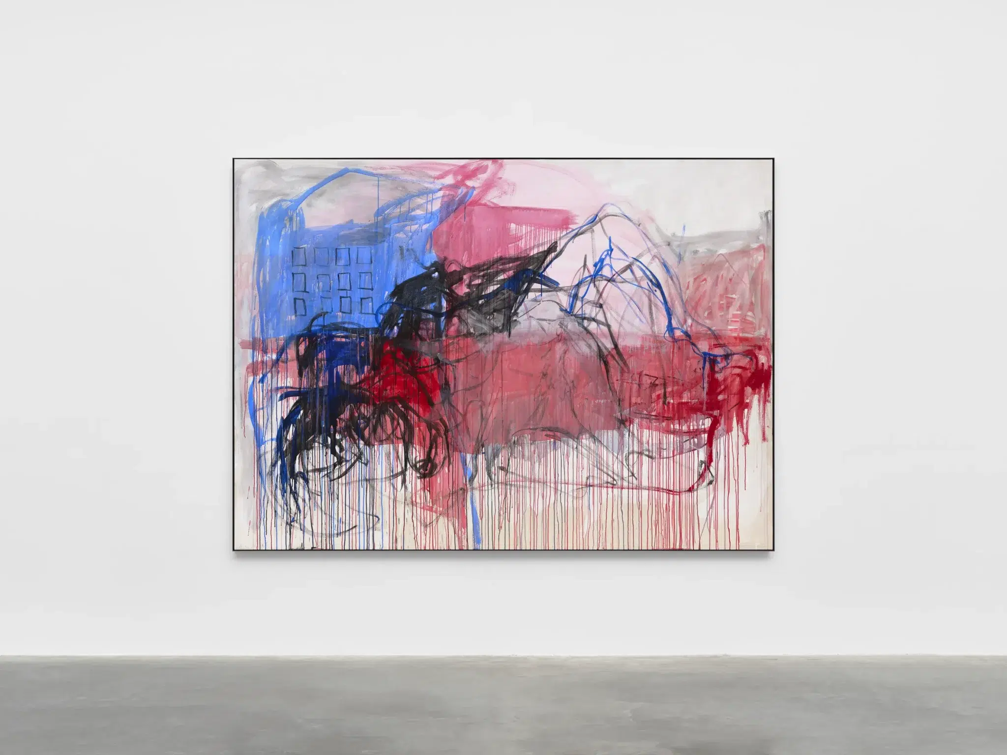
Painted in 2007, the year Emin represented Great Britain at the 52nd Venice Biennale, I Told You Don’t Try to Find Me belongs to a pivotal moment in the artist’s career. By this stage, painting had reasserted itself as a central medium in her practice, allowing her to translate the autobiographical intensity of her earlier works into a direct and physical painterly language.
In this work, the composition centres on a reclining female figure stretched across the canvas. The body is rendered with elongated limbs and fluid contours, defined through urgent, gestural lines. The sense of ground is mostly unclear, yet she may be suggesting that the figure rests directly on the canvas’s lower edge. Areas of exposed canvas remain visible, reinforcing the immediacy of the execution and the rawness of the surface. On the upper left of the canvas, a hint of text emerges, with the letter “I” clearly visible and the letter “t” partially buried beneath layers of paint. It’s evident that she originally wrote something, only to obscure it under thick, urgent brushstrokes. The beginning of the title is faintly visible in the text on the painting, suggesting it may reflect what was originally written but later covered. The title functions as both a declaration of withdrawal and an assertion of autonomy, while the painted figure remains fully exposed. The surface preserves the evidence of its making. Drips, revisions and thin washes of acrylic coexist with denser passages of pigment. This refusal of refinement heightens the emotional resonance of the work.
Emin approaches her work without a predetermined plan, letting intuition guide her entirely. In later interviews, she explained that she relies on what she calls “the thing” of painting — a force that animates the canvas. “I start to draw,” she said, “and then it starts telling me something I didn’t know before.”
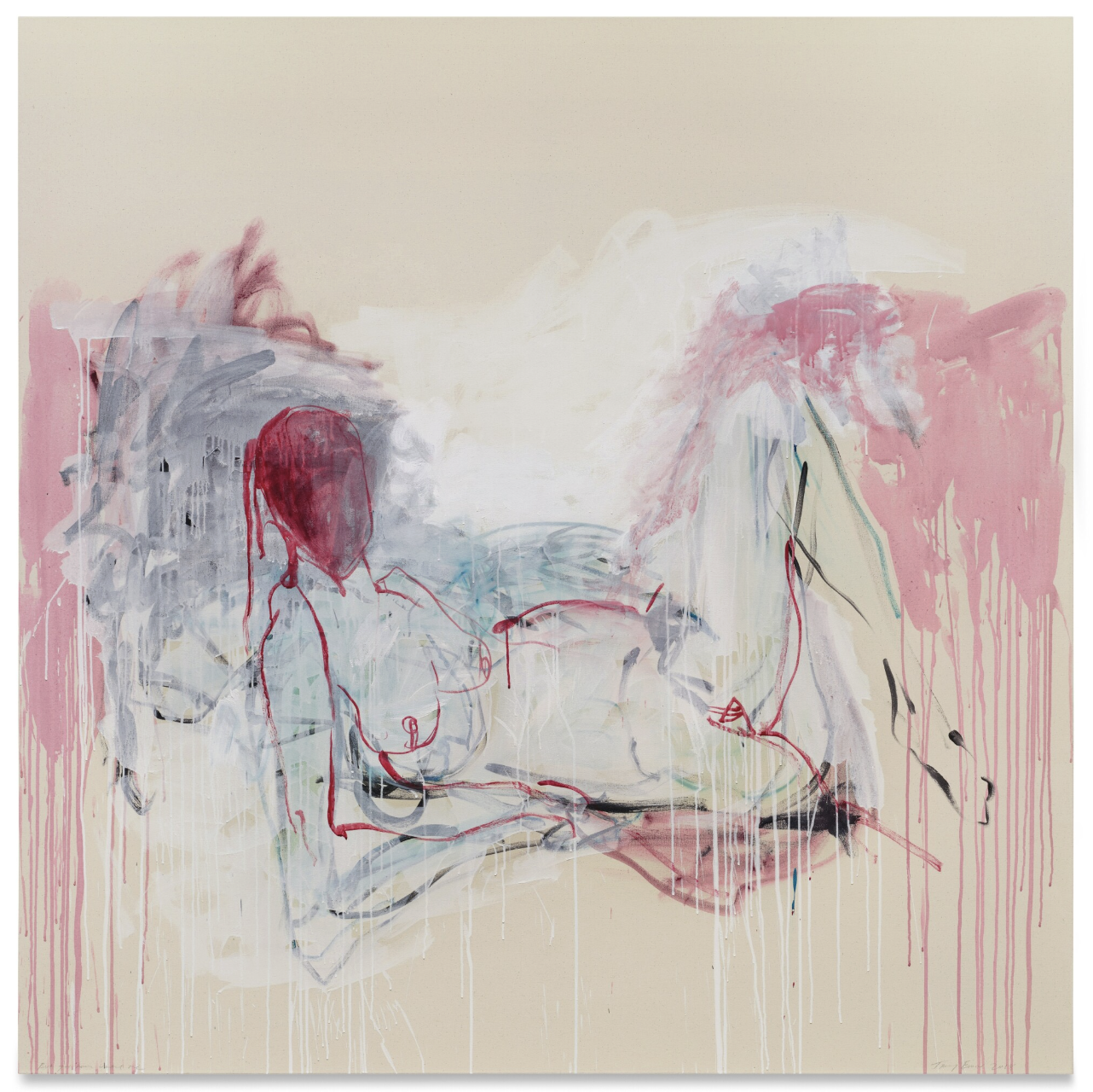
Painted more than a decade later in 2018, But You Never Wanted Me demonstrates the evolution and consolidation of Emin’s visual language. Here, her figures, often reclining or contorted, occupy ambiguous spaces rendered in vivid, emotionally charged colour. In Emin’s work, red functions as more than a chromatic choice. It evokes flesh, intimacy and emotional exposure, intensifying the psychological atmosphere of the painting.
The figure is delineated through fluid, searching lines that privilege emotion over anatomical precision. Limbs extend and curve with a sense of immediacy, suggesting movement and instability. The surface retains visible traces of the artist’s hand. Acrylic is applied in sweeping gestures, with translucent washes set against thicker areas of pigment. Notably, the face is obscured, submerged beneath a field of red. There are no discernible features, no gaze to meet the viewer. This absence is significant. By covering the face, Emin denies the conventional focal point of portraiture. Identity dissolves into colour. The red that envelops the head suggests flesh, evokes a wound, and conveys an overwhelming emotional charge all at once. It becomes a psychological mask rather than a literal one. Emin has remarked, “True art is very powerful; the greatest paintings have souls. They breathe and stare at us; we are looking through the artist’s eyes.” In this work, the “stare” does not originate from any depicted eyes but from the force of the body itself. The absence of a defined face intensifies this presence, inviting viewers to project their own emotional struggles onto the figure.
The title introduces a note of personal rejection, yet the scale and compositional dominance of the figure convey defiance rather than retreat. The body occupies the canvas with authority, transforming vulnerability into presence.
Painted in the aftermath of illness and major surgery, Another Place to Live (2024) occupies a pivotal position in the artist’s recent work. Created following her diagnosis with aggressive bladder cancer in 2020, the painting belongs to a body of work that confronts survival.
The composition feels more abstract than many of her earlier figurative canvases. While the female body remains central, it is partially entangled within a dynamic field of colour and line. A reclining form stretches across the surface, yet its contours dissolve into gestural sweeps of red, black and blue. The figure appears exposed, almost suspended within an indeterminate space, and space dissolves into fields of saturated pigment. In this work, Emin pushes the balance between figuration and abstraction further than in many of her earlier paintings. In the back left of the composition, she also introduces what appears to be a building, suggested through geometric forms. This structure may allude to the idea that, as human beings, we inhabit only one body, one place of shelter to care for and endure within; even through illness, there is no possibility of finding a new “home.” Exhibited as part of I Followed You to the End at White Cube Bermondsey in 2024, the painting signalled a new phase in Emin’s practice. The exhibition was widely understood as marking her reemergence following illness.
Sculpture
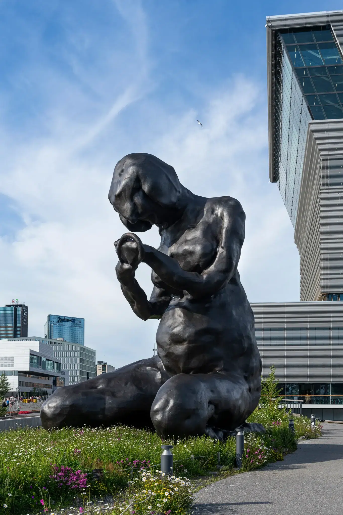
The Mother (2022) is a monumental bronze permanent sculpture installed outside the Munch Museum in Oslo, which overlooks the harbour. Positioned at the threshold of a museum dedicated to Edvard Munch, the work establishes a direct dialogue between Emin and one of her most formative influences. It marks her first permanent public sculpture in Norway and situates her within a lineage of artists concerned with psychological intensity and the expressive potential of the human figure.
“Munch’s mother died when he was very young,” says Tracey Emin. “So I want to give him a mother.” The statement is both personal and symbolic. By installing a maternal figure outside the museum, Emin offers a counter image to the absence that shaped Munch’s early life and haunted much of his work. From a young age, Emin was drawn to German and Austrian Expressionism, particularly the works of Egon Schiele and Edvard Munch. Their uncompromising treatment of psychological states and their distortion of the human figure shaped her own artistic sensibility. Her admiration for Munch was so profound that she dedicated her dissertation, titled My Man Munch, to his work. She later described the text as feeling like an intimate letter, a personal dialogue with an artist whose emotional honesty she deeply admired.
The sculpture itself depicts a nine-metre nude woman kneeling, her body slightly hunched as though bending protectively over an unseen child. The child is not physically present, yet the void beneath her torso becomes charged with implication. The posture conveys protection, grief and endurance simultaneously. The figure is elongated and subtly distorted, recalling Expressionist traditions, yet the surface retains the tactile immediacy of its clay origins. The Mother began as a small handmade maquette. “It started off with me playing with clay,” Emin explained. The decision to enlarge it was deliberate. “One reason is being close to Louise Bourgeois and seeing how she could go from small to giant.”
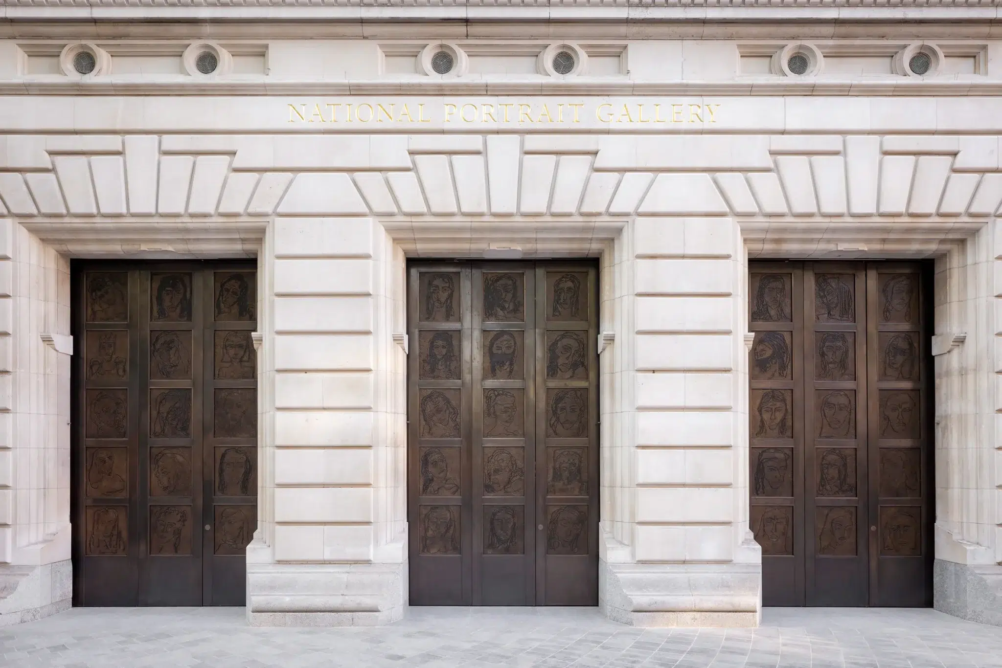
Emin’s commissioned work The Doors (2023), for the National Portrait Gallery in London, represents a landmark in her engagement with public space and institutional history. The project comprises ten bronze relief portraits cast from the monumental doors she designed for the gallery’s renovation. Originally painted in acrylic on paper, the portraits were meticulously transcribed into bronze panels. Each relief depicts a woman. Together they form a collective meditation on female presence and absence within art history. Emin articulated her intention: “Women in history are greatly underrepresented… I felt like the doors of the National Portrait Gallery should represent every woman, every age and every culture throughout time. I used myself as a mental template, but the end result is many different women, some that exist in my mind and some that perhaps exist in reality here and now, as well as from the past.”
The doors operate symbolically as thresholds. They mark entry into a space newly attentive to representation. Following the gallery’s renovation, the proportion of women displayed in the twentieth and twenty-first century galleries rose from 35 percent to 48 percent. Emin’s commission stands as a powerful statement on visibility, access, and the reconsideration of who is represented in institutions.
Neon
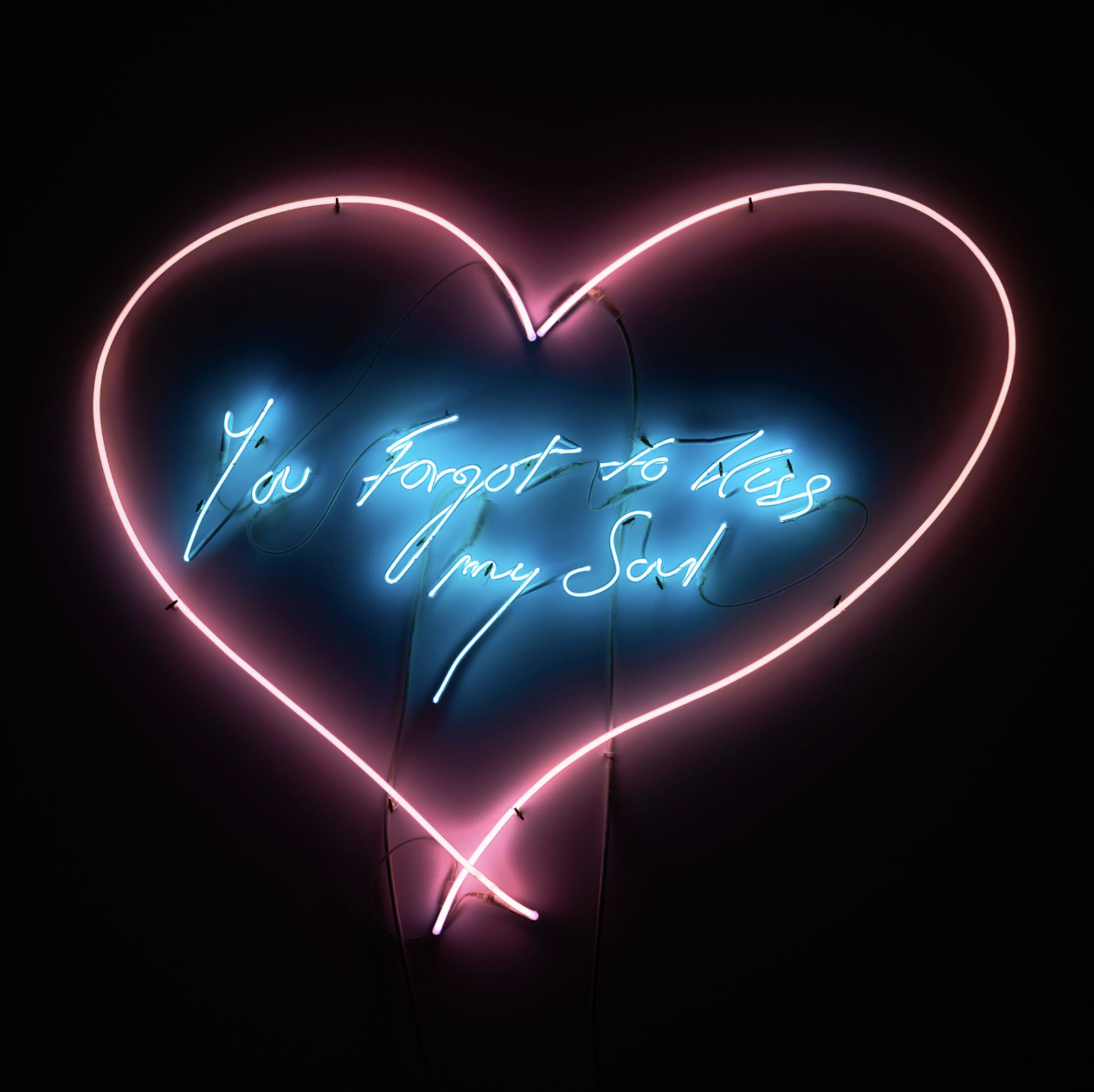
Neon occupies a central and consistent position in Emin’s practice. For more than three decades, she has worked with hand-blown neon tubing, transforming her distinctive, scrawling handwriting into bright light. By employing neon, a medium historically linked to industrial and commercial signage rather than traditional “high art,” she questions established artistic hierarchies and reveals how everyday materials can possess equal significance and impact. Exhibited in international museums and public spaces, her neons combine text and image to articulate complex, intimate narratives with disarming directness. If painting allows her to distort the body, neon allows her to expose the voice.
Tracey Emin’s You Forgot to Kiss My Soul (2001) is exemplary of her ability to distil emotional experience into a single charged phrase. The work consists of hand-formed neon tubing shaped into her unmistakable penmanship, often framed by an organically drawn heart. The letters slope and stretch as though lifted directly from a diary page. The effect is diaristic, immediate and unguarded. Emin has spoken of the emotional charge inherent in the medium itself. “Neon is emotional for everybody… That’s why neon is at fun fairs, casinos, red light districts and bars. It’s also to do with the way it electronically pulsates around the glass, it creates a feel-good factor.”
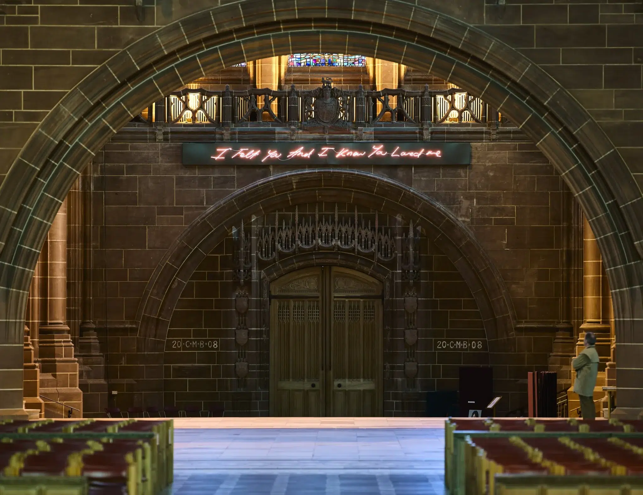
Emin frequently situates her neon works within public and architectural settings, extending personal declaration into communal space. A significant example is For You (2008), installed in the West Window of Liverpool Cathedral. The work reads, “I Felt You And I Knew You Loved Me,” its glowing script suspended within the vast Gothic architecture of the Church of England’s cathedral. The placement is striking. Neon, a medium associated with urban nightlife and commercial signage, inhabits sacred space.
Installation and Textile Work
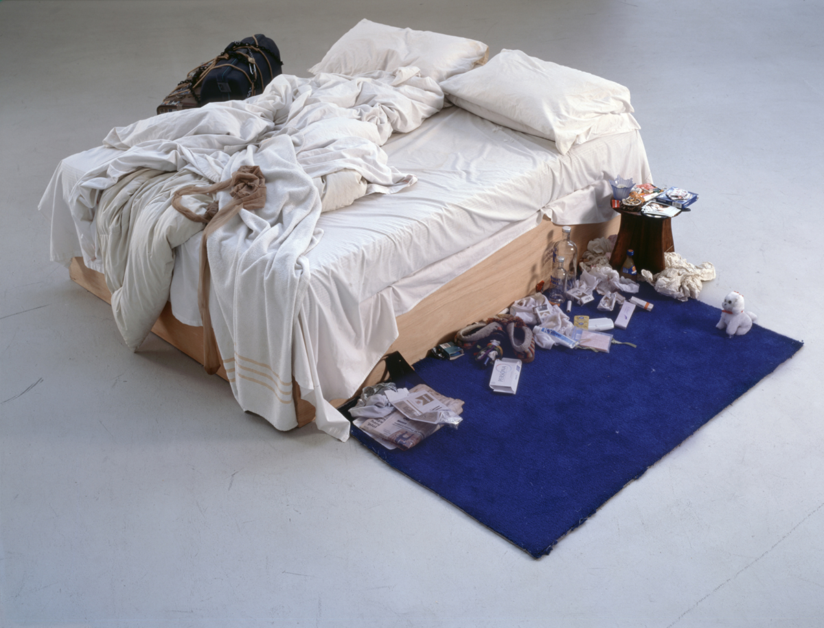
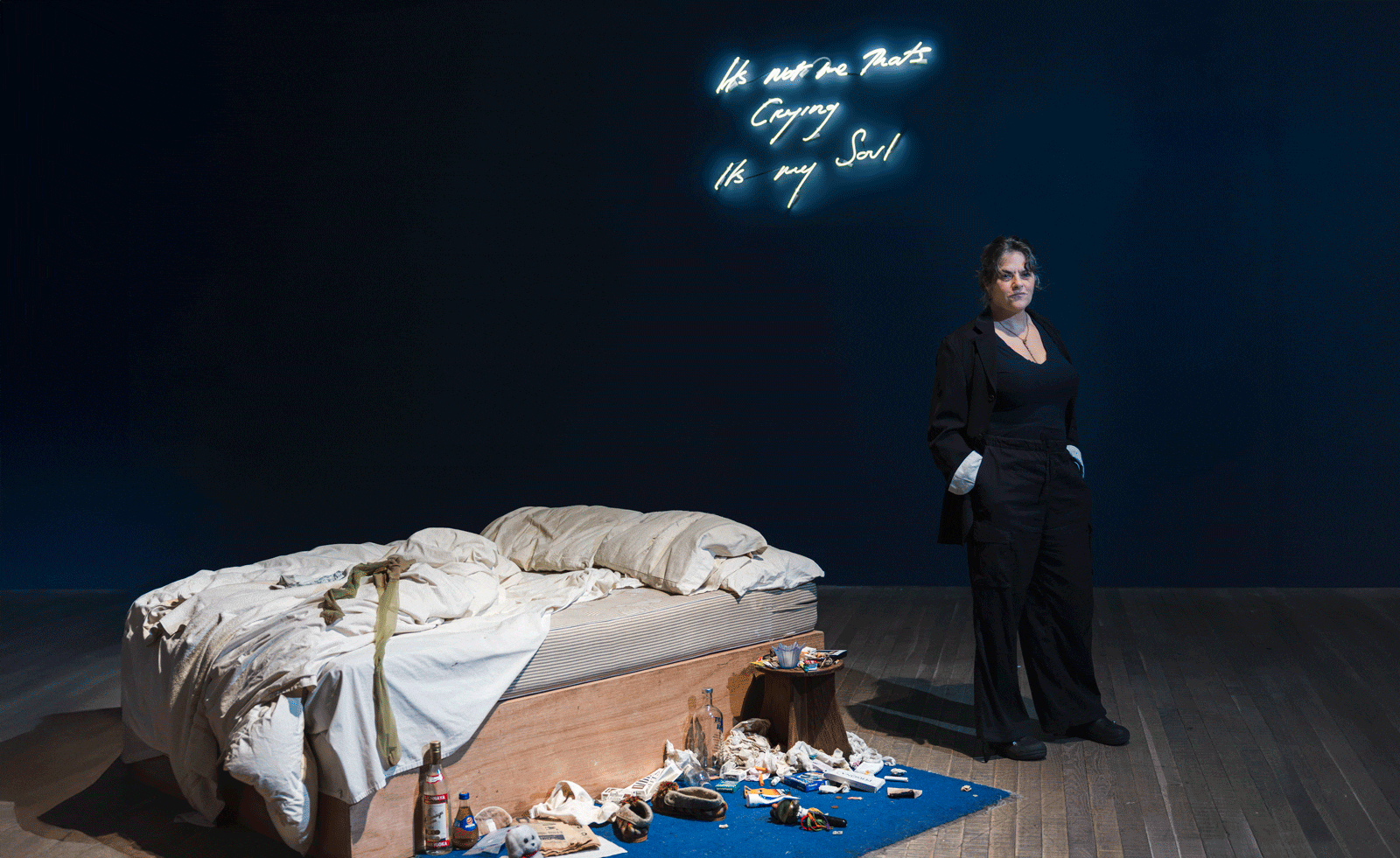
Produced in the wake of a personal breakdown after the end of a relationship, the installation turns the intensely private space of a bedroom into a strikingly public display. Emin spent several days in bed, immobilised by depression. When she finally rose to get water and returned to the room, she saw the deteriorating and chaotic scene with a new clarity. At that moment, she recognised it as an artwork. The installation consists of her unmade bed surrounded by the detritus of lived experience. Stained sheets, discarded bottles, cigarettes and personal objects remain exactly as they were. The bed is presented as evidence. In Emin’s hands, the bed becomes more than furniture. It is a recurring motif in her practice, a metaphor for passion and pain, isolation and communion, mourning and dreaming. It is where love begins and where despair settles.
My Bed was first exhibited in Japan in 1998, where it was originally accompanied by a noose suspended above the bed. The presence of the noose introduced a stark reference to self-destruction. When the work was later shown at the Turner Prize exhibition in 1999, Emin removed this element. Even without it, the installation retained its raw intensity. She later reflected that the time she spent in that bed felt like the end. The work embodies that sensation without theatrical embellishment. The installation is currently on view in Tracey Emin: A Second Life at Tate Modern, the artist’s major retrospective, reaffirming its enduring status as one of the defining works of late twentieth-century art.
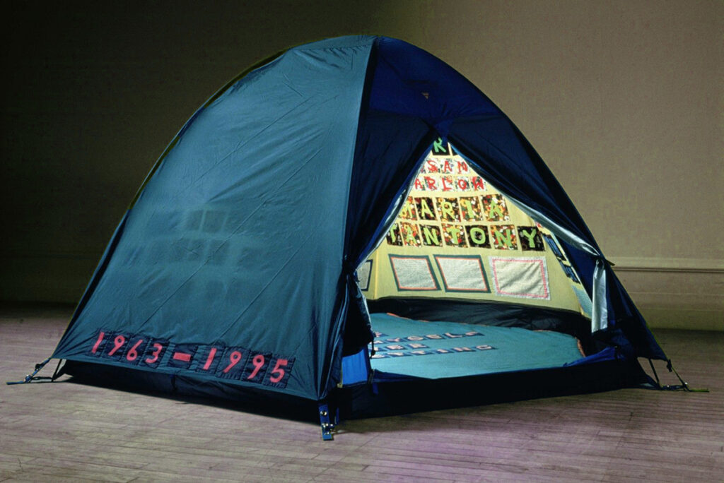
Everyone I Have Ever Slept With 1963–1995 (1995) is one of Emin’s most emotionally charged early works, created at a time when she was still forging her distinctive, confessional voice. The work takes the form of an actual, functional tent, incorporating ready-made materials into its construction. The tent is appliquéd with the names of everyone she had ever shared a bed with, including lovers, family, and close friends, transforming her personal history into a public display. By using this everyday object, Emin merges the ordinary with the intensely intimate, creating a literal and symbolic space that shelters her memories while exposing them to the viewer. The immersive scale and emotional directness invite viewers to confront the complexities of human relationships, while the use of familiar materials challenges traditional notions of what constitutes art. The work was destroyed in the 2004 Momart warehouse fire.
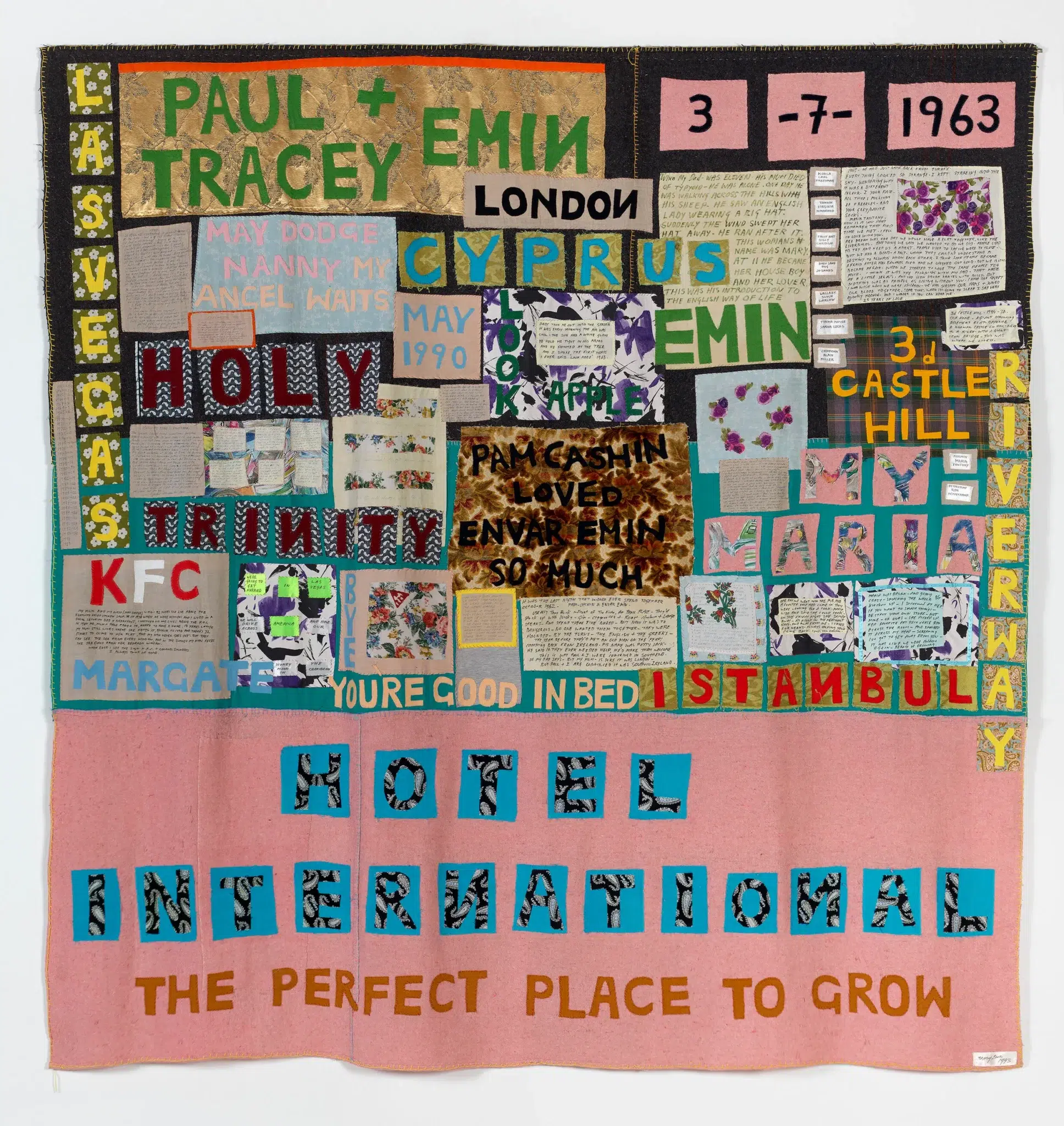
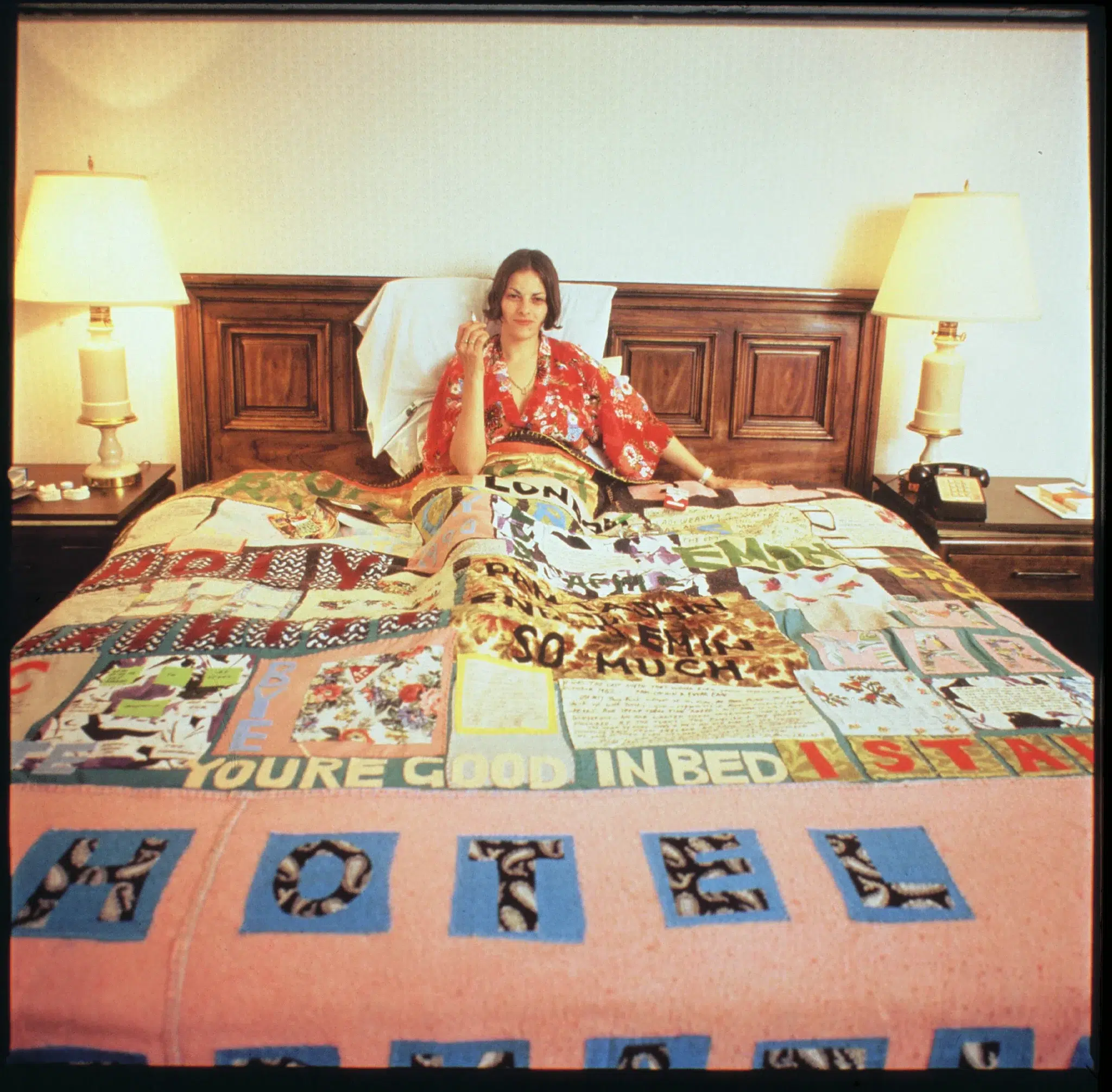
Hotel International (1993) marks a foundational moment in the artist’s career. It was not only her first quilt, but also a central work in her first solo exhibition at White Cube Gallery in 1993. With this work, Emin established the autobiographical language that would define her practice for decades to come.
The quilt takes its title from the hotel Emin’s mother ran in Margate during her childhood. Her early life was difficult, and she experienced sexual assault, an experience she later reflected on in her memoir Exploration of the Soul. The work does not recount these events directly; rather, it weaves them into fabric, text, and fragments. Names of family members are stitched across the surface, while smaller panels recall episodes from her early life.
Emin initially conceived the piece as a kind of curriculum vitae, a “CV.” With no prior exhibitions, she aimed to construct her own history and make a definitive statement. Rather than charting professional achievements, she presented the emotional and biographical experiences that shaped her. The choice of materials is central. Fabrics carry deep personal significance, some sourced from a sofa her family had owned since her childhood, others cut from her own clothing, embedding lived memory directly into the work. By using textiles and quilting, mediums traditionally categorized as “craft” and associated with women’s domestic labor, Emin plays with hierarchies in the art world, transforming a form often considered decorative into a vehicle for text, narrative, and personal history.
Tracey Emin’s work, from her early installations and textile pieces to her more recent paintings, reveals a fearless commitment to honesty and self-exploration. Across media, she consistently blurs the boundaries between private experience and public expression, challenging conventions and redefining the possibilities of contemporary art. Her practice stands as a testament to the power of personal narrative, showing how intimacy, vulnerability, and emotional truth can resonate universally.
From Tradition to Form: Mexico’s Design Landscape Today
Mexico has increasingly emerged as a key hub for contemporary design, shaped by a growing network of designers and galleries working across the country. This development reflects a design culture grounded in material research, local production, and a sustained dialogue between tradition and contemporary practice. Designers working in Mexico often engage directly with organic and locally available materials such as wood, clay, stone, textiles, and metal. Many practices draw on regional craft traditions and Indigenous fabrication knowledge, reinterpreting them within contemporary contexts while maintaining close relationships with workshops, artisans, and production sites.
Alongside talented individual designers, design galleries have played a central role in shaping the scene. By commissioning new work, supporting limited-edition production, and presenting design within an exhibition framework, these spaces have contributed to a clearer positioning of Mexican and Mexico-based design.
This article spotlights a selection of leading designers and galleries, showcasing why Mexico’s design scene deserves global attention.
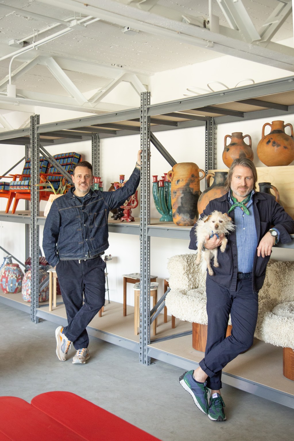
AGO Projects is a design-focused practice and designer representation platform founded by Rudy F. Weissenberg and Rodman Primack. Based in the creative hubs of Mexico City and New York, the platform is committed to nurturing exceptional design voices through experimental approaches, critical dialogue, and cross-cultural perspectives. It also serves as a collaborative environment where artists and designers can realize projects of any scale, encouraging innovation and creative exploration. AGO Projects has become a driving force in the growth of the design scene, fostering a strong sense of community and collaboration. Among the talent they represent are some of the country’s leading designers, including Pol Agustí and Federico Stefanovich, whose work will be discussed in more detail in this article.
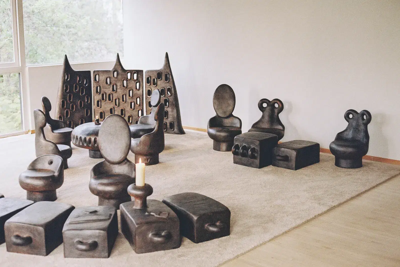
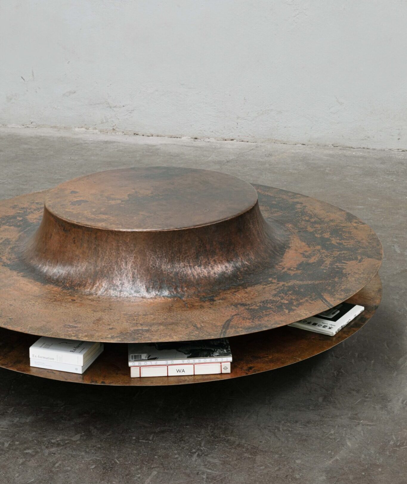
Originally from Barcelona, Pol Agustí is a designer based in Mexico City whose practice centres on black ceramic furniture and objects produced in the Mexican countryside. He is represented by Ago Projects. Twelve years ago, Agustí moved to Mexico after working across diverse fields including industrial design, art direction, production design, and photography, a multidisciplinary background that continues to inform his design approach. Working closely with local artisans, Agustí develops each collection through extended periods of shared living and making, using only three tools throughout the entire production process. This highly constrained methodology results in tables, chairs, lamps, and sound objects that have similar voluptuous forms and smooth cold surface texture. The pieces are characterised by black finishes and monolithic shapes that recall incinerated totems. As Agustí has remarked about his designs: “They’re like an excavation on Mars.”
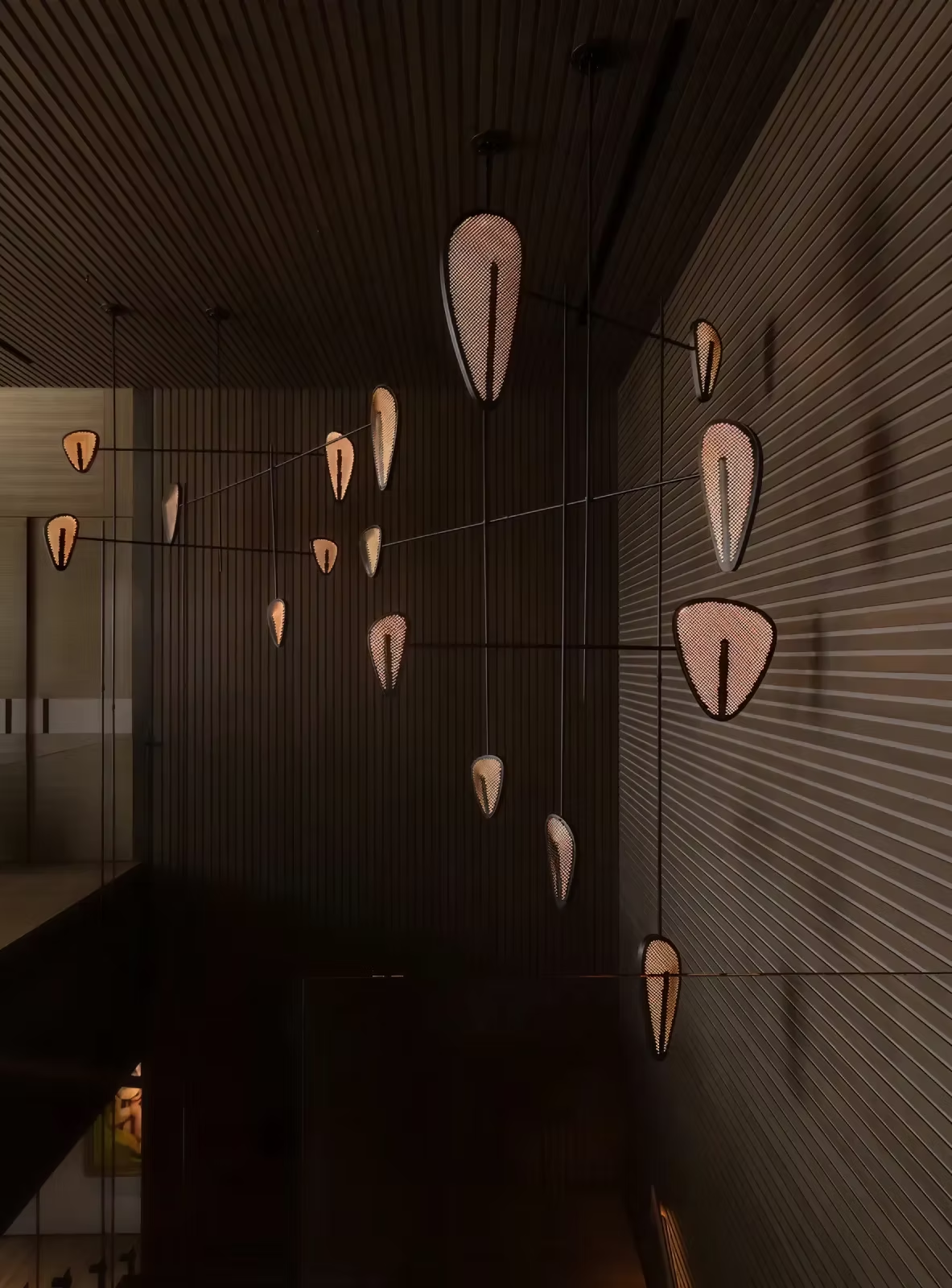
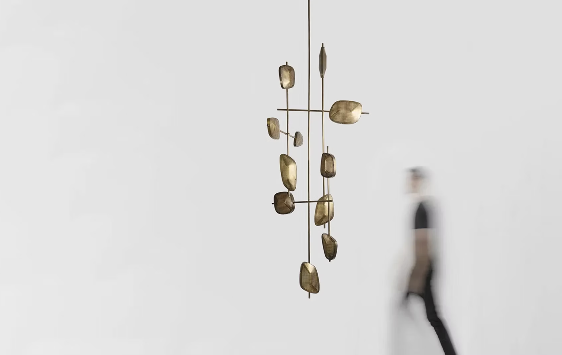
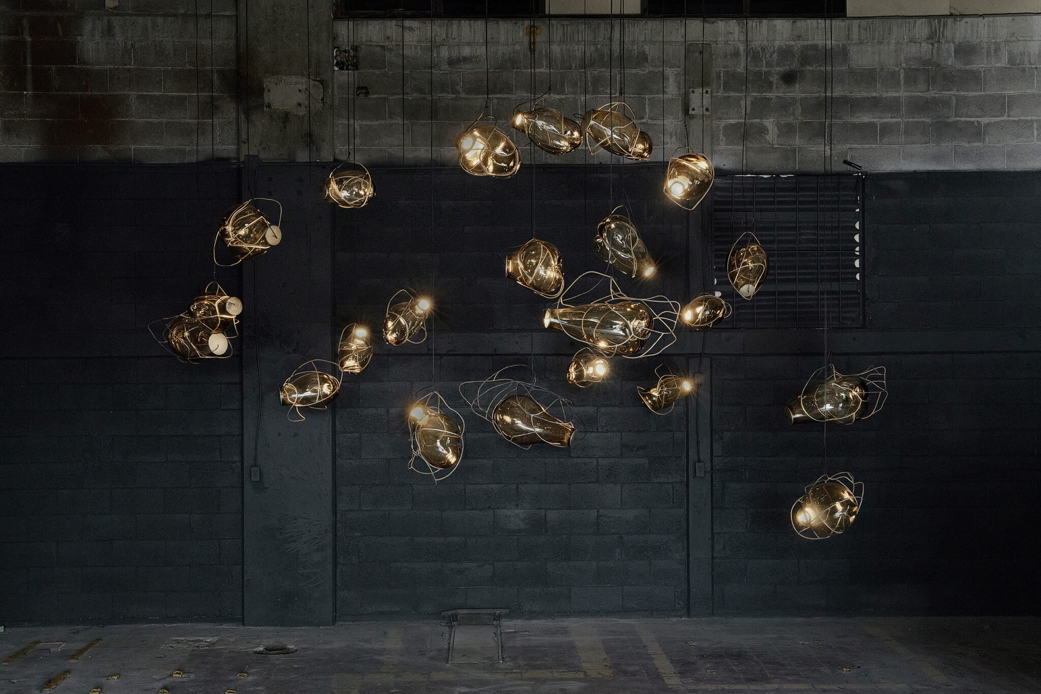
Federico Stefanovich is a Mexico City based designer whose practice centres on lighting, alongside furniture and collectable objects, and who is also represented by Ago Projects. Stefanovich combines digital design processes with artisanal production, collaborating closely with local craftsmen to produce hand-made works in materials such as brass, wood, and bronze. This hybrid approach allows his works to have precise formal compositions while maintaining a strong material and tactile quality. His design practice focuses on light, with many pieces often being inspired by plants, seeds, and fungi. These natural references inform the curves and proportions of his designs, with elements that appear to grow, branch, or unfold. His meticulous study of light and shadow, along with the nuanced interplay between controlled illumination and distinctive organic forms, transforms his lighting fixtures into works of art.
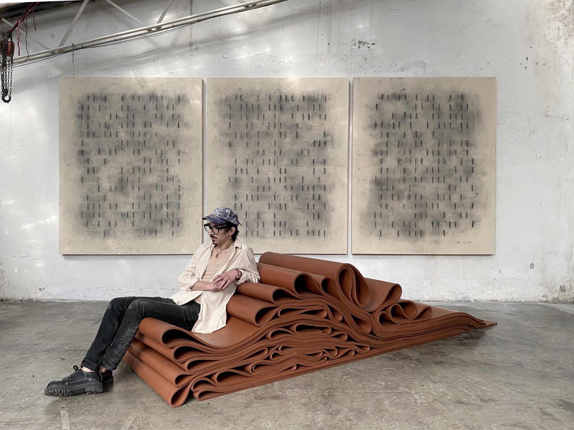
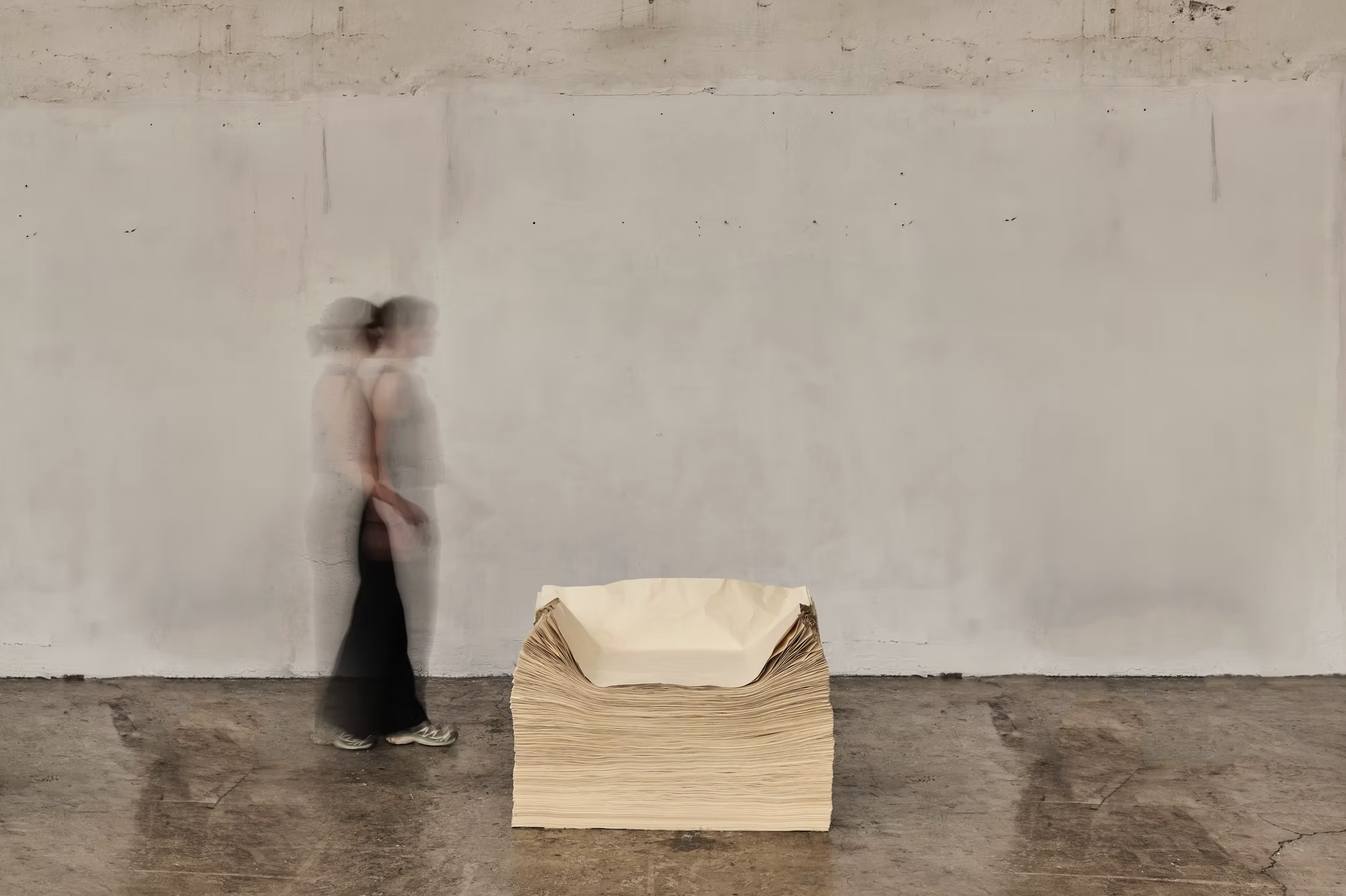
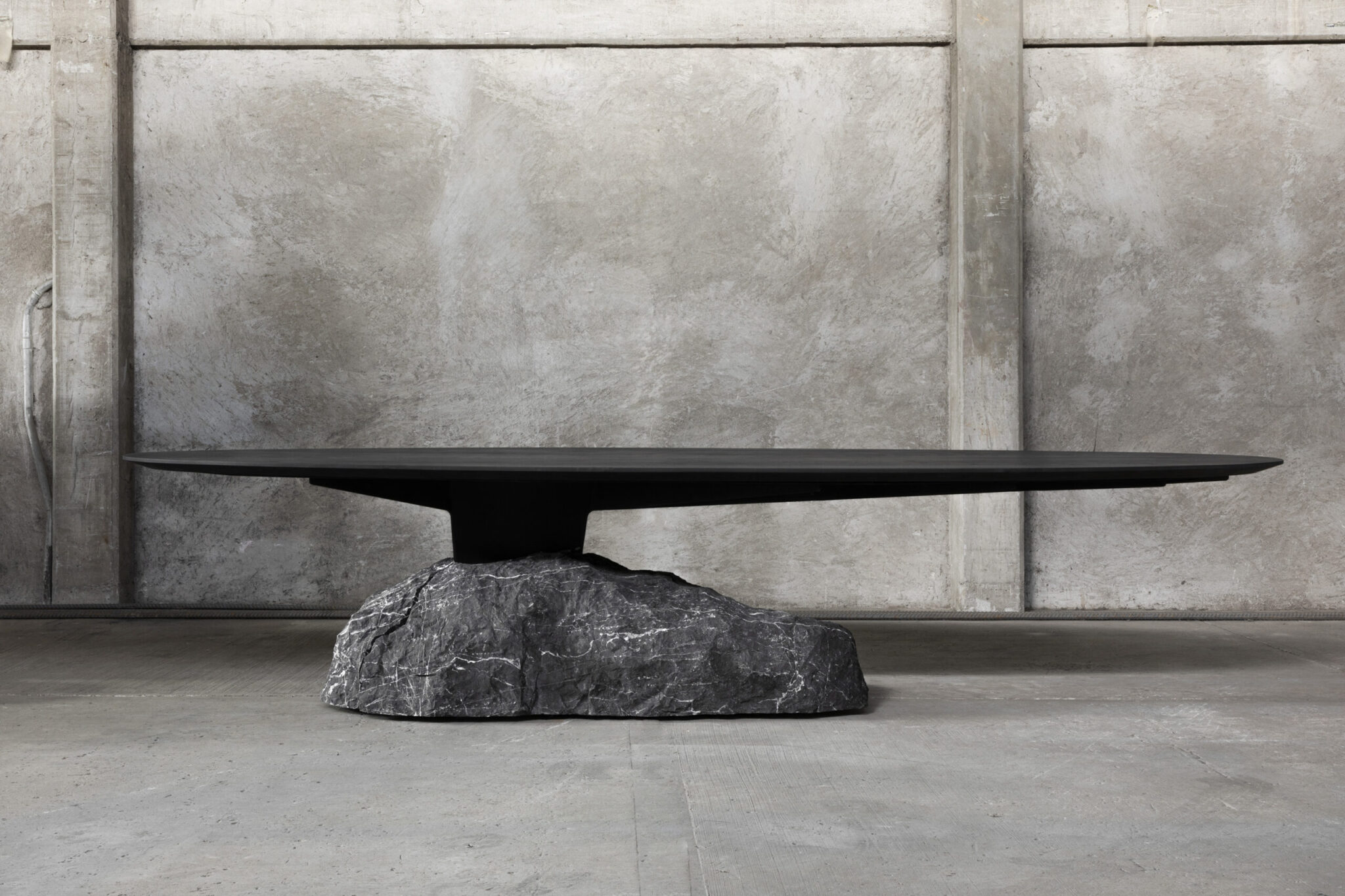
Born in California in 1979, Brian Thoreen is both artist and designer, currently working between Mexico City and Paris. Raised around construction, metal fabrication, and art installation, he developed an early and direct understanding of how materials behave in space. His practice is characterized by an extensive exploration of materials, including rubber, wax, paper, silicone, glass, and metals such as hammered copper, brass, and bronze. Heavy industrial materials are transformed into forms that appear soft, folded, or compressed, often using unexpected materials that provoke curiosity in the audience. Examples include his chairs crafted from Manila paper and his “sofa” constructed from red neoprene rubber. Thoreen’s designs deliberately blur the boundary between functional furniture and nonfunctional sculpture.
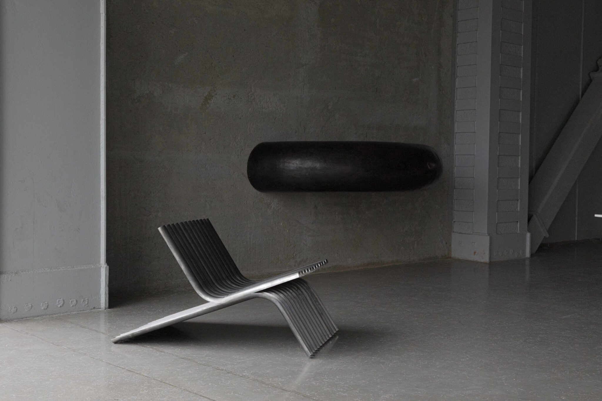
Manuel Bañó, born in Valencia, Spain in 1990, is recognized for his design practice that focuses on metalwork. After studying industrial design and completing a master’s in furniture and lighting, Bañó worked in London before relocating to Mexico City in 2013. Employing direct forming and finishing techniques, Bañó responds to how materials bend, age, and bear weight, allowing forms to emerge through the making process rather than being predetermined. This approach produces furniture and objects that are unique and tactile focused. Bañó is also a co-founder of EWE Studio alongside Héctor Esrawe and Age Salajõe, contributing to the studio’s emphasis on material heritage and local production.
Founded in 2017 by gallerist Age Salajõe and designers Manuel Bañó and Héctor Esrawe, EWE Studio operates at the intersection of design, craft, and cultural research. EWE Studio centres on organic materials and forms, allowing texture and weight to guide the design process. Through limited-edition furniture and objects, EWE Studio reinterprets historical references within a contemporary framework, positioning heritage as an active and evolving source of design. Ewe Studio exemplifies the creative force that emerges when talented designers and gallerists collaborate, united by the belief that design extends beyond mere functionality.
Located in a 1910 building in the La Roma neighbourhood of Mexico City, Galería Córdoba is a design gallery dedicated to vintage furniture and objects from the modern movement. The gallery presents original pieces selected for their clarity of form, historical significance, and exceptional craftsmanship. Córdoba’s programme highlights key figures in modern design, including Don Shoemaker, Michael van Beuren, and Clara Porset, situating their work within a broader conversation around the development of modern design in the Americas.
MASA was founded in Mexico City by Age Salajõe, Héctor Esrawe, Brian Thoreen, Isaac Bissu, and Roberto Diaz. Operating at the intersection of art and design, MASA focuses on collectible and experimental practices presented through exhibitions, research, and publishing. MASA operates across physical and conceptual spaces and regularly collaborates with international galleries. These partnerships expand the programme beyond a local context, situating design within a broader global dialogue and highlighting the interplay between art and design, advocating for their more frequent joint presentation.
In February 2026, MASA will open a collaborative exhibition with Modern Art (London/Paris) at their Mexico City space. Running from 3 February to 4 April 2026, the exhibition brings together artworks and collectable design by artists represented by either MASA or Modern Art. Modern Art will show works by artist from their program such as Eva Rothschild, Francesca Mollett, Frida Orupabo, Michael Simpson, and more. MASA will present design items by Charlotte Vander Borght, Atelier Van Lieshout, José Dávila, Brian Thoreen.
Héctor Esrawe is a Mexico City based designer, architect, and academic whose practice spans furniture, interiors, architecture, and collectible design. He is also one of the founders of Ewe Studio. Working across disciplines, Esrawe is known for a rigorous understanding of materials and production processes, developed through decades of both practice and teaching. His designs balance artisanal knowledge with contemporary manufacturing, producing unique, limited-edition works that feel both timeless and architectural. Notable examples include his coffee tables composed of multiple blocks, reminiscent of the Tower of Babel, and his geometric-grid light holders, where the organic drip of wax creates a striking contrast.
Emiliano Godoy is a Mexican industrial designer with over twenty-five years of experience working across furniture design, architecture, product development, and curation. Working internationally, Godoy approaches design as a tool for generating positive social and environmental impact, with applied sustainability at the core of his practice. Godoy frequently works with wood and natural materials, often incorporating woven or interlaced elements that reference textile traditions and handcraft. One of his most recognised works, the Knit Chair, exemplifies this approach. Combining industrial structure with hand-crafted textile elements, the chair explores comfort, flexibility, and material contrast. In 2011, the Knit Chair was acquired by the Museum of Modern Art (MoMA), New York.
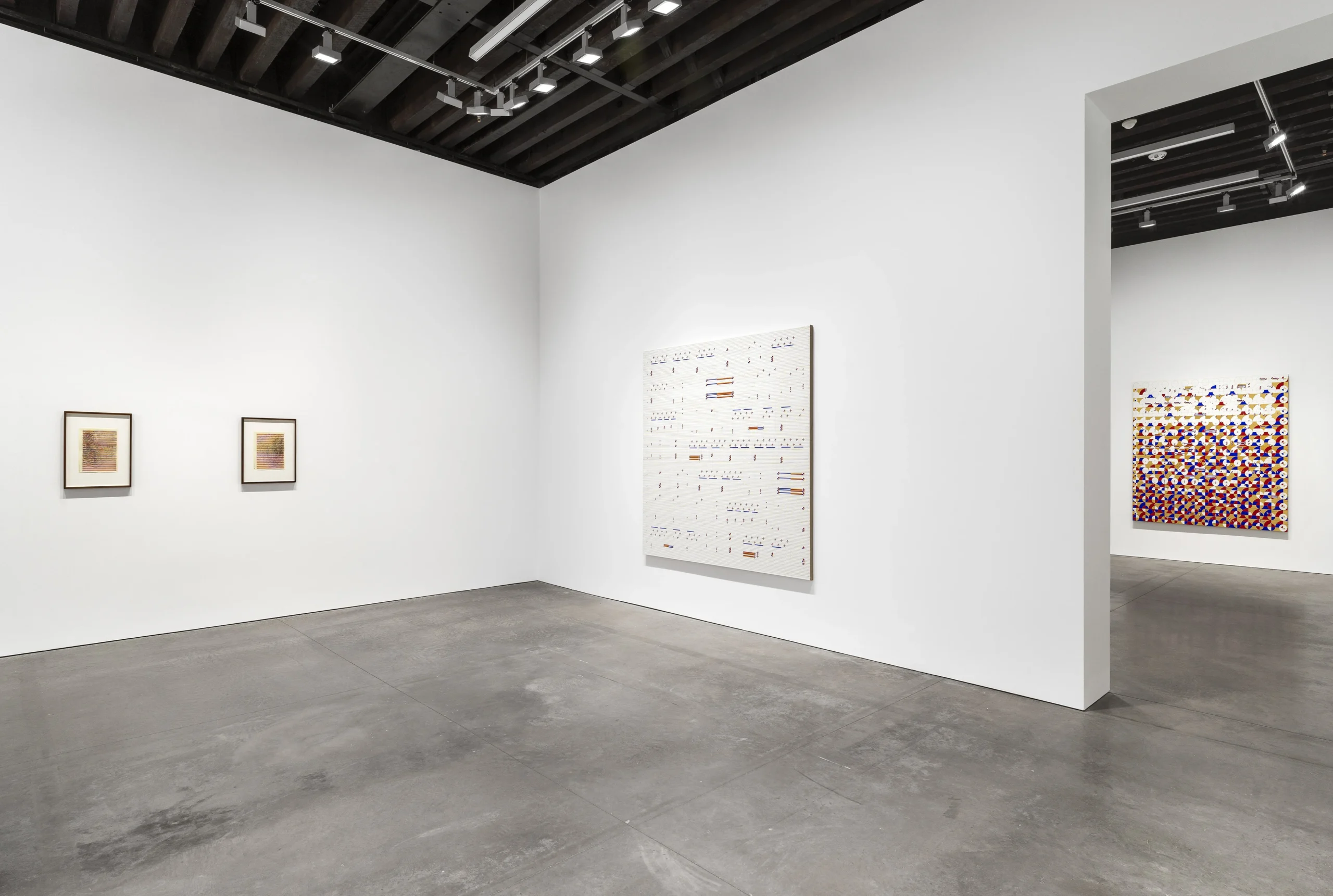
Mexico City Now: Artists, Galleries, and the Pulse of a Global Art Capital
Mexico City has become one of the most active and compelling centres of contemporary art today. Its vitality is visible not only in the scale of events such as Zona Maco, but in the density of its cultural infrastructure: a growing network of galleries, an engaged community of collectors, and a strong institutional framework that supports sustained artistic production.
In recent years, this ecosystem has expanded rapidly. Local galleries operate alongside international programmes, while artists from abroad increasingly choose the city as a place to live, work, and exhibit. These developments have been further accelerated since the pandemic, reinforcing Mexico City’s position as both a site of production and a destination for contemporary art.
The city’s cultural energy extends beyond the visual arts. Film, design, photography, and cuisine intersect closely with artistic practice, contributing to an environment in which experimentation is grounded in everyday cultural life. Mexico City allows creators to experiment boldly while remaining rooted in a rich cultural history, an influence that is often visible in their work and deeply appreciated by audiences. This combination of honouring Mexico’s heritage and pushing creative boundaries fuels a dynamic and thriving arts ecosystem.
In this article, we highlight artists who are shaping the current cultural conversation in Mexico. Whether based in the country, Mexican-born, or presenting significant exhibitions there now, these artists exemplify why Mexico City is the place to engage with cutting-edge ideas and art, and experience the vibrant interplay between tradition and contemporary practice.
Artists
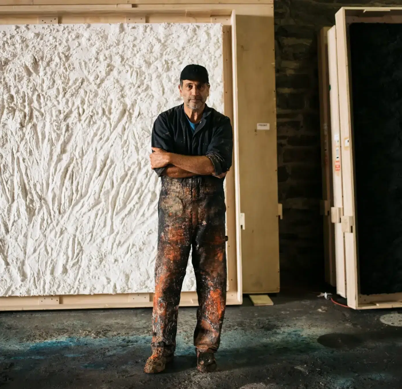
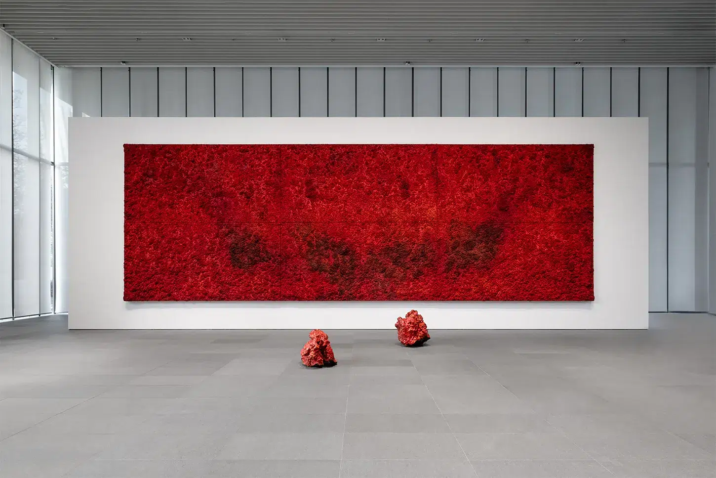
Bosco Sodi
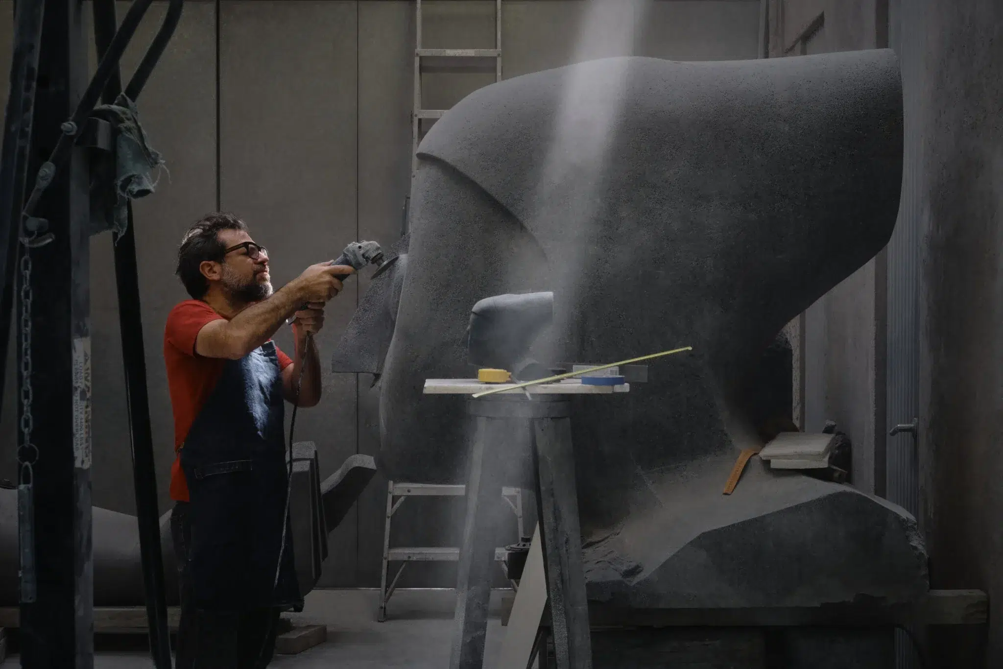
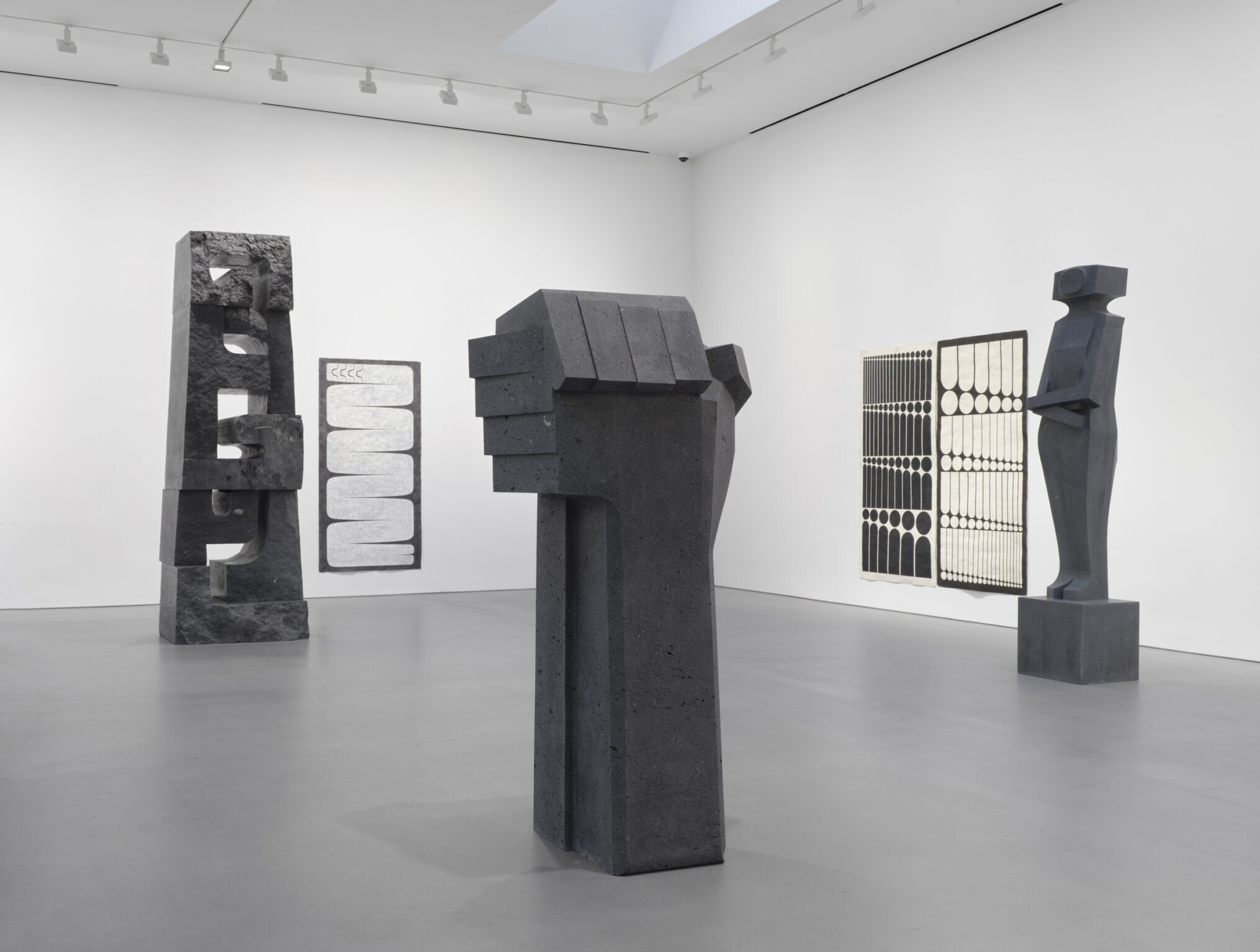
Bosco Sodi (b. 1970, Mexico City) is recognised for large-scale paintings and sculptures grounded in material intensity and physical process. Working with various natural materials such as sawdust and wood pulp, Sodi builds dense surfaces that crack and shift as they dry, allowing chance and material behaviour to shape the final work. Alongside painting, Sodi produces sculptural works using volcanic rock collected in Mexico, which he coats with glaze and precious metals before firing. These objects merge geological transformation with artistic intervention, reinforcing his sustained engagement with materiality, unpredictability, and the elemental forces embedded within the act of making.
Pedro Reyes
Pedro Reyes (b. 1972, Mexico City) places sculpture at the core of his practice, extending it beyond static form into systems, actions, and collective processes. Trained as an architect, he approaches sculpture as a constructed structure, often working with stone, wood, and traditional craft techniques rooted in Mexican and Mesoamerican histories. His sculptures often employ repetition and simplified geometry, emphasising endurance, structure, and collective memory. Through these materially grounded works, Reyes engages with Mexico’s artistic heritage while situating sculpture as a medium capable of addressing broader cultural and historical questions.
Jerónimo Rüedi
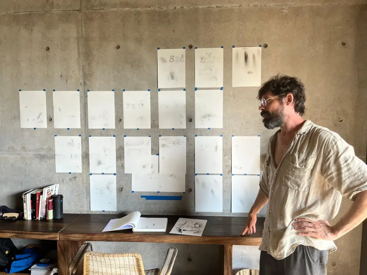
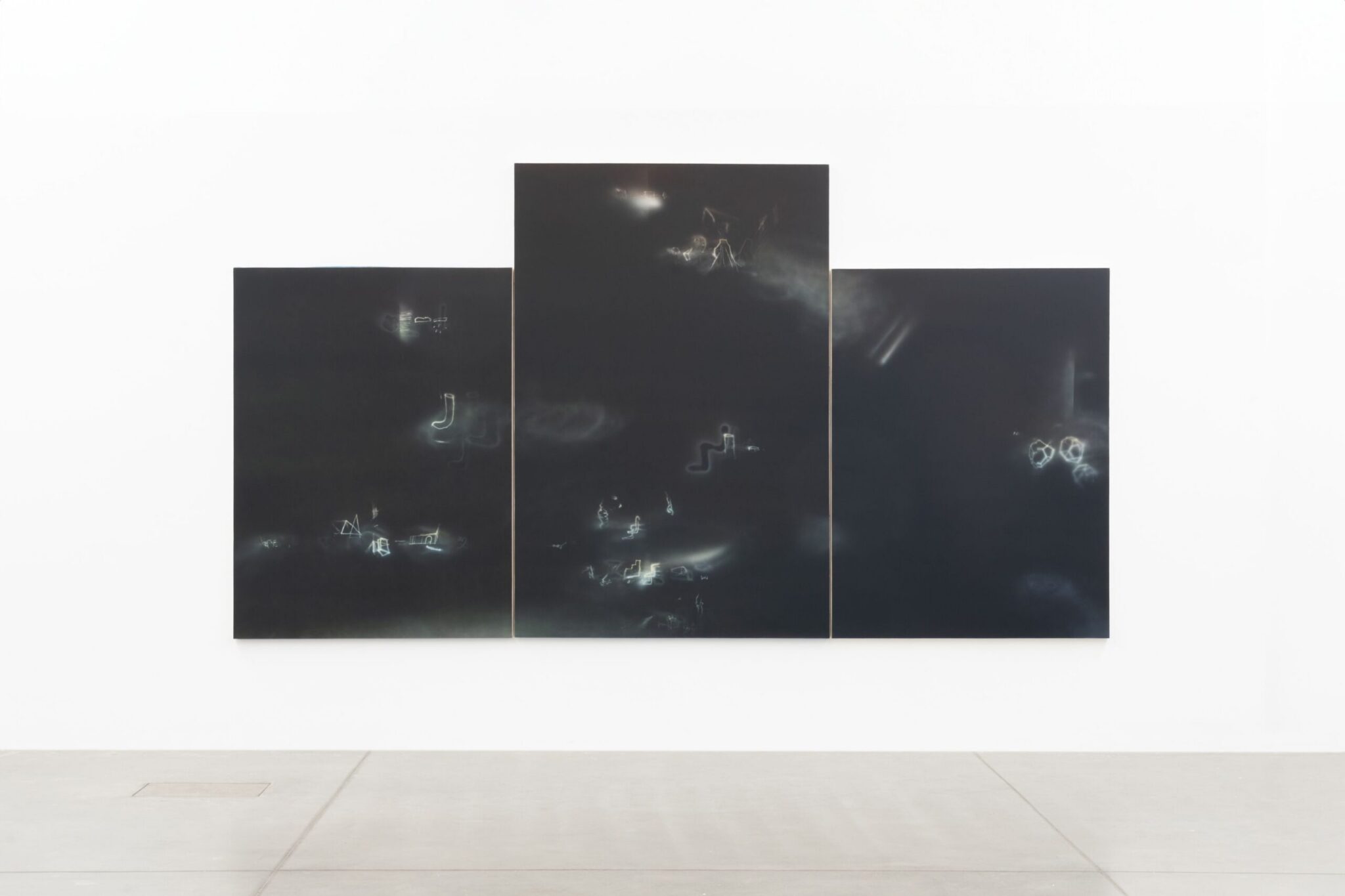
Jerónimo Rüedi (b. 1981, Mendoza, Argentina) lives and works in Mexico City. His painting practice centres on material experimentation and carefully controlled processes. He develops his own primers and pigments, applying paint through air-driven techniques that produce soft, layered surfaces with minimal direct touch. The shapes that emerge in Rüedi’s works often resemble fragmented signs or inscriptions, evoking the visual rhythm of ancient scripts or weathered manuscripts. They feel neither fully legible nor entirely abstract, hovering in a space between writing and form. Colour, transparency, and erosion play a central role in his practice, resulting in images that appear unstable or in transition rather than fixed.
Eduardo Terrazas
Eduardo Terrazas (b. 1936, Guadalajara) is a foundational figure in Mexican contemporary art whose practice spans architecture, design, and visual art. Trained as an architect, his work is rooted in modernist geometric abstraction combined with techniques drawn from Mexican folk traditions, most notably through concentric and modular forms. Since the 1970s, Terrazas has developed this visual language through drawings and, later, through works employing Huichol yarn techniques, arranging coloured threads on wax-coated surfaces. By combining modernist geometry with labour-intensive craft processes, his work bridges contemporary abstraction and Indigenous visual traditions.
Stefan Brüggemann
Stefan Brüggemann (b. 1975, Mexico City) works across sculpture, painting, drawing, and installation, frequently using text as a central formal element. His work merges Conceptualism and Minimalism with a rebellious punk aesthetic and the raw energy of street art. Many of his works also critique systems of power, consumerism, and cultural authority, and he often employs irony to challenge norms. Through these strategies, Brüggemann creates work that is simultaneously visually striking and conceptually rigorous.
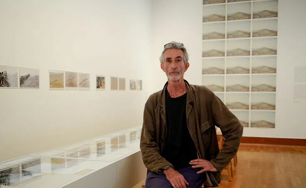
Francis Alÿs
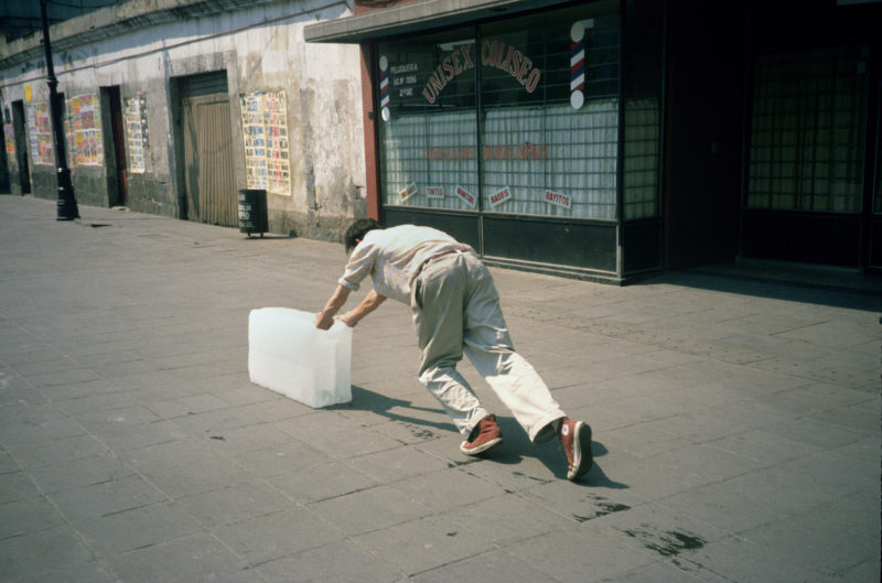
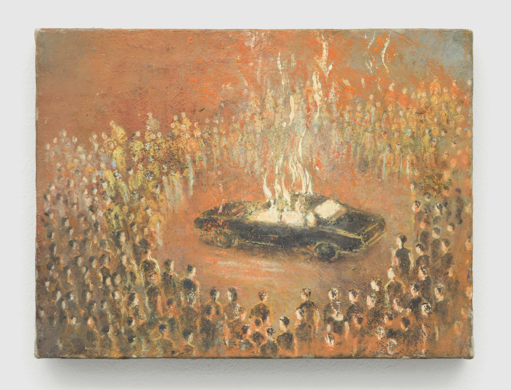
Francis Alÿs (b. 1959, Antwerp) has lived and worked in Mexico City since 1986. He initially moved there from Belgium to take part in post-earthquake reconstruction efforts and has remained in the city, where he has continued to develop his artistic practice. His work consists of long-term projects across film, drawing, painting, animation, and performance, addressing questions of movement, borders, labour, and collective behaviour. His work often unfolds through simple actions carried out in public space, using repetition and duration to explore everyday life within specific social and political contexts. One of his most famous works is Paradox of Praxis 1 (Sometimes Making Something Leads to Nothing) (1997), in which Alÿs pushed a large block of ice through the streets of Mexico City until it melted. The resulting video weaves together absurdity and sincerity, meditating on the role of ice in the lives of street vendors and on Alÿs’s quiet production of absence, opening the work to poetic interpretation. Though he is perhaps best known for his performance and documentary works, his paintings also preserve this poetic quality.
Abraham Cruzvillegas
Abraham Cruzvillegas (b. 1968, Mexico City) makes sculptures and installations from everyday and found materials such as wood, metal, cardboard, fabric, and household objects. He builds his works without detailed plans, assembling materials intuitively and when they become available. He calls this process autoconstrucción, which is deeply inspired by the ingenious and collaborative building tactics used by the people living in Colonia Ajusco, his childhood neighbourhood in Mexico City. Objects are created from what is available rather than what is ideal, capturing the chaotic and fragmentary nature of life.
Jose Dávila
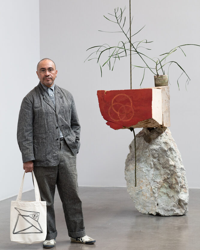
Jose Dávila (b. 1974, Guadalajara) works primarily in sculpture and installation, exploring balance, weight, and spatial tension. Dávila combines industrial and everyday materials such as steel, glass, concrete blocks, stone, and found objects. His works often appear carefully balanced or on the verge of collapse, with gravity and chance playing an active role in the final form. Referencing twentieth-century modernist art and architecture, Dávila reworks familiar forms into unstable constructions that test the physical and conceptual limits of sculpture.
Gabriel Orozco
Gabriel Orozco (b. 1962, Jalapa; lives and works between Mexico City and Tokyo) makes sculptures, photographs, and paintings using everyday objects and simple physical actions. He often rolls, cuts, or rearranges objects such as balls, stones, furniture, and vehicles, changing their form without disguising their original function. His works usually rely on balance, repetition, and geometry. Through these artistic interventions, Orozco demonstrates how ordinary objects can be reimagined through movement, time, and use, revealing new insights into familiar scenes or everyday objects.
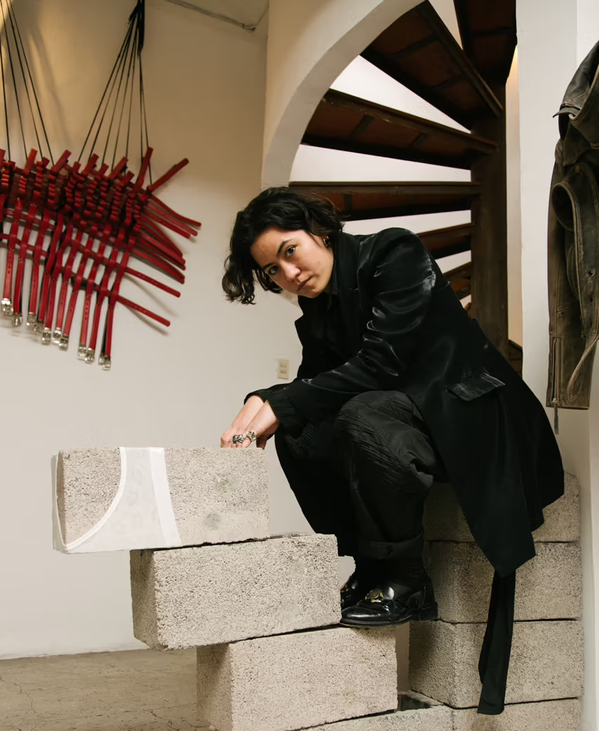
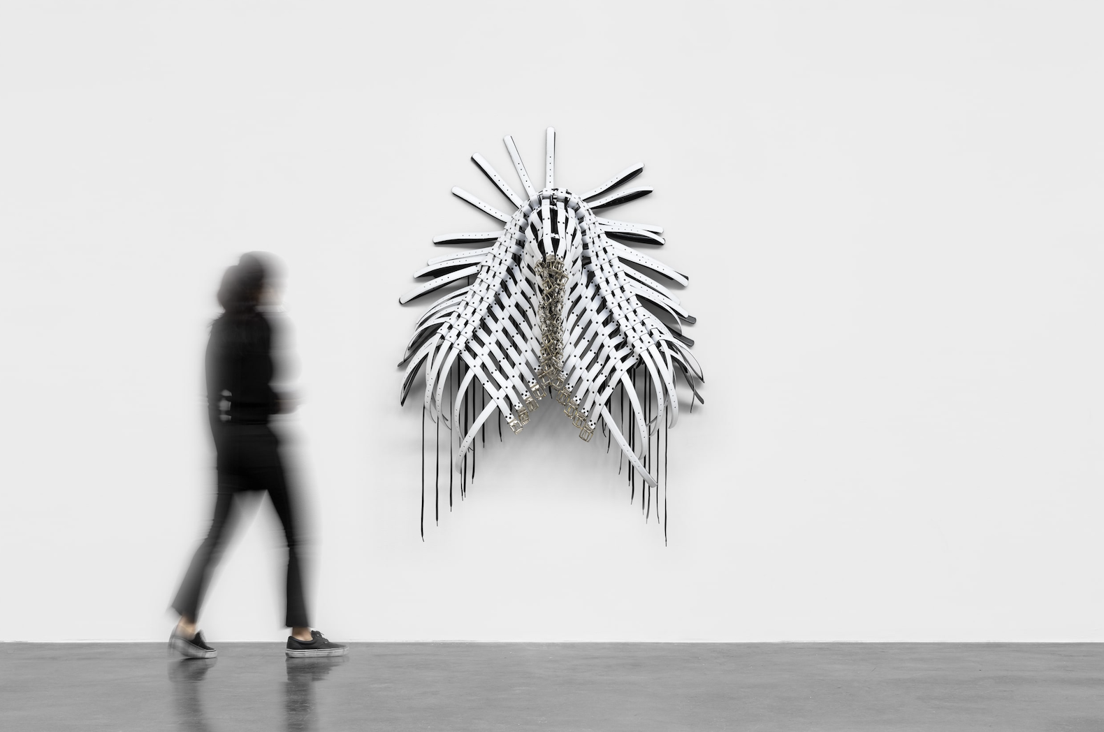
Bárbara Sánchez-Kane
Bárbara Sánchez-Kane (b. 1987, Mérida, Mexico; lives and works in Mexico City) develops works across sculpture, installation, fashion design, painting and performance, often using leather, metal, chains, and industrial fittings as primary materials. Many of her fashion designs function as wall pieces as well, reflecting her desire to blur mediums as much as possible. Her works confront systems of masculinity, power, domination, and the traditional notions of Mexicanidad, frequently staging the body as a site of pressure, control and domination. In 2026, Sánchez-Kane was awarded the Chanel Next Prize.
Gallery Shows
Mariane Ibrahim
Carmen Neely: a trace beyond the life of the body
2 February – 2 May 2026
Mariane Ibrahim Gallery presents Carmen Neely: a trace beyond the life of the body, the artist’s first solo exhibition in Latin America. Neely’s abstract paintings operate as acts of inscription, built through layered marks, interruptions, and controlled erasure. In this exhibition, she introduces masking tape to create negative spaces that recall redaction and censorship. Working on raw, subtly toned grounds, Neely treats painting as a site for examining memory, power, and historical instability.
Galerie Nordenhake
Sarah Crowner: Zigzags & Curves
3 February – 14 March 2026
Galerie Nordenhake is showcasing Sarah Crowner: Zigzags & Curves, an exhibition developed from the artist’s ongoing research into geometry and abstraction. This exhibition spans across two spaces in Mexico City. The Curves exhibition is staged in a pop-up space at Palmas 1535 and centres on Crowner’s new works, where biomorphic forms and sweeping lines introduce softness and rhythm into her formal language. Zigzags is a group exhibition at the gallery’s Roma Norte space, curated by Crowner and Toni Sadurní. The program in both spaces investigates alternative approaches to abstraction, shifting between fluid organic forms and structured geometry.
OMR Gallery
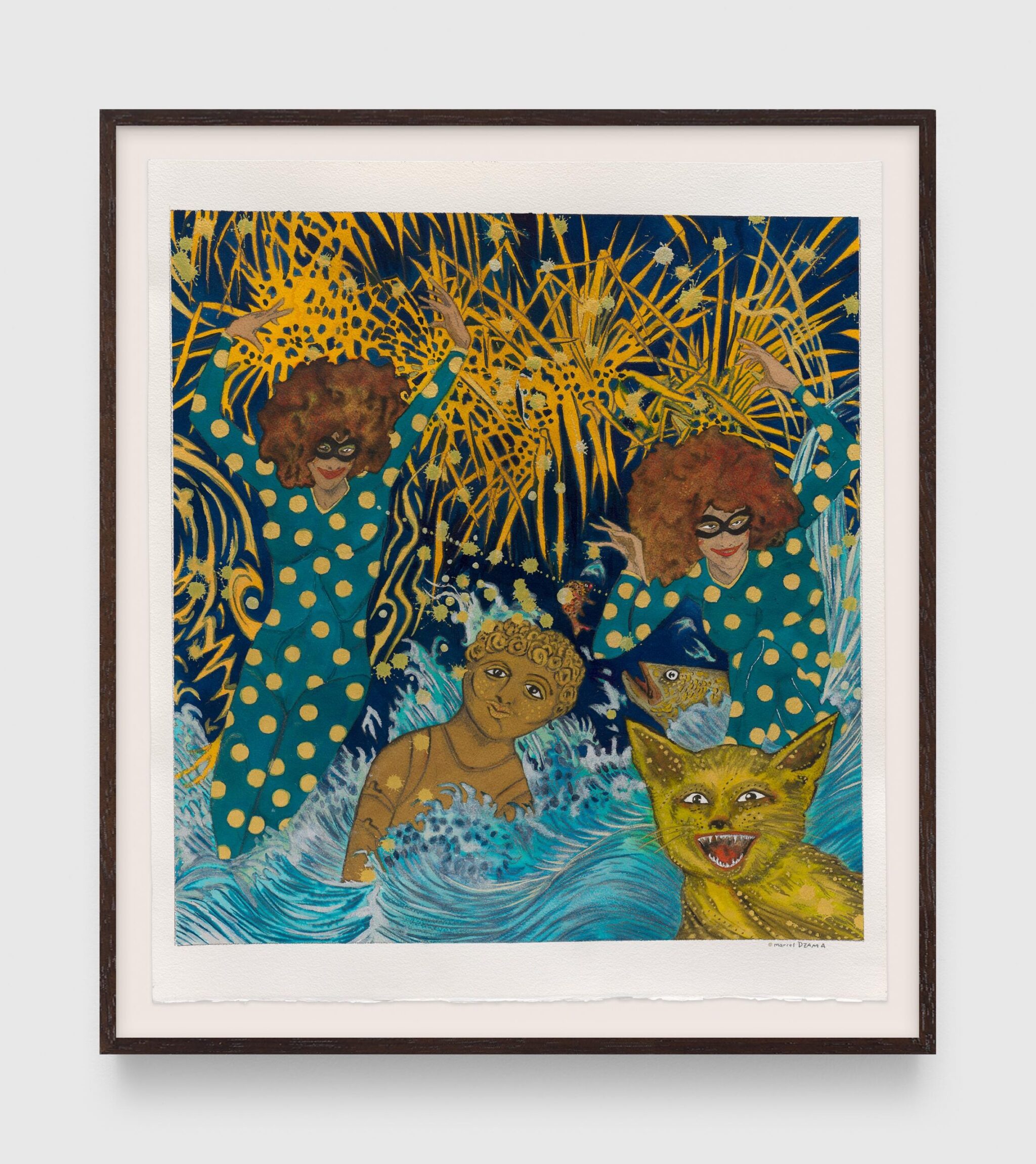
Marcel Dzama. I Am The Sun, I Am The New Year
3 February – 21 April 2026
OMR is showing a solo exhibition by Marcel Dzama titled I Am The Sun, I Am The New Year. Dzama’s paintings and drawings feature masked figures, dancers, and anthropomorphised characters set within recurring symbolic environments such as chessboards, oceans, and lunar landscapes. Drawing equally from folk vernacular, art-historical references, and contemporary culture, his work constructs a universe of childhood fantasies and otherworldly fairy tales. Shaped in part by the long, isolated winters of Winnipeg in Canada, Dzama developed a prolific drawing practice, which he has described as an “exorcism ritual” for political anger and a negotiation between dreamlike subconscious imagery and lived reality. Through a visual language that is both playful and unsettling, Dzama blends humour, surreal imagery, and fragmented narratives to create immersive worlds that offer both a momentary escape from everyday life and a subtle critique of it.
OMR Gallery
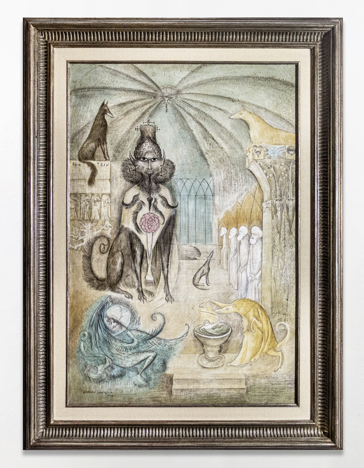
Leonora Carrington. ETHIOPS
3 February – 21 April 2026
OMR is also presenting works by Leonora Carrington, the influential British Surrealist artist who spent much of her adult life in Mexico City and became deeply embedded in its vibrant artistic community, alongside works by Remedios Varo, Alice Rahon, Wolfgang Paalen, and others. In recent years, increased scholarship has foregrounded Mexico’s profound influence on Surrealism, a movement long framed as Parisian and male-centric. It was in Mexico during the late 1930s and 1940s that Surrealism significantly expanded and diversified. Inspired by the country’s expansive landscapes, pre-Columbian mythology, traditions of witchcraft, and its relative distance from Europe’s rigid gender norms, artists working there produced some of the movement’s most visionary and radical works. Carrington’s work, in particular, has seen renewed critical and market recognition. Her paintings and writings are characterised by enigmatic female figures, hybrid human and animal forms, alchemical symbolism, and mythological narratives, articulating alternative systems of knowledge that challenge patriarchal and rationalist structures.
Kurimanzutto
Oscar Murillo. el pozo de agua
4 February – 28 March 2026
The acclaimed Colombian artist Oscar Murillo is having a solo exhibition at Kurimanzutto, titled el pozo de agua or “the water well” in English. Murillo works across a wide range of mediums, including painting, drawing, sculpture, video, performance, bookmaking, and collaborative projects with diverse communities. Murillo’s paintings are built from layered and reassembled canvases, often incorporating fragments from earlier works. Dense fields of pigment, printed marks, and gestural traces overlap across the surfaces, creating compositions that feel accumulated rather than composed. His practice is deeply concerned with materials, process, and labour, while also engaging with themes of migration, community, and the flows of exchange and commerce in a globalised world.
Galería de Arte Mexicano (GAM)
Stefan Brüggemann
Opening on 3 February 2026
Galería de Arte Mexicano brings together recent works on paper that extend Stefan Brüggemann’s text-based practice into a more immediate and exposed medium. Working on A4 sheets with graphite, oil stick, and marker, these works were not done as preparatory drawings before paintings, but as conclusions to paintings. These works on paper are where he would go to finish his thoughts and impulses once a painting was finished. The artist completed the works across his studios in London, Ibiza, and Mexico City, and used a range of paper types in different colours and textures. In these works, language is pushed toward abstraction, stretched and fragmented until meaning erodes, shifting from readable text into rhythm and visual noise. Brüggemann describes these drawings as made in “full speed mode,” emphasising feeling over rationalisation.
Travesía Cuatro
Tania Pérez Córdova
Opening on 3 February 2026
The Mexican artist Tania Pérez Córdova is having her first solo exhibition with Travesía Cuatro. Pérez Córdova’s is a Mexico City-based artist whose sculptures and interventions operate as carefully staged situations, bringing together everyday objects, subtle material shifts, and spatial placement. Working with found and industrial materials, she explores duration, absence, and the lifespan of objects. The artist’s interest in everyday events underscores how seemingly insignificant situations can be linked to the infrastructure of our social and economic reality, as well as to the complexity of the contemporary world. The exhibition unfolds quietly, with works that register fragility and change through minimal gesture and restrained form.
Georgina Pounds Gallery
Vanessa Raw. Monsters Paradise: The Becoming of Her Divine Beast
4 February – 22 March 2026
Georgina Pounds Gallery opens in Roma Norte with a solo show of works by Vanessa Raw, Monsters Paradise: The Becoming of Her Divine Beast. In her first solo exhibition in the city Raw presents large-scale paintings that centre on female figures set within lush, imagined landscapes, characteristic of her usual style. Her paintings combine heightened colour, fluid brushwork, and symbolic detail, moving between dream, myth, and interior states.
Museums and Institutions
La Cuadra Barragán
Félix González-Torres
8 February – 5 April 2026
Curated by Pablo León de la Barra, La Cuadra will host an exhibition that proposes a dialogue between the poetic works of Félix González-Torres and the iconic architecture of La Cuadra Barragán.
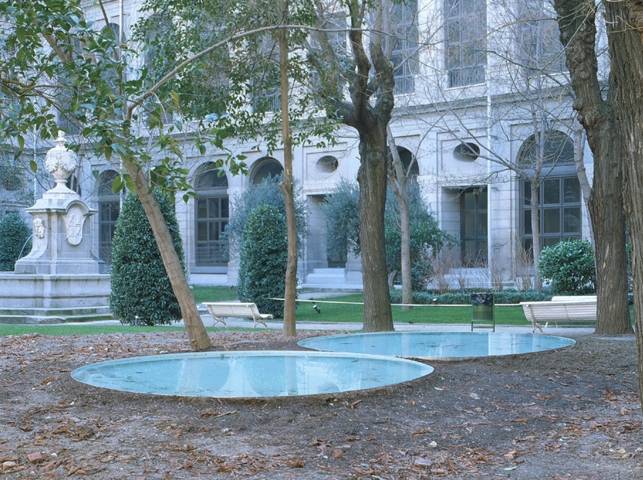
Designed by one of Mexico’s most celebrated architects, Luis Barragán, La Cuadra is a striking residential complex conceived as a house and horse stables arranged around an enclosed courtyard. La Cuadra Barragán is recognisable for its distinctive coloured walls, bold planes, and integration of water and landscape. Exemplifying Barragán’s poetic modernism, the site blends minimalist architecture with emotional warmth. Today, La Cuadra functions as a cultural site, with the stables preserved as part of the estate’s history, offering regular tours and hosting artist interventions within the space. A total of six works by González-Torres will be displayed throughout La Cuadra Barragán. One of the works included is “Untitled” (Sagitario) (1994–95), which is composed of two large circular reflecting pools set flush with the floor, positioned so closely that water can almost move between them. Responsive to light, sound, and movement within the space, the pools produce delicate visual shifts. The work is quintessential within the artist’s oeuvre, exemplifying his poetic conceptualism through quiet interactions that emphasise proximity and physical presence. The work also calls to mind his legendary “Untitled” (Perfect Lovers), which consists of two identical clocks hung side by side and has become one of the most iconic and widely recognised works of late 20th-century conceptual art. The show will also include “Untitled” (1989), a seminal work often referred to as González-Torres’s “dateline” or “frieze” piece. Comprising text—names, dates, locations, and historical events—painted directly onto the upper part of walls, the work interweaves personal milestones with shared historical moments. The artist did not limit the inscriptions to events between his birth and death; instead, institutions that have shown the works have become co-owners of the work, adding and subtracting events over time. In doing so, the installation and the artist himself are granted a form of renewable life, underscoring the mutable and open-ended nature of human identity.
Bringing González-Torres’s understated, lyrical works into dialogue with Barragán’s architecture, the exhibition offers a deeply poetic encounter in which space, time, and presence resonate in quiet harmony.
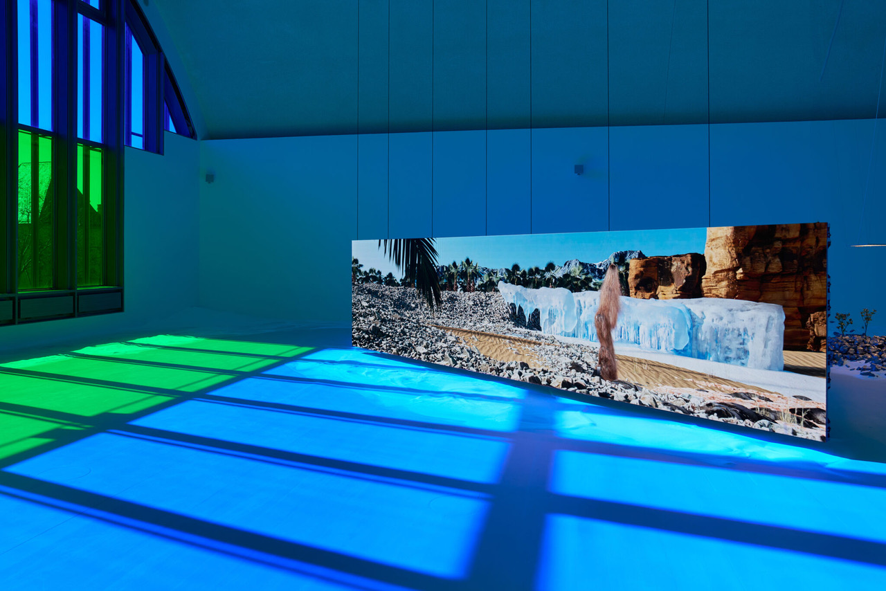
Lago Algo
Chapter VIII: Hallucinations. Trevor Paglen and Troika
5 February – 31 May 2026
At Lago Algo, inventive thinking drives every project, from immersive exhibitions to culinary experiences, all set within a striking lakeside venue. They are presenting Chapter VIII: Hallucinations, a group show of works by Trevor Paglen, an American artist and geographer, and Troika, an artist trio formed by Eva Rucki, Conny Freyer and Sebastien Noel. The exhibition explores how perception is shaped by technological systems, moving between machine vision, natural forms, and constructed environments. Troika presents immersive installations where organic and synthetic elements intertwine, suggesting alternative modes of intelligence and sensing. Paglen’s works focus on the visual infrastructures of surveillance and artificial intelligence, using photography and image-based systems to reveal how machines classify, generate, and interpret the world.
Museo Jumex
Gabriel de la Mora: La Petite Mort
25 September 2025 – 8 February 2026
Museo Jumex is a major contemporary art museum in Mexico City, featuring a remarkable collection and vibrant exhibition program housed in a striking building designed by David Chipperfield. Their survey exhibition Gabriel de la Mora: La Petite Mort, explores two decades of the artist’s practice. Born in 1968 in Mexico City, where he currently lives and works, he is best known for constructing visual works from found, discarded, and obsolete objects. Through alchemic processes, he transforms materials such as butterfly wings, eggshells, shoe soles, human hair, and reclaimed architectural surfaces into alluring surfaces, exquisite objects and beautifully tactile works. These meticulous, craft-based methods are often set against processes driven by fire, water, or erosion.
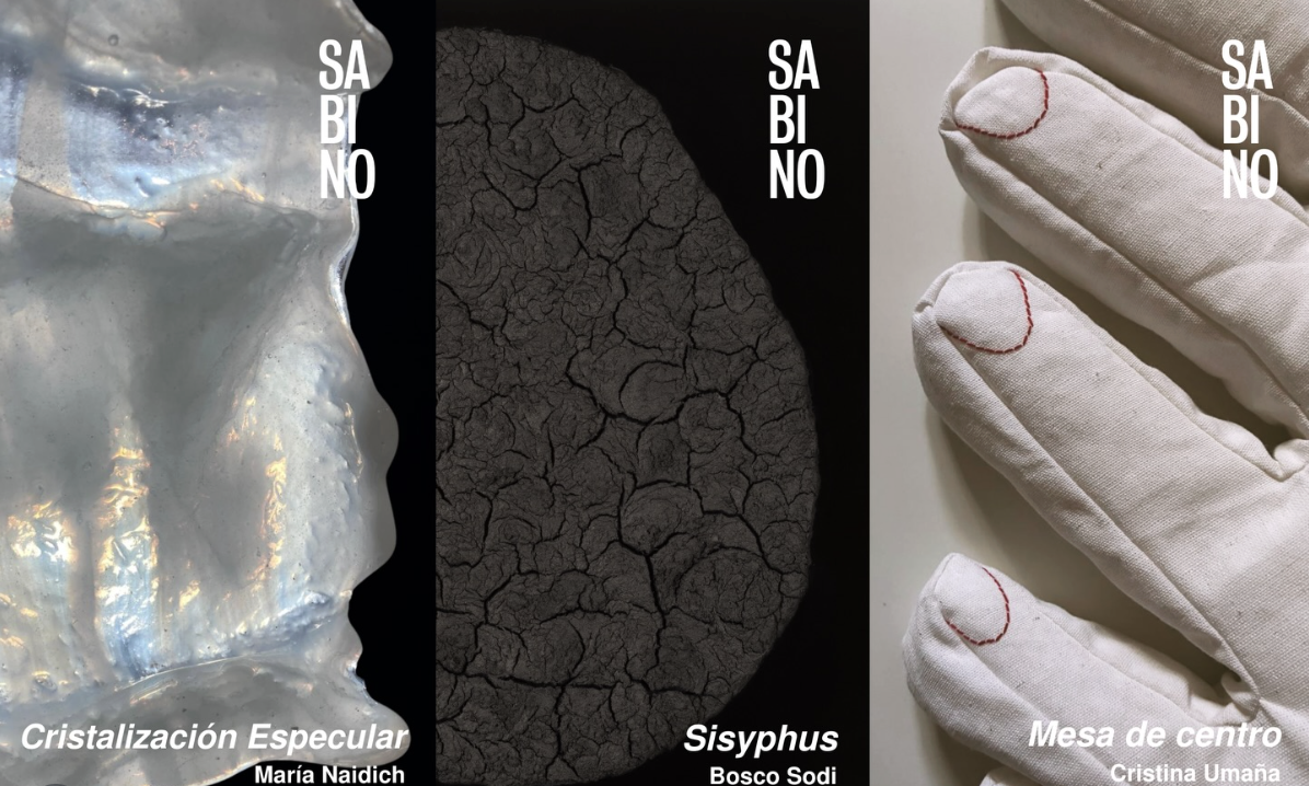
Fundación Casa Wabi
María Naidich
Cristina Umaña
Bosco Sodi
Opening on 3 February
Fundación Casa Wabi, Mexico City presents a group of concurrent exhibitions that centre on material transformation and process. Specular Crystallization by María Naidich explores glass as a medium shaped by heat, tension, and controlled instability. Cristina Umaña’s Coffee Table works with textile and soft structures, translating domestic forms into tactile objects. In Sisyphus, Bosco Sodi continues his engagement with raw, natural materials such as clay, pigment, and volcanic rock, allowing physical processes to determine form. Together, these exhibitions approach materiality through distinct materials, from glass and textile to clay, pigment, and volcanic rock, each shaped by its own physical process.
20 Minimal and Conceptual Visionaries We Follow
In this article, LVH Art brings together a list of key Minimalist artists and others whose work continues its sensibilities in new ways.
Emerging in the early 1960s, Minimalism marked a decisive shift in postwar art by insisting on the primacy of the object and its immediate spatial conditions. Artists associated with the movement pursued an aesthetic of radical reduction, privileging geometry, serial structures, and industrial materials in an effort to dismantle the illusionism and overt subjectivity that had defined much of mid-century abstraction. Rather than functioning as vehicles for symbolic meaning, Minimalist works asserted their presence within the viewer’s physical environment, generating what critic Michael Fried famously called “theatricality” through their attention to scale, duration, and the phenomenological encounter.
Yet Minimalism’s impact extends well beyond its foundational figures. The movement’s clear approach and attention to perception shaped later generations, who took its ideas in new, more sensory directions. The influence of Minimalism can therefore be traced not only in strict geometric abstraction but also in practices that foreground light, colour, atmosphere, and material conditions as primary artistic concerns.
This article presents a curated list of artists central to the Minimalist agenda alongside those whose work reflects its enduring legacy. Each engages, in different ways, with questions of presence, perception, and the viewer’s role in completing the artwork. This is a dialogue that continues to shape contemporary understandings of abstraction and spatial experience.
Artist List
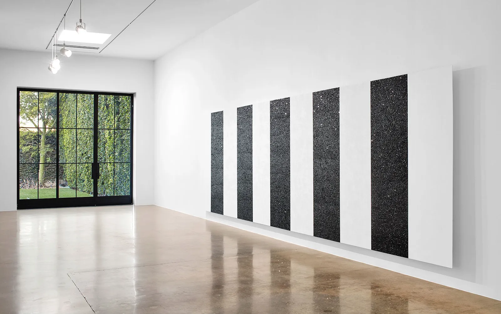
Jo Baer, Larry Bell, Mary Corse, Walter De Maria, Dan Flavin, Carmen Herrera, Roni Horn, Robert Irwin, Ann Veronica Janssens, Donald Judd, Ellsworth Kelly, Imi Knoebel, Sol LeWitt, Robert Mangold, Agnes Martin, Kenneth Noland, Park Seo-Bo, Robert Ryman, Richard Serra, Ettore Spalletti.
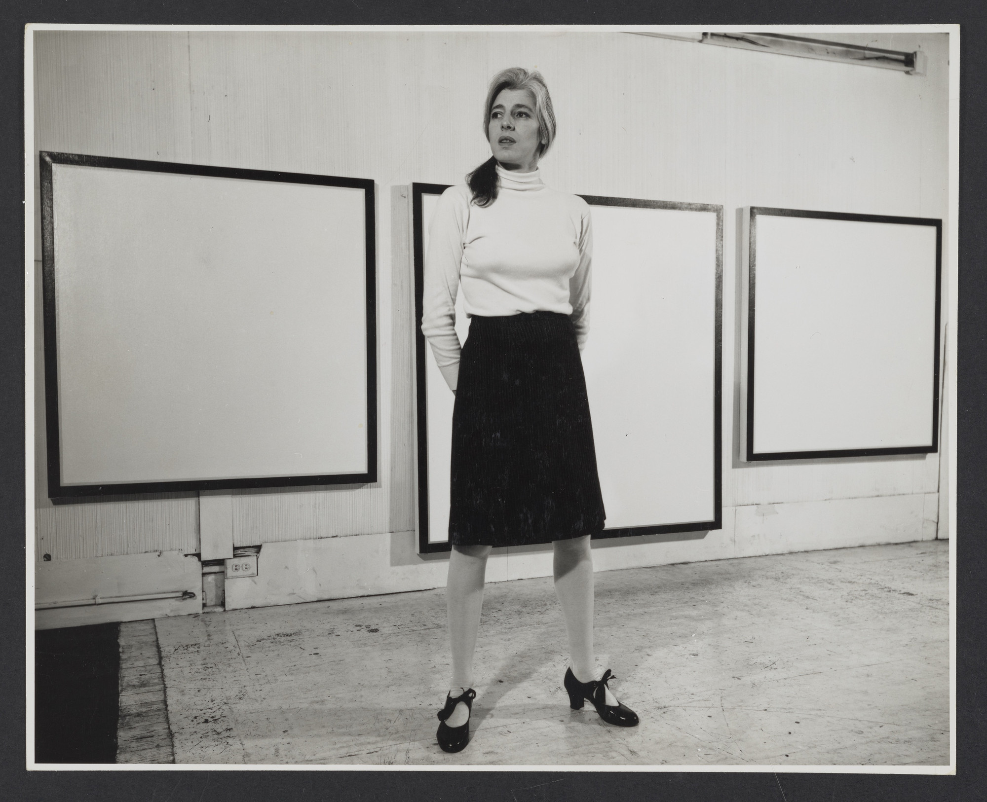
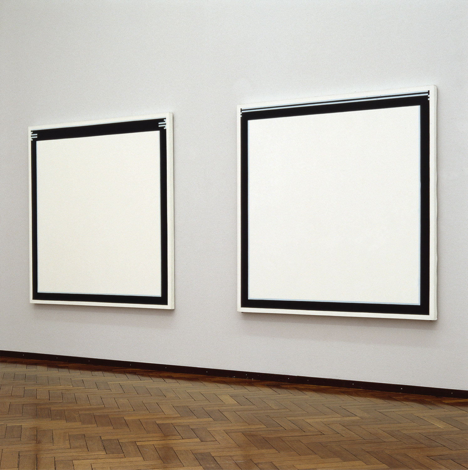
Jo Baer
Jo Baer (b. 1929, Seattle, Washington, United States – d. 2025, Amsterdam, Netherlands) developed a highly reductive form of painting in the 1960s, best known for her “hard-edge” works that frame the canvas with measured bands of colour. Her practice examined how the perimeter of a painting can determine visual attention, making the edge an active structural component.
Larry Bell
Larry Bell (b. 1939, Chicago, Illinois, United States) is known for his investigations into reflection, transparency, and optical phenomena through glass sculpture. Using vacuum-coating technology, he produces cubes, panels, and architectural installations that demonstrate the behaviour of light on treated surfaces.
Mary Corse
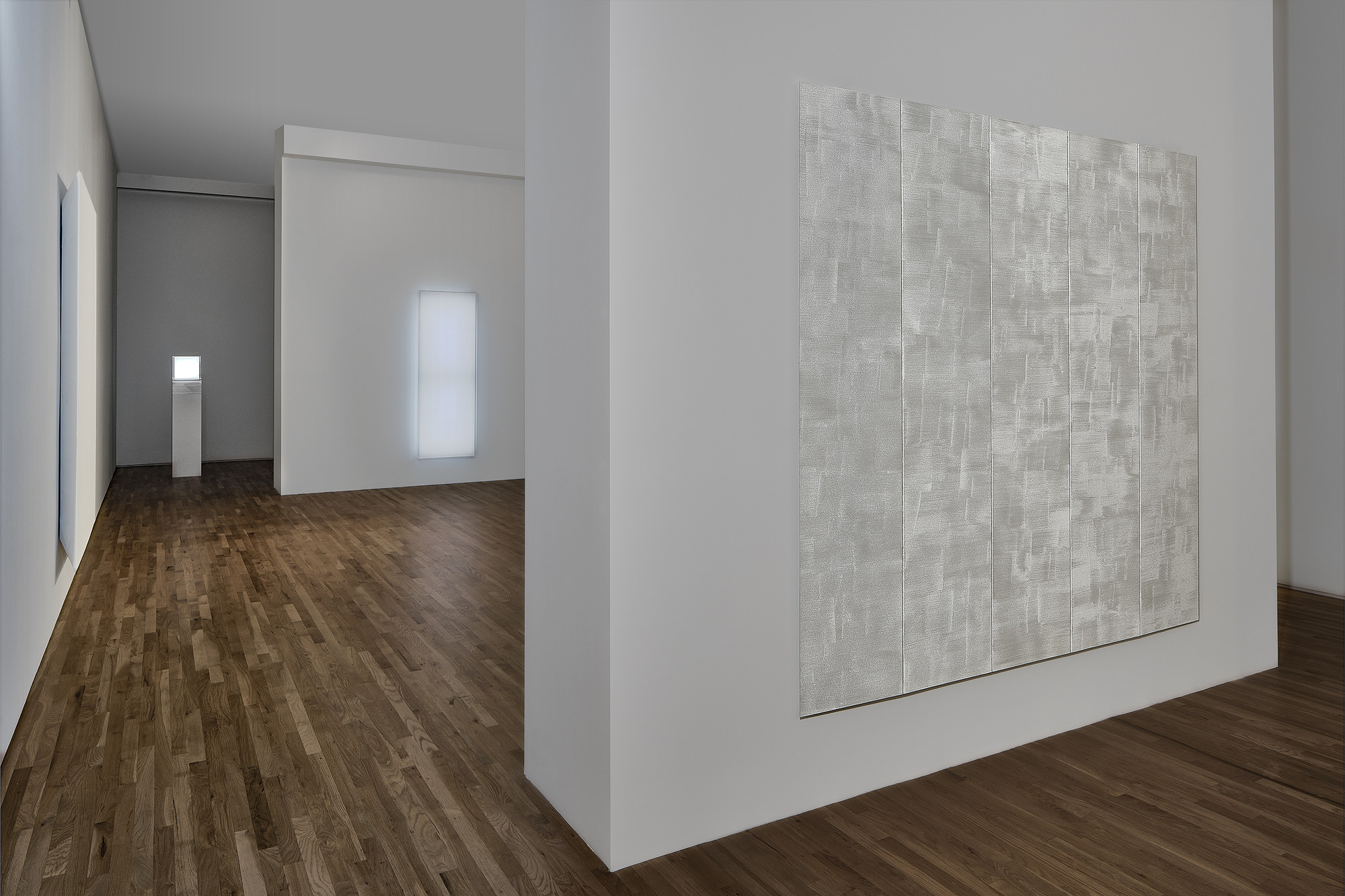
Mary Corse (b. Berkeley, California, United States) works with glass microspheres, acrylic, and reflective materials to create monochrome paintings that shift with changing light. Her practice emphasises perception and the viewer’s movement, aligning with the light-based experiments of the Los Angeles art scene.
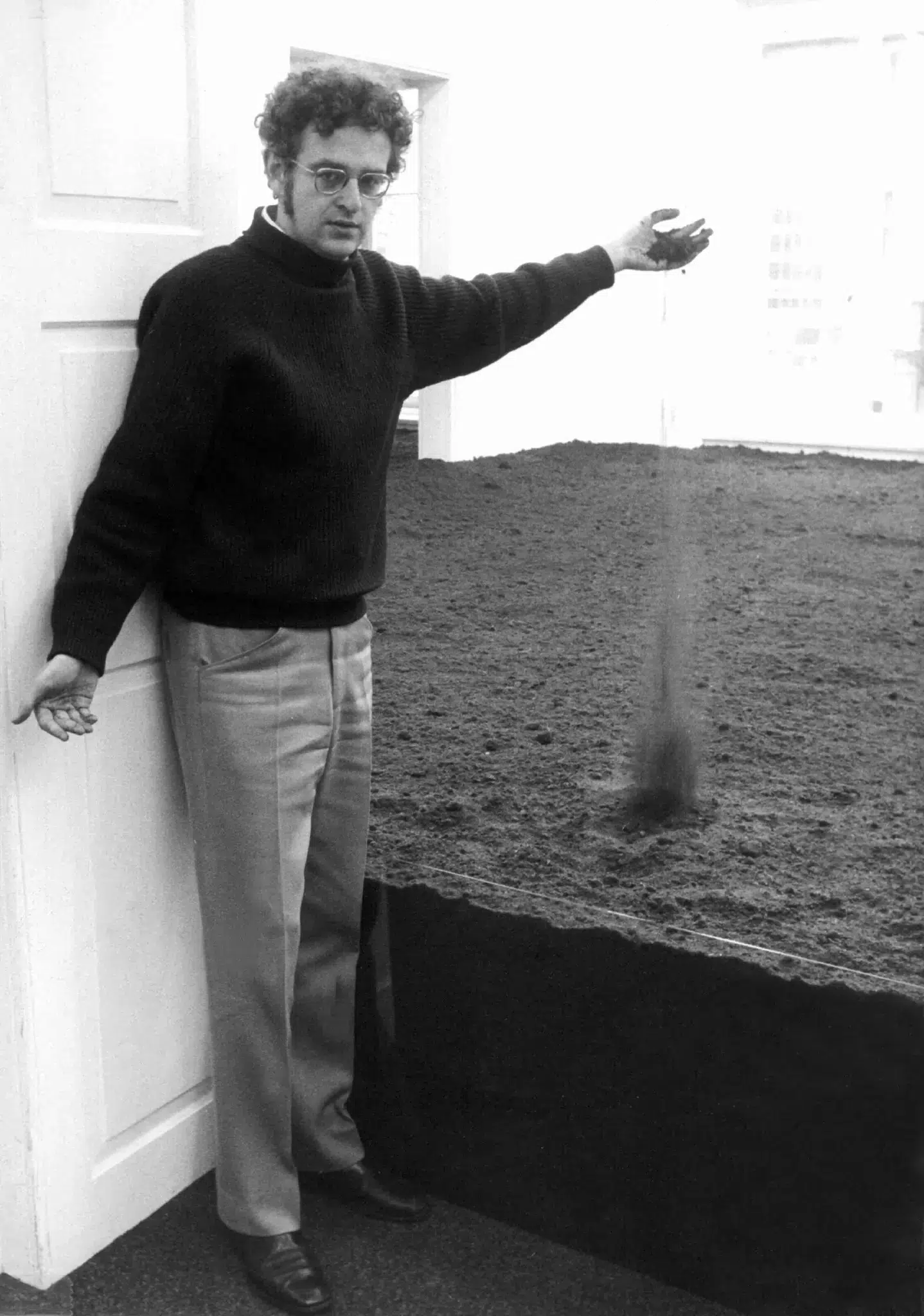
Walter De Maria
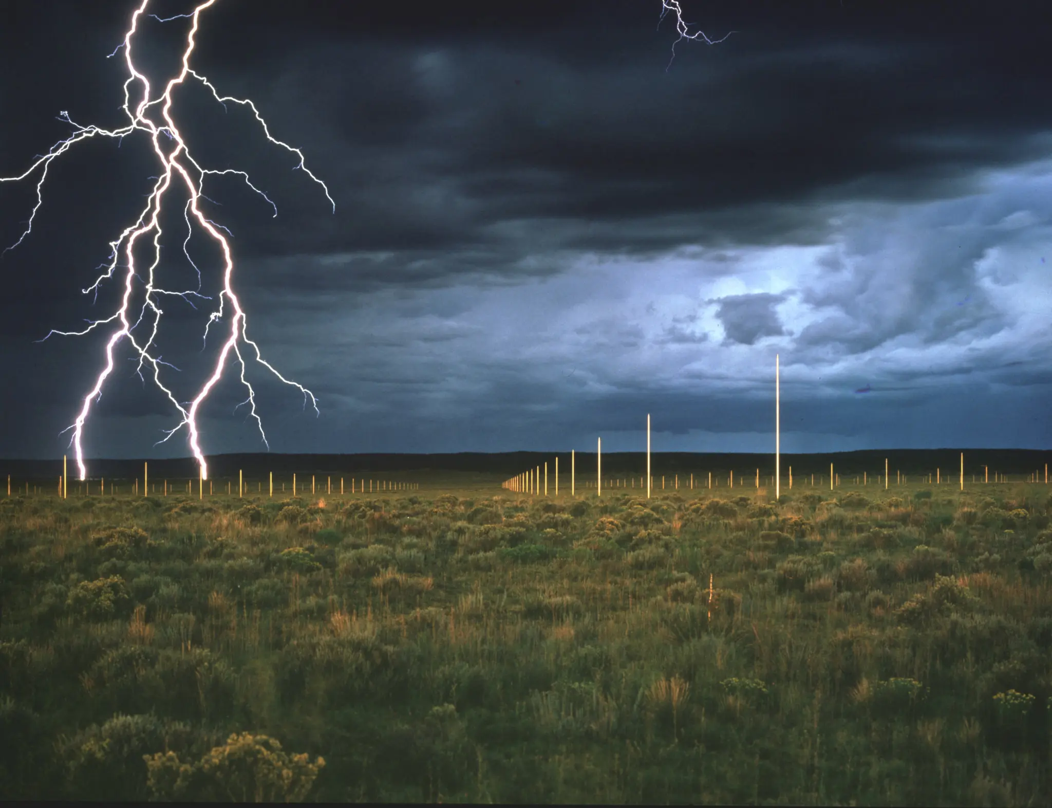
Walter De Maria (b. 1935, Albany, California – d. 2013, Los Angeles, California, United States) expanded Minimalist principles into large-scale, site-specific works. His practice combines geometric organisation with natural forces, most notably in The Lightning Field (1977), which uses a grid of metal poles to register weather and duration.
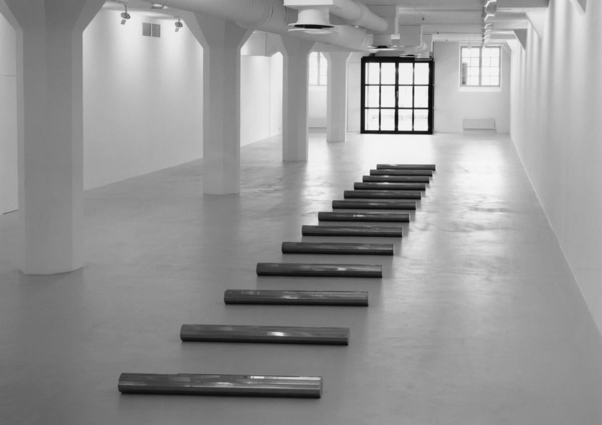
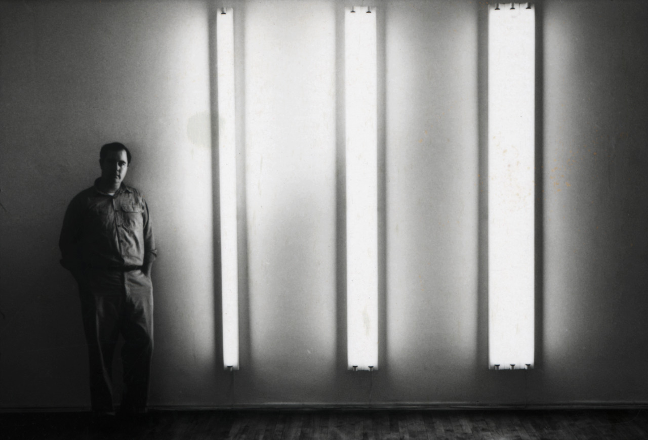
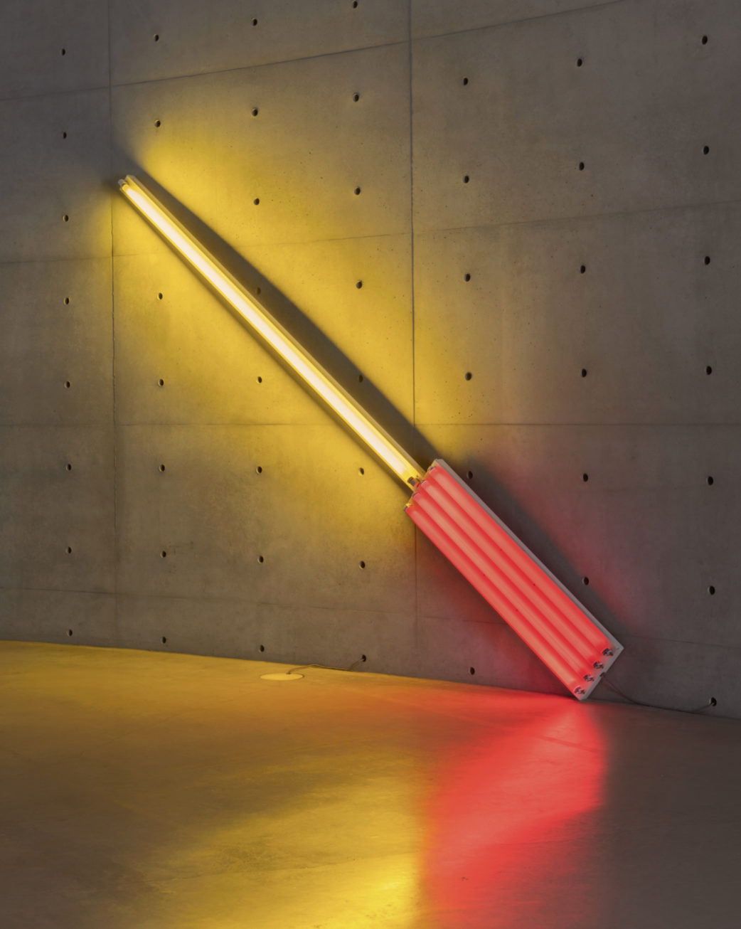
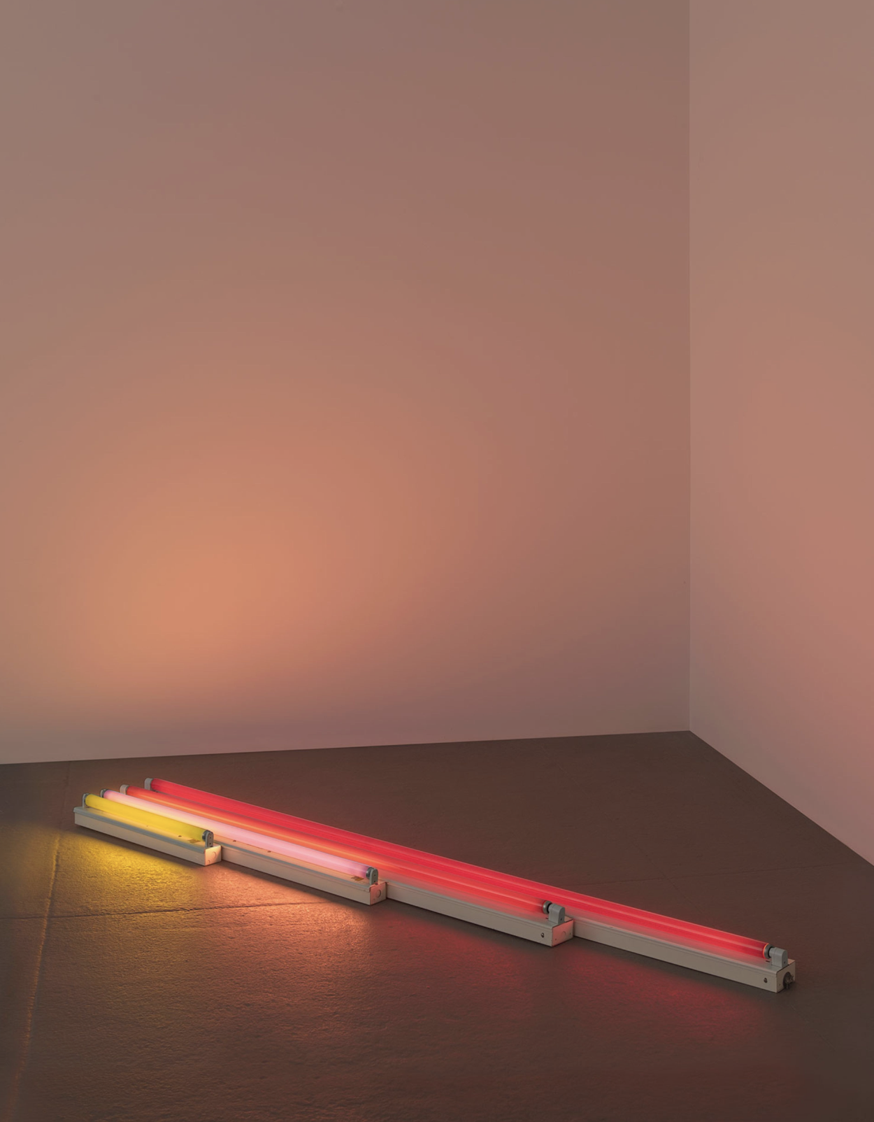
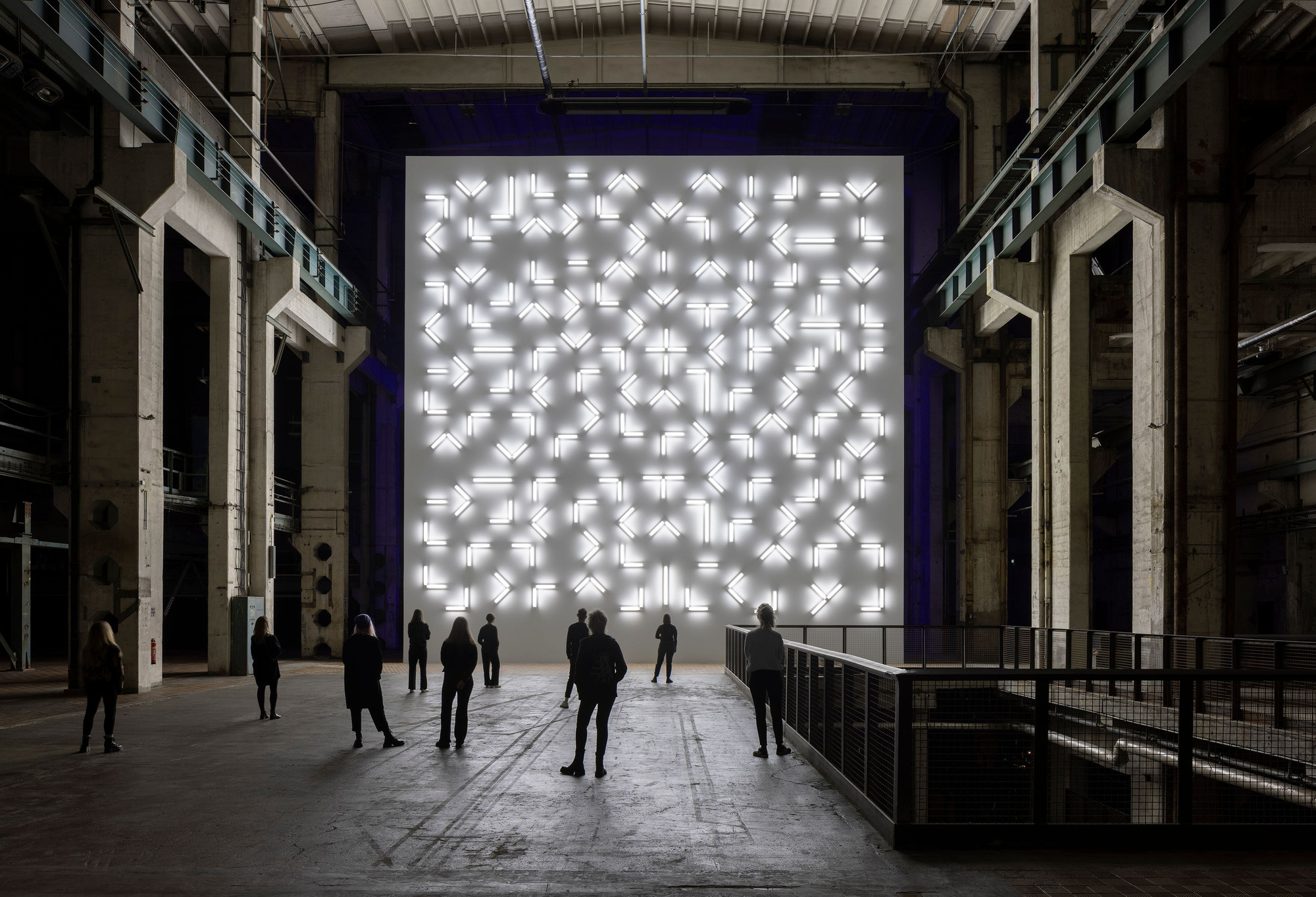
Dan Flavin
Dan Flavin (b. 1933, New York, New York – d. 1996, Riverhead, New York, United States) employed commercially produced fluorescent tubes to create installations defined by colour and spatial configuration. His work focuses on the physical properties of light and its ability to articulate architectural space.
Carmen Herrera
Carmen Herrera (b. 1915, Havana, Cuba – d. 2022, New York, New York, United States) produced sharply defined geometric paintings characterised by distilled forms and high-contrast colour. Her practice reduces composition to its essential elements, aligning with Minimalist concerns while emerging independently through decades of disciplined, pared-down abstraction.
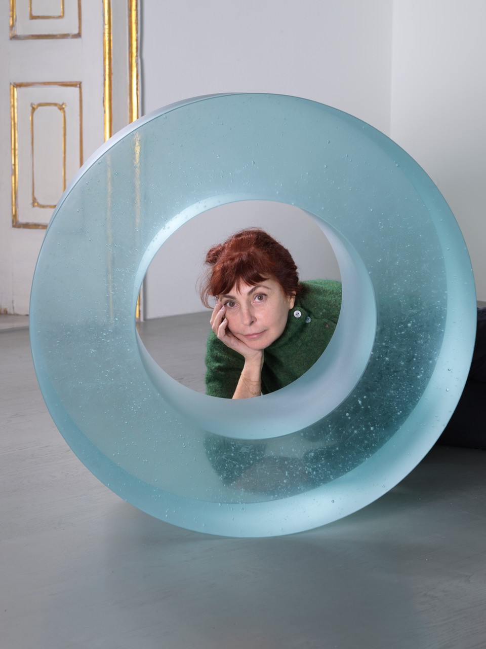
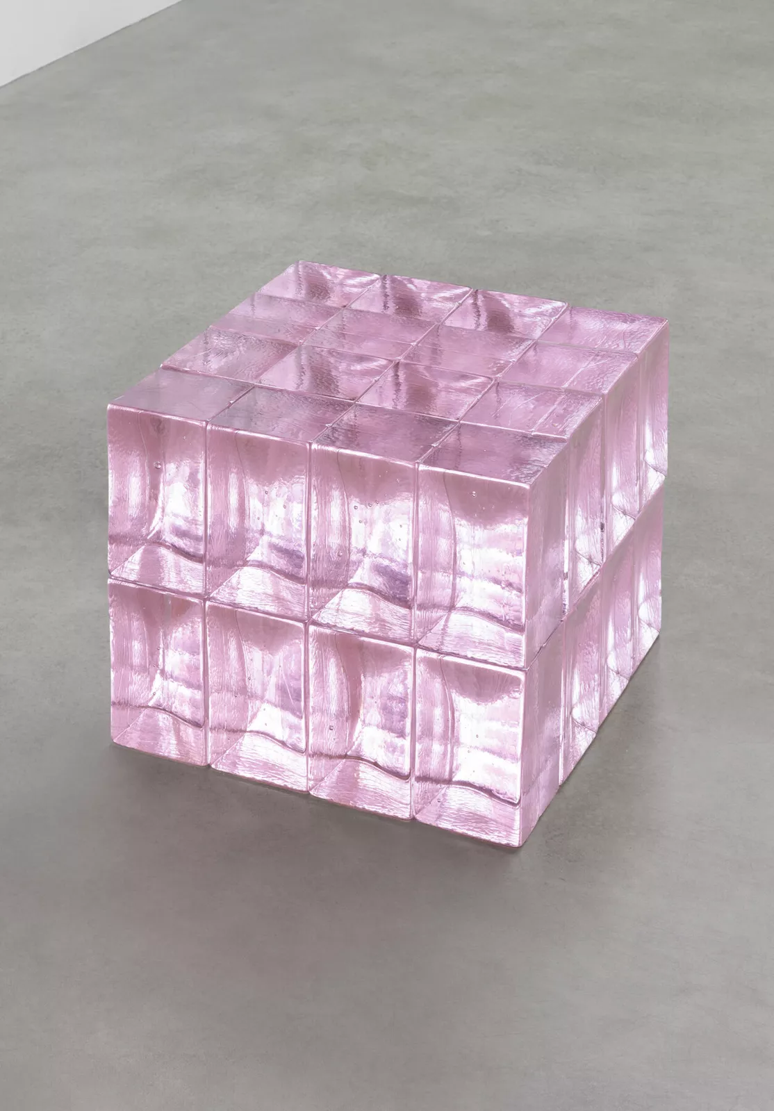
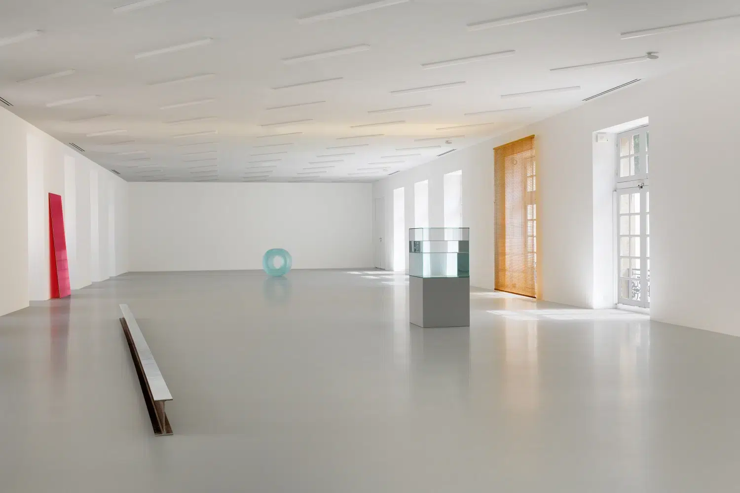
Roni Horn
Roni Horn (b. 1955, New York, New York, United States) works across sculpture, photography, and works on paper, often using serial formats and repeated forms. Her cast-glass sculptures, books, and photographic sequences examine how material, context, and weather affect perception over time.
Robert Irwin
Robert Irwin (b. 1928, Long Beach, California – d. 2023, San Diego, California, United States) shifted from painting to perceptual installations that use scrims, framing devices, and altered environments to direct attention to light and spatial conditions. His practice is grounded in phenomenology and the study of how vision operates in real space.
Ann Veronica Janssens
Ann Veronica Janssens (b. 1956, Folkestone, United Kingdom) creates installations that use light, colour, haze, and reflective surfaces to alter spatial perception. Her work centres on direct sensory experience, inviting viewers to navigate environments where vision becomes uncertain and atmospheric conditions define the encounter.
Donald Judd
Donald Judd (b. 1928, Excelsior Springs, Missouri – d. 1994, Manhattan, New York, United States) developed a body of work defined by precise, industrially fabricated objects he termed specific objects, which sit between painting and sculpture. Using materials such as aluminium, steel, plywood, and plexiglass, he created boxes, stacks, and progressions arranged in serial formats that emphasise clarity, repetition, and the object’s direct relationship to space. His practice removed illusion and narrative entirely, focusing instead on how form, material, and spatial conditions structure the viewer’s physical experience of the work.
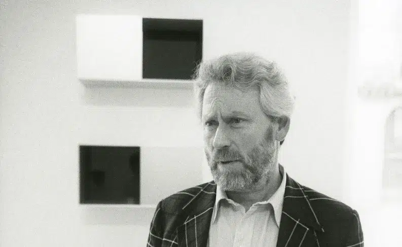
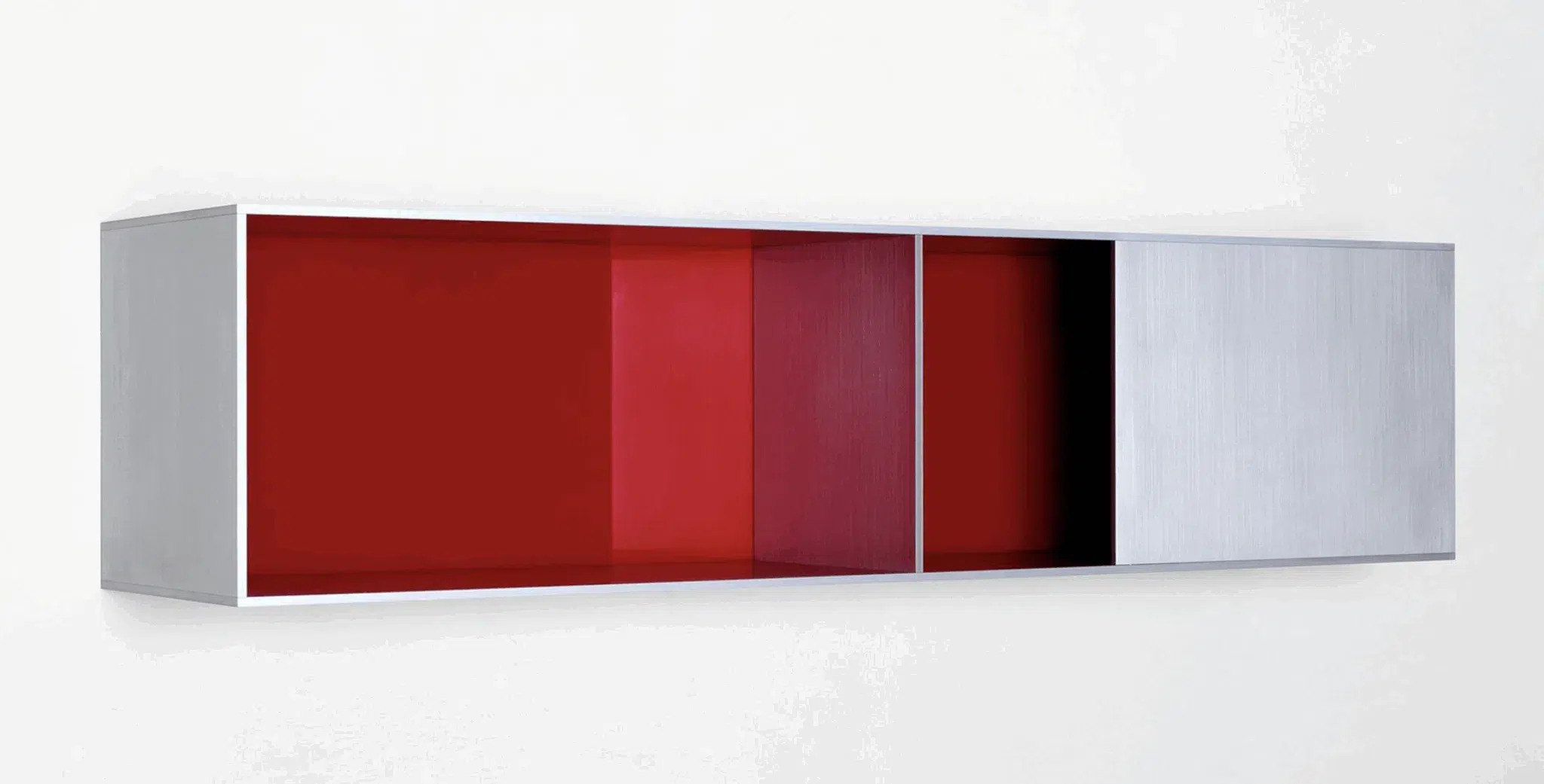
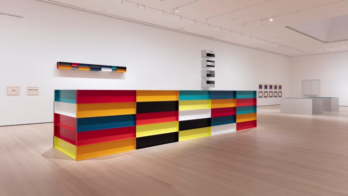
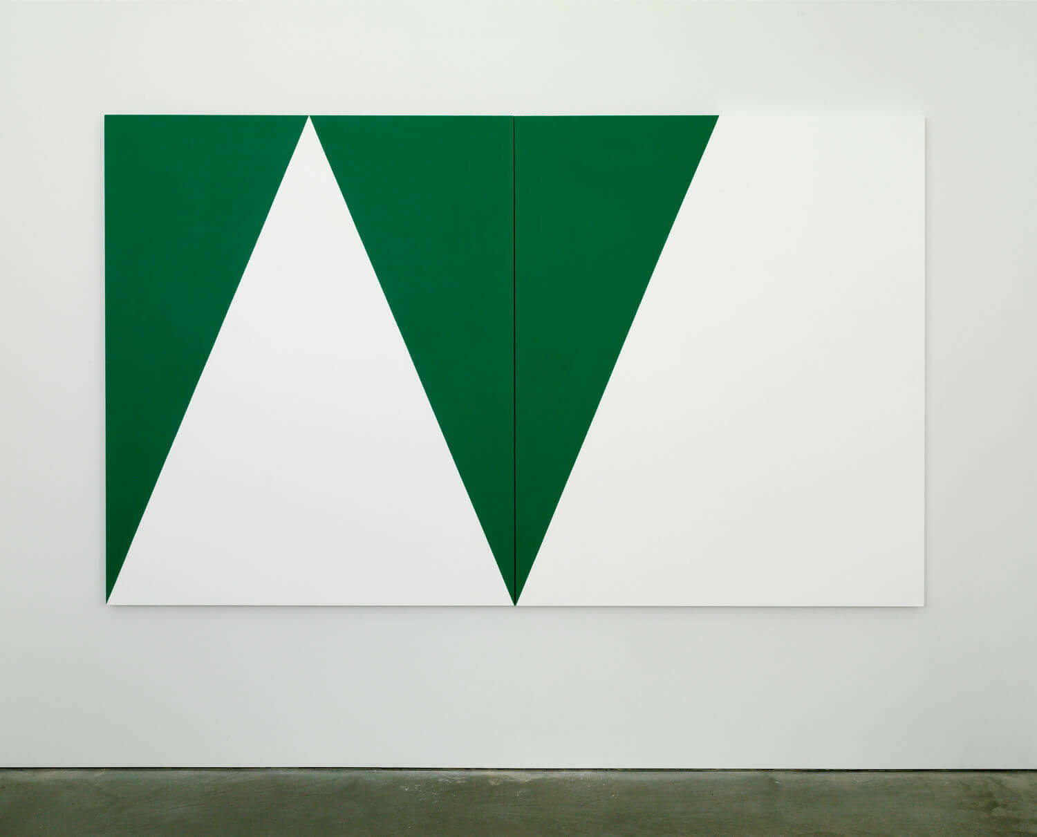
Ellsworth Kelly
Ellsworth Kelly (b. 1923, Newburgh, New York – d. 2015, Spencertown, New York, United States) is known for his shaped canvases, monochrome panels, and precise use of colour. His practice draws on the observation of forms in the natural and built environment, translating them into abstract compositions of clarity and simplicity.
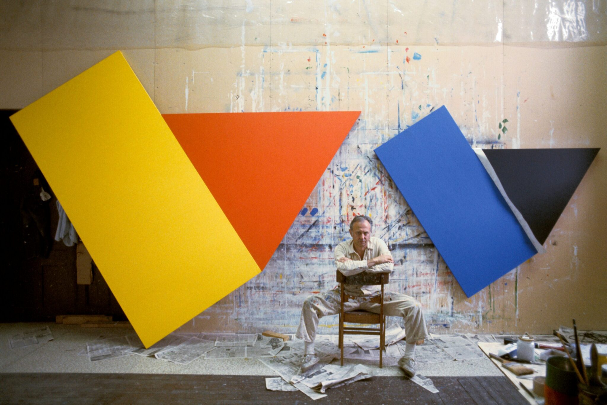
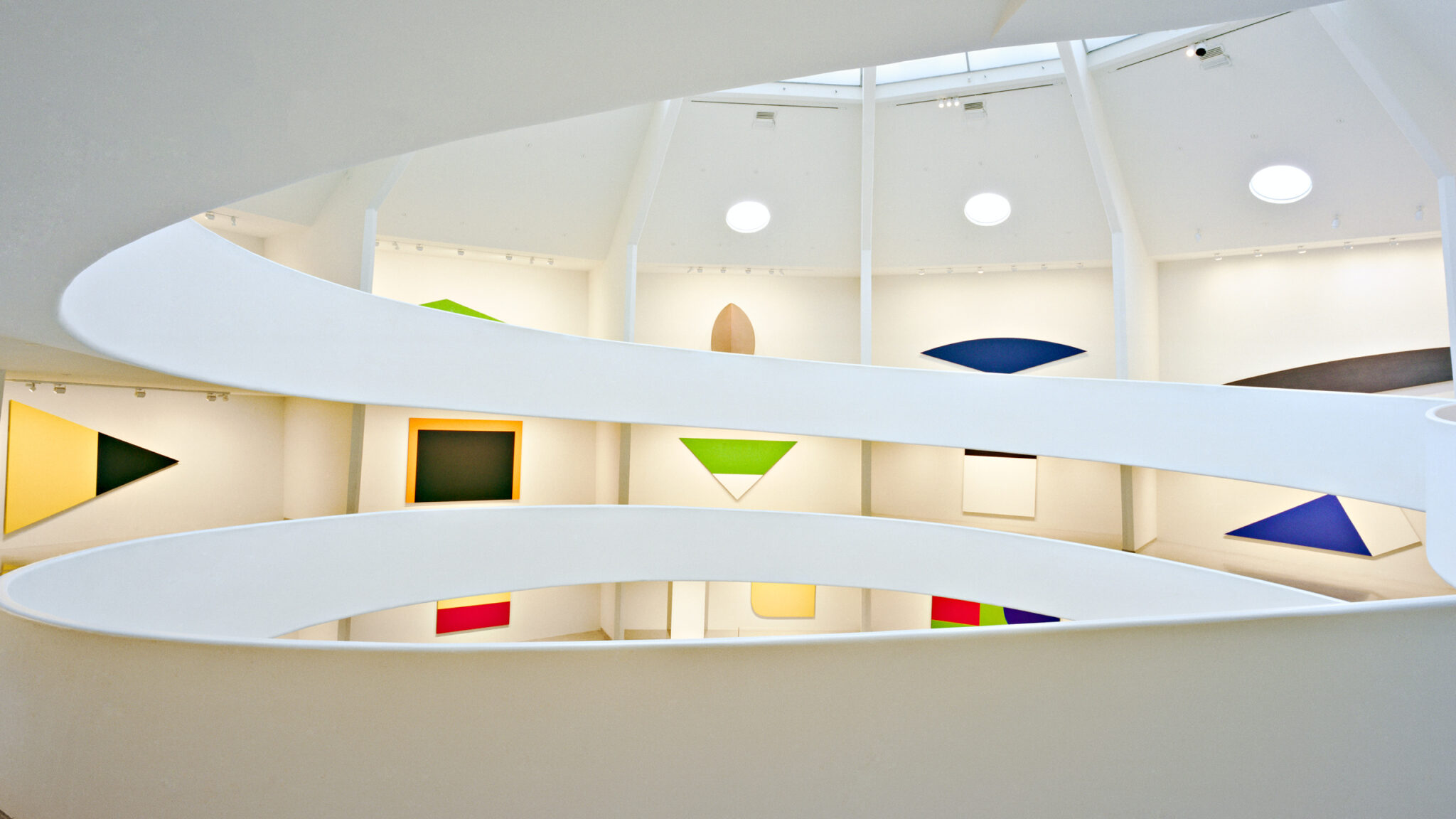
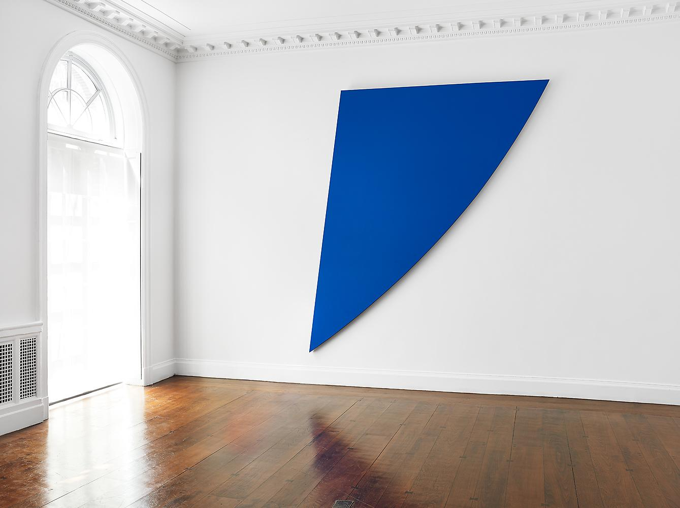
Imi Knoebel
Imi Knoebel (b. 1940, Dessau, Germany) works with painted panels, modular forms, and industrial materials to explore the relationship between colour, shape, and spatial arrangement. His practice draws on Constructivist and Minimalist principles, often using repetition and variation to test how simple geometric elements can generate complex visual structures.
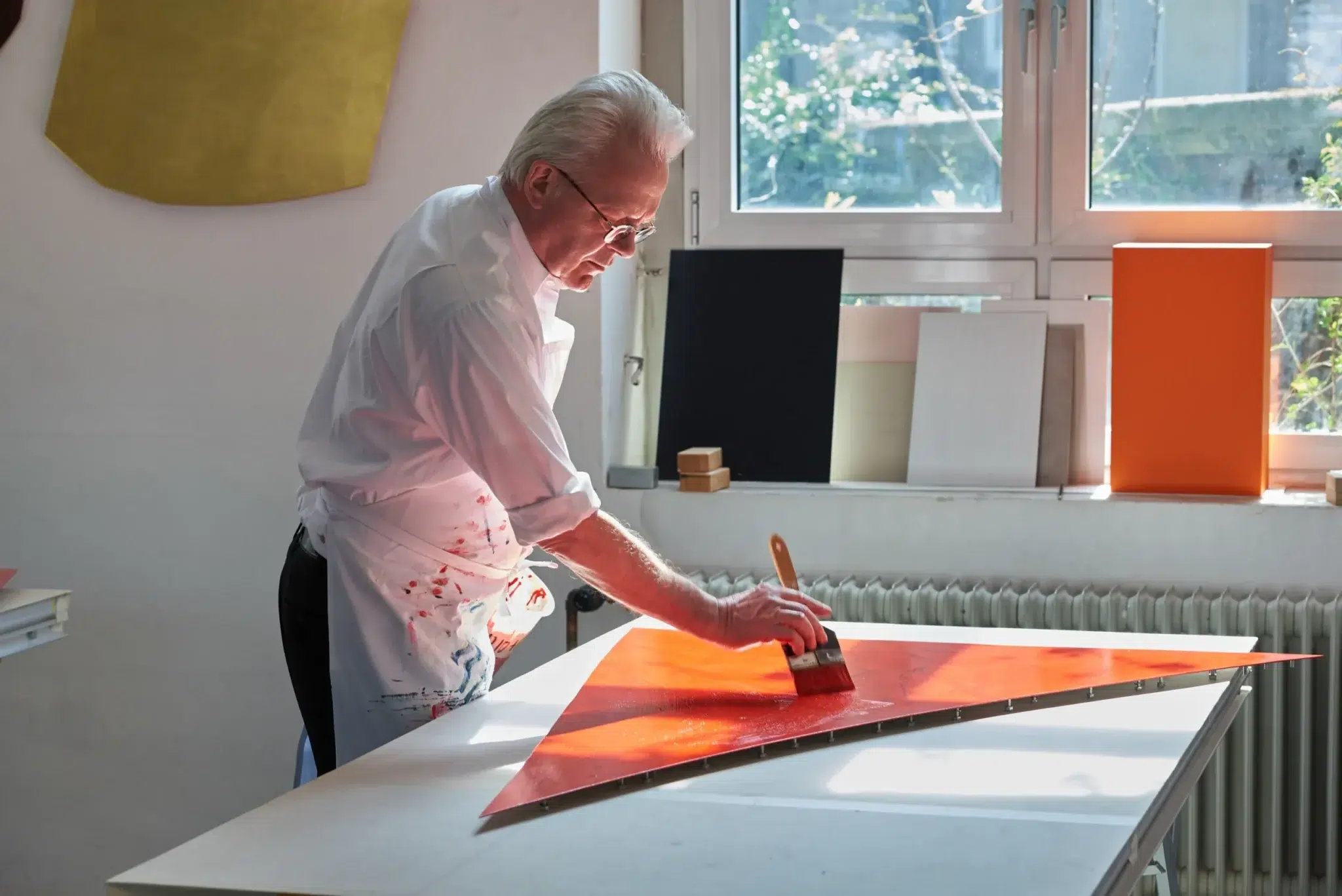
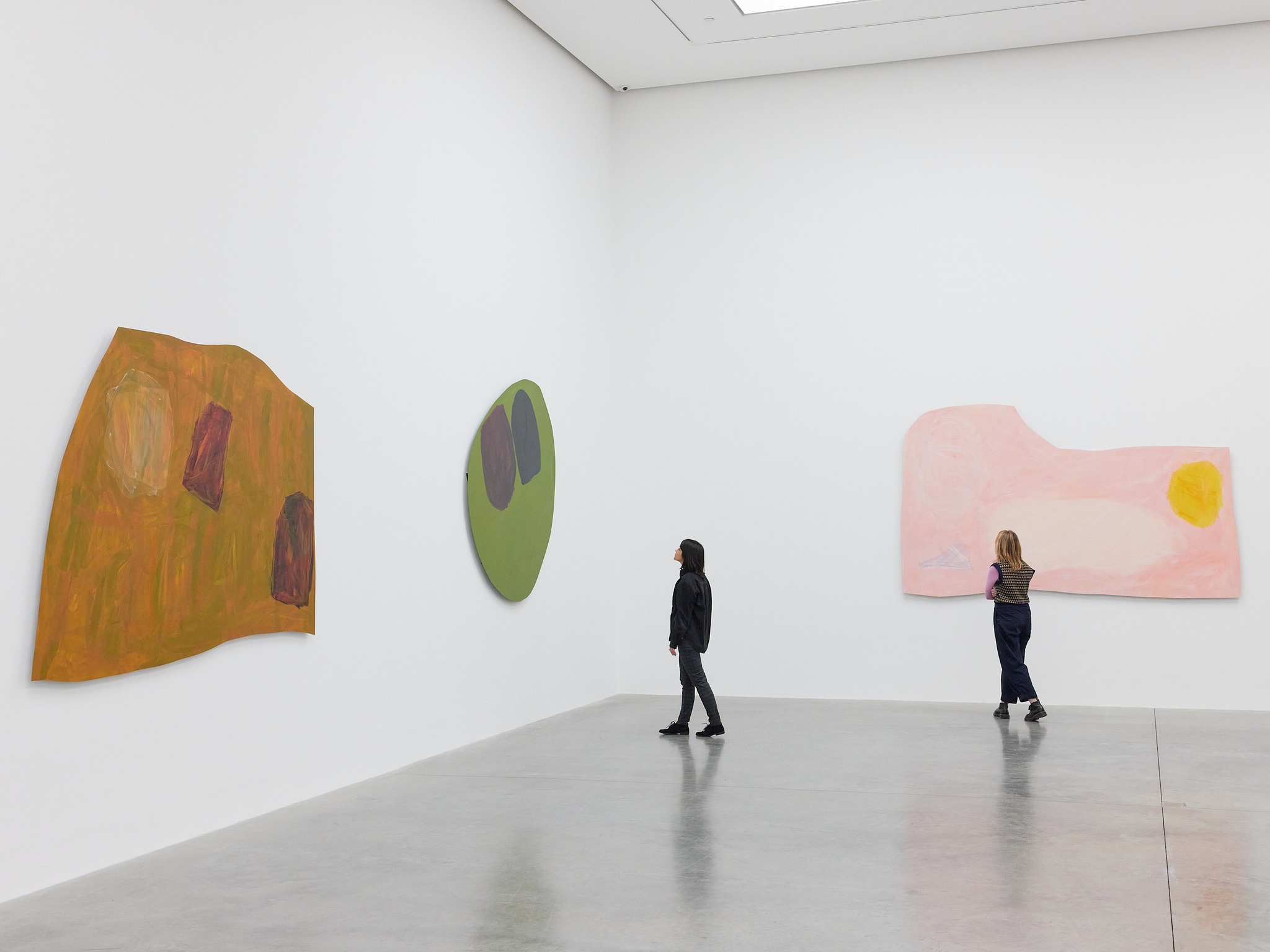
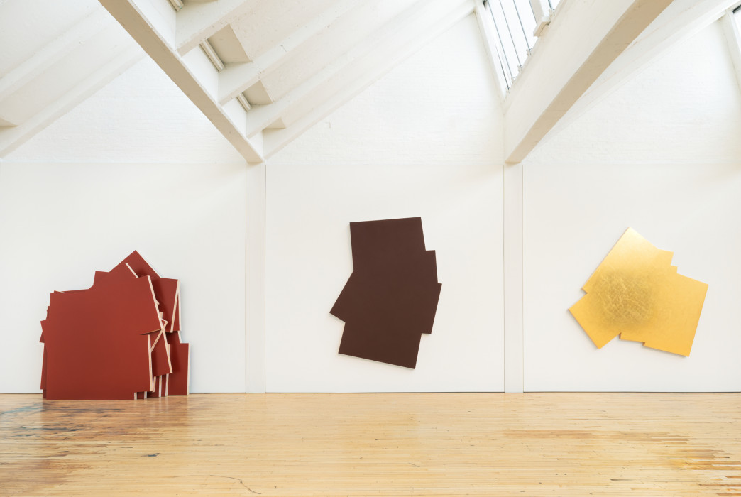
Sol LeWitt
Sol LeWitt (b. 1928, Hartford, Connecticut – d. 2007, New York, New York, United States) introduced instruction-based wall drawings and modular “structures” grounded in serial and geometric systems. His work emphasises the primacy of the idea and follows strict procedural logic, forming a key bridge between Minimalism and Conceptual art.
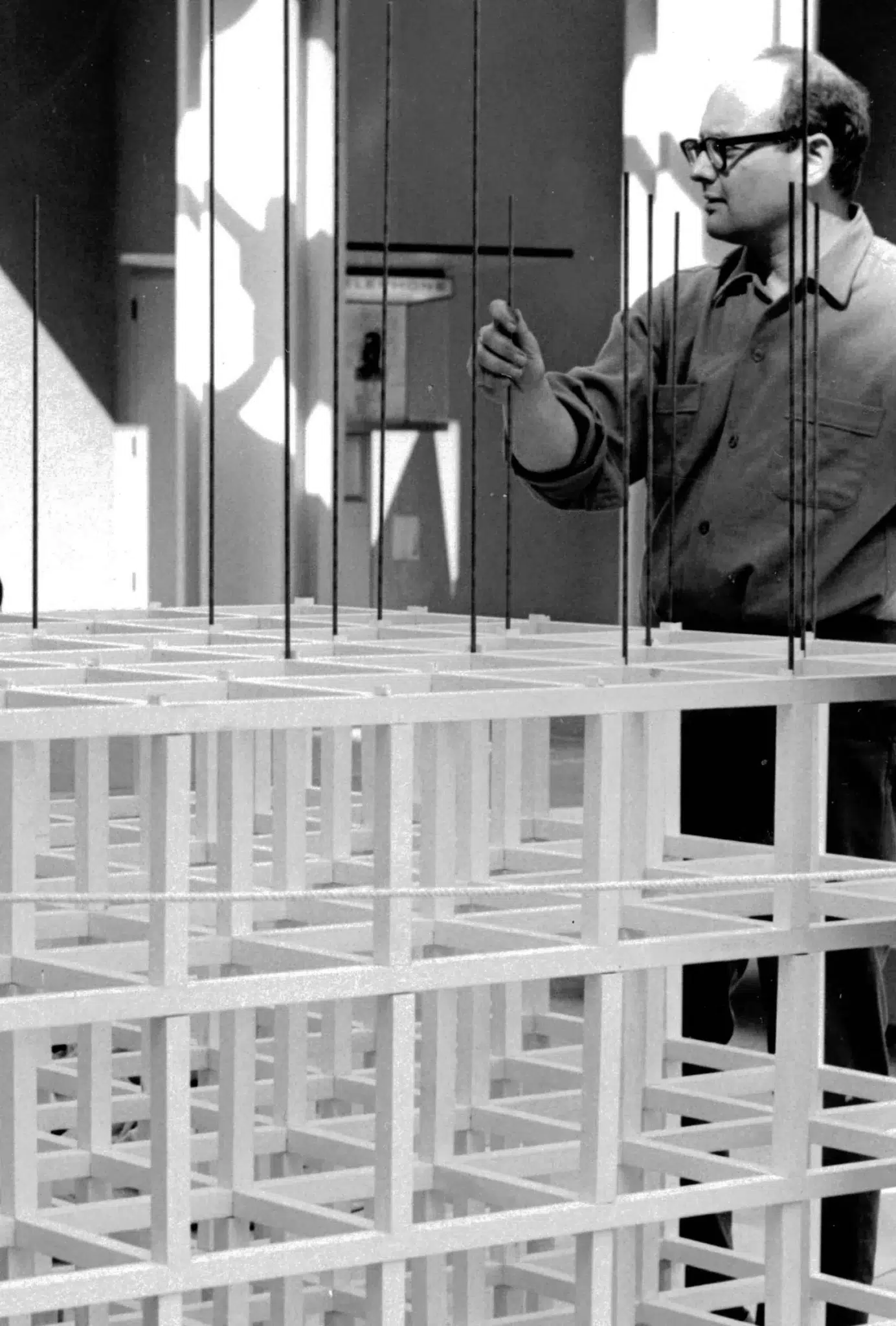
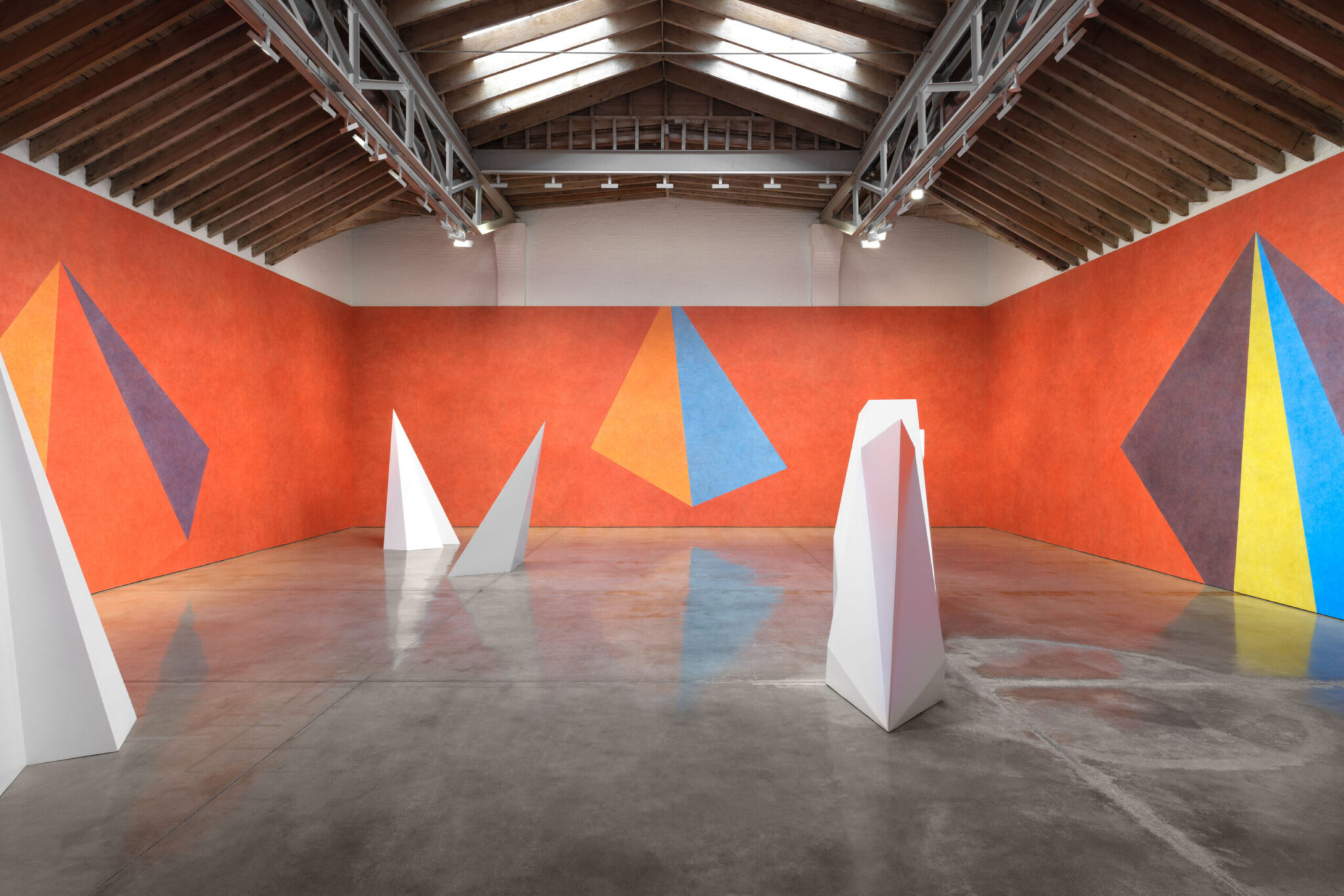
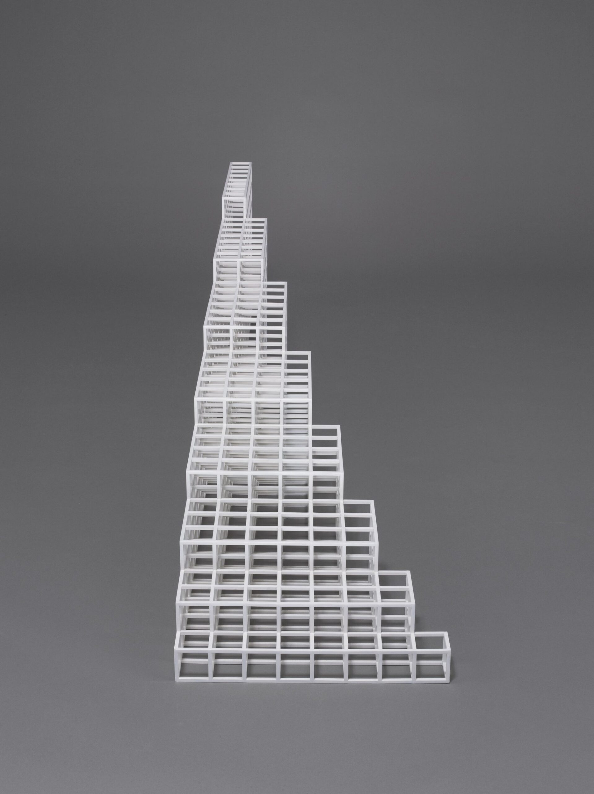
Robert Mangold
Robert Mangold (b. 1937, North Tonawanda, New York, United States) creates shaped canvases and geometric compositions often combined with hand-drawn lines. His practice explores the relationship between form, proportion, and the architecture of the picture plane.
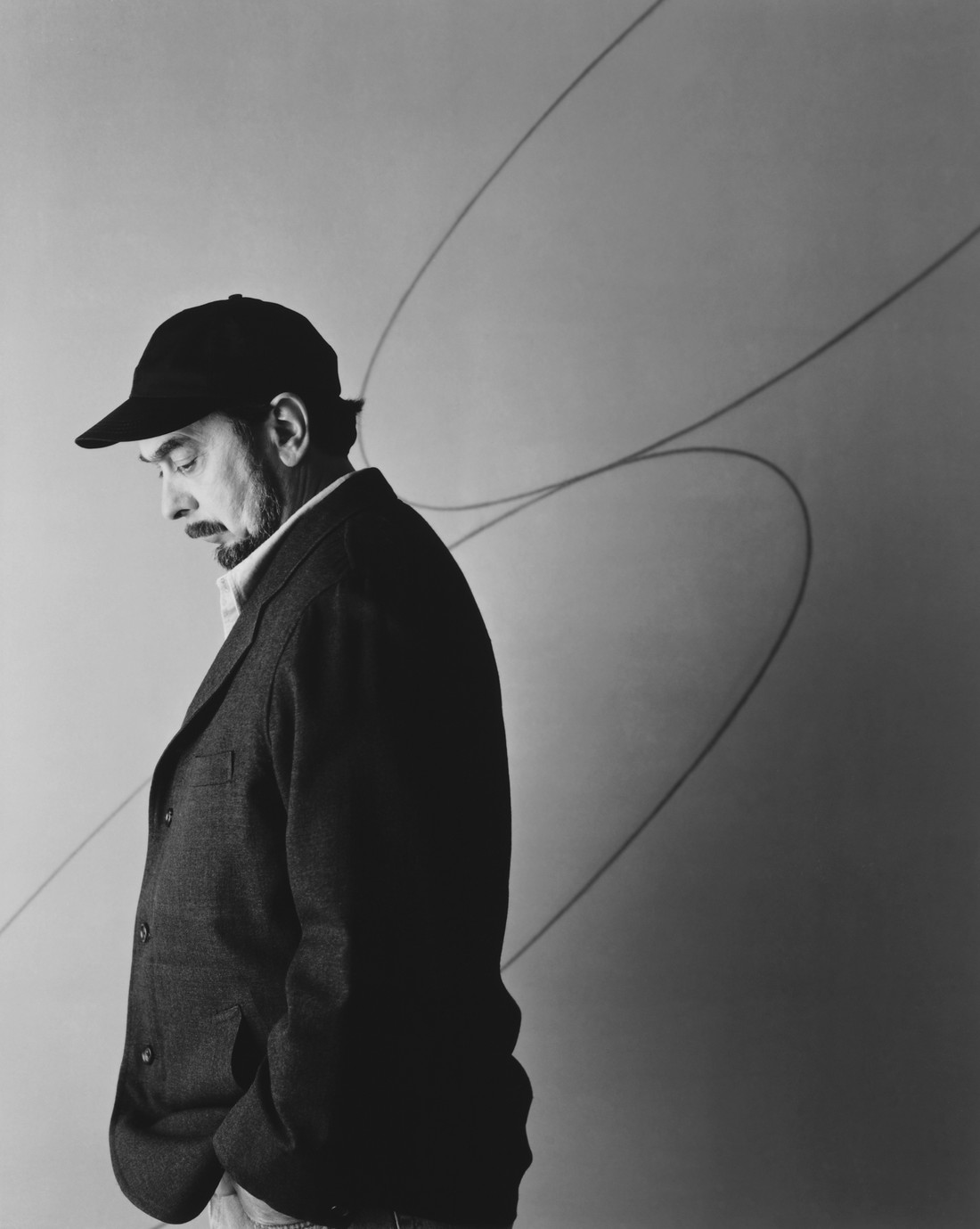
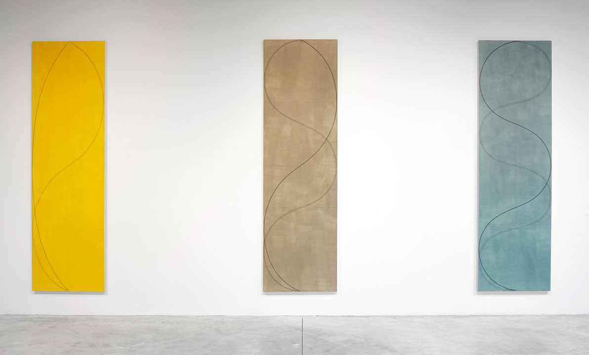
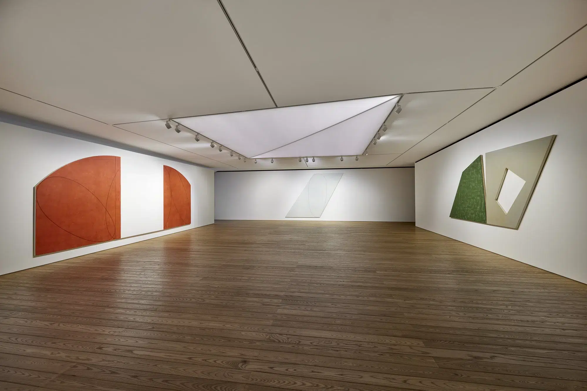
Agnes Martin
Agnes Martin (b. 1912, Macklin, Canada – d. 2004, Taos, New Mexico, United States) produced paintings characterised by faint grids, soft washes, and subtle tonal variation. Her work is marked by restraint and regularity, creating surfaces that emphasise order, repetition, and quiet perceptual experience.
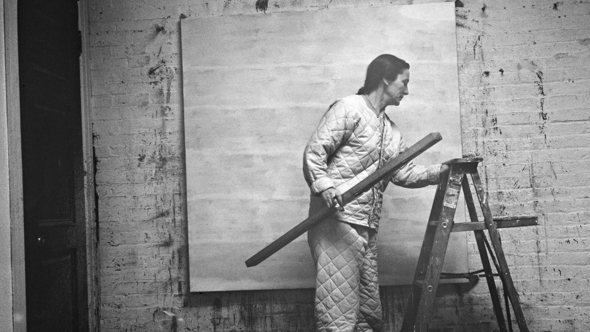
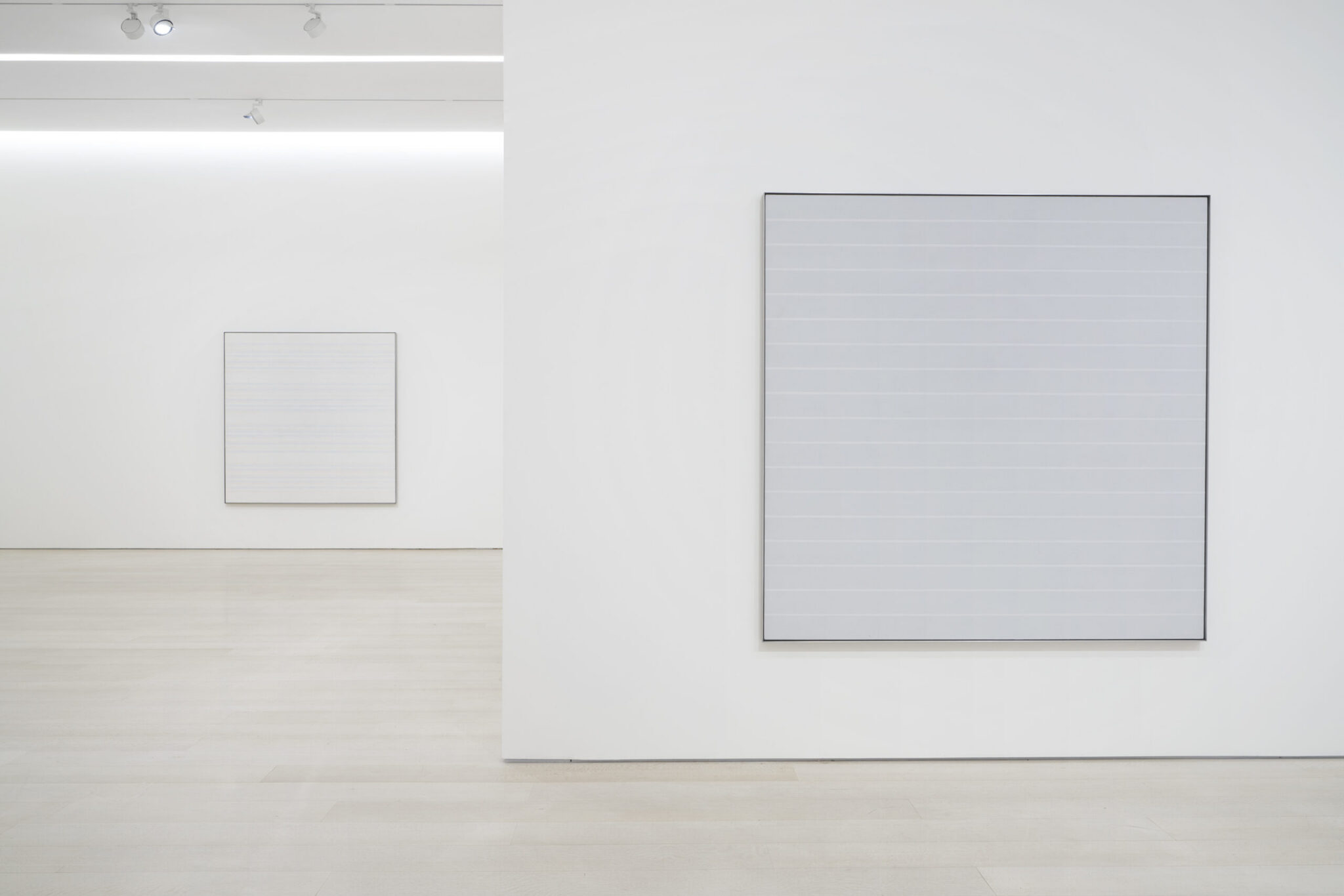
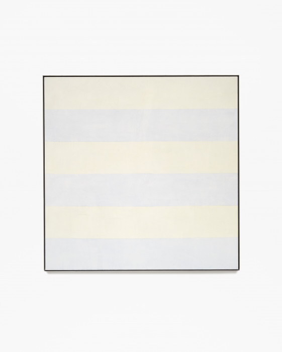
Kenneth Noland
Kenneth Noland (b. 1924, Asheville, North Carolina – d. 2010, Port Clyde, Maine, United States) was a leading figure of the Washington Color School, known for concentric circles, chevrons, and horizontal stripes. His practice uses colour as the primary structural element, applied through staining techniques that eliminate gesture.
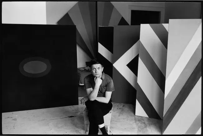
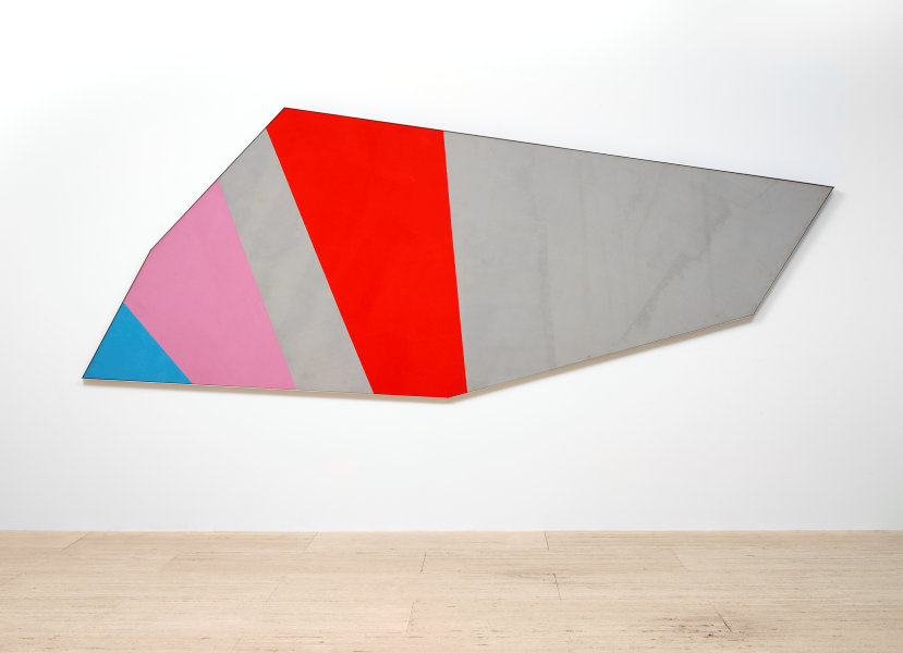
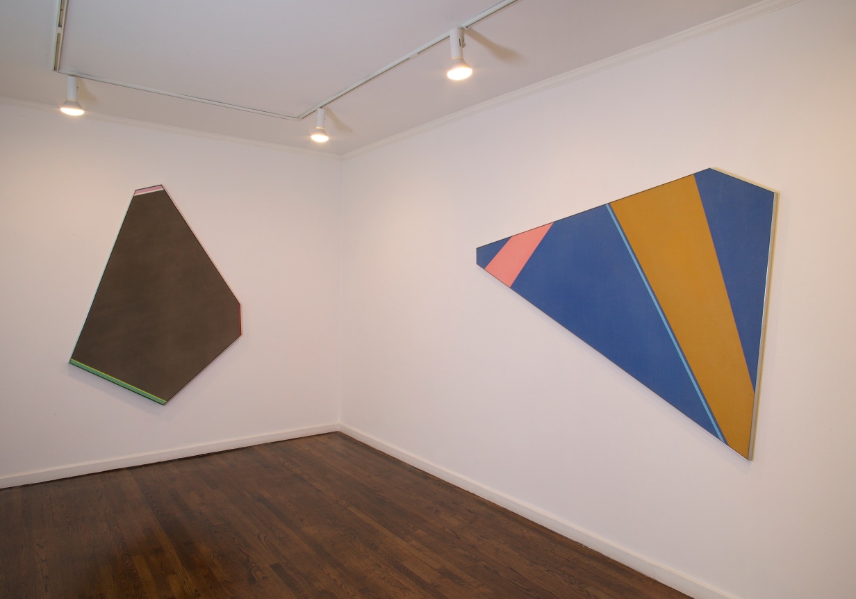
Park Seo-Bo
Park Seo-Bo (b. 1931, Yecheon – d. 2023, Seoul, South Korea) developed the Écriture series, in which repeated pencil marks or layered pigments are pressed into wet surfaces to create rhythmic, meditative textures. His work emphasises process, repetition, and material discipline, contributing significantly to the history of Dansaekhwa and its Minimalist affinities.
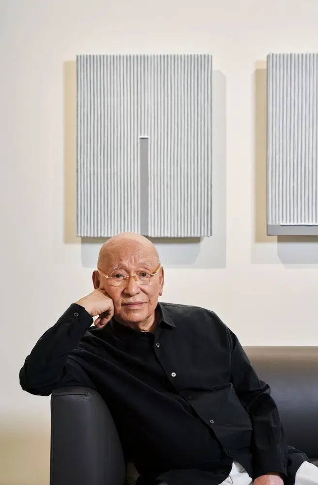
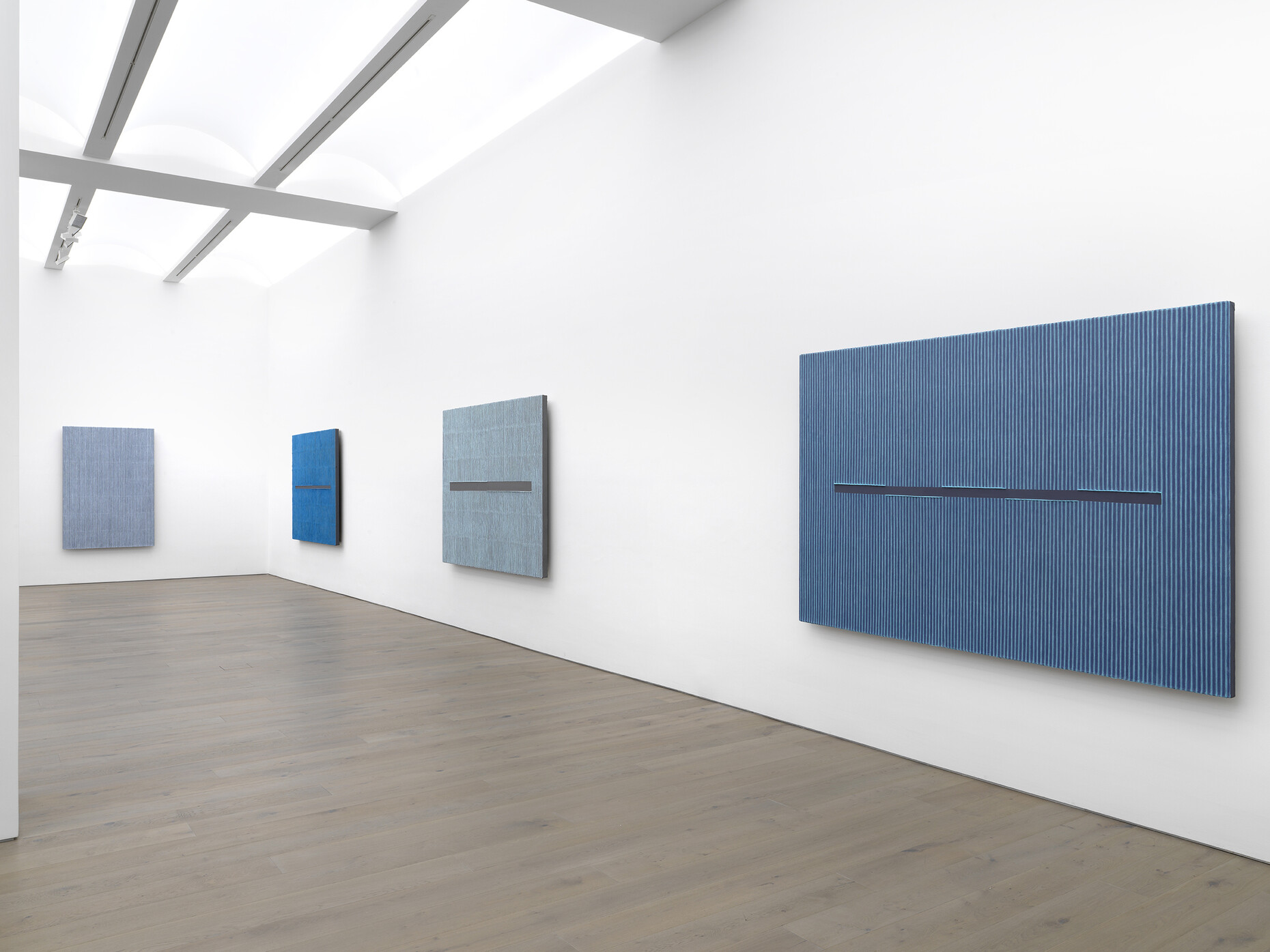
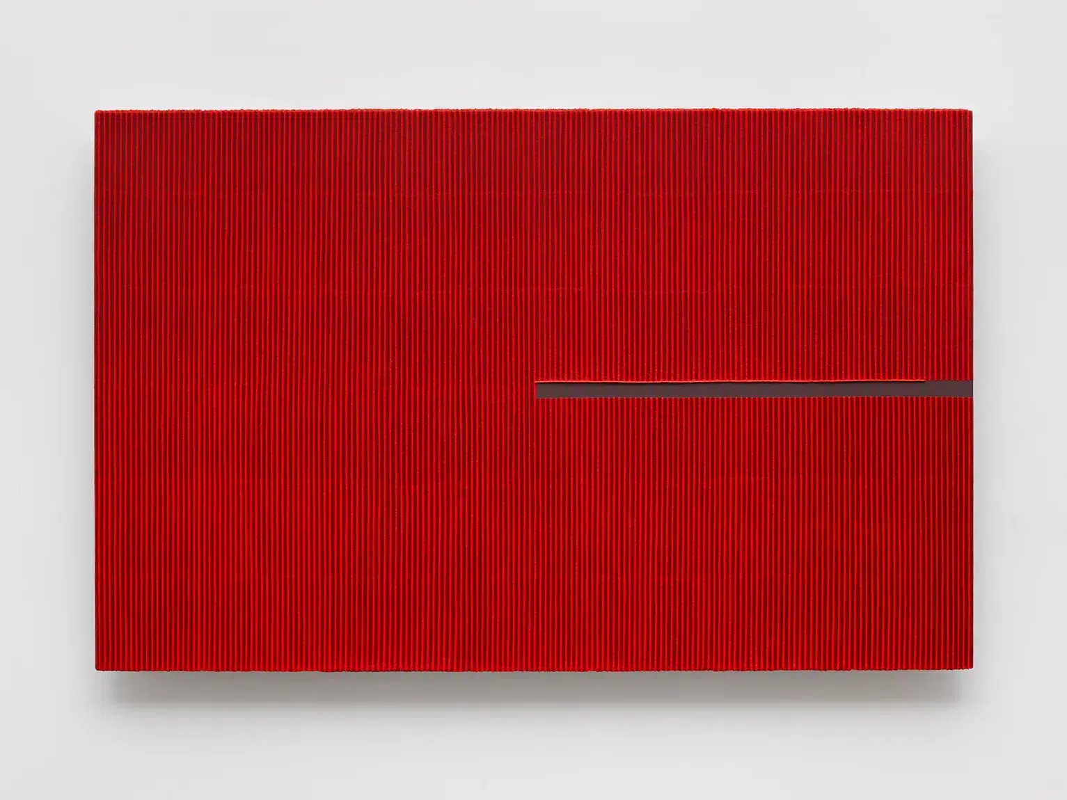
Robert Ryman
Robert Ryman (b. 1930, Nashville, Tennessee – d. 2019, Greenwich Village, New York, United States) concentrated almost exclusively on white paint and the mechanics of the painted surface. His work examines supports, fastenings, brushstrokes, and edges, using minimal means to foreground the physical components of painting.
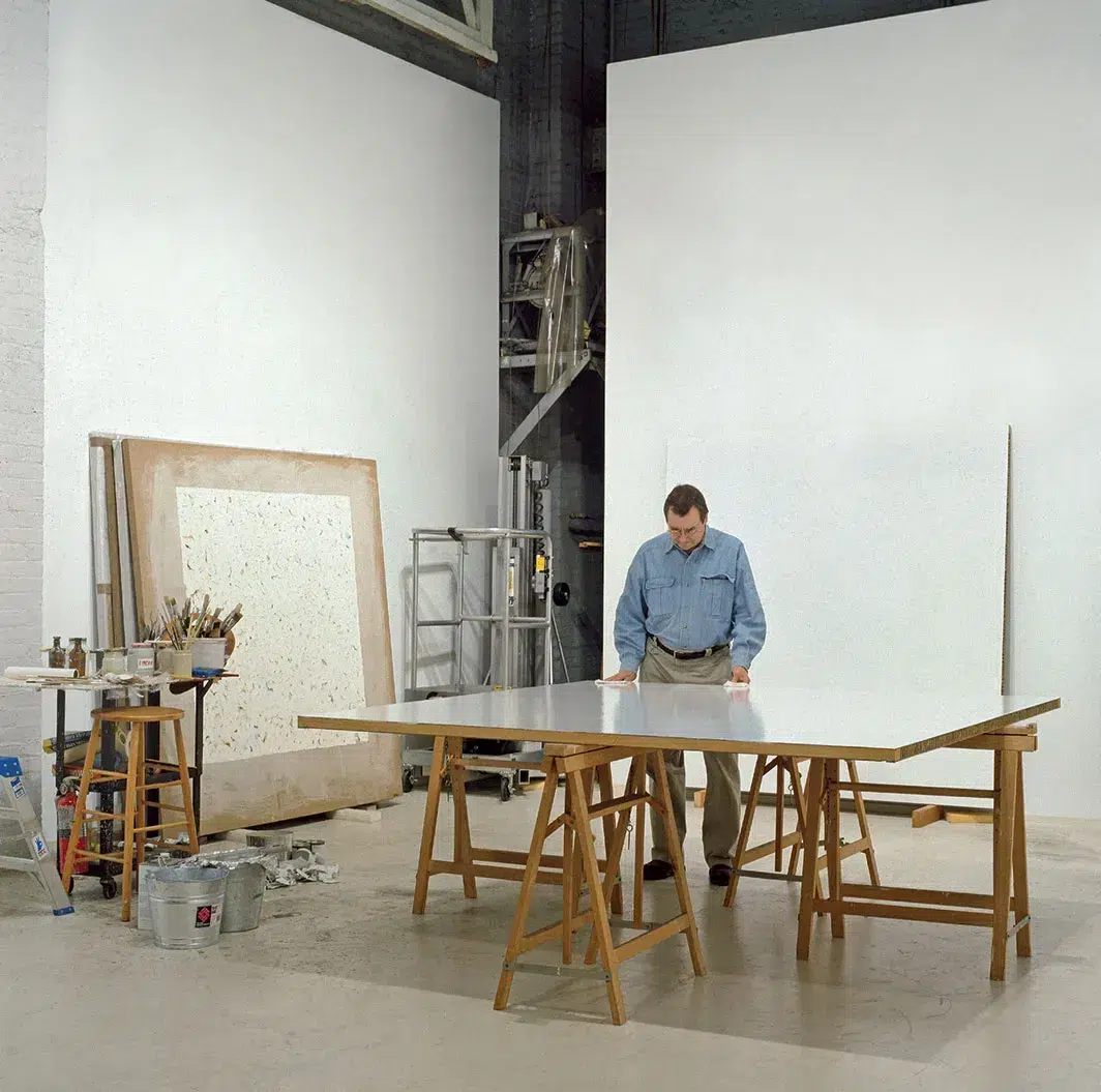
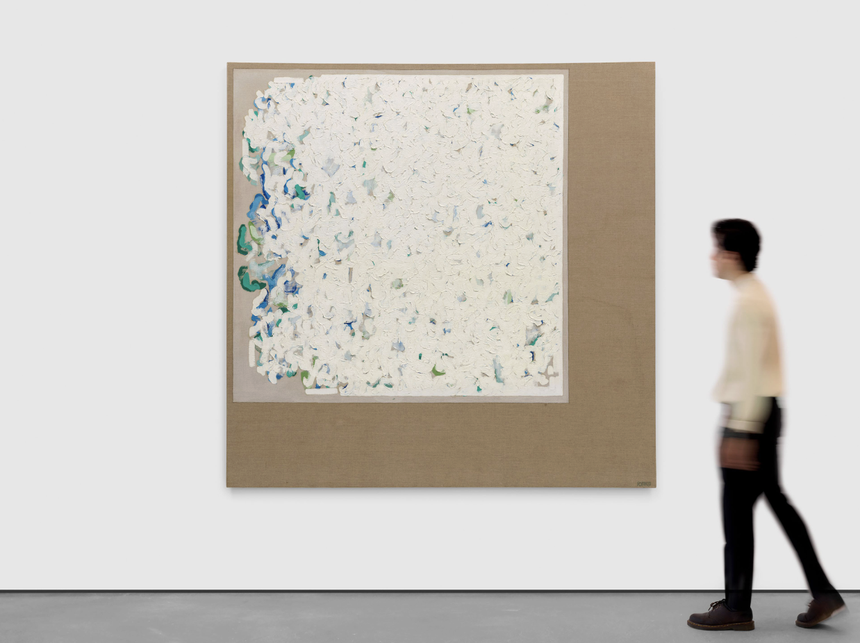
Richard Serra
Richard Serra (b. 1938, San Francisco, California – d. 2024, Orient, New York, United States) developed large-scale steel sculptures that explore balance, weight, and the viewer’s movement through space. His torqued ellipses, rolled steel plates, and site-specific installations draw on industrial materials to create environments defined by gravity, scale, and bodily orientation.
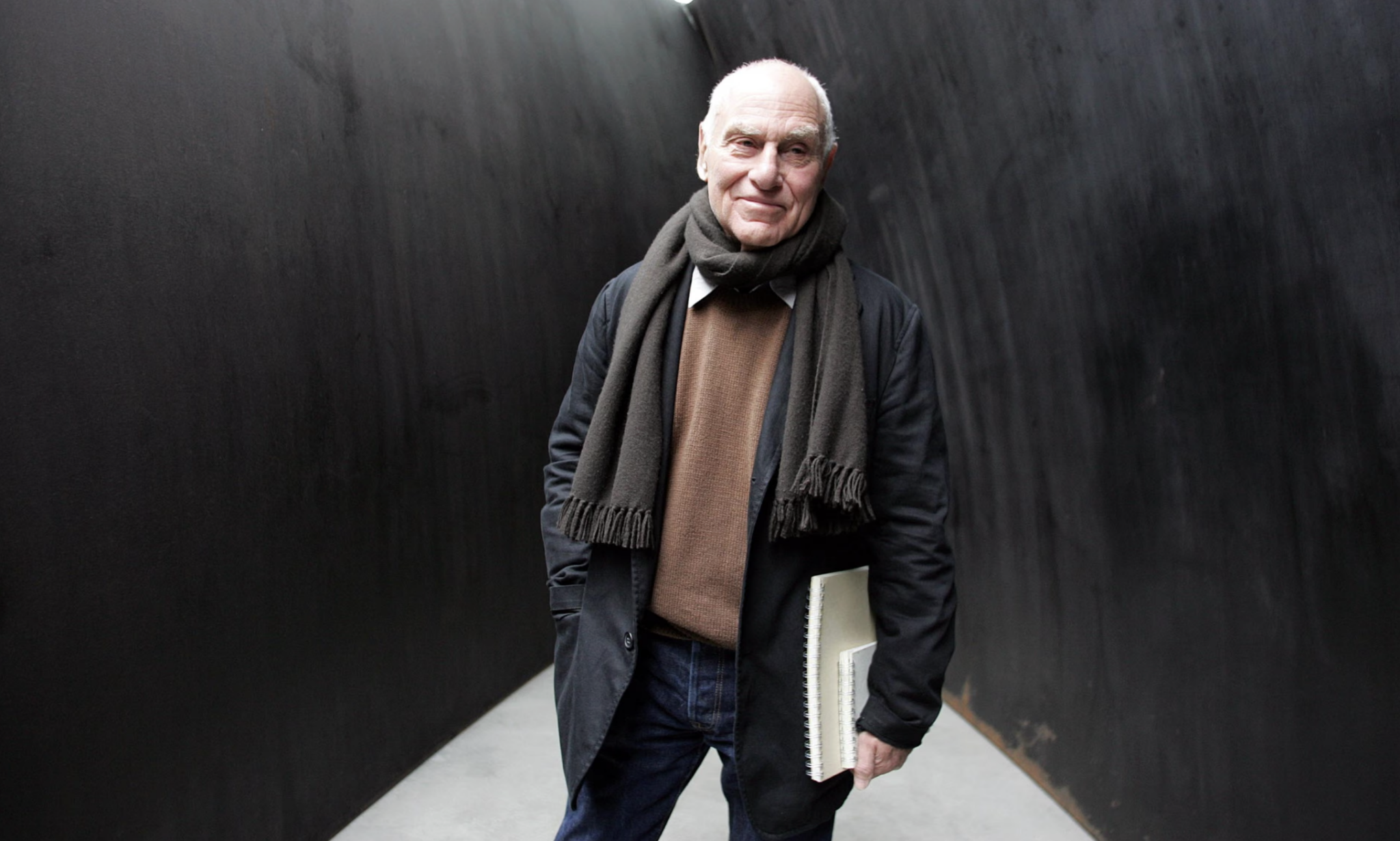
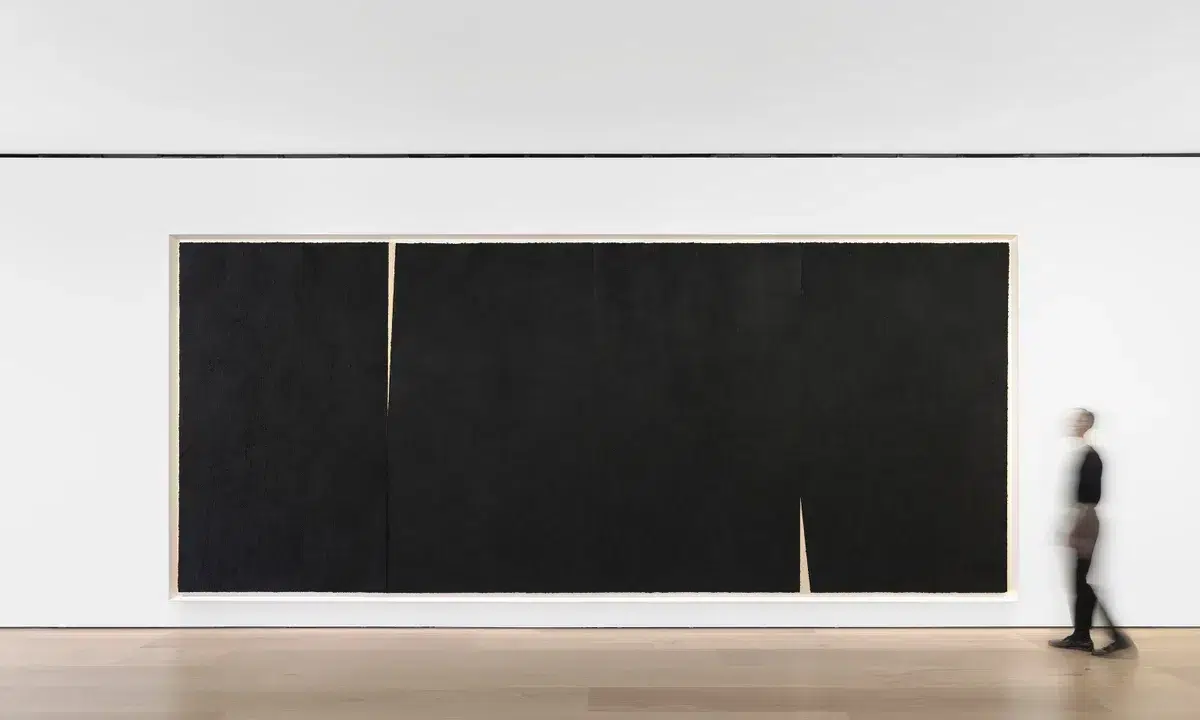
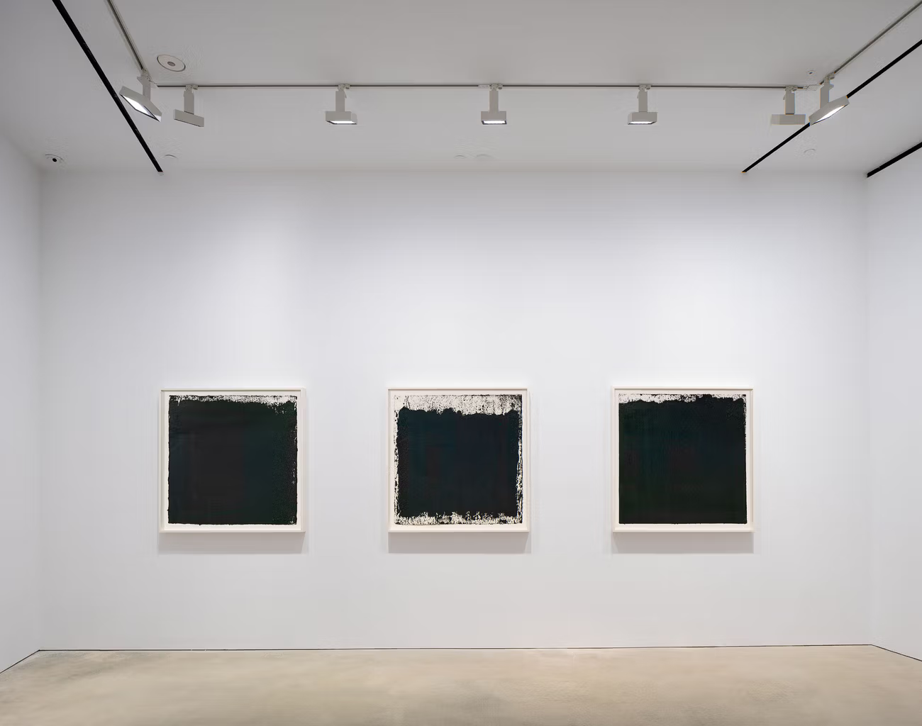
Ettore Spalletti
Ettore Spalletti (b. 1940, Cappelle sul Tavo – d. 2019, Spoltore, Italy) created monochrome paintings and sculptures in softly modulated hues that blur the boundary between surface and volume. His practice relies on a slow, layered application of pigment and plaster, generating works where colour becomes a spatial and atmospheric presence.
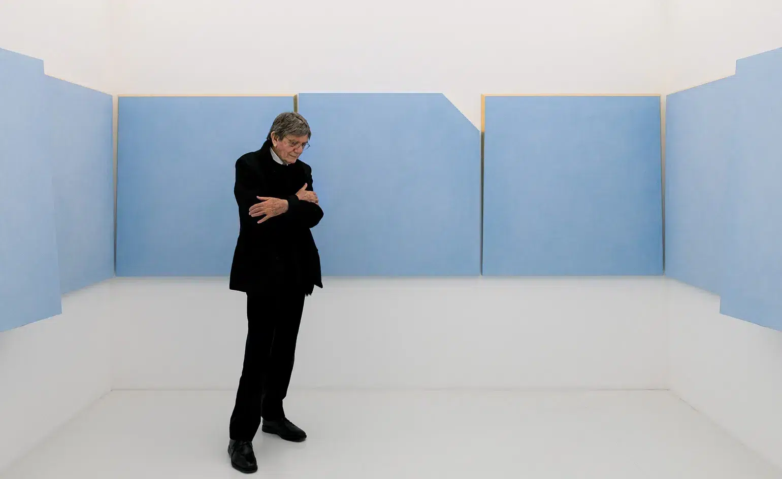
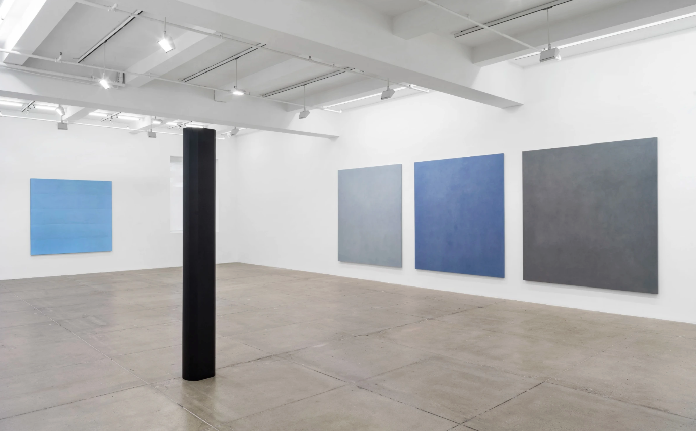
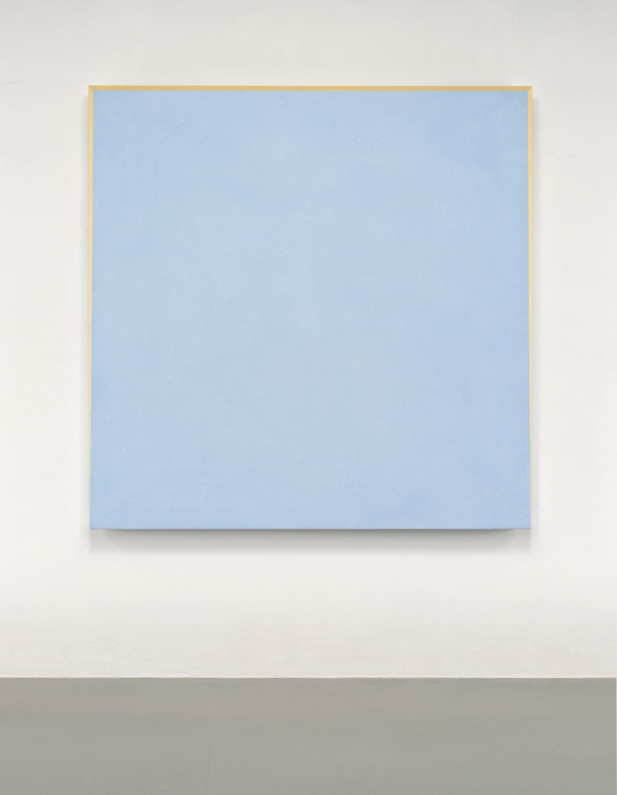
Sculpting the Cosmos and Shaping Time in the works of Alicja Kwade
Alicja Kwade has built a poetic and hypnotic body of work across multiple series, repeatedly returning to the same philosophical questions while shifting materials, forms, and spatial arrangements. In this article, we delve into her most significant series to examine how her sculptures make the world feel unsettled and unstable, but in ways that expand our sense of possibility and deepen our understanding of the systems that shape reality.
Alicja Kwade (Katowice, Poland, 1979), who lives and works in Berlin, investigates the structures that shape our reality, examining how we perceive both the world around us and the passage of time. Her practice probes the instability of perception and reveals the constructed nature of the social systems we depend on, prompting viewers to reconsider what they accept as true. One of the most important materials in her practice is stone. She employs stones in many forms, sometimes smooth, rough, carved, or polished, using them not only for their physical properties but also for their conceptual depth. “Stones are compressed time,” she once remarked, capturing the way geological material contains vast histories within it. For Kwade, stones represent accumulated time and the shared material foundation of human existence, as earth is also in many ways compressed stone.
Kwade also frequently pushes the boundaries of what is technically possible, working closely with engineers to realise works that require complex fabrication. Her sculptures rely on precision, balance and structural ingenuity, and her collaborations with engineers allow her to create effects that appear to defy logic. In an interview with the Louisiana channel, Kwade boldly said, “I would describe myself as an absolute non-believer. I don’t believe in anything. I don’t even believe in this chair that I’m sitting on. It’s not actually there; it’s just empty space. I am a relativist.” Kwade, through her works, invites the viewer into a space where knowledge is no longer fixed, prompting us to question everything. In this state of uncertainty, we allow ourselves to become curious and open to other worlds, new perspectives, and wonder.
Be-Hide
In Kwade’s Be-Hide series, she places two-sided mirrors between stones, multiplying the stones through reflection, and destabilising the viewer’s sense of what is real. At certain angles, the mirror may reflect the environment, expanding the viewer’s surroundings; other times, the stones appear fragmented or doubled, or at certain angles even look as though the stones are merging in real time. The work cannot be fully understood from a single viewpoint, and the Kwade’s work encourages the viewer to move around it, constantly shifting their position to change the entire nature of the work. As the viewer moves around the sculpture, the mirror continually shifts between acting as a reflective surface and a transparent window, causing the original stone and its replica to appear as interchangeable reflections. This creates a “game of hide-and-seek.” The title “Be-Hide” itself gestures toward Kwade’s conceptual intentions: the stone exists in real space (“be”), yet the mirror complicates this existence by making parts invisible (“hide”). In this series, the mirror becomes a tool for transforming stable real-world objects into unstable conceptual tools. She has done multiple iterations of this series, some more monumental, titled “Big Be-Hide” and some more intimate in scale, titled “Little Be-Hide.” She has also created a few versions where she incorporated additional stones and mirrors, creating more complex installations that also introduce questions around parallel realities.
Pars Pro Toto
In Pars Pro Toto, multiple perfect spheres of varying sizes and materials are grouped in proximity. The title is Latin for ‘a part for the whole,’ reflecting the philosophical relationship between individual elements and the larger systems they comprise. Each sphere, made from stones sourced from different parts of the world, can be seen as a microcosm of the universe, or a single part representing a larger whole. At the same time, the meaning of each sphere emerges from its relationship to the other spheres and the installation as a whole. If they were single spheres, they would not create the same meaning. The “whole,” or the entire installation, gives context and significance to each “part” (the individual spheres), while each part also contributes to your understanding of the whole. Also, when encountering this work, viewers are faced with the contrast between individual existence and the vast scale of time and matter. Kwade does not paint any of the stones or disguise them as something different; instead, she opts to keep the lines on the stone visible, revealing the literal manifestation of pressure over time. The stones are carved into perfect spheres, simultaneously evoking planets and atoms. Kwade has often explained that her work seeks to connect the monumental with the microscopic, capturing the vastness of the universe while also invoking the scale of atomic structures.
A recurring motif in Kwade’s work is the circling system or the idea of forms repeating into infinity, which is echoed here in the sphere appearing in various sizes. As she has explained in an interview, she continually returns to this imagery because the matters she is dealing with are “time, space, gravity, and that automatically brings you into a circulation.” Kwade strives to keep her works open-ended, encouraging viewers to engage their imagination and derive a range of interpretations. In an interview, she noted that when looking at Pars Pro Toto, she envisions God playing marbles, and she hopes the work prompts people to question the randomness of human existence. One work from this series was shown in the Arsenale at the 2017 Venice Biennale. It featured twelve meticulously selected stone spheres arranged like a family of planets momentarily frozen in orbit. In this iteration of the series, Kwade also incorporated an audio recording from the Voyager Golden Record, produced in 1977. The soundtrack, intended for extraterrestrial civilizations and future humans, was designed to communicate the richness and diversity of life and culture on Earth, adding a further conceptual bridge between the physical presence of the stone spheres and the broader narrative of human curiosity, communication, and our desire to situate ourselves within the cosmos.
Siège du Monde (Seat of the World)
Alicja Kwade’s Siège du Monde (“Seat of the World”) is a sculpture that brings the intimate into dialogue with the cosmic. In this series Kwade pairs a simple, everyday chair with a polished sphere of marble or stone. The chair, a familiar and practical object that invites viewers to imagine their daily lives, is set in contrast to the enigmatic sphere, which evokes the planet or the broader universe. By combining classical materials like marble with ordinary objects and materials, like a wooden or plastic chair, Kwade unsettles familiar forms, challenges assumptions about reality, and prompts reflection on our place in the cosmos. The work functions as a metaphor for humanity’s desire to understand, dominate, or symbolically “sit upon” the world, yet its positioning either under or through the chair introduces irony and restraint. Kwade emphasises the absurdity of human ambition: we dream of mastering the world yet remain constrained by our limited perception and physicality. The work encourages viewers to consider the interplay of desire, power, and reality. As Kwade has observed, “We are really poor animals in a way… we are able to ask the questions, but too stupid to get the answers.”
The title L’ordre des mondes references Piero Manzoni’s 1961 bronze Socle du Monde, whose inscription can only be read upside down, causing the pedestal to appear inverted and serve as the foundation of the world. Drawing on this conceptual idea, Kwade’s series engages with profound themes in a likewise playful manner, suggesting with a touch of humour that we all fantasize about sitting on the globe and contemplating the universe. The series includes multiple iterations: sometimes a sphere sits beneath a chair, sometimes the chair balances atop it, and sometimes multiple chairs and spheres are combined.

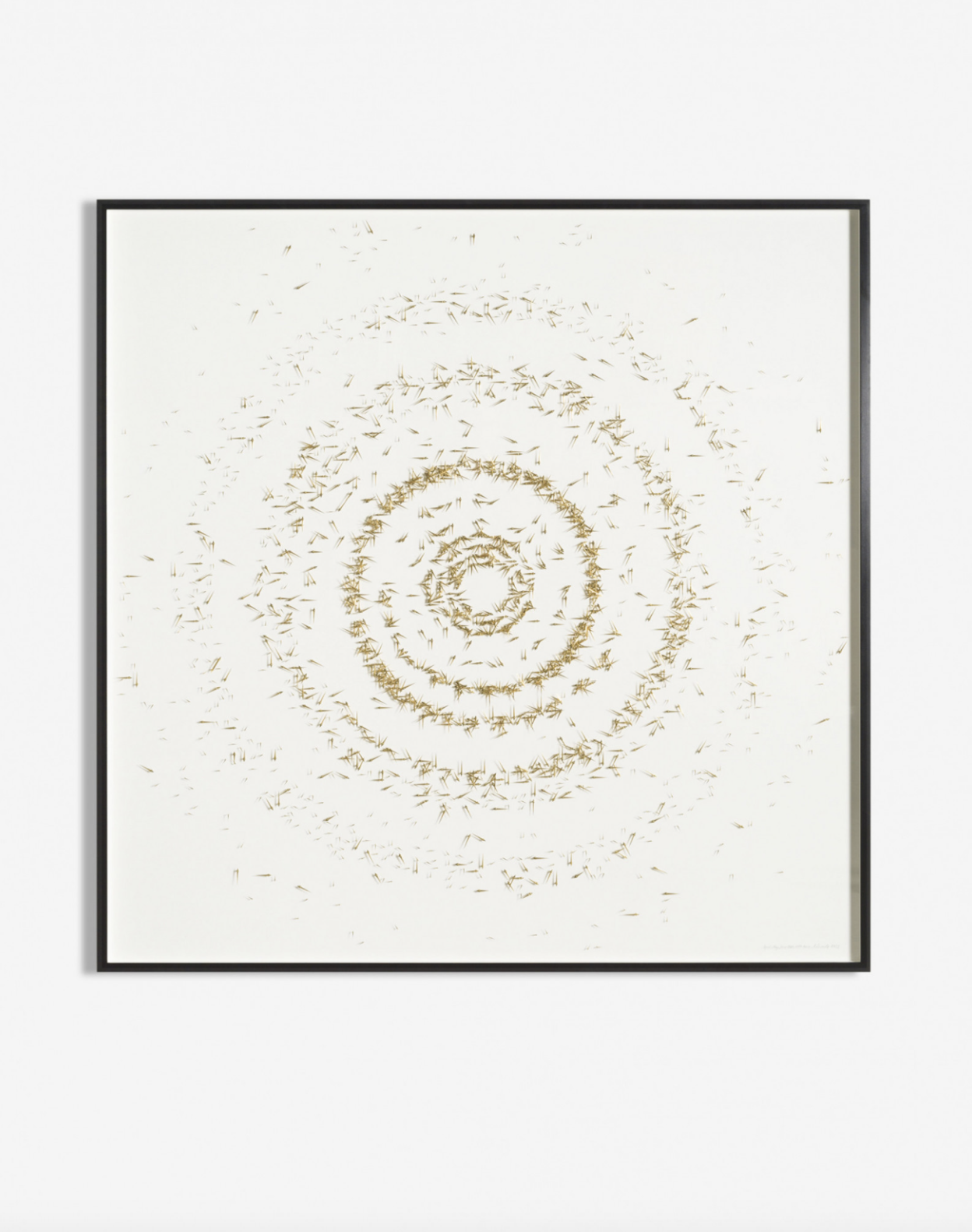
Against the Run & Entropie
Kwade’s work challenges reality and conventional systems, often examining time and how we measure it. Two of her series that do this are “Against the Run” and “Entropie.” In her series Against the Run, Kwade transforms a familiar clock into something almost “unusable,” raising questions about perception and convention. While the clocks technically show the correct time, they deliberately confuse the viewer: as the hands move clockwise, the face rotates counterclockwise, creating a subtle perceptual trick. Through this manipulation, Kwade invites reflection on our reliance on arbitrary systems, such as the measurement of time in daily life. In Against the Run (2023), she created a commission for the Pista 500, which is the track historically used by the FIAT factory for testing cars on the roof of the Lingotto building, which now also houses the Pinacoteca museum. For commissioned works, she often adapts the clock to its specific location. For this Pista 500 commission, Kwade’s design drew on the clocks historically used in FIAT factories, where timekeeping measured workers’ productivity. The work also subtly references the famous “clock’s hands strike” of 1920, when FIAT Brevetti workers collectively set the clocks back by an hour to protest daylight saving time. A century apart, the workers’ actions and Kwade’s intervention both reflect on time as a human construct, revealing the fragility of progress and questioning the stability of the systems that structure our lives.
In her series Entropie, Kwade arranges immobile watch hands on paper, often plated to appear gold against a white background. The metallic plating not only creates a striking visual effect but also adds a symbolic layer, referencing the idea of time being valuable. Each work corresponds to a specific span of time measured in days or hours, with the number of hands increasing in proportion to the duration represented. Kwade developed the series during lockdown, treating it as a diary of sorts. As she explained in an interview, “I tried to create one piece every day and record the passing of time as it appeared to me, because these lockdowns have changed my perception of time extremely. All travelling suddenly stopped, projects were frozen in process, everything became very slow and at the same time extremely fast; a standstill race.” During lockdown, she studied the system of time itself, asking questions such as “why are there twelve numbers?” and “why are there numbers at all?” She searched for patterns in her research and tried to connect her results to light. She saw that when the clock’s numbers are reinterpreted in a linear arrangement, the watch hands form patterns reminiscent of light or sine waves. The concept of entropy, a scientific measure of a system’s disorder or randomness, underpins the work. Although the arrangement of the clock hands may initially appear structured or rhythmic, there is an underlying sense of disorder. The clocks are motionless and functionally meaningless as timekeeping devices. Kwade’s work invites reflection on the human impulse to measure and order time, while reminding us that these systems are ultimately constructs.
ParaPivot
In ParaPivot, large, intersecting steel frames support suspended stone spheres that seem perpetually on the verge of movement, as if the entire structure were an unstable solar system caught in mid-orbit. She made one monumental version of ParaPivot for her commission for the Metropolitan Museum’s Roof Garden in 2019 (seen in the image window above). Kwade described the experience of installing it as “placing a hat on top of all we have achieved in the last thousands of years.” At first glance, the geometry is striking: crisp squares and rectangles intersecting with perfectly smooth spheres. The angular steel structures evoke a human-made system, framing the jagged Manhattan skyline as though it, too, were part of the composition. Against this rigid architectural frame, stone globes gathered from all over the world, each one carrying its own geological biography.
Kwade created another iteration for this series, ParaPivot (sempiternal clouds) for Desert X in 2021. Here, instead of smooth stone spheres, massive blocks of white marble appear like fragments of glacier ice transported from another world. As viewers move through and around its frames, the sculpture seems to shift in response, echoing an experiential version of Heisenberg’s uncertainty principle. The act of observing subtly alters what is being observed, creating an illusion of perpetual instability. The steel appendages radiating from the structure’s central points seem to trace an invisible orbital path, recalling the early scientific instrument used by Greek and later Islamic astronomers to map the positions of stars and planets. It evokes humanity’s ongoing attempt to chart the universe and to understand our shifting place within it.
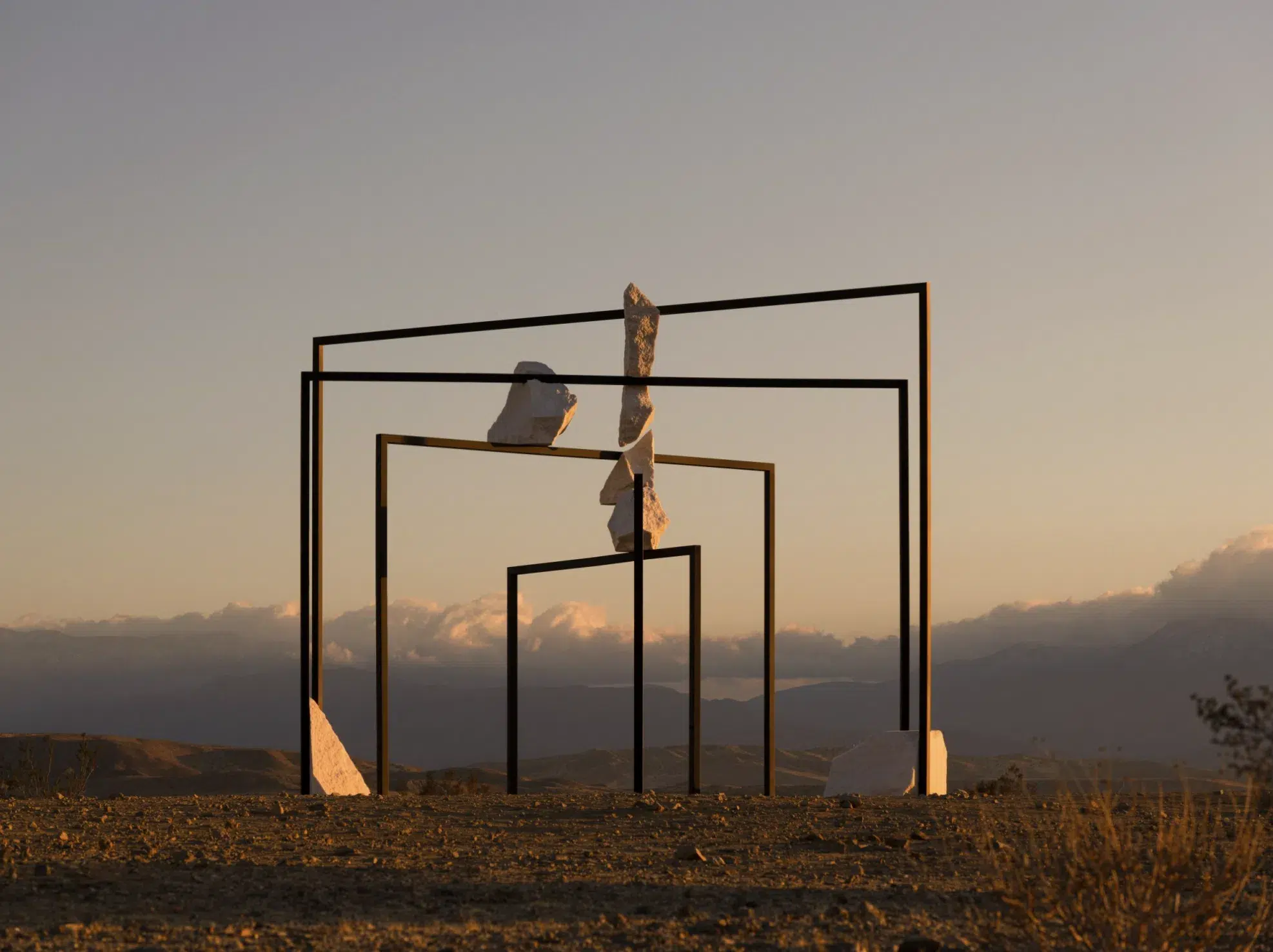
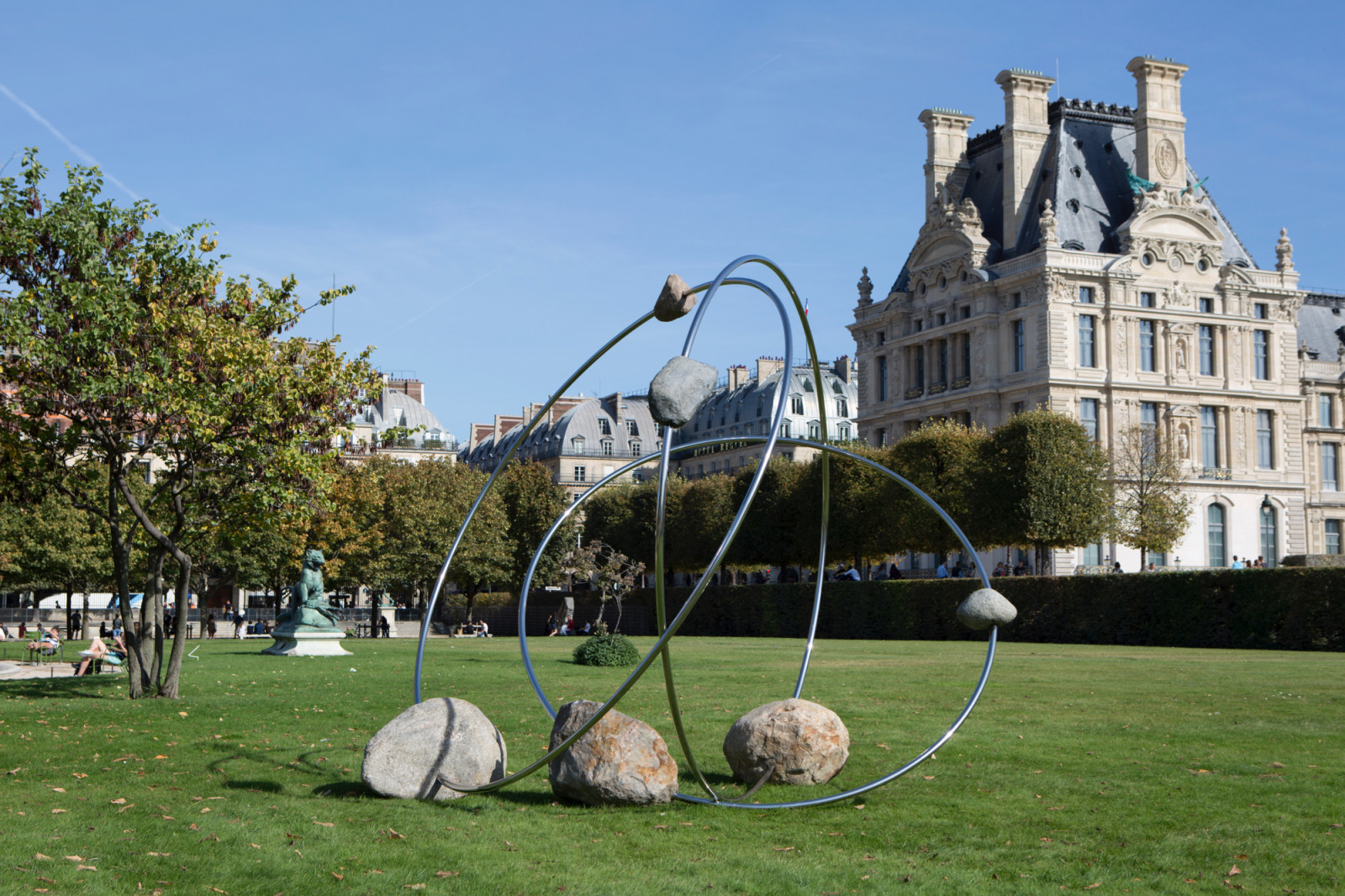
Revolution Orbiter (or Freiheits Grad)
In Revolution Orbiter, Kwade builds on ideas explored in her ParaPivot series, but instead of placing stones along rigid, linear frameworks, she sets them within sweeping circular formations. This shift from straight lines to orbits amplifies her investigation into gravity and motion, pushing the limits of what can be physically balanced and held in place. The work becomes a finely tuned negotiation between opposing forces, a fragile equilibrium. The German title Drehheitsgrad, meaning “degree of freedom,” refers to the range of movement an object possesses, though here the stones are tightly constrained. They rely on absolute precision to remain suspended, even as their configuration creates the illusion of dynamic, continuous rotation. Kwade invites viewers to feel this tension and reflect on the idea of freedom itself—particularly the way our own movement through the cosmos is fixed, our orbit predetermined long before we are born. For Kwade, gravity is both the essential force that anchors existence and a paradoxically weak one, easily countered by the human hand. Circularity, orbital patterns, and the suggestion of motion recur throughout her sculptures, reminding us of the unseen forces and predetermined trajectories that silently structure our lives.
Kwade’s sculptural language demands that viewers move, look closely, and confront the assumptions they carry into the act of seeing and in their ways of being. As she herself notes, her practice is ultimately an exploration of how objects, and our understanding of them, transform over time. By probing who defines reality, how our senses constrain us, and how perspective reshapes what we consider “objective,” Kwade reminds us that reality is never fixed. It is negotiated, contingent, and inseparable from the subjective experience of the observer. Kwade’s works make the world feel unsettled and unstable, but in a way that opens it up to new possibilities.
The Influence of Jazz on Stanley Whitney and Sam Gilliam
“I can’t stand to sing the same song the same way two nights in succession,” Billie Holiday wrote in her autobiography, Lady Sings the Blues. To her, performing the same song without variation drained the idiosyncratic magic out of music, reducing it to automation. In the same way, we can think about Stanley Whitney’s paintings as a variant of the same motif: his iconic coloured grid, which is interpreted and represented differently in each of his canvases through different colour combinations, maintains the same structure that the artist is famous for. At the same time, when we look at Sam Gilliam’s work, we can feel that sense of rhythmic fluidity that has come to define the basis of much jazz music. Like Whitney, Gilliam comes back to the same improvisatory approach to abstraction, revelling in the infinite possibilities contained within the same process.

Jazz emerged from a distinctly African American sensibility. Drawing on a rich cultural heritage that had developed over centuries, African Americans combined African rhythmic and percussive styles with more European forms of harmony and structure. Jazz was also unique in its focus on improvisation, allowing for unprecedented freedom of expression through music. Like a jazz player riffing on the same chord or melody, both Gilliam and Whitney, African American artists active during the Civil Rights era, have frequently spoken about the influence of jazz in their work.
Sam Gilliam B. 1933, Mississippi, US.

“Jazz leads to the acrobatics of art,”—Sam Gilliam
When Gilliam relocated to Washington, DC, in the early 1960s, he organized concerts that brought the Modern Jazz Quartet and Marian Anderson to the city during the Civil Rights era. Painting in his DC studio, Gilliam listened to the vanguards of bebop: radical improvisers who pioneered a liberated Black musical aesthetic rooted in African and African American cultural history. Gilliam has talked about his associations with John Coltrane’s music and the aural impression of his “sheets of sound”—a conscious visual metaphor for Coltrane’s innovations in jazz harmony and rhythm. “Coltrane worked at the whole sheet,” Gilliam has remarked, “He didn’t bother to stop at bars and notes and clefs and various things, he just played the whole sheet at once.”

Gilliam has compared his artistic practice to the performance of jazz musicians, saying, “jazz leads to the acrobatics of art.” His words evoke a kinship with the physical and emotional intensity of a musician like Coltrane, caught in the exhilarating, improvisational “acrobatics” of each note.

As is well documented, Gilliam remained wholly committed to abstraction in the 1960s and 1970s, at a time when the Black Arts Movement (BAM) sought to frame Black art through a “socially responsible aesthetic” that was rooted in figuration and realism. Gilliam’s abstraction allowed him to move more fluidly through questions of race and self-identity, and he chose to relate to them freely as one element among many, rather than as a matter of fate. His engagement with jazz was similar; it is not always explicit in his work, but it is central to the mosaic of his artistic identity. His statement that “before painting, there was jazz” is revealing in this context. As French philosopher Gilles Deleuze has observed about the painterly process, “It is a mistake to think that the painter works on a white surface,” by which he means that the blank canvas is already filled with the ideas that the artist brings to the painting. Deleuze calls this “the painting before the painting.” Gilliam’s decisive “before painting, there was jazz” compels us to interpret the aural trace of jazz influence in his work.

Stanley Whitney B. 1946, Philadelphia, US.

“Music was always there for me as a kind of rhythm – getting in rhythm, having a rhythm.” – Stanley Whitney
A lifelong music lover, Whitney’s intuitive painterly process draws parallels to the free-flowing and improvisational style of his favourite jazz musicians. From Miles Davis to Nina Simone, Whitney cites the nature of jazz music as a major source of inspiration from childhood to today. The Philadelphia-born, New York-based artist often cites experimental jazz , Roman architecture, Egyptian hieroglyphs, and Gee’s Bend quilts as influences on his practice.

Today, any viewer of Stanley Whitney’s paintings is immediately attracted to the magnetism of his irregular grids in vibrant, saturated hues. What is not so immediately apparent is the influence on Whitney’s work from his African-American heritage and the jazz clubs he would frequent both in Philadelphia and New York. Describing the analogy between music and his paintings, Whitney likens his process to the call and response structure characteristic of the music he loved. He explains, “I start at the top and work down. That gets into call and response. One colour calls forth another. Colour dictates the structure, not the other way around.” Whitney has also described the influence of Ornette Coleman’s 1959 album, The Shape of Jazz to Come, on both him and his approach to painting. He said, “It wasn’t easy. It was something totally different. A bigger part of the world. And that was where painters tried to take their painting.” As the artist Adam Pendleton has observed, Whitney’s enduring engagement with the grid explores “how to break down visual order and imbue it with music, with life, with a kind of poetic.”

Since 1996, Whitney has returned to the same format for his paintings: stacks of colourful rectangles arranged within a large square of canvas. His colours are brilliant and expressive, with jolts of tangerine oranges, drippy reds, and meditative azures. Each canvas follows its own off-beat rhythm, with three or four horizontal bands dividing each square into quirky grids.
When asked about the impact that jazz music has had in his art, Whitney, in an interview with Louise Neri, responds: “By the time I was in high school, around 1964, I was listening to Ornette Coleman’s Shape of Jazz to Come, John Coltrane’s Love Supreme, Thelonious Monk, Charlie Mingus, and others; these musicians were great revelations to me. Before that, I was thinking about joining the army! But when I discovered jazz, I realised that there was a whole other world. So when I first went to art school, I thought of Cézanne in terms of Charlie Parker and the rhythm. After five years at art school in the Midwest, looking at Munch and Goya, I came to New York and went to jazz clubs — Five Spot, Village Gate. I wanted to hang out with the musicians.”

The Artists Redefining the Language of Abstraction
This month, LVH Art presents Beyond Form, a new exhibition on view at Gallery Rooshad Shroff in Mumbai from 9 to 15 November. Bringing together artists from diverse generations and backgrounds, the exhibition examines what it means to move beyond representation, engaging with visual languages grounded in material, process, and perception. In this article, we take a closer look at the artists featured in Beyond Form, tracing the ideas, gestures, and experiments that inform their unique approaches to abstraction.
Discover all the works from the exhibition by clicking below
Private View of Beyond Form
Beyond Form highlights artists who move away from dominant figurative imagery, focusing instead on abstraction and the limits of figuration. The exhibition prioritises formal qualities like colour, form, process, and materiality over fixed narratives.
Many artists explore unconventional materials and processes. For example, Salvatore Emblema unweaves his jute canvases to reveal light and structure through absence. Peppi Bottrop combines industrial and organic materials, while Poppy Jones uses suede to emphasize texture. Rita Ackermann’s chalkboard paintings layer gesture and erasure. Sam Gilliam blends painting, sculpture, and architecture through improvisation and material exploration. Ha Chong-Hyun pushes paint through canvas to create sculptural textures. Anish Kapoor engages with material and void to create immersive experiences. Donna Huanca uses paint and texture to evoke transformation rooted in the body. For other artists in the exhibition, moving “beyond form” happens within the composition. Kylie Manning’s works hover between abstraction and figuration, while Marina Perez Simão evokes surreal landscapes through colour and shape. Sean Scully and Stanley Whitney focus on rhythm, structure, and colour’s expressive power. Abstraction here offers an open-ended, introspective mode of expression, accessing inner consciousness and the intangible aspects of human experience.
Artist List
Rita Ackermann, Peppi Bottrop, Salvatore Emblema, Sam Gilliam, Brice Guilbert, Ha Chong-Hyun, Camille Henrot, Donna Huanca, Poppy Jones, Anish Kapoor, Kristy Luck, Kylie Manning, Marina Perez Simão, Sean Scully, Ryan Sullivan, Stanley Whitney.
Rita Ackermann

Rita Ackermann (b. 1968) is known for a practice that oscillates between figuration and abstraction, memory and erasure. Having relocated to New York from Budapest in the early 1990s, she became a central figure in the downtown art scene, drawing on influences from graffiti, film, and underground culture. Over the past three decades, her work has evolved from raw figurative compositions depicting adolescent energy and chaos to complex abstractions that explore the instability of image, gesture, and recollection. Ackermann’s paintings often carry traces of what has been covered, wiped away, or transformed. Working with layered compositions of oil, chalk, and pigment on canvas or board, she constructs and deconstructs images in a continual process of making and unmaking. Figures emerge only to dissolve into the surrounding surface, as if memory itself were collapsing under the pressure of time and gesture.
Ackermann’s work included in Beyond Form is from her Chalkboard Paintings series, which she began in the early 2010s, marking a pivotal shift in her artistic practice. Using chalkboard paint as both surface and metaphor, she created works that evoke the classroom as a site of learning, repetition, and erasure. Onto these dark, matte grounds, Ackermann draws and scrapes with oil, chalk, and pastel, layering gestures that recall the spontaneity of drawing while maintaining the density and depth of painting. In her process, Ackermann transforms the language of drawing into a meditation on impermanence. Her work resists closure, remaining perpetually open to revision and reinterpretation.
Peppi Bottrop

Peppi Bottrop (b. 1986) is from a generation of artists whose work engages deeply with the changing landscape of post-industrial Europe. He graduated as Meisterschüler from the Kunstakademie Düsseldorf in 2014, where he studied under Albert Oehlen, Andreas Schulze, and Jutta Koether. He comes from Germany’s Ruhrgebiet, the country’s industrial heartland. Once a center of coal mining and steel production, the region has since been transformed as the mines closed and nature gradually reclaimed the landscape. The coexistence of human industry and natural regeneration lies at the core of Bottrop’s work.
Bottrop’s compositions often recall the spatial logic of maps, architectural plans, and urban grids, yet they remain open and intuitive. In the work included in the Beyond Form exhibition, he employs graphite, charcoal, and metal pigments to create layered networks of lines that oscillate between meticulous precision and expressive spontaneity. The visual language that emerges in his works moves between construction and dissolution, figuration and abstraction, suggesting a psychological landscape as much as a physical one. This rhythm of building, erasing, and rebuilding becomes a reflection of the historical and emotional cycles that define Germany’s Ruhrgebiet, the region in which he grew up.
Salvatore Emblema

Salvatore Emblema (b. 1929, d. 2006) was born in Terzigno, at the foot of Mount Vesuvius. He forged an artistic language inseparable from the landscape of southern Italy. The eruption of 1944, which covered his town in volcanic ash, left a lasting impression on the young artist, instilling a lifelong sensitivity to how light, matter, and time shape perception. The materials he used in his works such as raw jute, oxidised metals, volcanic sand, leaves, and earth pigments were taken directly from his environment. As Emblema explained, “My main concern was to have a direct relationship with truth.. Leaves and sackcloth were truth to me.” A central focus of Emblema’s career was exploring transparency, absence, space, and light. As art historian Giulio Carlo Argan observed, his work is “space which serves no purpose other than to be space.” From the late 1960s onward, he explored these ideas through the meticulous technique of detessitura, removing threads from the woven jute to let light pass through the canvas. By subtracting material, he paradoxically generated new forms, turning absence into a creative force that shaped the work.
Working in relative isolation in the Neapolitan countryside, Emblema remained distinct from the dominant currents of postwar Italian and American art. Yet his work resonates with a wider exploration of perception and materiality that characterised the period. While Arte Povera artists pursued dematerialisation and Minimalists explored serial form, Emblema discovered his own language of reduction: one rooted in the Mediterranean landscape, in its heat, luminosity, and tactile earth.
Sam Gilliam

Sam Gilliam (b. 1933, d. 2022) was a leading artist in postwar American abstraction. Emerging in Washington, D.C. in the mid-1960s, he was associated with the Washington Color School yet soon expanded beyond its compositional and chromatic restraint. By adopting a process-oriented and improvisational approach, Gilliam challenged the conventions of traditional painting. His radical Drape paintings of the late 1960s, made by suspending unstretched, paint-soaked canvases from walls or ceilings, redefined the relationship between painting, sculpture, and architecture. For Gilliam, the physical liberation of the canvas mirrored a broader pursuit of creative and personal freedom at a time of social and political transformation in the United States.
Throughout his career, Gilliam’s work remained in constant evolution. He treated colour as a living substance, shaped by gravity, gesture, and material chance. Inspired by the improvisatory energy of jazz, his paintings and works on paper evoke rhythm and movement through layered chromatic harmonies. Even as his methods changed from staining to folding, draping, and later collage, his art consistently sought to reconcile spontaneity with structure.
Brice Guilbert
Brice Guilbert (b. 1979) combines figuration and abstraction in a practice that explores landscapes, particularly the volcano motif. Guilbert’s compositions often evoke elemental forces, light, air, and temperature, through colour and movement rather than clear figuration. The materiality of the oil stick, which he often employs, plays a crucial role in Guilbert’s process: its dense, waxy texture gives his works a physical presence that feels at once drawn and painted. By using oil stick on paper or canvas, he achieves a balance between immediacy and reflection: beneath the apparent simplicity of his marks lies a quiet intensity shaped by rhythm and repetition.
His work is deeply rooted in personal and lived experience, drawing inspiration from his Creole heritage and childhood on Réunion Island. The work included in the show is titled Fournez after the local pronunciation of Piton de la Fournaise, the volcano located on Réunion Island, which the artist recalls from his childhood. He has created countless works featuring this title and motif. As Guilbert noted, “The volcano is part of an unconscious, a space I lived and grew up in. The subject represented is an eruption, a projection, a sensation projected to the surface of every painting. Every work of art is the projection of an effect and of an idea.”
Ha Chong-Hyun

Ha Chong-Hyun (b. 1935) is one of the most significant figures in post-war Korean art and a central member of the Dansaekhwa movement, which redefined painting in Korea during the 1970s. His practice developed in the decades following the Korean War, a period marked by rapid reconstruction and cultural change. Ha sought to redefine a language of painting grounded in process, discipline, and the inherent qualities of his chosen materials. While in the 1950s he was still exploring Art Informel and geometric abstraction, by the 1960s he had shifted toward a more physical and meditative approach, in which process became the central focus of his practice.
In 1974, Ha began his Conjunction series, a lifelong body of work that would come to define his career. The series is based on the artist’s unique technique known as bae-ap-bub, or the “back pressure method,” in which thick layers of oil paint are pushed from the reverse side of hemp cloth so that they permeate and emerge on the surface. Through this process, Ha transforms painting into a physical act of negotiation between the visible and the hidden. The pigment fuses with the weave of the hemp, creating a field that is at once tactile and meditative. The result is not an image placed upon the canvas but a surface that embodies the tension between control and release.
Camille Henrot

Camille Henrot (b. 1978) is a New York based artist whose work draws on sources ranging from anthropology and mythology, to literature and psychology. Henrot explores how individuals navigate the overwhelming accumulation of information, emotion, and cultural narrative in contemporary life. A graduate of the École Nationale Supérieure des Arts Décoratifs, Henrot began her career in animation and video, before expanding into an interdisciplinary practice that merges research and intuition. Her projects often begin with a process of collection and comparison, bringing together ideas, images, and materials from disparate contexts. As the artist has remarked, she approaches knowledge “with the curiosity of the amateur,” transforming research into a poetic and at times contradictory visual language.
The meaning in Henrot’s paintings are not always obvious; however, there is always a deeper layer informed by her prior research. Notably, the title of the work included in the show reveals the conceptual nature of Henrot’s practice. Anguille sous roche, literally translates to “eel under the rock,” a French idiom meaning “something hidden beneath the surface.” This also reflects Henrot’s interest in the instability of perception.
Donna Huanca

Donna Huanca (b. 1980) is a multidisciplinary artist whose practice explores the intersections of the body, nature, and material transformation. Huanca’s practice often incorporates live performance and the human body as a living canvas. Models covered in layers of pigment, clay, and natural materials that she applies to their bodies perform among her paintings, becoming extensions of the surrounding works. This performative element underscores her interest in impermanence and transformation and the body.
Huanca’s process typically begins with images of her painted performers, which she then enlarges and prints onto canvas. Over this frozen snapshot, she applies successive layers of paint or other materials, allowing time to accumulate within the surface of the work. “Everything always goes back to the body, ” Huanca says. “And that’s such an important part for me to start, because I feel like everything I do is collage work. It’s based on taking something and combining things that don’t necessarily belong together. The paintings wouldn’t exist without the live body. I’m not really interested in painting on something that has no history or is just blank.”
Poppy Jones
Poppy Jones (b. 1993) creates paintings that distil the fleeting impressions of daily life into moments of quiet intensity. Her work often begins with her own photographs, capturing interiors, and still objects, that often focus on the play of light and shadow. These images act as repositories of mood and memory from which Jones constructs a visual language that balances figuration and abstraction, and transforms something familiar into something poetic and elusive. Jones’ process is guided by intuition. Her compositions evolve through slow observation and material experimentation, revealing a deep sensitivity to surface and light. She works on silk, suede, or cotton, often repurposing garments or fabrics she has collected herself. The texture and absorbency of each support influence the final image, mirroring the tactile qualities of the scenes she depicts and reflecting her interest in the relationship between image and object. Although her practice is often grounded in figuration, her work in the exhibition gravitates towards abstraction, capturing atmosphere and emotion through subtle shifts in tone, texture, and light.
Anish Kapoor

Anish Kapoor (b. 1954) is internationally acclaimed for a practice that investigates perception, materiality, and the metaphysical dimensions of form. Although best known for his monumental sculptures and mirrored installations, Kapoor’s works on paper reveal a more intimate aspect of his exploration into colour, space, and the void. These pieces distil his sculptural concerns into concentrated meditations on presence and absence, inviting reflection on how the material world can contain the immaterial. Kapoor’s gouaches are not preparatory studies but self-contained inquiries into the tension between surface and depth. Using dense layers of pigment, he creates fields that appear to hover between expansion and collapse, emergence and absorption. The act of painting becomes both a physical and philosophical gesture.
Kristy Luck

Kristy Luck (b. 1985) creates paintings that inhabit the space between the figurative and the abstract, where organic forms and psychological landscapes intertwine. Her practice is rooted in an intuitive process that translates emotion and memory into layered compositions. Her paintings often suggest fragments of flora, anatomy, or interior architecture, yet resist fixed interpretation. Each composition develops through a balance of precision and spontaneity and is often executed in a style influenced by surrealism. Luck’s works feel elusive and dreamlike, as if they exist in a space between memory and imagination, inviting viewers to explore their own interpretations. Through her handling of paint, Luck transforms natural motifs into psychological symbols, using forms as a means of expressing feeling rather than depicting motifs accurately.
Kylie Manning

Kylie Manning (b. 1983) works are built from layers of gestural energy that evoke the natural world and the human condition. Working primarily in oil on linen, Manning constructs visual fields that feel atmospheric and corporeal, where figures and landscapes dissolve into one another. Her practice is deeply informed by the dramatic environments of her upbringing between Alaska and Mexico, places that both feature unique light and terrain. These early experiences fostered a sensitivity to the rhythms of weather, water, and shifting horizons that continues to shape her visual language.
Marina Perez Simão

Marina Perez Simão (b. 1981) is a Brazilian artist whose compositions emerge through layered washes of colour, fluid transitions, and rhythmic curves that suggest horizons, rivers, and skies without ever resolving into representational form. Working primarily with oil and watercolour, Perez Simão builds her compositions through a process of accumulation and erasure. Transparent layers overlap to create depth and luminosity, allowing colour to become the primary vehicle of expression. The artist’s use of fluid, gestural forms conveys an inner rhythm that recalls the natural world. In her work, landscape becomes a site of imagination rather than direct observation.
Perez Simão’s work embodies a distinctly Brazilian sensibility, attuned to the interplay between light, nature, and emotion. Her landscapes are not literal depictions but poetic meditations on perception and place. For Perez Simão, painting is a process of discovery rather than representation. Her colours appear to vibrate and merge, creating an illusion of movement and dreamscapes. Each work exists as part of a larger constellation, what the artist describes as “a dance between paintings”: individual yet interconnected, open to change and dialogue.
Sean Skully

Sean Scully (b. 1945) is one of the most significant painters of his generation, known for his rigorous exploration of abstraction through rhythm, structure, and colour. His work bridges the geometric clarity of Minimalism with the emotional depth of painterly gesture, creating compositions that feel architectural and at the same time human made. Throughout his career, Scully has worked across painting, printmaking, sculpture, and works on paper, using each medium to investigate how structure can convey emotion. Known for his stripes, blocks, and grid works, he uses these repeated forms not to impose order but to create a language of tactile resonance. They evoke a sense of stability intertwined with fragility, capturing the tension between control and imperfection inherent in his work.
Ryan Sullivan

Ryan Sullivan (b. 1983) is a New York based artist whose practice centres on a continuously evolving language of abstraction. Each work becomes a trace of its own creation, recording the forces and conditions that shaped it. Rather than applying paint in a conventional manner, Sullivan manipulates chemical reactions, temperature, and gravity, allowing his materials to determine their final form. How works are made from a constant dialogue between control and chance, structure and entropy.
Working with industrial materials such as resin, fiberglass, and epoxy, Sullivan captures processes that are usually invisible or fleeting. His surfaces appear simultaneously geological and gestural, evoking natural phenomena like erosion or sedimentation while also reflecting the artist’s deliberate manipulation. Through these material explorations, Sullivan reimagines abstraction as an act of transformation, revealing painting as a living process rather than a fixed image.
Stanley Whitney

Stanley Whitney (b. 1946) is celebrated for a lifelong engagement with colour and rhythm. Rooted in abstraction yet deeply influenced by the improvisational structure of jazz, his paintings construct visual harmonies through the repetition and variation of chromatic blocks. Since the 1990s, Whitney has refined a distinctive compositional format composed of vibrant squares and rectangles arranged in rhythmic balance that serves as both structure and improvisational score. In his works, the surface’s geometric grid like structures are softened by fact that you can clearly see the artist’s hand, where slight imperfections animate the forms and imbue them with human touch.
Working without preliminary sketches, he builds each composition colour by colour, responding to the energy and resonance of the previous hue. The spaces between blocks, often defined by thin lines or shifts in tone, act like intervals in music, allowing the eye to move and rest in turn. His work draws equally on the legacies of Colour Field painting and African American cultural traditions. Whitney demonstrates how colour can serve as both subject and structure, emotion and intellect. His art transforms the grid into a field of rhythm, turning painting into a temporal experience, a visual music of light, movement, and freedom.
Donald Judd’s ‘Specific Objects’ and how they Revolutionised The Art World
Donald Clarence Judd (1928–1994) is regarded as one of the most influential figures of twentieth-century art. Born in Excelsior Springs, Missouri, he studied philosophy and art history at Columbia University and attended the Art Students League of New York between 1946 and 1947. From 1959 to 1965 he wrote extensively for Arts Magazine, producing a body of criticism noted for its analytical precision and intellectual independence. These writings articulated the principles that would define his later practice: clarity of form, avoidance of illusion, and a conviction that art should exist as an autonomous physical reality.
Judd began as a painter and was still working in two dimensions in 1961, but that year, influenced by artists like Rauschenberg, Chamberlain, and Kusama who were transforming the art world, he began creating shallow reliefs that shifted into three-dimensional space. By 1962, his objects had moved off the wall and into space, initiating a decisive shift away from painting and toward works rooted in real spatial presence. These early reliefs marked the start of a new direction in his work, representing a formative period defined by steady and persistent exploration. Through 1963 and 1964, Judd engaged in extensive sketching, experimentation, and a process of trial and error. He was developing a language that, although he may not have fully understood it at the time, had no clear precedent. His goal was not to refine existing forms, but to create something fundamentally new.

In 1964 Judd formalised his position in the essay Specific Objects, which proposed a new category of art defined by material and spatial exactness. He argued that the conventional divisions between painting and sculpture were obsolete, and that the work of art should be understood as an independent object defined by proportion, scale, and light. While his work was later associated with Minimalism, Judd himself rejected that classification, emphasising that his works were not reductive but specific, conceived to engage the viewer through direct physical experience rather than symbolic meaning.
Judd’s decision not to title his works reflects his intention to avoid narrative or metaphorical interpretation. Each piece exists as a self-contained entity whose meaning lies in its structure, materials, and spatial relationships. He sought a condition of absolute visual and conceptual clarity in which proportion and surface could determine the work’s identity.
Fabrication was central to Judd’s methodology. His father, a skilled carpenter, assisted in constructing early wooden works and transmitted a respect for precision that informed Judd’s later collaborations with industrial workshops such as Lippincott Inc. in Connecticut and The Bernstein Brothers in New York. These partnerships enabled him to achieve a level of accuracy unattainable by hand fabrication. Although produced using industrial techniques, the works were not products of mass production but unique objects made to exact specifications. As Judd observed in 1987, “I like the quality of mass production, but I want them to do one or two, and that just makes a mess.”

Judd employed a wide range of materials including galvanized iron, stainless steel, copper, brass, anodised aluminium, and natural woods. Each was selected for its intrinsic qualities—surface, reflectivity, colour, and weight—rather than as a neutral support. He avoided any treatment that would disguise the material, allowing it to define the visual outcome. As curator Barbara Haskell has noted, Judd’s approach “substantiated his implicit claim that every material possessed formal properties that belonged to it alone, and that the artist must limit himself to those properties to allow the materials to speak.”

Donald Judd developed several key series that defined his artistic practice and embodied his philosophy of clarity, precision, and spatial presence. Among his most iconic forms were the stacks, which could be composed of either single or multiple units mounted vertically on the wall, evenly spaced to integrate the wall itself into the work. These began with galvanized iron and later included coloured Plexiglas, which introduced light and transparency as active components. For Judd, the stack was not merely a repeated format but a conceptual framework. Donald Judd once wrote that an artist’s primary challenge is to find “the concatenation that will grow,” meaning an artist must discover a formal or conceptual pursuit capable of sustaining ongoing development rather than fading after just a second or third iteration. For Judd, the stack offered a stable structure that supported continual experimentation, making it a form he could return to throughout his career. Although he worked within a repeated format, he believed each piece should be entirely distinct, defined by precise variations in material, and colour. This focus on specificity informed his use of the term “specific objects,” emphasising how a single form could generate a wide range of visual and perceptual experiences.

Another key series was the progressions, typically horizontal floor or wall works based on mathematical systems such as arithmetic or Fibonacci sequences. These works often featured L-shaped aluminium profiles or rectangular blocks that changed incrementally in size or spacing, creating a sense of logical progression. The boxes, another essential series, consisted of floor-based rectangular forms, often presented singly or in rows, that asserted their presence as independent objects in space. These works highlighted Judd’s interest in spatial autonomy and the idea that the floor and room were integral to the work’s perception. In the late 1980s and early 1990s, Judd developed the multicoloured works, where he applied industrial enamel paints or anodised aluminium finishes in bold colours to his forms, emphasising colour as a structural and spatial element rather than a decorative one. He also extended his visual language into furniture design and large-scale, site-specific installations, most notably in Marfa, Texas, where he created permanent environments that unified art, architecture, and landscape.

As Judd moved into larger spaces, first the five‑story cast‑iron building in Soho, New York in 1968 and later the vast landscape of Marfa, Texas, his work expanded in both scale and intention. The New York loft allowed him to permanently install his work and explore its relationship with the surrounding space, and today it is preserved by the Judd Foundation. Marfa provided the freedom to create monumental, site-specific pieces that transformed the idea of sculpture. Apart from the permanent installations in Marfa and SoHo, Judd did not demand a fixed context for displaying his work, though he remained deeply attentive to the conditions in which it was experienced. Judd believed his work should be given the room enough room to exist at its fullest potential, to resonate, to breathe.
Donald Judd’s legacy lies not only in the physical clarity and rigor of his work but in his radical redefinition of what art could be. By rejecting illusion, narrative, and traditional boundaries between mediums, he forged a new path focused on material, space, and perception. His insistence on specificity over symbolism, and his embrace of industrial processes without compromising individuality, positioned his practice as a break from the past. Although Judd rejected the title of designer, his formal vocabulary has had a lasting influence on architecture, furniture, and contemporary industrial design. As art critic Jerry Saltz observed, “You know Donald Judd’s work even if you don’t know you know it. He is in the buildings we live in, the furniture we sit on, our workspaces, even iPhone design.” Judd’s concern with structure, measurement, and honesty of materials has extended far beyond the field of art into the visual language of modern life.
