(index.php)
In Conversation with Gabrielė Adomaitytė
For our upcoming exhibition Urban Dwellers, LVH Art sat down with Lithuanian artist Gabrielė Adomaitytė to explore how she transforms archival material and digital fragments into gestural, painterly forms.
Gabrielė Adomaitytė (b. 1994) is a Lithuanian painter based in Brussels whose work explores how memory and material are stored, circulated and transformed in the digital age. She moves between archives, photography, writing and painting, treating each as a technology of remembrance and testing how traces fragment and re-form across different systems. Initially drawn to printed matter for its quiet material histories, she has shifted toward more direct and complex methods, transmitting networks of images, data and research into layered, gestural paintings. Patterns of repetition and sequence run through her practice, evoking loops, erosion and renewal rather than simple reproduction. In this way she situates painting within contemporary digital conditions, opening new frameworks for how personal, collective and planetary knowledge can be preserved, reframed and reimagined.
LVH Art: In your process, you move between archives, photography, writing, and painting. How do you connect these different knowledge frameworks?
Gabrielė Adomaitytė: I think of painting less as making images and more as building systems. Archives, photography, writing, and painting are all technologies of memory, and I move between them to test how information circulates, fragments, or collapses. For me, a painting is never singular, I see it as a repository.

LVH Art: In your earlier work, you engaged with printed matter such as photocopies or book pages, but over time your attention has noticeably shifted. What kinds of source material are most important for you today?
Gabrielė Adomaitytė: Printed matter first drew me in because its material subtleties already carry history without revealing any particular information. Although over time, I shifted towards more complex systems, choosing this direct interaction and transposition instead of copying the source material.
LVH Art: You often layer images, creating a dense grid or network. Why have you selected your specific subjects to clash, interweave?
Gabrielė Adomaitytė: My work is driven by accumulation. Images come broken up, indexed, or re-coded, like data in circulation. I let them coexist rather than creating painterly scenic views. The compositions are non-hierarchical. Everything happens all at once, so the body is decentralised. Painting evolves as a systematised totality.
LVH Art: Can you talk about your source material in general and how your process of collecting and incorporating the photographic collection into your paintings evolved?
Gabrielė Adomaitytė: Collecting and categorising is at the core. If my earlier series dealt primarily with singular images, now I am drawn to constellations of knowledge infrastructures and archiving systems. The photographic collection is no longer just a resource bank, but a work in and of itself. My engagement with the vastness of data concedes to operating from a non-human-centric perspective.

LVH Art: Your paintings feel less like isolated images and more like networks. How would you describe them connecting across a room or within an exhibition?
Gabrielė Adomaitytė: I rarely think of paintings as closed objects. Each one is behaving in a system, and together they form networks. The exhibition space is an environment of relations sustained by its own logic, just as a collection does.
LVH Art: Technology, archives, and medicine intersect in your paintings. How do you see these systems converging?
Gabrielė Adomaitytė: I was always surrounded by medical iconography. With most of my family working as doctors and pharmacists, visiting hospitals was a big part of my daily life. Medical and diagnostic devices transform the human body into diagrams, scans, and language. What interested me early on was how the promise of technology, which appears so structural and aims for clarity, ultimately manifests as something incredibly fragile.

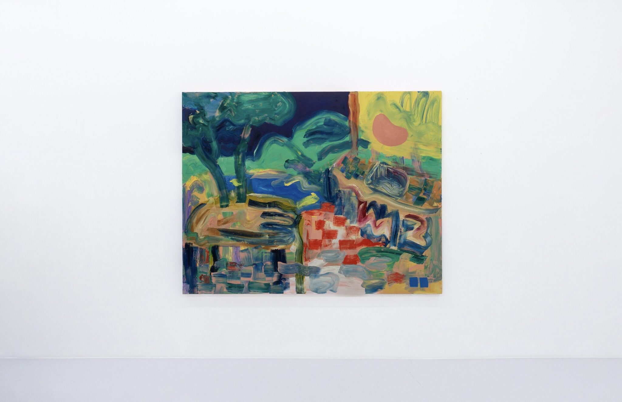
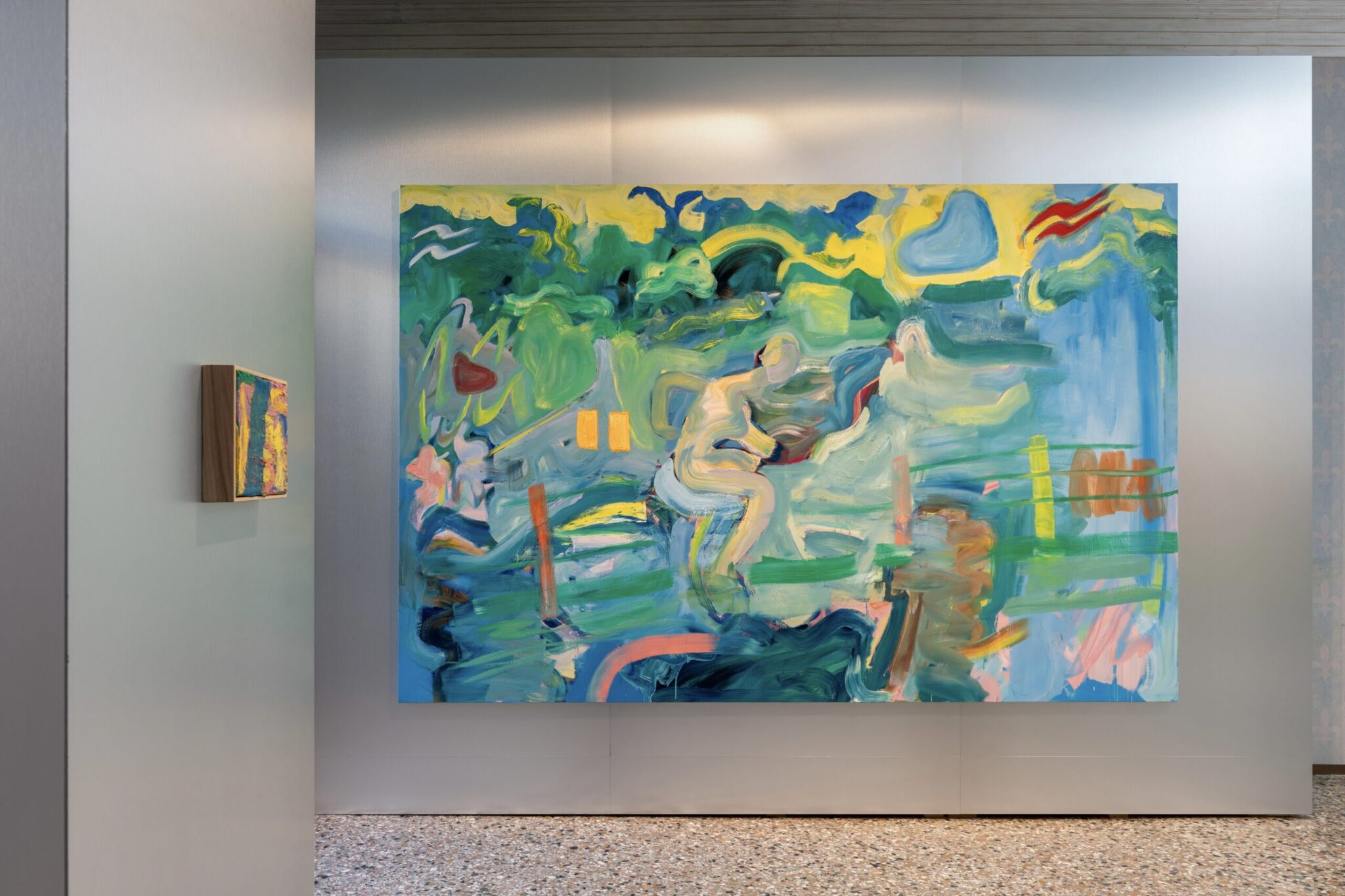
LVH Art: Can you speak in detail about the work you are showing in Urban Dwellers?
Gabrielė Adomaitytė: Automation (2025) began with my visit to the Abbey Library of Saint Gall in Switzerland. I often encounter terrestrial globe models in museums, which are symbols of science and, inevitably, its thresholds. That became the starting point. The work then evolved through fragments from medical imaging, echoscopy panels, and monitors appearing simultaneously. Today we are hyper-trained to absorb novel complexity, almost to the point of automation, yet our bodies impose hard boundaries. I am deeply invested in tracing what happens beyond these limits.
In Conversation with Orfeo Tagiuri
For the forthcoming Urban Dwellers exhibition curated by LVH Art, we spoke with Orfeo Tagiuri about the stories, materials and rhythms that shape his practice.
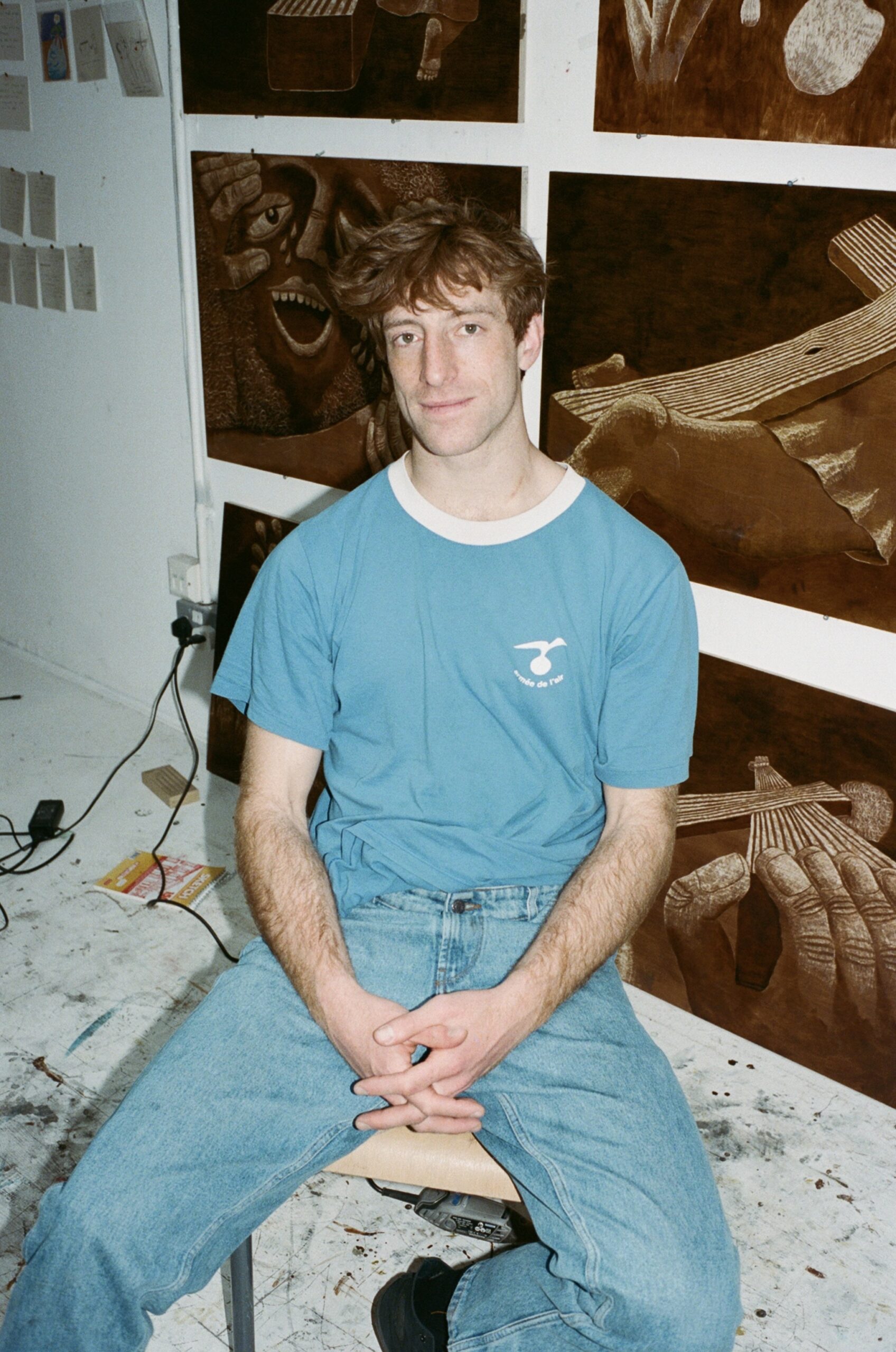
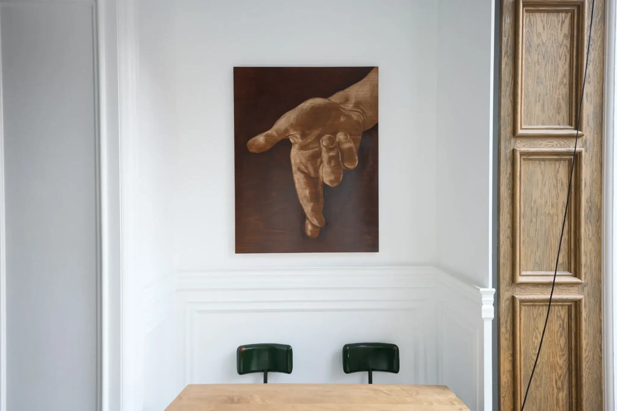
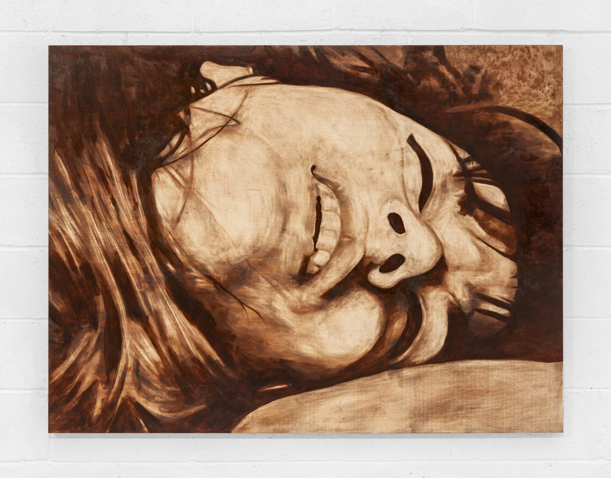
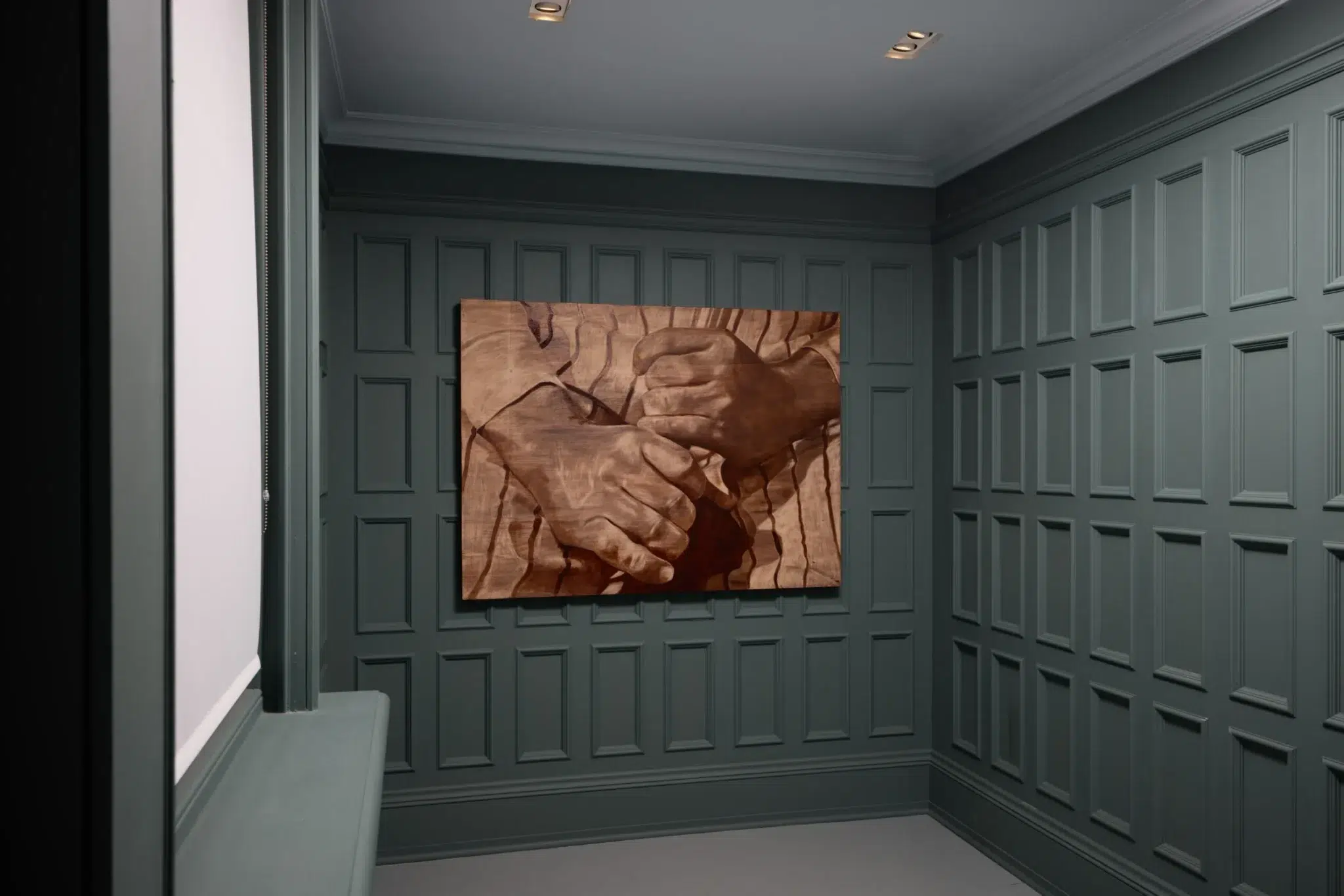
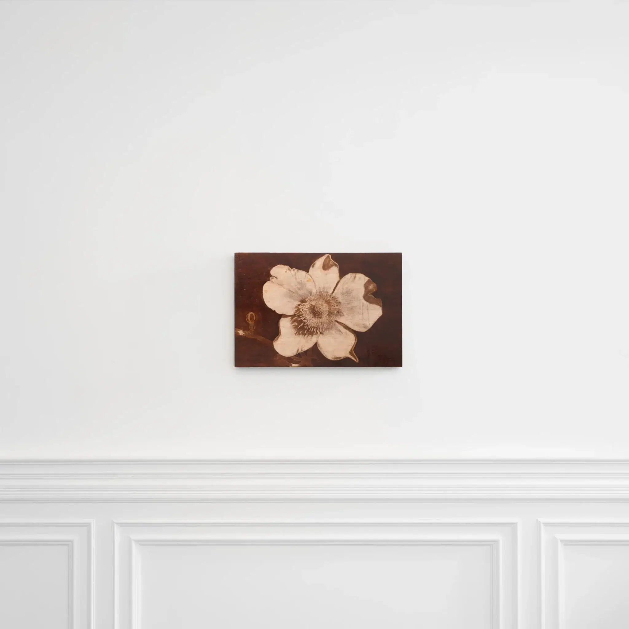
Orfeo Tagiuri (b. 1991) is an American artist and writer based in London. He works almost exclusively with wood stain, rarely using traditional paint. Each composition is built through layered applications of stain, with the depth and darkness of the image determined by the number of layers applied. Working on wooden panels, he allows the natural grain to remain visible, making it an active element in the work and inviting reflection on the nature of painting and the process by which it is normally created.
We talk about Orfeo Tagiuri’s new crowd painting for the Urban Dwellers exhibition, sparked by a 1943 photograph taken in Rome after the bombing of San Lorenzo, where the focus shifts from authority to the faces gathered in search of hope. Tagiuri explains why he works on wood, how staining and carving set the tempo of a piece, and how that began with a Slade project that turned school desks into surfaces for daydreaming.
LVH Art: We know you are still working on the painting that will be in the show, but could you
share a bit about the inspiration behind it?
Orfeo Tagiuri: It’s a large crowd scene, and I’m still in the process of bringing it together. It’s not a close-up like some of my previous works; instead, it’s a wide, complex composition. I was really inspired to make this particular work, and I always feel it’s important to follow that inspiration.
The inspiration for this piece comes from a black-and-white photograph taken in 1943, just after the bombing of the church San Lorenzo in Rome during World War II. In the original photo, there’s a huge crowd gathered, and at the front is Pope Pius XII, who was the pope at the time. What’s remarkable is that the Pope almost never left the Vatican, but on this day, because of the bombing, he came out to the site. The crowd is there both because of the destruction and because they’re searching for hope or guidance in a moment of crisis. In my version, I’ve cropped the image so that the Pope is almost entirely out of frame – only the back of his hand remains visible in the lower right corner. I wanted to shift the focus away from the figure of authority and instead highlight the faces and emotions of the people gathered. What drew me to this image was the intensity in the crowd – the sense that everyone is caught between something devastating and the possibility of hope.
What struck me was the importance of people’s connection to the architecture of a city. In this case, it’s a church, which of course carries a whole resonance. Even though the building isn’t depicted, you sense its presence in the way people have gathered, and their connection to the city and to this specific site.
Up to now, I’ve only really worked with single faces or couples in my images. This is the first time I’ve created a piece that brings together multiple portraits in a single space. That was exciting for me — it opens up a whole range of dynamics. You get these different senses of relationships forming, because when everyone is crowded together there’s almost a breakdown of social boundaries.
LVH Art: Have you looked at historical references before for your work?
Orfeo Tagiuri: Yes, that’s often how I’ll start a lot of my works. For example, Beatnik Chaos (2024) takes inspiration from an image that comes from a newspaper feature where a woman and her partner were given LSD as part of a scientific study, and the photographs documented them becoming progressively more altered. What interests me with that moment was the way it sits at a crossroads. It was a time where there was both a violent political climate and, at the same moment, blossoming of spiritual and psychedelic experimentation. So again, you have this tension between a subject full of spiritual potential in a way and a backdrop of a potent political moment. I think my work often sits between those two poles.
LVH Art: Could you talk more about your colour choices? Most of your works are in a brownish palette, they feel like they come from the same ‘universe’.
Orfeo Tagiuri: All my works are on wood, so the tones are naturally wooden. The only thing changing the colour is wood stainer. I rarely use other materials, except for the occasional oil pastel.
LVH Art: How did you first discover wood as a medium, and what attracts you to working with
it?
Orfeo Tagiuri: When I was at the Slade, we had to write an essay choosing five of our favourite contemporary artworks. I picked five things that weren’t technically artworks at all — but I defined them as such. One was a woman who lived near a church I passed daily. Every week she would place a huge bouquet of fresh flowers at the church door. I thought of that as a kind of performance sculpture. Another came from my mother’s work: she was a child psychiatrist, and one of her patients, during recovery from addiction, had been given a box of sweets. Each day she allowed herself only one sweet and then stuck the wrapper to her hospital window. Over time it became this stained-glass-like collage. When she finished her treatment, she peeled the wrappers off the window and gave them to my mother as a gift. To me, that was one of the most powerful artworks. I wrote my essay around gestures like these.
My professors pulled me aside and said, “You’ve critiqued the whole idea of institutions, as you haven’t mentioned a single artist, gallery, or museum.” I thought I was about to lose marks or be criticised, but instead they gave me a long list of artists who had done exactly this kind of work – blurring art and life, subverting and expanding the art world. That moment revealed to me a whole lineage I hadn’t known existed. For my degree show, I recreated a classroom with eight desks in the centre. On each desk, I carved into the wood as if a troublemaking student had been given endless time to leave their scratchings. That was the beginning of me working with wood — turning this institutional space into one that also allowed for daydreaming, and play.
LVH Art: You studied Creative Writing before. How did the shift toward art feel for you?
Orfeo Tagiuri: I studied Literature and Creative Writing at Stanford in California, and still do quite a lot of writing, especially when making paintings. I sometimes think of it as taking footsteps. One step might be making an image or working with a photograph, and the next step is writing; which becomes a way of analysing why I was drawn to that subject in the first place. What I like about doing both is that in making art, you don’t always need to know why you’re interested in something – you can just jump in. Then writing gives you a chance to reflect and understand what that interest was. That in turn becomes another step. So it becomes this cycle: not knowing, then curiosity, then research and knowing, and then back again to not knowing, curiosity, research, and knowing, etc.
LVH Art: The new works are quite different from your previous works. Could you tell us more
about the shift in style?
Orfeo Tagiuri: Yes, so before I used a lot of imagery I imagined myself. I was inventing subjects for things I was internally feeling, or narratives I was curious about, but now I am looking more at capturing these historical moments.
I think the turning point for me was during an artist residency called IM Residency in Worlingham, Suffolk in April last year. There were a lot of flowers that started to open while I was there, and by the time I left they were fully blossoming. In particular, the magnolias. I started drawing them just as an exercise, and then I learned that magnolias have both male and female parts, but they can switch them off and on. I think noticing how something as simple as a flower can hold that kind of narrative — the same kind of narratives I’m trying to tell through my own imagery — suddenly opened up a door. So, everything I’m curious about can tell a story, whether it comes from me or from the world.
LVH Art: Do you have any creative rituals or processes that help you get into the right mindset?
Orfeo Tagiuri: The nice thing about working on wood is that it has to be prepared, as I need to put down a base layer and then several layers of stain. There’s already a rhythm built into that process before I even start making deliberate marks, and I think that helps get me into the zone.
LVH Art: Are there any artists or writers who inspire you at the moment?
Orfeo Tagiuri: I’m always drawn to the poet James Tate. He describes very ordinary situations, but each one has a kind of twist to it. Another artist I admire is David Horvitz, an LA-based artist who interacts very poetically with the world around him. His work is quite conceptual, but also accessible, not alien or opaque the way some conceptual art can be. For example, he once made a project where every time he went to a café, he would steal a spoon and mail it to MoMA. Eventually, there was a drawer in one of the offices filled entirely with these stolen spoons, and he turned it into a book called Stolen Spoons. He also made a beautiful work where he collected sea glass — the broken bits of glass you find on the beach. He gathered so much that he was able to melt it down and make new vases.
In Conversation with Channatip Chanvipava
For the Urban Dwellers exhibition curated by LVH Art, we sat down with Channatip Chanvipava, a London-based artist whose layered paintings draw from personal memory and architectural forms, to discuss his process and how his work engages with the theme of the exhibition.
Channatip Chanvipava (b. 1993) is a London-based artist whose work seamlessly blends abstract and figurative elements, capturing intimate personal moments alongside universally relatable experiences. By avoiding sketches and physical references, he leans into spontaneity and intuition to capture the immediacy of memories as they arise. Characterised by thick, expressive brushstrokes, his work celebrates the materiality of paint, drawing on its sculptural texture and the dynamic energy of fluid, visible marks. Familiar objects such as chairs and sofas often appear as symbols, offering viewers visual prompts that invite reflection and a renewed appreciation for everyday mundane moments of life.
LVH Art: You work intuitively, without sketches or references, relying on memory. Why is painting from memory such an important part of your practice?
Channatip Chanvipava: I use paint and memory to express what I can’t always put into words. I am a narrative painter, creating works rooted in memory — drawn from my experiences, observations, and personal stories. By painting directly rather than transferring sketches first, I allow myself to be impulsive. I don’t like diluting the expression of memory. When I paint from a physical reference, sketch beforehand, or test colours in advance, the memories and expression can lose their sincerity. I believe in letting impulse guide how I paint; my goal is to have my memories expressed as sincerely as possible.
LVH Art: Your paintings appear vibrant and freshly applied, with visible brushstrokes that don’t conceal the medium of paint. What draws you to this technique of using such thick, expressive applications, and does this approach affect the drying time of your works?
Channatip Chanvipava: I’m really drawn to the qualities of paint, so I don’t want to hide that. I want it to be true to its form. It’s sculptural, it’s deep, it has texture. It’s illuminative, it’s deep, it’s saturated. I want to see this on my surfaces. I want the paint on my canvas to looks so delicious that you can eat it and want to touch it. My works take an extremely long time to dry. I am self-taught, so I do not think of having or being fixed to a certain technique, but I think of this concept of time, time stepping away from the canvas and using that as a variable and as a tool. If I want the strokes and colours to be more visible, separate, and imposed, that means I need more time, and a wet brush on a dry surface. Whereas with wet-on-wet, I want the colours to merge, to blend, to create a gradient. I grew up surrounded with traditional Chinese ink paintings and I was always so curious about its fluid yet bold strokes. I wanted to also capture the same velocity and movement of the brush. I want to make visible this energy of emotional charge.
LVH Art: Colour plays a central role in your work, do you approach it more instinctively, or do you deliberately build palettes to evoke certain moods or themes?
Channatip Chanvipava: Colour is constantly evolving for me, it has changing values and emotions. Each memory depicts the same colour differently and each painting contains the same colour where the meaning has shifted. Colour can function in many ways, just as a word changes meaning within a sentence. I use colour to push the direction of the subject and expression within a narrative, and I think of it as shaping form rather than merely filling it.
LVH Art: Your work seems to shift between abstract and figurative. What attracts you to that space, and what helps you find your balance in a painting?
Channatip Chanvipava: I don’t consciously think about balancing abstraction and figuration. I stay true to my practice and let the process guide the outcome of the painting. As I mentioned, memory has so many abstract components. How do you remember love? How do you remember sadness? How does that translate into paint? There’s also the question of containment—how do you hold onto memory? Memory is both contained and uncontained, and over time, it becomes difficult to define it sharply in the mind. I think that tension between abstraction and figuration emerges naturally from the nature of memory itself, rather than from anything I control.
LVH Art: Often you use familiar objects, like chairs and sofas. What draws you to include these in your work?
Channatip Chanvipava: Familiar objects are all around us every day, so I can’t really escape them. They act as hints or clues for the viewer, inviting them to respond and create their own narrative or reflection. These simple objects are metaphorical, symbolic, and full of meaning, but at the same time, they are reminders to notice and appreciate the simple moments in life and to find beauty wherever we can.
LVH Art: Is there a moment in that process when you feel your painting is complete or that it has reached a point where you are satisfied?
Channatip Chanvipava: I am not always sure I am happy with it, but there is a point of inflection, and I am getting much better at recognizing it.
LVH Art: Are there any artists, writers, or creatives who have influenced you or your practice, and if so, what makes you resonate with them?
Channatip Chanvipava: Yes, there are many, but the two most meaningful to me are Marcel Duchamp and Claude Monet. I would start with Duchamp. His idea of using found objects and repositioning and repurposing them is like how I work with memory. I think of memory as something found, which I then repurpose with new meaning and narrative in my work. The second is Claude Monet. I grew up imitating his paintings from a very young age, and the way I convey light and atmosphere in my work is still deeply influenced by him.
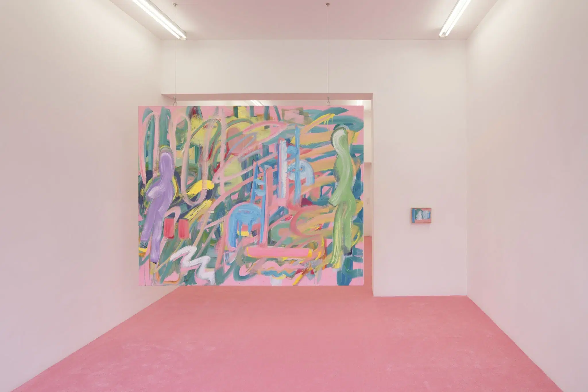
LVH Art: We would love to know more about your painting State of Mind, which will be part of Urban Dwellers. What was the inspiration behind the work? How long did it take you to complete it?
Channatip Chanvipava: I was thrilled to learn of Urban Dwellers, because State of Mind is part of a series where I explored how we connect to spaces and our relationships with them. Why are we so attached to certain environments? How do we recollect them? How are they stored in memory, and why is it so important to be able to remember and revisit these places without physically being there? State of Mind, as the title suggests, points directly to this exploration. However, I prefer not to give too much away, beyond the title and the forms that appear on the surface.
LVH Art: Are there any recurring symbols that appear often in your work?
Channatip Chanvipava: Yes, we spoke about objects as being symbols. But there are also other symbols that appeared in my first paintings, and they keep on reappearing. They haunt me everywhere I go and paint, but they’re representative of a spiritual belief and a reminder inside me. So it grounds the memory, it grounds the meaning, it grounds the painting, and most importantly, it grounds me.
LVH Art speaks with Tastemaker and Art Patron Giancarlo Giammetti on PM23, Valentino and the Art of Legacy
LVH Art sits down with iconic Valentino Co-founder Giancarlo Giammetti to discuss the launch of PM23, his enduring partnership with Valentino, and the legacy of a life devoted to beauty.
This month, LVH Art interviews Giancarlo Giammetti, a name already legendary in the fashion world for co-founding the iconic Maison Valentino. While Valentino Garavani was the creative force behind the designs, Giancarlo was the architect behind the scenes: securing the best time slots at fashion weeks, identifying key financial and strategic opportunities, and providing unwavering support to Valentino throughout their decades-long partnership. More than just a business partner, Giancarlo was Valentino’s protector, confidant and friend.
Now, Mr. Giammetti is making a significant impact on the art scene as well with the grand opening of PM23, the space which will host the activities of the Fondazione Valentino Garavani e Giancarlo Giammetti in Rome. The ambitious new location, named after its prestigious address at Piazza Mignanelli 23, is located next to the iconic Valentino headquarters and near historic places related to the duo, such as Via Gregoriana or Via Condotti. While the Fondazione was established in 2016 by Valentino and Giancarlo to safeguard the Valentino legacy, champion creativity, and support charitable and educational initiatives, it is only this year that they have opened a physical space.
The inaugural exhibition, titled Orizzonti | Rosso (Horizons | Red) curated by the esteemed Pamela Golbin and Anna Coliva, is a beautiful journey through both fashion and art. The exhibition closes August 31st. As the title implies, the show features only red garments and artworks. After all, red is a colour inextricably linked with Valentino’s identity. As Pamela Golbin told us, “Valentino Garavani is the only couturier to have created a distinct red oeuvre within his body of work, making the colour a hallmark of his identity.” The exhibition opens with the iconic Fiesta dress from Valentino’s 1959 debut collection. Directly opposite stands his final red design from 2008, creating what Golbin describes as “a fitting counterbalance.”
The artworks in the exhibition are from the private collection of Mr. Valentino Garavani and Mr. Giancarlo Giammetti, as well as loans from around the world.

LVH Art: Given that the colour red is so intrinsically linked with the Valentino brand, it’s fitting that your inaugural exhibition is titled Orizzonti | Rosso. Can you share when and where this iconic association with red first began? What is it about the colour red that you and Mr. Valentino finds so special?”
Giancarlo Giammetti: Valentino’s love for red started with a moment he never forgot—as a young student at the opera in Barcelona, he spotted a woman in red velvet who stood out from everyone else. That image of elegance and confidence stuck with him. For him, red wasn’t just a colour; it symbolised strength, beauty, and presence. It reminded him of the drama of the stage, of passion, power, and unforgettable moments. He often said that the woman in red became a kind of goddess in his mind.
Valentino’s Red is more than a color. Over decades, it has become a symbol of elegance, of strength, and of timeless femininity. It felt like the perfect starting point.
This exhibition is our way of saying that beauty still matters — perhaps now more than ever. It has the power to uplift, to connect, to inspire. And that is precisely what we hope people take with them after visiting PM23.

LVH Art: When did you first meet Mr. Valentino, and at what point did you both realize you shared a vision strong enough to build one of the most iconic fashion houses in history?
Giancarlo Giammetti: My encounter with Valentino, in the summer of 1960 at the Café de Paris on Via Veneto, was completely unexpected—but it changed both our lives. At the time, I was a young architecture student, spending the afternoon there with some friends. Valentino had just returned from Paris and spoke to me in French—something he still does to this day. We exchanged only a few words, but it was immediately clear to me that he had something truly special. By the end of the evening, I offered him a ride in my little Fiat. During that short drive, we discovered we were both planning to spend part of the summer in Capri. Ten days later, we ran into each other again on the island.
I was very young then, but not long after, I made the most important decision of my life: I left university to devote myself entirely to Valentino’s vision. The atelier was going through a challenging period, but together we found the strength to persevere and grow. That chance meeting was the beginning of everything. From that moment on, we were inseparable, and what we built over the years was something truly unique—based on shared values, deep friendship, mutual trust, and a common vision.

LVH Art: You were born in Rome, a city that also holds special meaning for the Valentino brand. What do you believe makes Rome so special? Do you think the city is growing as a cultural and creative centre?
Giancarlo Giammetti: Rome, the city where I was born, has always held a special place in my heart. It’s a city of extraordinary beauty and timeless charm, where history speaks from every stone, and yet, it never stops evolving. Over the years, I’ve watched it open up more and more to contemporary art, design, and fashion, becoming a space where tradition and innovation coexist in a truly unique way.
What I find most inspiring is Rome’s ability to embrace the future without losing its soul. From the classical grandeur of its monuments to the energy of its emerging creative scene, the city continues to surprise me. It’s not just a backdrop—it’s the city where our story began, it’s a living, breathing part of the story we’ve built, and we’ll continue to build, through our work and through our Fondazione.
LVH Art: Speaking of the Fondazione, could you tell more about its mission and what makes it unique?
Giancarlo Giammetti: The Fondazione was created in 2016 out of a genuine desire to give back. Valentino and I felt a strong responsibility to preserve our legacy and, more importantly, to turn it into something that could inspire and support others. Our mission is grounded in the idea of beauty—not just in a visual sense, but as a transformative force capable of educating, uplifting, and creating positive change.
That vision has come to life through many projects: from supporting pediatric care and research at hospitals like Bambino Gesù and Policlinico Gemelli in Rome, to support the Teatro Valentino Garavani in Voghera, and most recently, launching our cultural space PM23.
What makes the Fondazione unique is its independence and personal commitment—we support what we truly believe in. Because we are convinced that beauty, when shared, has the power to create even more beauty.

LVH Art: Orizzonti | Rosso features 50 iconic Valentino designs alongside 30 art masterpieces. You could have exclusively showcased dresses, so why did you include art as well? In your view, how are art and fashion connected?
Giancarlo Giammetti: From the very beginning, I knew that Orizzonti | Rosso had to be more than just a showcase of Valentino’s iconic creations. Fashion has always been a form of art in its own right, but for us, it has also always existed in dialogue with other disciplines: painting, sculpture, photography, architecture, movies. Including art in the exhibition felt natural, even necessary. It’s a way of showing how inspiration flows freely between creative worlds, how a silhouette can echo a brushstroke, or a colour can carry the same emotional weight in a dress as in a canvas. Art and fashion are connected by the same desire: to express, to move, to leave a mark.


LVH Art: In one room stands the first red dress designed by Mr. Valentino, the hourglass-shaped cocktail dress “Fiesta” dating back to 1959, together with his last, from the couture spring 2008 show. What does it mean to you to present these two iconic moments side by side, and what story do you hope they tell together?
Giancarlo Giammetti: Placing the “Fiesta” dress from 1959 next to Valentino’s final red gown from 2008 was one of the most meaningful choices we made with the fashion curator Pamela Golbin. These two pieces are like bookends of an extraordinary journey. One represents the very beginning—a young designer’s bold vision, full of promise and passion. The other is the culmination of a career built on discipline, elegance, and innovation. Together, they tell a story of continuity and evolution, of unwavering identity through time.
LVH Art: You founded the foundation in 2016. When did you first recognize the need for a multidisciplinary space to fulfil the foundation’s mission—and why was this so important to you?
Giancarlo Giammetti: The idea of creating a multidisciplinary space was something that grew over time, as I reflected on the mission of our Fondazione. Since the beginning, I felt a responsibility not only to preserve the legacy of our work, but to offer something forward-looking… something that could inspire new generations. A space like PM23 allows us to do exactly that: bring together fashion, art, culture, and education under one roof. It’s not a museum, it’s not a gallery, nor a museum, it’s a place for ideas, encounters, and experimentation. That openness was very important to me. To us.

LVH Art: What was the very first artwork you purchased for yourself?
Giancarlo Giammetti: My first artwork was a Lucio Fontana canvas. I was very young, and when I brought it home, I remember my father asked me: ‘When are you going to unwrap it?’ He thought the cut was just packaging! That moment never left me. From that day on, collecting art wasn’t just about beauty, it became a way to collect emotions, memories, a personal journey, and what I like the most.
LVH Art: You and Mr. Valentino are both known for your impressive art collections. How would you describe your collection today?
Giancarlo Giammetti: Over the years, both Valentino and I have built our collections with great passion and curiosity. Our taste has naturally evolved, but one thing has always remained constant: we are drawn to pieces that tell a story, that have emotional or historical weight. Today, my collection spans classical and contemporary works, design objects, and photography. I don’t follow trends; I follow instinct and what I like. Art has always been a source of inspiration and reflection for me, and I like to surround myself with pieces that evoke something personal and in a way meaningful to me.

LVH Art: You mentioned that showing the exhibition and space to Mr. Valentino two days before the public opening was very emotional. Can you describe what made that moment so special for you?
Giancarlo Giammetti: Yes, showing the exhibition and the PM23 space to Valentino before anyone else was a deeply emotional moment for me. We have shared so many milestones in our lives, but this one felt different. It was intimate and quiet walking through a space that was created with a scope and intention, to celebrate beauty, creativity, and everything we’ve stood for over the decades. Seeing his reaction, the way he connected with the works, and with the spirit of the exhibition—it was like opening a new chapter. It reminded me of why we started all of this in the first place.


LVH Art in Conversation with Matthieu Humery, The Pioneering Curator Shaping the Future of Photography
This month, LVH had the pleasure of speaking with renowned photography specialist and curator Matthieu Humery. His multifaceted career—spanning museums, auction houses, and private collections—is rooted in his exceptional expertise in photography, his expert eye, and an unwavering drive to innovate and push the boundaries of curatorial practice. Whether curating an exhibition, spotlighting emerging photographers, or offering fresh perspectives on familiar works, his approach consistently seeks to uncover something new and challenge the viewer’s perception.
Matthieu Humery spoke with us about the landmark exhibitions he has curated, how to start collecting photography, the most meaningful works in his personal collection, the growing momentum of the photography market, and more. His words and work invite you to appreciate photography in a way few others have, offering a compelling case for why it deserves the same recognition and respect as any other art form.
From 2001 to 2005, Humery worked in the photography department at Phillips auction house in Paris and New York, where he revolutionized the sales catalogue format, achieving remarkable success. In 2007, he became head of the photography department at Christie’s in New York. He then joined the LUMA Foundation—founded in 2004 by Maja Hoffmann in Zurich. He currently serves as the director of the Living Archives program at the LUMA Foundation and is also a curator for the Pinault Collection.
Over the years, Humery has advised some of the world’s leading photography collectors and curated several of the most compelling photography exhibitions of the past decade. In 2021, he co-curated Henri Cartier-Bresson: Le Grand Jeu at Palazzo Grassi, offering a bold new interpretation of the legendary photographer’s work. In 2023, he returned to Palazzo Grassi to curate Chronorama, a major exhibition featuring photographs and illustrations from the Condé Nast archives. Recently, Humery curated Untroubled, the first exhibition of Irving Penn’s work in the Middle East, held at the Mina Image Centre in Beirut.

LVH Art: How did your passion for photography first begin?
Matthieu Humery: My passion for photography is part of a broader fascination with images in general. From an early age, I was captivated by the way a single image-whether a painting, a photograph, or a film still-could condense time, space, and emotion. I was drawn to composition, to the architecture of an image, how light, form, and framing come together to create meaning. My interest in cinema sparked a fascination with the way images move and unfold over time. Photography, for me, emerged as a bridge between painting and film— as a perfect balance between stillness and narrative. Over time, my interest extended beyond the photographs themselves to include studying how they are collected, preserved, and presented. That’s where my curatorial path began: from a desire to understand how images, and the ways they are collected, influence our perception of the world.
LVH Art: How do you feel the digital age has impacted the value and appreciation of photography as an art form?
Matthieu Humery: The truth is that photography has always evolved in direct dialogue with technological and technical innovation. I would even say that this is its very nature. And it’s precisely this adaptability that has often led people to question whether photography is truly “art,” or whether it’s losing its artistic status in the face of constant transformation. But to me, it’s quite the opposite. It is the very instability and constant transformation of photography that are what make it so vital and engaging.
From the very beginning, photography was about invention. The first images, like daguerreotypes, were unique, irreproducible objects. Then came the invention of the negative – first on paper, then on glass – which allowed for multiplication, enlargement, manipulation. Every major shift in the medium’s history – from analog to digital, and now to AI-generated imagery – has simply been a new chapter in the same story: photography as a medium constantly at the frontier of change.
Far from diminishing its value, these shifts have continually redefined what photography can be. They force us to ask: What is an image? What is authorship? What is real? In that sense, photography remains one of the most intellectually and artistically challenging forms of expression today – precisely because it never stops evolving.
LVH Art: What advice would you give to an art collector looking to acquire their first photograph for their collection?
Matthieu Humery: Even though you’re collecting photography, you’re not just collecting an image—you’re acquiring an object. A photograph is a work of art in its own right, and like any artwork, it has qualities such as materiality, history, rarity, condition which one needs to consider. The quality of the photograph- its paper, its tonal depth, its state of preservation, the date of the print – is fundamental. Otherwise, you might as well be collecting images on your phone.
Then there’s the important question of how images relate to one another. A collection is never a series of isolated works. Each photograph becomes a fragment of a larger narrative. In photography, perhaps more than in any other medium, the connections between images – formally, conceptually, historically – are incredibly rich. The way you build your collection can express a vision as coherent and personal as a curatorial project. So, trust your eye – but also think in terms of dialogue, not trophies.

LVH Art: What was the first photograph you ever purchased as part of your collection?
Matthieu Humery: The first photograph I ever bought was a beautiful three-quarter oval portrait of the painter Gustave Doré, taken by Étienne Carjat in the early 1860s. I was immediately drawn to the idea of one artist being portrayed by another – of a photographer capturing a painter. It brings up questions that intrigue me, such as, do a painter or a photographer approach a portrait in similar ways? Also, in the image the codes of the pose were subtly subverted, as the image hovered between homage and invention. That photograph sparked a deeper curiosity about how photography represents artists, and how it borrows – and transforms – the conventions of other mediums. I ended up exploring these themes more thoroughly, particularly through the photographs of Eugène Disdéri, who invented the carte-de-visite portrait format around the same period.

LVH Art: Is there a particular photograph that holds special significance for you in your collection?
Matthieu Humery: I mostly collect portraits, and the photograph that’s closest to my heart is probably Edward Steichen’s portrait of Gary Cooper from 1928. As a teenager, I had found a poster of a Whitney Museum exhibition on Steichen at a flea market, with that very image on it. I remember being struck by its absolute modernity – both in the pose and in the intensity of the figure. Years later, coming across the original print and being able to acquire it felt almost unreal, like a quiet sign from the past.
What made it even more meaningful is that, much later, I had the opportunity to curate Chronorama at the Palazzo Grassi in Venice, drawn from the Condé Nast archives – exactly where that portrait originated. It was as if the photograph had been following me through time.
LVH Art: How do you go about making decisions when adding new photographs to your collection?
Matthieu Humery: Whether it’s for my own collection or for those I advise, I try to follow the “inner logic” of the collection, which the collector may have formed unconsciously. It always begins with the relationships between images, then between groups of images. Often, the collection ultimately reflects the owner’s story and sensibilities. When I’m not buying for myself, I try to become a kind of chameleon. I step into the mindset of the collector. One dreams in images, and my role is to dream on behalf of someone else. That shift allows me to see photographs from angles I wouldn’t have considered on my own.
Of course, beyond that, I always look at the photograph as an object – the date of the print, its paper, dimensions, condition. The materiality matters. An image must resonate – but it must also hold up, physically and historically.

LVH Art: Who are some contemporary photographers whose work you admire, and what is it about their work that resonates with you?
Matthieu Humery: There are several, but a few stand out. I greatly admire Deana Lawson, whose work I recently had the privilege of presenting in France for the first time at the Bourse de Commerce, as part of a group exhibition titled ‘Body and Soul’. What fascinates me in her practice is its hybridity – she works with a very specific methodology, often using large-format cameras. She also interrogates the various uses of photography – vernacular, sacred, constructed- to build her own language. Her images are both meticulously composed and deeply symbolic.
Wolfgang Tillmans is another key figure for me. He opened the door to a diverse range of photographic language nearly forty years ago, and he remains highly relevant today. Both in his conceptual thinking and in the way he presents images, he exhibits a freedom and bravery that remain inspiring.
I’m also very drawn to Frida Orupabo’s work. Her use of collage works beautifully with many of the themes her work speaks to, such as fragmentation, history, and identity. And, in a different register, I find the work of Anhar Salem – recent winner of the Reiffers Art Initiatives prize – compelling. Unlike Orupabo’s work, Salem crafts images by blending various other images, frequently using AI to build a unique form of visual mythology. It’s fascinating to see how these two artists explore the body and image-making through such different yet equally powerful means.


LVH Art: Can you discuss how in 2002, you changed the way catalogues were presented at Phillips auction house? What changes did you make, and why did you believe it was the best approach?
Matthieu Humery: When I arrived at Phillips in 2002, I had no prior experience in the auction world. My background was in fashion and runway production. So, I approached the catalogue not from a traditional auction perspective, but from a visual and editorial one. I asked myself: how do we make this object more seductive? How do we stand out from our competitors?
It was clear to me that the look and feel of the catalogue had to change. The catalogue couldn’t just be a neutral sales tool – it had to be an extension of the work itself. So, we changed the format, enlarged it, redesigned the layout, refined the paper stock, gave more space to the images, and introduced short essays. It was about giving the works the editorial dignity they deserved. And it worked. That bold format made us immediately more visible in a crowded market. So much so that the large-format catalogue approach was quickly adopted across other departments at Phillips.
LVH Art: How has the photography market evolved over the years?
Matthieu Humery: The photography market has changed enormously and developed relatively late. It wasn’t really until the 1970s that auction houses began to structure photography sales in a serious way – thanks in large part to pioneering figures like Philippe Garner or Harry Lunn. Before that, the market was small, almost confidential. Even the major museums were making few purchases, and when they did, it was for relatively small amounts—MoMA, for example, was acquiring works by Lee Friedlander and Diane Arbus for about $200.
Over time, the market gradually organized itself around key names from the 19th and 20th centuries. The great collections were formed – many of which have since entered institutions and remain there. What’s also particular about photography collectors is that they tend to be deeply passionate, often emotionally attached to their works, and they rarely sell individual prints. As a result, the availability of major vintage prints from the 19th and 20th centuries has dramatically decreased. These works now often change hands privately, and increasingly as part of full collections rather than single works.
For contemporary photography, the dynamics are different. Competing with painting on the primary market is difficult—pricing, visibility, and fashion trends all play a role. But photography, like everything in art, moves in cycles. It’s a medium that is uniquely responsive to the present, and that gives it a timeless relevance.
LVH Art: Are there any photography fairs or photography-related events you would recommend for someone interested in immersing themselves in the world of photography?
Matthieu Humery: I’m not fond of isolating photography from other mediums—I’ve always preferred it as part of the broader art conversation. That’s why I appreciate seeing strong photography presentations at art fairs like Art Basel, TEFAF or Frieze, as it is there where it resonates most through its dialogue with other forms.
That said, there are of course dedicated events that are essential. Paris Photo remains the annual gathering point—it’s the most established and comprehensive fair devoted entirely to photography. And then there’s photo festival Les Rencontres d’Arles, which in my view, is the most intelligent and daring photography festival in the world, which offers a truly comprehensive exploration of the medium. Arles invites you to slow down, to spend time with the image, providing a richer form of engagement and connection.

LVH Art: In 2020, you curated Henri Cartier-Bresson: Le Grand Jeu at Palazzo Grassi, a show that later traveled to the BnF in Paris in 2021. For this exhibition, you invited five leaders from different fields to each select around 50 works from the archive, presenting five distinct visions on the collection. What motivated you to involve such a range of perspectives?
Matthieu Humery: For Le Grand Jeu, I wanted to move away from the format of a traditional monographic exhibition. Two major and beautifully curated retrospectives had already taken place, at the Centre Pompidou in 2014 with Clément Chéroux, and at MoMA in 2010 with Peter Galassi. Rather than offering yet another narrative about Cartier-Bresson’s life and work, I was more interested in exploring how his work is perceived – how it’s understood, interpreted, even projected upon. The idea wasn’t to define his oeuvre, but to open it up, to liberate it from any singular, official reading.
Cartier-Bresson himself had selected a group of 385 prints that he considered representative of his life’s work – the so-called Master Collection. Starting from that selection, I asked five individuals to create their own exhibitions, each choosing around 50 images. In a way, it became a project about perception: Cartier-Bresson shaping his own legacy, and others responding to it in turn.
The five participants each embodied a distinct point of view: François Pinault as the collector, Sylvie Aubenas as the museum curator, Annie Leibovitz as the photographer, Javier Cercas as the writer, and Wim Wenders as the filmmaker. Each brought not only their professional lens, but also something deeply personal. What emerged was a kind of curatorial mirror, an exhibition that reflected just as much about Cartier-Bresson as it did about the people interpreting him.
I’m drawn to that kind of layered perspective when curating—the goal is to create a space where an artist’s work can breathe, resonate, and generate new meaning, rather than simply be explained.

LVH Art: In 2023, you curated the Chronorama exhibition at Palazzo Grassi, which showcased photographs and illustrations from the Condé Nast archives, that had been recently acquired by the Pinault Collection. As a curator, how would you define your primary responsibilities in terms of both presenting and preserving such an extensive archive?
Matthieu Humery: When I first began working on the Condé Nast archive, I was struck not only by its scale, but by its extraordinary richness and diversity. The range of genres that makes up the archive is exceptional: portraiture, fashion, architecture, still life, reportage… All the major photographic languages of the 20th century are represented. Then came the historical realisation: nearly every great photographer of the 20th century worked at some point for Condé Nast. The archive is not simply a record of editorial history – it’s a mirror of the century itself. And finally, the great quality of the prints themselves.
I realised this is no ordinary press archive. The Condé Nast collection carries a greater significance—it’s part of our shared cultural heritage and reflected the evolution of the modern gaze. From the moment I began working on the acquisition with the Pinault Collection, I felt strongly that this archive needed to be shared with the public – not just as documentation, but as a living history. That intuition led to Chronorama, which at its core was an exhibition that attempted to reveal the diversity of the archive, as well as to let singular photographs speak for themselves. The aim was to offer viewers an editorial, artistic, and emotional interpretation of the 20th century through the lens of this archive.

In Conversation with Kingsley Ifill about his captivating show at Hannah Barry Gallery
This month, LVH Art spoke with Kingsley Ifill about his multidisciplinary practice and his current exhibition at Hannah Barry Gallery, on view until May 17th. The show, titled Blue Roan carries a quiet intensity and intimate atmosphere, offering a diaristic quality that invites viewers to imagine fictional narratives— while also connecting the images to personal memory, emotion, and mortality. It’s one of the most compelling gallery shows on in London at the moment.
In the show Kingsley Ifill brings together images of snakes, birds, sleep, movement, and ritual—some screen-printed in acrylic onto raw surfaces, and others platinum palladium prints on handmade Japanese Washi paper, framed in intricately carved wooden frames.
The title, Blue Roan, comes from Romany slang, passed down from Ifill’s grandfather. It speaks to the blending of two distinct things into one. As Ifill puts it: “Non place as place. A name for the nameless. Neither here, nor there, but somewhere.” The exhibition becomes a meditation on that in-between space—a celebration of photography as both image and object, and a test of how far that object can be pushed.
Photography lies at the core of Ifill’s practice. Working primarily in 35mm—a habit that began with a disposable supermarket camera in his teens—he embraces the medium as a way to preserve memory and craft visual poetry

LVH Art: Are there recurring themes that you find yourself exploring in your work?
Kingsley Ifill: If there are, it’s not conscious. I like to imagine that I’m constantly moving and picking up the pieces as I go along, but whether the direction is in a straight line or an endless circle, I’m not sure. My focus is on putting one foot in front of the other and with enough walking, the path will become worn.
LVH Art: In your current exhibition ‘Blue Roan’ at Hannah Barry Gallery, some recurring subjects are snakes, cropped nudes, and figures on horseback. What draws you to these specific visuals?
Kingsley Ifill: My studio in Kent is right next to the sea. Often when looking out at the landscape from the shore over the vast desert of water, I find myself experiencing a great level of comfort in acknowledging that the sight which I’m witnessing in that moment, is similar to the exact sight other living beings would of seen, for as long as we’ve been here and looking. A timeless beauty. I get the same satisfaction from each subject which you have mentioned. Bare skin, rattling snakes, horses pushing against the current. Each image has a story, or provides a clue and I’m confident that one day it will all add up to make sense.

Game Bred, 2020-2025. Platinum palladium print on Tosa Washi paper in hand carved wood frame with UV Filtering glass. © Kingsley Ifill. Courtesy the artist and Hannah Barry Gallery, London. Photography ©Damian Griffiths
LVH Art: On the ground floor of your exhibition at Hannah Barry Gallery, you presented a series of silkscreens—acrylic on canvas or linen. Can you talk us through your process for these works?
Kingsley Ifill: There’s a wide variety of processes involved. All of the works on show have existed within several different mediums or formats, before eventually finding their final resting place at this scale, printed with these methods. Through a journey almost purely based on instinct, until the image feels right. Which in some cases has taken over a decade to get from there to here.
For example, a photo can initially be taken using a 35mm film camera, which I then process, print as a contact, make a silver gelatin print, reprint as silver gelatin using abstraction methods, tea tone, then Xerox the silver print, then risograph the zerox, then scan and crop, print as transparent, expose as a silkscreen. Repeat for several images and print using silkscreen on large stretched linen, combining several images as new “photography”.

Blue Roan, 2015. Acrylic on linen. Blue Roan (installation view). ©Kingsley Ifill. Courtesy the artist and Hannah Barry Gallery, London, UK. Photography ©Damian Griffiths
LVH Art: They’re not “perfect prints”—the ink often bleeds or soaks into the canvas. In Blue Roan (2015), for example, there are drips running down the canvas. What draws you to this effect?
Kingsley Ifill: I often feel like I’m a collaborator with the actual image or as if the image will do what it wants to do and my job is to simply keep my mind open to accept inspiration. I try not to rationalise. Or to put it even more clearly, the images and ideas are already there and I’m just a mediator. A bit like when Townes Van Zandt talked about how he wrote a song in his dream, woke up and started playing it. As if it had appeared from thin air. It’s the same with capturing the images in a camera too. All the images are there, you’ve just got to look and click the shutter.
With Blue Roan, it’s technically a difficult image to print as the head of the horse is a deep back, with the dark river as the back ground. They blend into one. I spent days exposing different large 40×60” silkscreens and then even when they seemed crisp, it was still tough to work out the pressure and angel of the squeegee. I got the point where I’d almost given up. But through the failure and frustration, allowed a gap for chance, where I did certain things that I wouldn’t usually do. The drips came through attempting to thin out the paint from a failed print, which ultimately provided the base which I didn’t know I was searching for, until it appeared. To then built upon using silver paint and yet another silkscreen print. Completing the image.
LVH Art: The exhibition shifts upstairs to featuring beautifully framed photographs. Can you talk about your selection process for these photographs, and what influenced your decision around the framing?
Kingsley Ifill: They’re photographs which I’ve taken over the last 15 years. Images I feel are strong enough to exist individually, without support from each other. Like single chapters from a book of short stories.
The frames I carved myself by hand over different points in the last five years. The contrast of time between the two acts interests me. Some of the photographs would be been taken in a 1/1000th of a second, whereas the tree may have taken a couple of hundred years to grow before being cut and dried. And then a week or two of solid work to carve each one. The washi paper was produced using the same process in Japan, with water from the same river, that’s been used for over a thousand years.
The platinum palladium prints, I made myself too. The process took me a long time to work out. Several years. And the archival properties of the print are 1000+ years, or supposedly forever. So essentially, although the image was brief moment, it could potentially live forever if placed in suitable conditions.

LVH Art: Your work often plays with omission and the use of empty space. How do you approach composition, and think about absence and fragmentation?
Kingsley Ifill: There’s no right or wrong. And photography is more about what you crop, rather than what you include. I heard someone once say that poetry isn’t in the words, it’s in the space between the lines. Room for the mind and imagination.

LVH Art: Have there been any artists, from the past or present, who have particularly inspired you or who you are thinking about a lot lately? What is it about their work that speaks to you?
Kingsley Ifill: Always. I’m forever thinking about Bruce Nauman. In particular with this show, I kept going back to his large scale installation, Room With My Soul Left Out. Room That Does Not Care, which was a big inspiration for my piece Chrysalis. Dekoonings early brushstrokes, which I saw in Venice last summer and how they drag themselves dry. Ad Reinhardt’s darker works and the way colours merge, floating into black and need to be experienced in person. Just like the subtle tones of platinum palladium.

Lifer, 2020-2025. Platinum palladium print on Tosa Washi paper in hand carved wood frame with UV Filtering glass. © Kingsley Ifill. Courtesy the artist and Hannah Barry Gallery, London. Photography ©Damian Griffiths
LVH Art: Looking back, how has your practice evolved over the years? Are there any new mediums or themes you’re excited to explore in the future, or is there something in particular you’re excited about coming up?
Kingsley Ifill: It’s become more concentrated. For a while I was interested in finding or “taking” images, but now I’m only using my own photographs which I’ve taken using a camera. I’m excited to make the book for this show, which I’ll produce by hand in my studio. I’d like to carve more too, go up in scale. Same with the platinum palladium prints, to see how they translate bigger. No grand plans though. With each new work, I feel like I see more clearly. And that’s my main interest, seeing and feeling more.

The Mirror, 2023. Acrylic on canvas in aluminium frame. © Kingsley Ifill. Courtesy the artist and Hannah Barry Gallery, London. Photography ©Damian Griffiths

Fermina, 2020-2025. Platinum palladium print on Tosa Washi paper in hand carved wood frame with UV Filtering glass. © Kingsley Ifill. Courtesy the artist and Hannah Barry Gallery, London. Photography ©Damian Griffiths

A Design Dialogue: LVH Art speaks with Four Trailblazing Furniture Designers
This month at LVH Art, we had the pleasure of speaking with four exceptional furniture designers whose work we admire. Elliot Barnes, Ransom & Dunn, Nifemi Marcus-Bello and Studioutte each bring a unique perspective to their designs—creating pieces that are not only beautifully made but also rich with intention and artistry. We asked each designer four questions to dive deeper into their creative practices, uncover their inspirations, and explore the ever-evolving dialogue between art and design.

Elliot Barnes is a London-based British furniture designer who blurs the boundaries between industrial design and decorative art. Known for creating captivating pieces, Barnes’ work draws inspiration from the past while forging a bold, unconventional future. The term “usable sculpture” is frequently used to describe his designs and perfectly encapsulates Barnes’ approach—his ethereal pieces contrast the weight of heavy materials, blending striking visual appeal with functional form. While he’s reluctant to define a specific aesthetic—believing that a forward-thinking designer’s work should constantly evolve—his aim with each furniture piece is to uncover a mysterious element in an object that resonates with him, and hopefully with others as well.

Ransom & Dunn is a design brand specializing in lifestyle, interiors, and furniture, founded by American-born Londoners Johanna Dunn and Julia Ransom. Their work is a study in simplicity, texture, and contemporary forms, characterized by bold, modernist designs that are both tactile and refined. The Ransom & Dunn aesthetic blends elevated classics with striking statement pieces, drawing inspiration from their American roots and European sensibilities. Julia is a graduate of the School of Visual Arts in New York and Inchbald School of Design in London. Johanna is a graduate of the University of Pennsylvania and received an MBA from the London Business School. Combined they have over three decades of experience in fashion, retail and finance, honed whilst living in both New York and London. This year, Ransom & Dunn will launch a full lighting collection, alongside new designs including a sofa, coffee table, slipper chair, side table, bed, and bedside table. The duo is also working on two residential projects—one in Milan and one in Miami.

Nifemi Marcus-Bello is the founder of Nmbello Studio, a commercial and artistic design studio guided by a philosophy that emphasises intuition, resourcefulness, and a deep connection to context. Marcus-Bello’s approach is defined by humility and a profound respect for materials and culture. With a strong connection to African design heritage, he engages with global narratives while honouring tradition and place. Rather than dictating outcomes, he facilitates a dynamic dialogue between material, function, and cultural significance. His work is informed by real-world interactions and human-centred insights, ensuring designs that are both authentic and impactful. His work and contributions sit in some of the most prestigious institutions, The Museum of Modern Art, New York, The Brooklyn Museum, New York, The Los Angeles County Museum, The Art Institute of Chicago, The Design Museum London and more, and this year he has also been shortlisted for the Loewe Craft Prize.

Studioutte is a Milan-based multidisciplinary practice founded in 2020 by Guglielmo Giagnotti and Patrizio Gola. Giagnotti, a former architect at Vincent Van Duysen, studied at the Polytechnic of Bari. After moving to Antwerp in 2015, Giagnotti specialized in luxury interiors and small to medium-scale architecture. Gola trained in interior design at the Politecnico di Milano. In 2017, Gola joined Dimorestudio, working on large-scale hospitality, retail, and residential projects. Despite their different backgrounds, the duo shared a common vision and understanding of each other’s aesthetic, leading them to create a studio where architecture, interiors, and furniture are seamlessly integrated into a unified design language. Drawing from Italian and vernacular traditions, their approach embraces warm minimalism, merging form and function into distilled, poetic spaces. Giagnotti and Gola’s design approach is focused on purity and primal essence, with each environment shaped by an emotional connection to its elements.


What sparked your passion for design, and when did it begin?
Elliot Barnes: Whilst I’ve always been interested in what makes a place or an object stand out against others, my introduction to furniture design was through necessity; I moved into a room with no furniture and my new flatmates had tools, scrap wood and an outdoor space to make things. Whilst the resulting pieces weren’t exactly design classics, the process of watching tutorials online and getting stuck in to trying things started me obsessively researching design, drawing and attempting to produce work that I wasn’t completely despairing of.
Julia Ransom & Johanna Dunn: Our passion for design sparked well before the sensation of Pinterest when we began to travel as teenagers and young adults. Travel has an ability to broaden perspectives and inspire creativity. We both are very observant and detail oriented women who are deeply inspired by our surroundings – the art, architecture, nature, landscapes, local craft and traditions. Seeing how people live and interact with furniture, art and objects inspired us to create a brand and a design business that is an expression and reflection of our continual refining taste.
Nifemi Marcus-Bello: My passion for design started through making. I started making at a very young age and did not find path design as a profession till a later age. Making started at 14 and my interest in becoming a designer started at 20. I studied Product design at the University of Leeds for both undergrad and masters and after graduating realised I was on the right path on doing this profession for the rest of my adult life.
Guglielmo Giagnotti & Patrizio Gola: An accurate and constant observation: a sort of obsession with everything aesthetically valuable that surrounds us, architecture and design are everywhere: from a good movie to a casual object, from a pair of trousers to a window frame in the street. It’s a matter of intuitive sensibility that has always been in both of us in a spontaneous way, a sort of animistic devotion for any scale of “objects – pieces”.


In what ways has art played a role in shaping your designs or design approach, and how do you think art and design might influence each other?
Elliot Barnes: My work references design history a lot, and a large part of that will come from iconic interiors, where design and art play a similar role in being largely decorative elements in a scheme. Donald Judd’s non design works could often be shelving or lighting, and there is a great story of Peggy Guggenheim using Giacometti works as coat racks during parties. It is this sort of object that I would like to make; functional objects which have their own contextual presence, like an artwork might, and I often reference iconic artworks to convey this. Both art and design rely on a strange sort of poetry to be worthwhile in their own right. In my mind that poetry tends to arise from a combination of execution, context and beauty, each being subtly specific to each artist and each beholder. You know it when you see it, I rarely do.
Julia Ransom & Johanna Dunn: Art and design are deeply intertwined and both play a role in shaping and responding to the world around us. The use of colour, forms and textures is often a starting point to thinking about an object should look, feel or perform. Contemporary artists and designers often have shared references from historical art or design movements, and there are cultural trends and movements that inspire both practices. We personally reference the shapes of Imi Knoebel, the texture of Pierre Soulages and the palette of Rothko.
Nifemi Marcus-Bello: Even though I grew up making, I spent most of my spare time indoors drawing and painting. Infact I painted so much that my mother kept pushing me to study art. So before studying design, I studied a foundation course in Art History in the hopes of majoring in History of Art, becoming an artist or a curator. Fast forward to studying design at a technical design school (School of Mechanical Engineering, University of Leeds). I don’t think I ever got rid of my artistic precedence and do think I ever will. In my own humble opinion, good design has an element of art to it, this is what takes care of the emotional side to the experience of the product.
Guglielmo Giagnotti & Patrizio Gola: Art has a crucial part in our first approach to design and spatial composition, it sensibly influences the phase of brainstorming and concept. In many aspects some names are radically architectural: Tapiès, Oteiza, Heizer, Ungers, Vandenhove and many others.. It’s a mutual influence with different aims. Design is often softening art, diluting its freedom into function. Art sometimes radicalizes design. It demolishes, digests and splits it back with a new sense.

In your opinion, what are the factors that makes an object stand out as a well-designed piece?
Elliot Barnes: Beauty is a difficult thing to define with design as it’s meant to be practical so often the beauty aspect come through the line of thinking that solves a problem in an intelligent or resourceful way, in combination with the final ‘look’ of the piece. Execution is variable also, some of the best design works have the ‘my toddler could have made that’ factor, but that is what makes them interesting contextually and their casual or primitive production is exactly what makes them beautiful.
Julia Ransom & Johanna Dunn: The key elements we look for are in a great piece are – proportion and scale, use of materials, practicality and quality.
Nifemi Marcus-Bello: This is a tricky question as everything has and needs a bit of context to be experienced and understood. But in another humble opinion design stands out when it is considerate through its inception and completion.
Guglielmo Giagnotti & Patrizio Gola: When it is difficult to get from which period it is from. When you can still read the sense of archetype in it, when you can reed a process of refinement and deduction in it. When is timeless, when is absolute.


Is there a specific material that excites you the most to work with, and what about it resonates with you right now?
Elliot Barnes: I had the chance to work with cast glass recently, which was a revelation. It does magical things with light, almost like freezing the reflections across water in a useable surface. It is also a hugely difficult material to produce, which makes it quite rare and special to see in domestic settings. I work a lot with stainless steel as it is simultaneously quite industrial and somehow refined. With the right polish it can emulate silvered surfaces, and takes on the colour surrounding it which is an interesting tension.
Julia Ransom & Johanna Dunn: Currently we are captivated by the use of glass and exploring ways to make it feel modern.
Nifemi Marcus-Bello: I love metal and the process of sand casting because of the intimacy between the material, the human hand and the earth. Sand Casting preserves the marks of making—the textures, the flaws, the traces of touch—which makes each piece feel alive and human. It’s a reminder that creation isn’t just about precision or polish, but about presence. Right now, as the boundary between digital and physical narrows, I think these kinds of tactile, earth-rooted practices are more important than ever.
Guglielmo Giagnotti & Patrizio Gola: Since our goal is being focused on the sense of primal essence of forms, using natural material is the only way to reach a controlled expressivity. Natural materials, with their imperfections and patina change and transform with time. Sometimes we like to play with the duality of a material, for example a very plain wood that looks like paper/parchment, a very aged and oxidized copper that looks like marble and so on..


In Conversation with Max Boyla on the Importance of Experimentation
This month, LVH Art spoke with Max Boyla, a Scottish-Turkish artist based in London, to learn about his affinity to using satin, his experimental approach, and the inspirations that drive his work.
Boyla’s work is currently featured in Hauser & Wirth’s Somerset exhibition, An Uncommon Thread, running until April 21, 2025. He also has a work in New Contemporaries at the Institute of Contemporary Arts (ICA), which closes on March 23, 2025. He is part of a group exhibition opening at Sim Smith on March 20th, running until April 19th, 2025. LVH Art also showcased Max’s work There is no key, you have to sing in our last exhibition, “Double Take,” which ran from May 30 to July 22, 2024.
Boyla’s creative process is highly physical, often involving twisting and wrapping fabric on the floor. He speaks of his practice as if he’s engaging with living, breathing matter. While each of his works is unique, they share common themes: the exploration of illusion, the fleeting nature of existence, and the complexities of consumerism. His canvas’ conjure abstract cosmologies—surreal landscapes that seem to shift before the viewer’s eyes, transforming with changing light or as one moves around them.
LVH Art: What attracts you to working with satin?
Max Boyla: I guess I’m a bit of a magpie, I like to collect things that I’m drawn to. I was in my second year of studying at the RA, and was playing around with different materials that I had accumulated. Exploring synthetics at the time, I came across this satin; then, all of a sudden, it became a core element of my practice. The unique quality of the material highlighted certain conceptual aspects that I was thinking about. I love the lustrous sheen of this particular satin. I think in part, it has to do with wanting to achieve a physical interaction with the person viewing it, in that I wanted the work’s presence to shift, as one moves around and the light changes; to make something that you can’t really capture in a photograph, that comes alive when you stand in front of it.
I also often think of satin as a ready-made, with its own history; a mass-produced synthetic material made of petroleum that’s closely tied to consumerism. Something about the satin just has a touch of kitsch to it in the best way that other materials don’t possess.
LVH Art: How important is experimentation to your practice? Just looking around the studio I can see lots of buckets of ink and chemical mixtures.
Max Boyla: I’m always trying something new or trying to figure something out. I feel that experimentation is really at the core of my practice. In terms of all the buckets, this is tied to a kind of alchemy in a way. I see my work as this sort of semi-self-aware spiritual endeavour. This idea to will something into existence through these kinds of mixtures, feels slightly spiritual and alchemical to me at times.

LVH Art: I’ve read that you’ve referred to your paintings as an illusion—could you elaborate on this?
Max Boyla: I guess what I mean with illusion is that I’m very removed from the paintings in a way. My works are mostly all folded, twisted, soaked and sprayed. They go through all these various very physical hands-on processes, yet there’s no gesture of the hand in it. Instead of painting on a surface, the surface is moving around the paint.
My work also revolves around exploring different dimensions. Much like how the Cubists tried to capture the fourth dimension to explore time and space, I aim to subtly convey these different dimensional qualities in my works. When I shape and mold the forms, I’m working in the third-dimension, as it’s very physical and on the floor and it takes up a physical space. Then once it’s dried and stretched it becomes flat and technically two-dimensional. So you see this three-dimensional reality in a two-dimensional way, hypothetically giving you a fourth-dimensional vantage point. So when a viewer is present and moves around it, the work transforms and activates in relation to their movement. I’m exploring how things change and evolve over time, so the concept of perception and illusion plays a central role in my work in that way.
LVH Art: Could you walk us through your process? Do you begin with a plan, or is it more spontaneous?
Max Boyla: In my studio, there’s a large sheet of canvas spread out on the floor, which serves as my painting environment or “zone.” I usually work directly on the floor, and sometimes hang the fabric in various positions. Afterwards I might crop it and stretch it over a canvas or on the wall to see how it’s developing. Sometimes I work with a loose plan, but some of the best works I have made are the ones that I’m very surprised by – the ones that emerge. If I know what a painting will look like before I make it, then it can feel like it has this dead quality to it that I’m not as interested in. I also try never to repeat works directly. Repetition and duplicity already have an important role to play.

LVH ART: How long does it usually take you to create your works?
Max Boyla: It’s hard to say as every work is different. I kind of work in these bursts of energy and liveliness. I often question my work for a long time, like is this the direction I want to take it in, or is this the right palette or size.. I sometimes take one thing, such as a colour or size and use that as a springboard to action. Then the actual making is often quite quick and can be somewhat chaotic, even though it feels direct and specific at the same time. For example, sometimes I will be in the studio most of the day thinking through work, and then I will realise that I need to get a certain train and leave in 20 minutes. I then get this pressurized moment and burst of energy where I have to make decisive actions and trust my intuition. Then the next day I will unfold what I have done, and sometimes if it’s still wet I will alter its course if I can see a work is not doing something well or becoming too obvious in a way.
LVH Art: It sounds like you’re working with another living entity in a way.
Max Boyla: For sure, when I work the satin feels like it’s very much alive. Sometimes when a piece simply doesn’t work I’ll redye it, scrub it, crop parts of it, or have to just entirely give up on it, for a while at least. Sometimes it’s these works that I am wrestling with for a while that turn into quite interesting things. In my studio I have a whole pile of satin works that I have put to the side that are “in the balance.”
LVH Art: Is there a specific reason why you gravitate towards a larger scale in your practice?
Max Boyla: I do make smaller works, but right now making larger works interests me more because they feel more all-enveloping. They are able to achieve this idea of presence, when a person stands and moves in front of the work. In a way I feel like my works are as close to installation as they are to painting, because they’re so reactive to an environment, while also having the ability to produce or emanate one. They feel like they can exist in different conditions than a normal painting. I also quite like the idea of paintings in the way that they’re only alive when you’re there, and right now I am able to achieve that better through a larger scale.
%20copy.jpg)
LVH Art: How do you go about titling your works?
Max Boyla: Quite a lot of my titles come from songs actually, lyrics or titles. Or sometimes someone will just say something and it is kind of strangely poetic, so I’ll write it down and then recall it as a title later. For example the work that was in the LVH show, There is no key, you have to sing, was from a random moment. It came from when I was visiting my partner’s grandmother and went to use the bathroom, and when I was in there she shouted through “there is no key, you have to sing,” as in sing so no one comes in accidentally because there isn’t a lock. I wrote it down somewhere just because I thought it was interesting on its own. Then also, with that work the pattern turned out slightly similar to the crochet blankets my partner’s grandmother crochets, so there was also that connection to her, so it felt even more “right” to title the work that way. Sometimes these things feel like they’re aligning and falling together in a very serendipitous way.
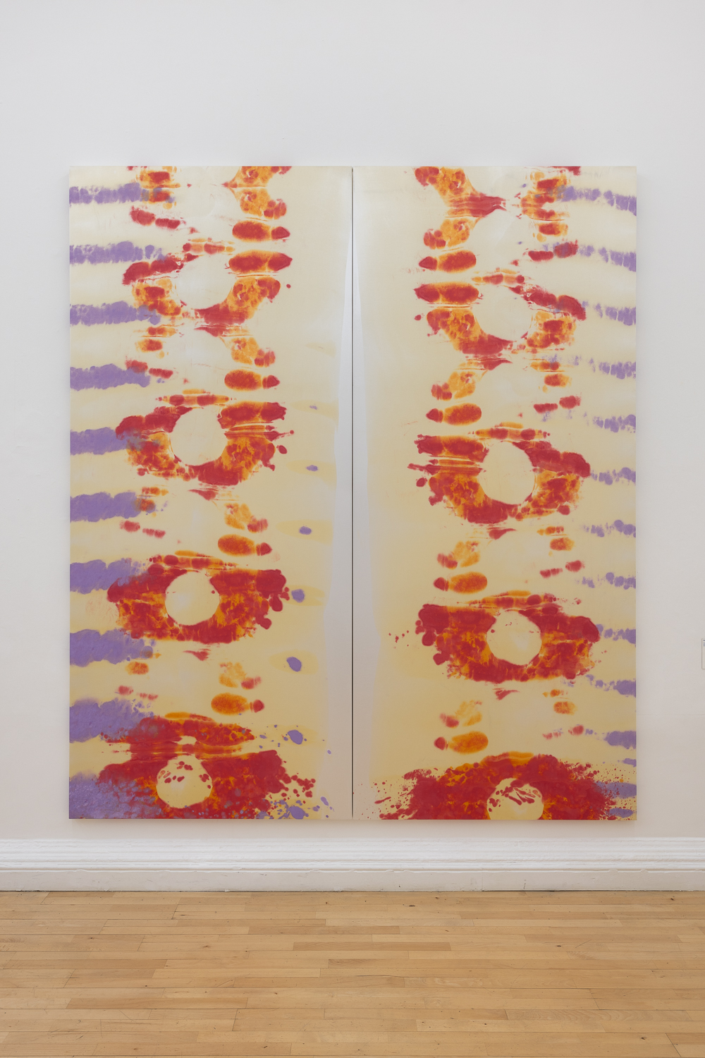
LVH Art: Does the work Fire of Love have to do with the documentary by any chance?
Max Boyla: Yes, it ties into the film. It was such a good film about love, as well as volcanoes, destructive forces, fire and light, and some of those themes are really relevant to my work. When I watched that film I was starting to see my current partner, which I think in hindsight also contributed to the work. I also remember seeing a Patrick Heron exhibition and thinking I was really seeing colour for the first time in a way. I really wanted to capture a sense of vibrancy within that painting, so I used more red and orange tones, which is more of my partner’s favourite palette. At the time I was mainly using lilac, so having the red tones really contrasted and broke, and expanded what I was doing in a way. But I could not have told you any of this while I was making the work. It was just instinctual at the time, and now looking back I can tell you all of this in hindsight.

LVH Art: Some of your works have this feeling of close-up shots, almost as if you’re observing something under a microscope, particularly A Chance to Bond, 2024 that is currently being shown at Hauser and Wirth Sommerset. Yet, they also have an expansive quality to them as well. Is this something you’ve thought about in your work?
Max Boyla: That’s definitely something I think about a lot. I want my works to have both a micro and macro quality, so they feel vast and celestial, almost like they’re tapping into that fourth-dimensional space. There’s this sci-fi element to them, something otherworldly. But at the same time, they also feel like they have a micro existence, almost like atoms or molecules. I kind of want all these possibilities to exist in my work. Not necessarily all in one work, but for my works to have this openness to them where people can bring their own thoughts. Like for Fire of Love, someone told me it looks like DNA, and I hadn’t even thought of that.

LVH Art: I noticed you created the SOS sign in the telephone booth next to the Royal Academy. I was quite surprised to learn that, as it’s not the medium I would typically associate with your work.
Max Boyla: I like this John Cage quote, “if all music is sound, then all sound can be music.” So I was kind of thinking about that in terms of materiality – if all paint is material, then all material can be used as paint. In that way I’m also quite interested in neon – it feels like you’re drawing or painting with almost pure light. It sort of touches on these ideas of consumerism and the history of advertising, that I also find intriguing.
For the SOS sign the RA purchased those boxes from the phone company, and they wanted to do a rotation of students’ work in them, but I wrote this proposal that used all three phone boxes for one installation, which they really liked. It was installed during the time of COVID, and being stuck in a confined space, like the neon is on those phone boxes, felt highly relevant to that moment. It is also about communication, lapses, and dead technology. As phone boxes are becoming more and more obsolete, I found it interesting that they were designed by Sir Giles Gilbert Scott and read that the design was inspired by the tombstone of his wife. The title of the work “The Sound of Silence” is also a reference to a Simon Garfunkel song, though I’m more into The Chromatics cover.
LVH Art: Have there been any artists, from the past or present, who have particularly inspired you or who you are thinking about a lot lately?
Max Boyla: Yeah there’s loads. I think when I started getting into art I was fascinated by Rene Magritte and Marcel Broodthaers. I am also a big fan of Philip Guston and Louise Bourgeois. Then there is Bernard Piffaretti. I really like his work, also because he often works in a diptych format, which I often work with. I was amazed when I saw his work, and was surprised by how someone was doing diptychs as their “whole thing”.

LVH in conversation with WangShui
We find ourselves in a moment when many artists are speaking out about their fears surrounding the rapid evolution of technology and artificial intelligence and the potential impact it might have on the art world. WangShui (b. 1986, Dallas, Texas), however, is an artist who thinks the exact opposite.
Choosing to fully embrace technology and AI in their creative process, WangShui explores the hallucinatory states between detail and distance, transparency and opacity, knowing and unknowing. WangShui’s utterly unique aluminium canvases are visually striking and transform depending on the light around them. We sat down with the artist this month to discuss their upcoming debut at the Venice Biennale and their thoughts on the current conversations surrounding technology and AI.

LVH: While many artists seem to be afraid of technology and how it’s evolving, you are an artist that chooses to fully embrace technology and its potential to enhance the creative process. Can you speak about your relationship with technology and how it influences your art?
WangShui: It’s impossible for me not to contend with our obsession with data at this point in history. Integrating different modes of technology in my work are just ways to understand the transmission of that data and how it augments our desires.
LVH: For your paintings, you made the decision to swap out a typical canvas in place of pieces of aluminium. Could you speak about how you utilise aluminium and what it was about raw, industrial materials that excites you?
WangShui: The aluminium panels have an important relationship to digital screens in how they project light from within. The abrasion and painting process is a way for me to both reveal and conceal that light.

LVH: One of your aluminium works – ‘Description of Ambiguous Congress’ (2023) – is currently at the Guggenheim in New York as part of their group show, ‘Going Dark: The Contemporary Figure at the Edge of Visibility’. Could you speak about the particular piece and what the “edge of visibility” means to you?
WangShui: I’m interested in the more peripheral dimensions of perception. Images that require de-focalized viewing, for example, reach much richer dimensions of our consciousness than easily identifiable subjects.
LVH: Artificial Intelligence is everywhere in the media right now. As someone who integrates generative AI into their process, could you speak about some of the misconceptions people may have about it and why you choose to use it?
WangShui: I have no interest in the media’s obsession with the binary opposition between human and machines. Machines have already surpassed humans in terms of processing power so it’s time to cultivate these generative tools. I hope AI can eventually fix our sad species.

LVH: Beyond the Venice Biennale, what future projects do you have lined up?
WangShui: I have a solo exhibition with Kurimanzutto gallery in New York coming up and I will also be partaking in the Sharjah Biennial.

In Conversation with Viola Leddi
Working between Milan and Geneva, Viola Leddi’s works are explorations of girlhood and disillusionment. The artist takes inspiration from a vast range of sources: from history of art, to the very personal experience of anxiety and nightmares.
The precise, nearly digital, finish of her figurative paintings is achieved through an extensive study into the processes of painting. Starting with hand drawn sketches on which she explores colour combinations with the help of digital tools, she continues on the canvas alternating between crisp lines and air brushed finishes.
Blurring the lines between hallucinations and memory, the paintings question the very capacity of visualising things through her eerie, yet meticulously constructed environments. Her canvases are filled with symbols, and she constructs her own choreography of signs which has become her unique visual language.
This month we sat down with Viola Leddi to discuss her creative process, tensions between the digital world and physical world, and her involvement in our upcoming exhibition, ‘Double Take’.

LVH: Your works explore the themes of memory, dreaming and nostalgia. How do you come up with your dream-like compositions?
VL: Recently, I’ve developed a strong interest in the concept of vision and visibility, encompassing their broader implications – historical, political, and scientific alike. My paintings employ collage techniques, empirical perspectives, and mixed viewpoints, all of which aim, to some degree, to challenge the very act of visualisation. I’m intrigued by the tension between visibility and intimacy, which is why I evoke references to self-narration, DIY practices, and relational dimensions in my paintings, positioning them as “resistant” practices against a backdrop of hyper-visibility and surveillance.

LVH: We will be including one of your works in our upcoming London exhibition, ‘Double Take’, which will explore the theme of perception in the contemporary age. Some might assume from a first glance that your works are digitally created when in reality you have meticulously employed airbrush techniques to create your compositions. Could you speak about this visual tension?
VL: I was introduced to the use of airbrushing by my mother, who is a graphic designer. Her early works in the 1980s were all done with an airbrush. The result of airbrushing is somewhat akin to digital painting, but unlike the latter, it’s more “warm” because it’s entirely handcrafted. I believe this difference is especially noticeable when viewing my works in person. The idea of mimicking the language of machines and digital art by hand fascinates me because it allows me to reflect on the processes of translation and reproduction of images, signs, and gestures. The translation and reproduction of images in my works, besides being a tool for understanding and studying images and their effects, in some cases, becomes a tribute and an act of care. For example, I love reproducing images from the personal archives of my friends, drawings, diary pages, and biographical elements in my works because I like the idea of leaving their mark on the canvas.

LVH: Before you begin a painting, you start with preliminary sketches and then transpose them onto Photoshop to experiment with colour palettes. Could you speak about why you choose to use technology in your preparatory process?
VL: I enjoy using software to visualise and design paintings; it’s much faster and easier to experiment with various colour schemes and compositions. For the past few months, I’ve also been using an iPad. However, the moment of conceiving the basic design has always been, and still is, very intimate for me. Only on paper, strictly A5-sized, and with the use of a pencil, can I bring out my subjects. I must also have a specific inner disposition to draw, to be able to immerse myself in my own bubble for a while.

LVH: As a young artist, what are your thoughts on the recent rise of Artificial Intelligence and image generation tools? Do you see it as a potential threat to artistic creation? Or even a tool that can be used?
VL: I’m not currently using image generation tools in my work. I’ve only tried DALL-E a couple of times and was amazed by the results, especially considering the significant improvement they’ve undergone in just a few years. If we consider how machine learning works, simplifying, we know that these technologies generate new images by utilising learned patterns from the data they’ve been trained on, and combining these patterns to create an image that is coherent with a given prompt. It’s a computational, rational process. I’m not sure how these technologies will evolve, but as of today, I feel like I’m doing something very different, and I don’t feel threatened by them.

LVH: What future projects do you have lined up?
VL: At the moment, I’m preparing for my first institutional exhibition, which will take place in France at the FRAC Champagne-Ardenne in Reims in October. Next year, I will open my first exhibition in China at the TAG Museum in Qingdao.
Double Take, the latest exhibition curated by Lawrence Van Hagen, will open in Mayfair, London next month. More details to be revealed soon. Viola Leddi is represented by VIN VIN Vienna / Naples.